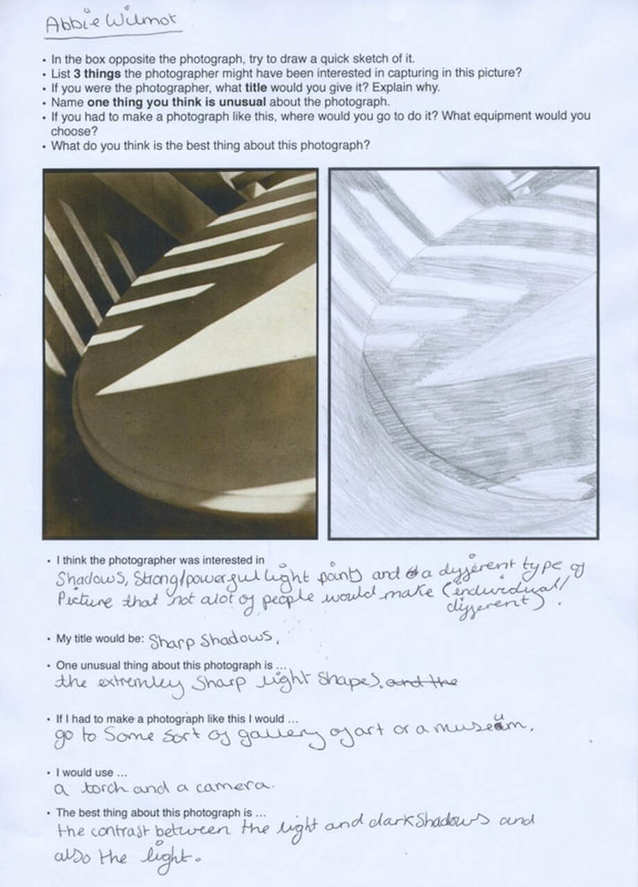
Definition Of Abstraction
Abstraction is a style of photography which is different to average images. The most common way to create a good abstraction photo is to make it blurry, have something in front of the camera, using different lighting and changing the colour of the image. I think abstraction is one of my favourite styles of photography because you can never have a right or wrong image, however you photograph the image it would always be abstraction.
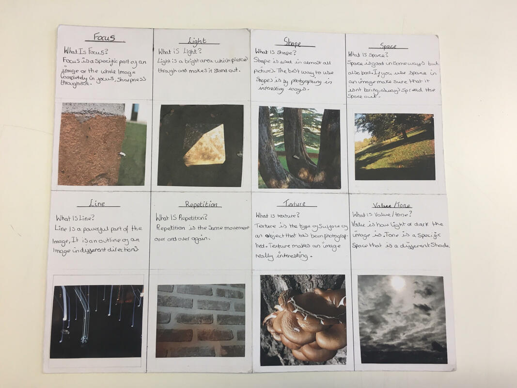
formal elements
|
Focus:
Light: Line: Repetition: Shape: Space: Texture: Value/Tone |
Which areas appear clearest or sharpest in the photograph? Which do not?
Which areas of the photograph are brightest? Are there any shadows? Does the photograph allow you to guess the time of day? Is the light natural or artificial? Harsh or soft? Reflected or direct? Are there objects in the photograph that act as lines? Are they straight, curvy, thin, thick? Do the lines create direction in the photograph? Do they outline? Do the lines show movement or energy? Are there any objects, shapes or lines which repeat and create a pattern? Do you see geometric (straight edged) or organic (curvy) shapes? Which are they? Is there depth to the photograph or does it seem shallow? What creates this appearance? Are there important negative (empty) spaces in addition to positive (solid) spaces? Is there depth created by spatial illusions i.e. perspective? If you could touch the surface of the photograph how would it feel? How do the objects in the picture look like they would feel? Is there a range of tones from dark to light? Where is the darkest value? Where is the lightest? |
|

Evaluation of my images that I like

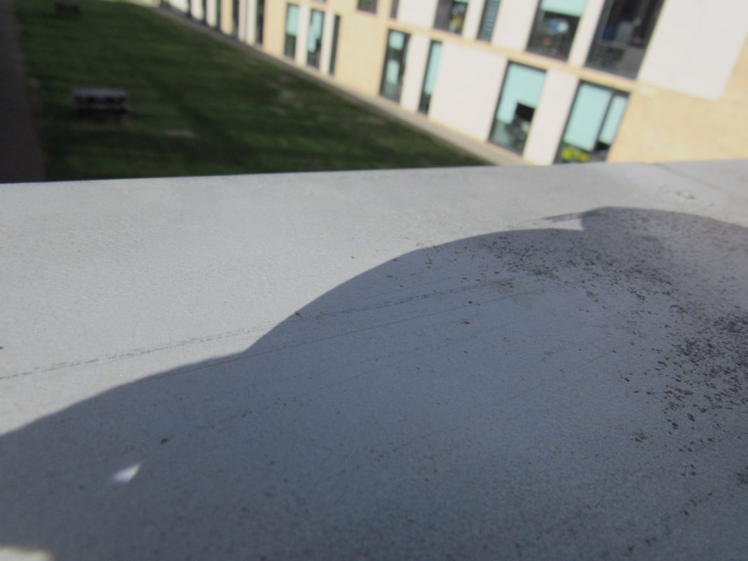
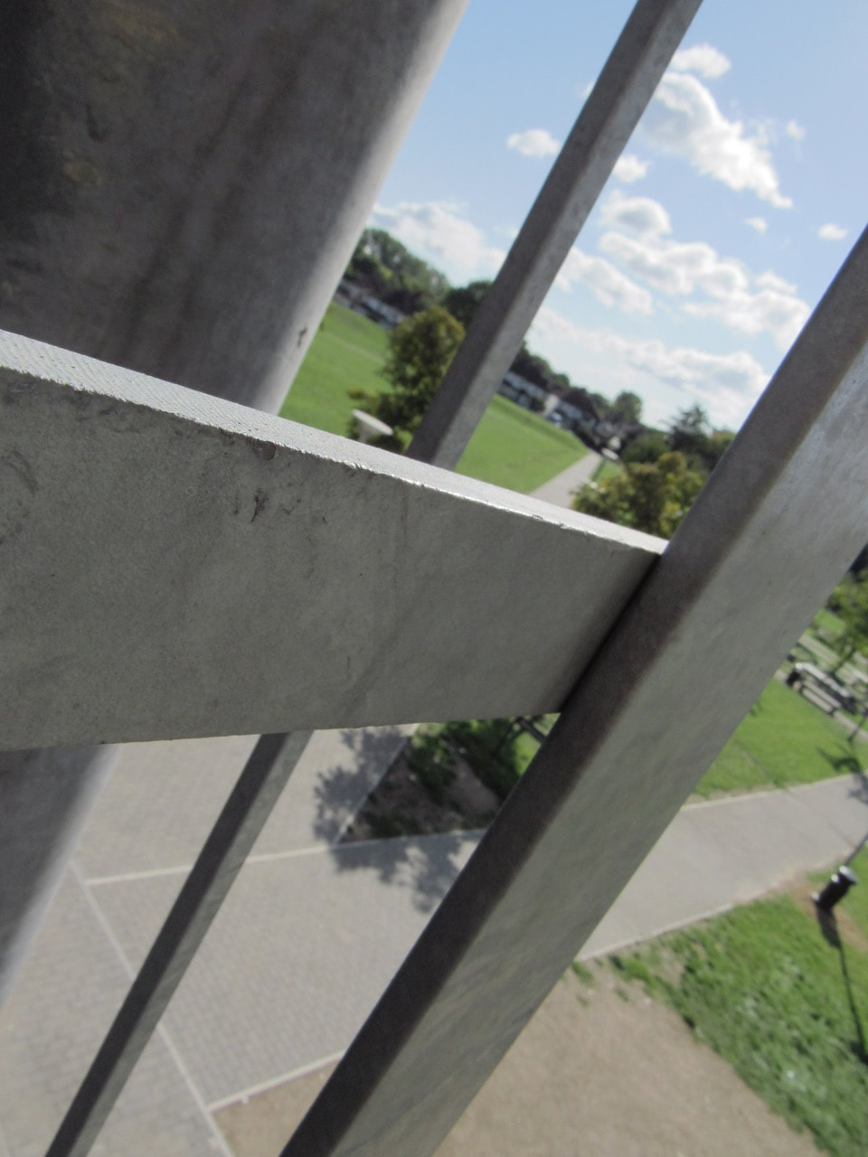
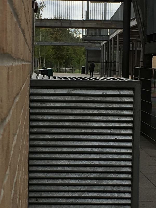
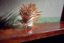
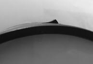
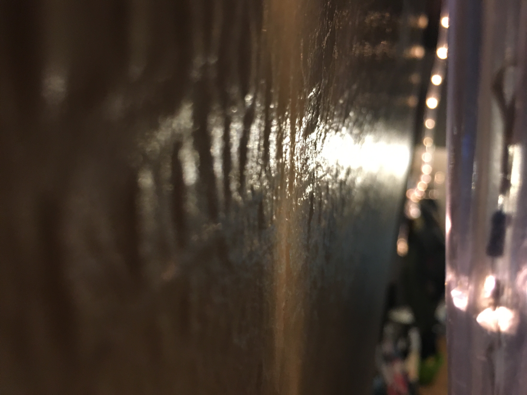
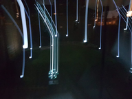
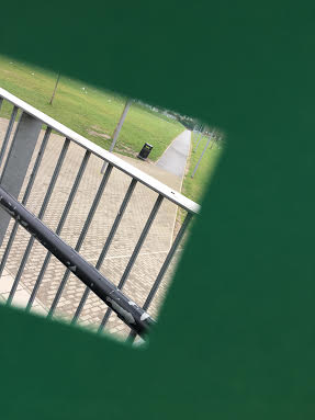
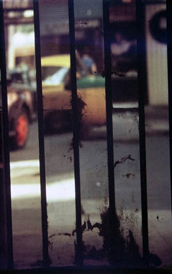
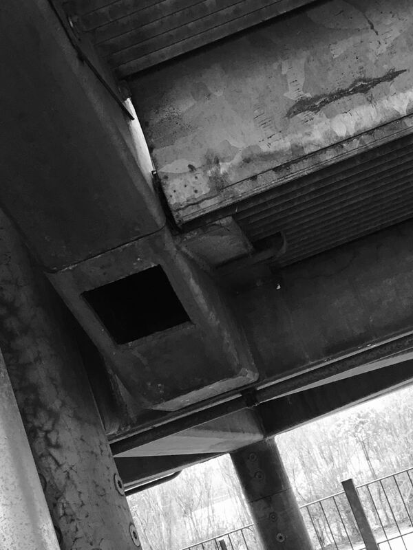
WWW: I like this picture because the metal bars are in focus really well and then the greenery behind is slightly out of focus. The greenery behind has a lot detail and added objects which makes the view draw their eye even more. Throughout the image there is a lot of texture which makes the image a lot more interesting.
EBI: What I could do to improve this image is to make the metal bars more in focus and try and distort the background a bit more to make a the image more powerful.
EBI: What I could do to improve this image is to make the metal bars more in focus and try and distort the background a bit more to make a the image more powerful.
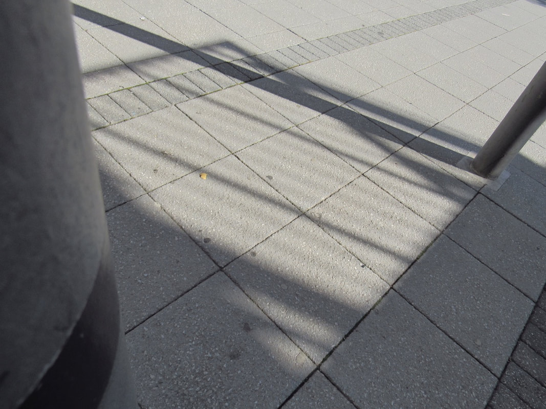
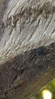
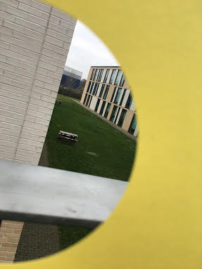
EBI: I think this picture is quite plain and boring. A way to improve my image is to distort parts of there image, the parts I would distort would be everything but the tree.
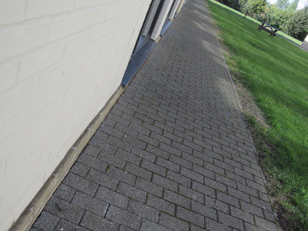
WWW: What I like like about the image is that the background is full of trees and also the shadows from the trees are reflecting back on the ground.
WWW: What I like like about the image is that the background is full of trees and also the shadows from the trees are reflecting back on the ground.
My Thoughts On Abstraction
Before I did my research my ideas on abstraction was individual, different, unusual, contradictory, mis-shapen, imaginative, unrealistic, distorted, self-explanatory and strange. After a little bit of researching my opinion has kind of stayed the same, the only thing that has accrued to me is pictures that I think are just normal they all have some bit of abstraction in it even when you don't realise it.
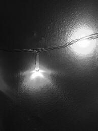
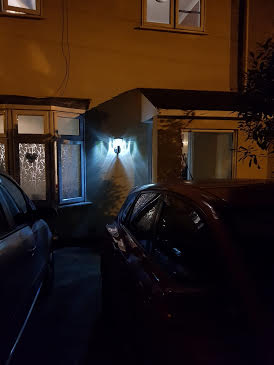
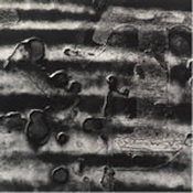
Abstract photo mainly light and lines

WWW
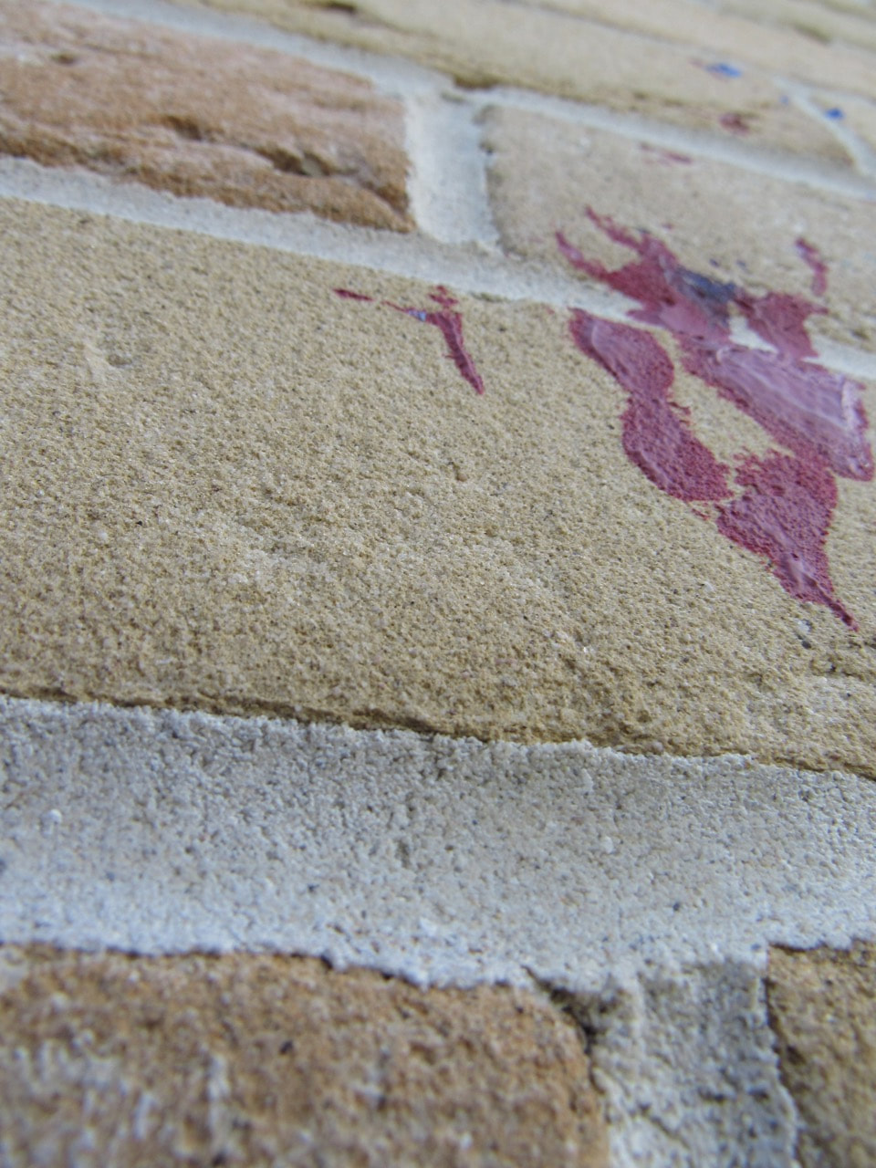
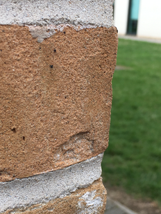
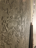
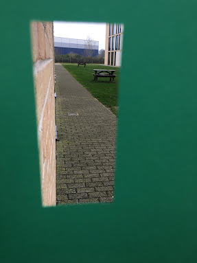
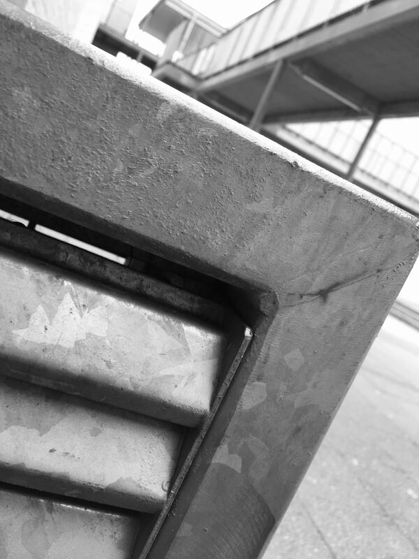
I think this photograph is good because it is focused on the wall or brick which I think is quite interesting. What I also think is interesting is the blurred background of the grass. What I also like is the texture from the brick wall.
EBI
I think that this isn't the best picture because my formal element was light and in this photograph it doesn't have a lot of light in it at all, and it is also quite bland there is not a lot of interesting parts to it .The way I could have improved my image is by coming from a completely different angle and that will create I different image and more detail to it.

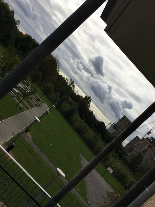
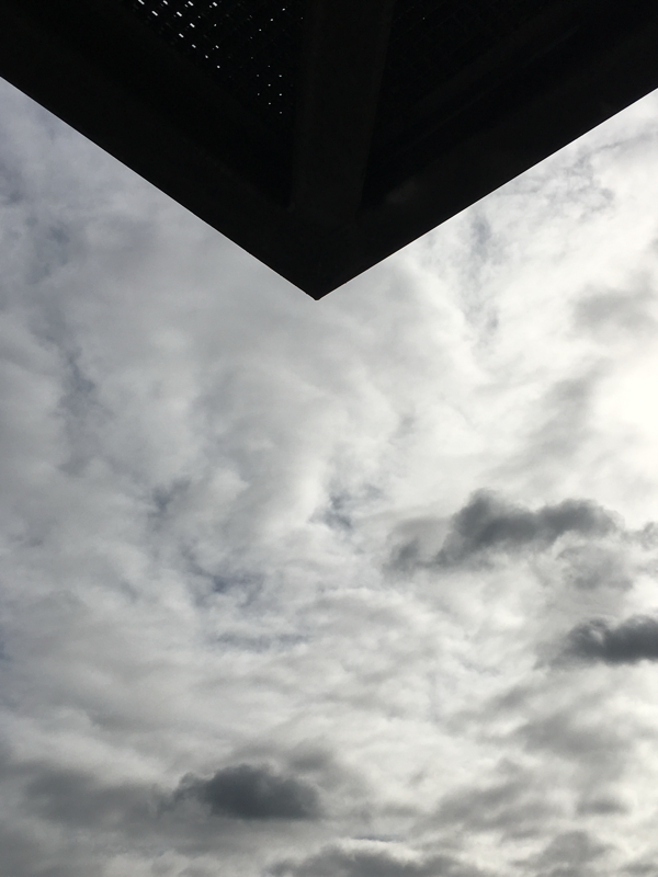
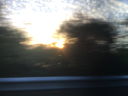
WWW
I like this photograph because of the really detailed clouds at the bottom of the picture, and also that the clouds are light at the top and then really dark at the bottom. I also like the piercing sun coming through the middle.
EBI
I think to make this picture better I could have taken it from completely different angles to get a different perspective of the photo. Another way to improve my image is by incorporating some more objects to the photograph.
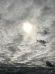
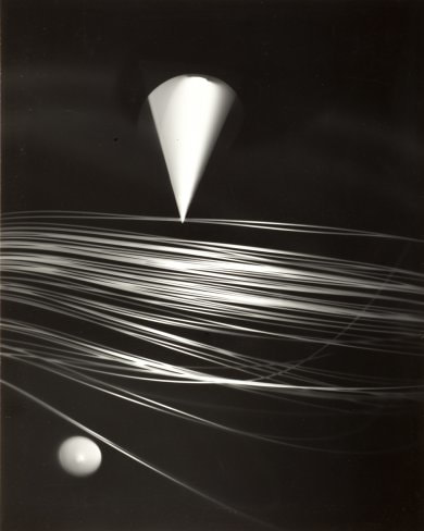
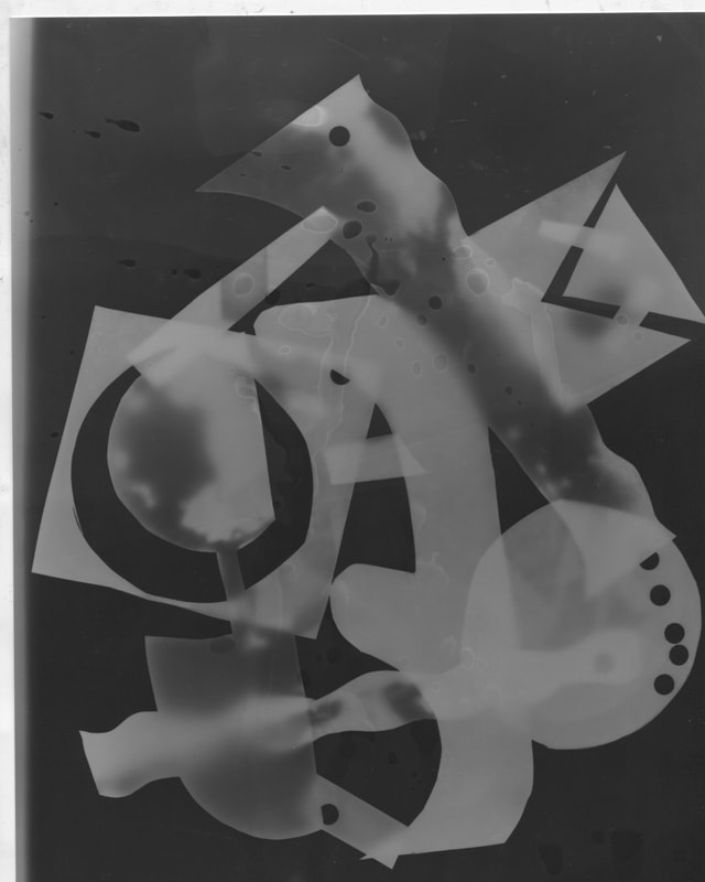
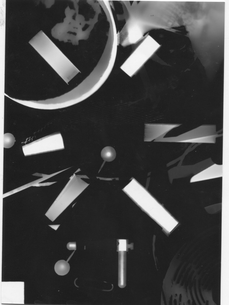
Abstract photograms by Gyorgy Kepes
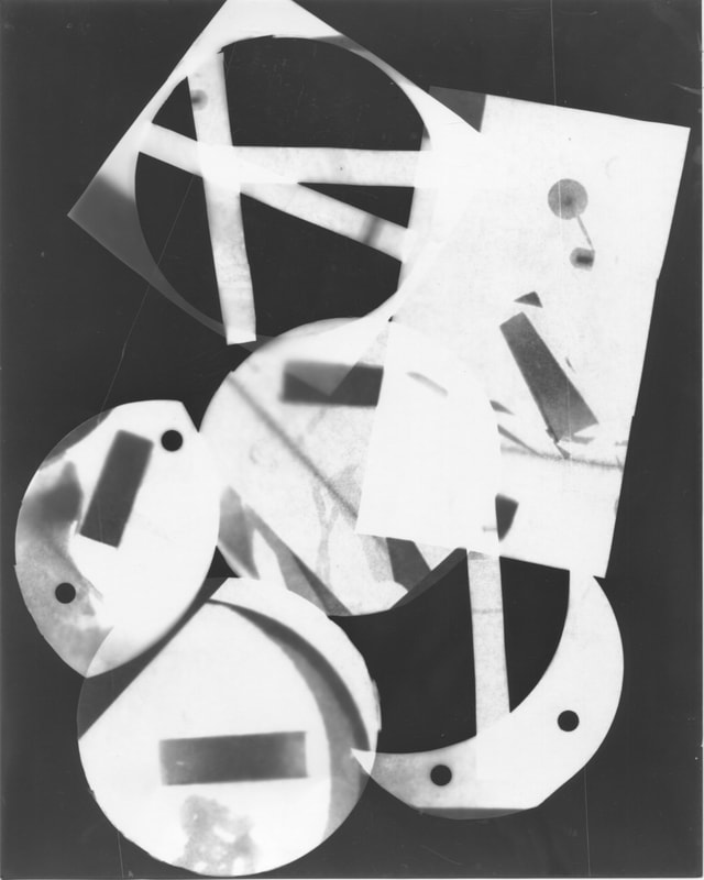
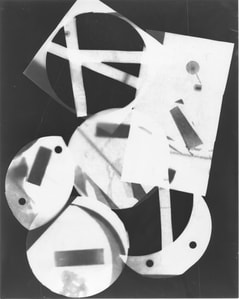
Abstract photogram by Barbara Kasten
|
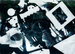
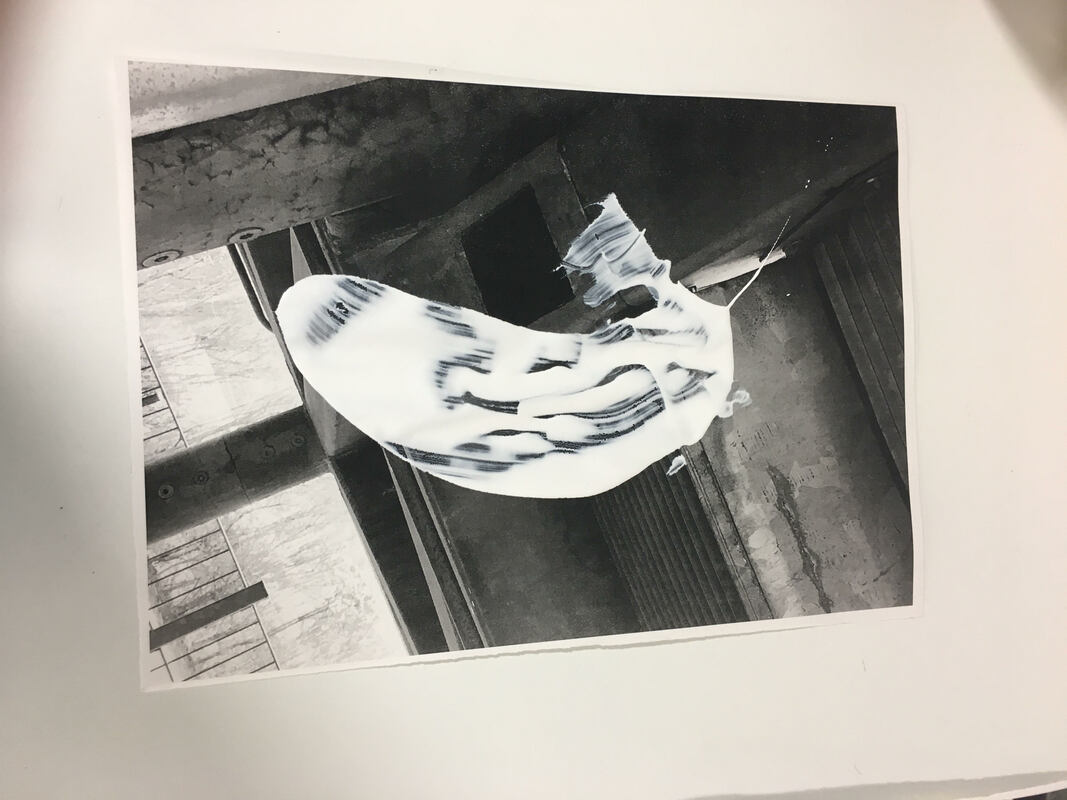
I really do like this image because of the brightening white that has come from the objects. This image is also really abstract even though it is quite simple. It has a lot of aspects to the photo, for example the streaks across the page and I have two thoughts. I think it could be hair laid across the page or it could be straight wire across the page. Also if you look closely the cylinder overlaps the streaks across the page and that give some suspicion that maybe the cylinder is attached to the hair or if it is laid on top of the hair. In the background it is extremely dark which is a good thing because it creates heavy contrast. There is also a contrast between the shapes for example there is really fine hair like a liquid form and then you come across a solid form.The hair type substance also reminds me of a record player as the needle hits the disc it creates a sharp scratch around the disc.
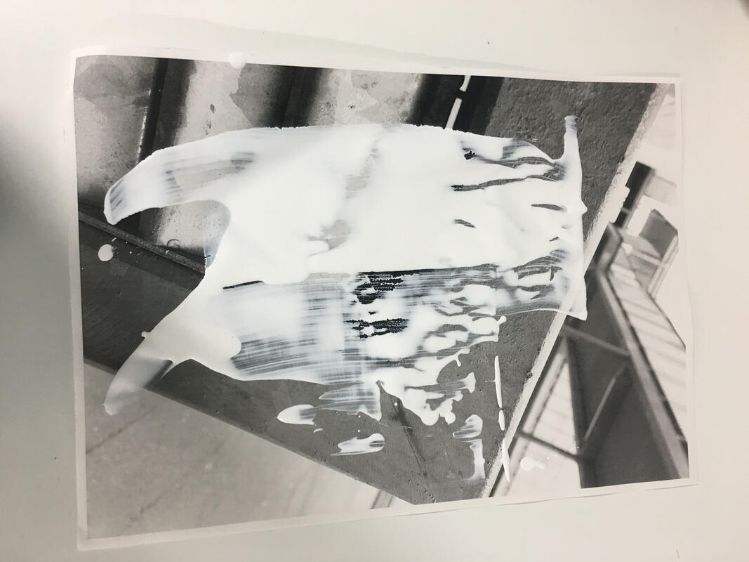
This image is quite interesting because of the marks they look a lot like finger prints or a marble affect. In my opinion I think this image is quite abstract. It also looks like an open book with the images in, it also reminds me of a mirror reflecting off each other and that made the image really interesting.The contrast between light and dark is a very good balance I think because the lights are very piercing but very little which doesn't overpower the image but when it comes to the darks there is a lot but it doesn't overpower the image because there is various shades. |

whats a photogram?
A photogram is an image that has absorbed light and then place into chemicals which brings out the negative and positive colours. Where the objects have been laid down on top of the paper the light hasn't absorbed that bit of paper so it becomes white, this forms a photogram and makes it intriguing to the eye.
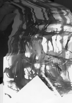
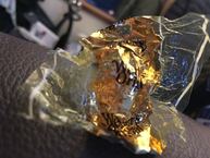
This photogram is completely different to my other ones because I didn't lay the whole paper in I brushed it and flicked it with the developer and that gave it a really cool affect. You can also see that the objects have been thrown on, this makes the photogram look really messy. I like this photogram because of the way it is has developed.
I think this image is a really neat photogram but very catchy to the eye as well. The non developed part of the image is a solid substance. In my opinion its quite a full on image because every object is touching and also its in the middle of the page which makes it stand out even more.
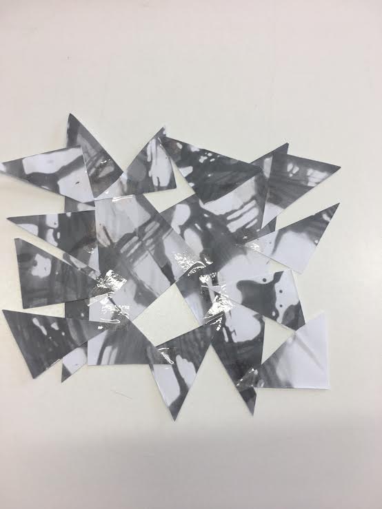
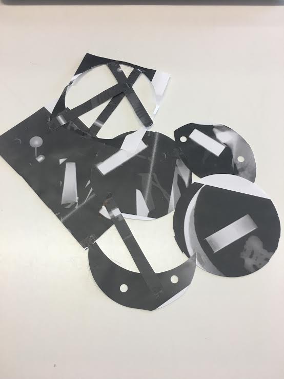
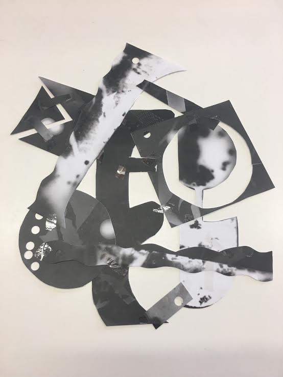
My cut up images of my photograms
duotone photogram and evaluation
This image has been duotone, which gives the image a really affect. The way I have got this final image is by combining two images that I have done by a normal camera and also a image made by photograms.This image has a lot of texture mostly the whole image but the part that draws my eye the most is the middle of the image it looks really interesting because it has a 3D affect to it.The contrast between light and dark has combined really well for example the white stand out really well in good shapes and then the dark is stands out as well in a different way because there are different shades of dark.

I like this image because of the colour that it has become and also the lights. The patterns in the image are quite bland compared to others that I have done in the past but I think that the way the patterns have come out after been duotone it makes the patterns more intriguing.The light in this image is what makes the whole picture because there are little sparks of light dotted around the whole image, there is also a lot of reflection in the image and also very dull light and that makes it more interesting for whole image.
Photoshop composite using 1 duotone and another image
this is the duotone image that I used
|

this is the abstract image that I used
|
this is the final duotone
Evaluation
I really like my final outcome because of the contrast between light and dark for example the light is very bright and it comes in bursts throughout the image but the dark isn't extremely dark which works really well with the image because otherwise it would be over powering. what i could do to make this image better is do a different colour for both images.

this is the duotone image that I used
|
this is the abstract image that I used
|
this is my final duotone
Evaluation
I like my final outcome because of the contrast of light, dark and colour for example there is a little bit of light but has a slight hint of blue throughout which looks really interesting, for the dark there is a lot of dark throughout the whole image but what I think makes not too over powering is that it has a hint of blue and also different shades of dark and for the colour there is only a little bit but it just makes the image more interesting and doesn't make it bland, it throws a bit of life towards it.
My Final Project
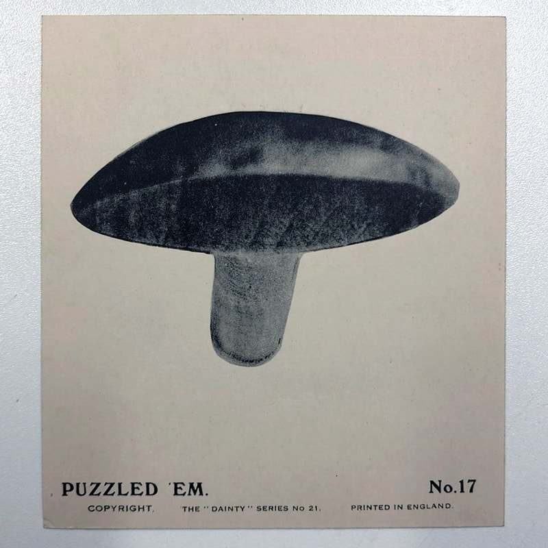
Puzzled'em
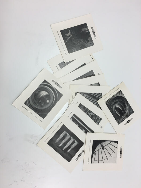
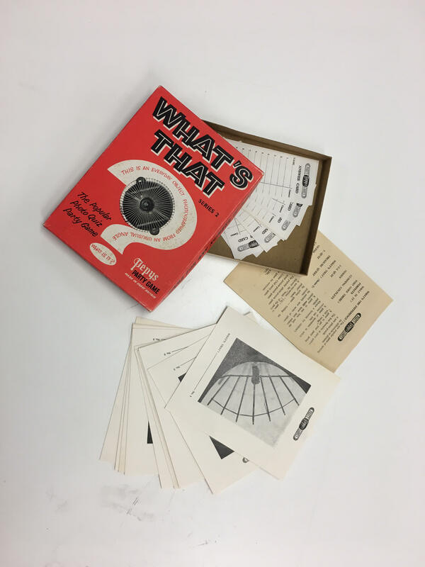
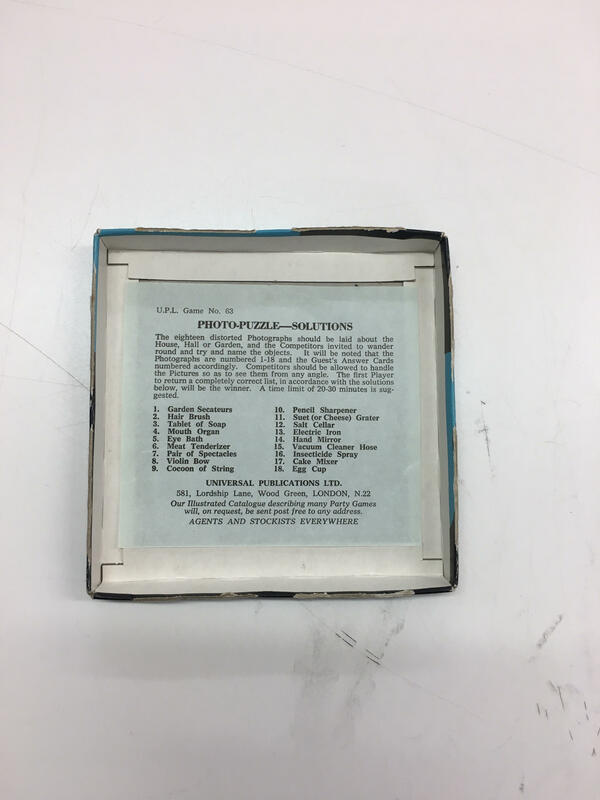
What is puzzled'em?
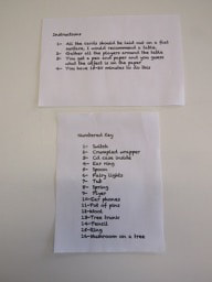
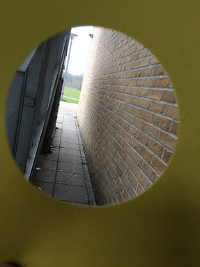
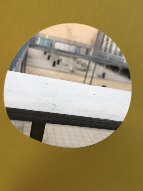
Puzzle'em is a old card game. The way this game works is there is about 24 images that have been taken in unusual angles laid out on a wall or table, and the people who are playing have to guess the object and whoever gets it right is the winner, there is also a card with the key which is helpful
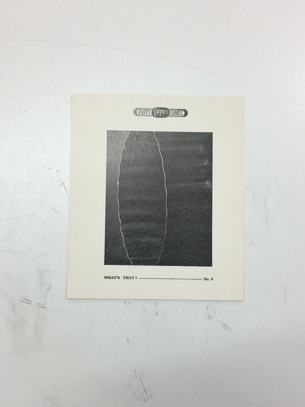
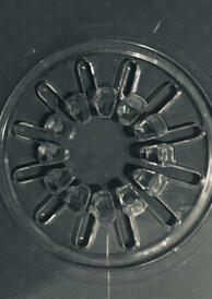
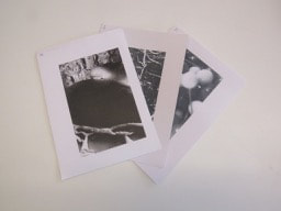
Example of puzzle'em:


Here are some more example of that type of game:
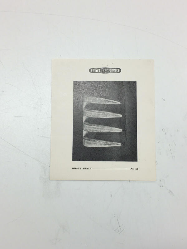
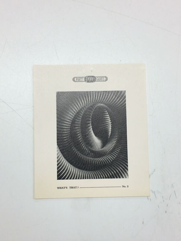
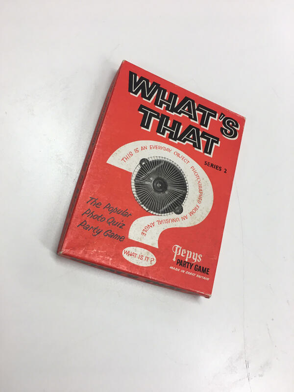
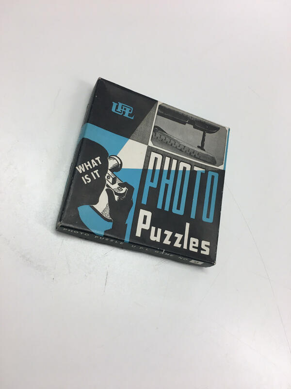
What do I have to do for the challenge
What I have to do for the challenge is to make a physical game in relation to the game "Puzzled'em" with at least 20 images that you have to think about what it is.
Photographers who make unconventional photographs
Abbott Berenice
~ She was an American artist
~ In 1923, she fortunately ran into Man Ray she was her old friend from New York, and she introduced photography to Berenice
~ Some of her artworks are called Janet Flaner and The Construction Of Rockefeller Centre
~ In 1923, she fortunately ran into Man Ray she was her old friend from New York, and she introduced photography to Berenice
~ Some of her artworks are called Janet Flaner and The Construction Of Rockefeller Centre
Peter Fraser
~ He is a contemporary photographer
~ Mostly known for colourful images
~ His work is mainly extremely in focus and regular objects you find on a day to day basis
~ Mostly known for colourful images
~ His work is mainly extremely in focus and regular objects you find on a day to day basis
A List Of Ideas For My Puzzled'em
~ straw ~ fork
~ key ring ~ whisk
~ tree ~ cookie cutter
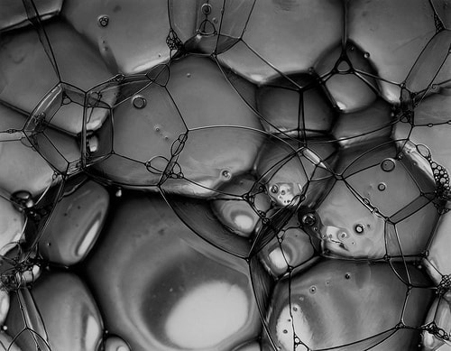
~ bubbles ~ string
~ pencil ~ scrunched up sellotape
~ cup of pencils or pens ~ spoon
~ cake ~ bowl
~ smudged toothpaste ~ cup
~ key ring ~ whisk
~ tree ~ cookie cutter
~ bubbles ~ string
~ pencil ~ scrunched up sellotape
~ cup of pencils or pens ~ spoon
~ cake ~ bowl
~ smudged toothpaste ~ cup
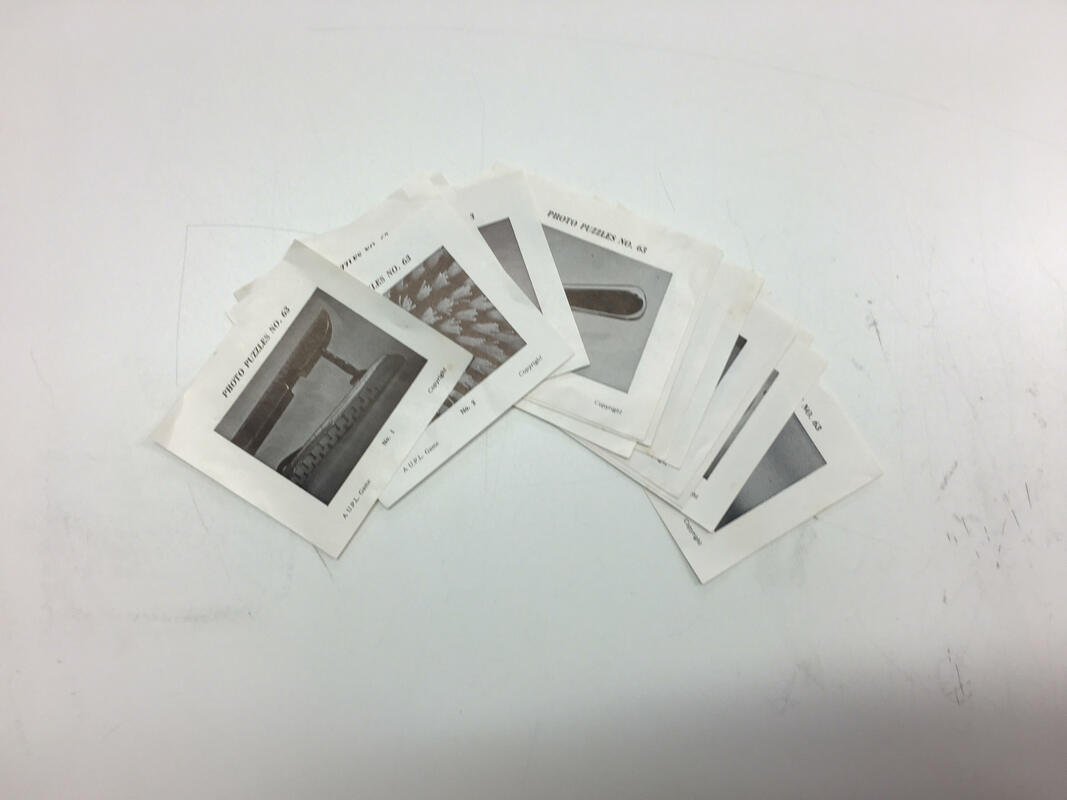
My Final Game
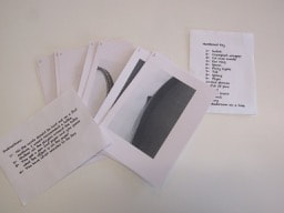
Evaluation
The result of my game was good, a lot of people were confused on what the objects were and that was the Aim of the game. Mostly all the pictures were blurry and out of focus which made the players of the game think a lot more of it. What I could do to improve my game is to provide it with a box and maybe print the instructions and key on card . Another way to improve my images is to make them smaller to make it harder and also maybe print in colour.
Abstraction Photographs

Artist Research
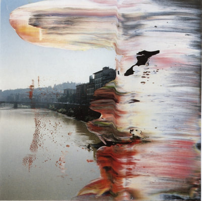
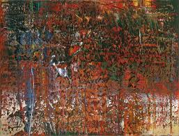
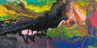
Gerhard Richter
~ He was born on the 9th of February, in 1932, in Dresden, Germany (age 86).
~He is a German visual artist.
~The awards he has won is called the 'wolf prize in arts'.
~His style of photographs is blurred photos, and distorted photo's.
~ I like those type of photo's because you have to look really closely to actually see what the photo is and sometimes you still can't even figure out what the picture is, it kind of gives some mysterious to it.
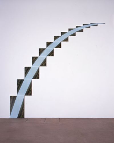
Jan Dibbets
~He was born on the 9th of may in 1941,in Weert, Netherlands (77 years old)
~He started as an art teacher at the Tilburg Academy.
~He studied a painting with Jan Gregoor in Eindhoven.
~His style of photographs is a plain background with a picture in the middle
~ I like those type of pictures because the picture against a plain background makes the main picture stand out which then makes all the colours loads more powerful.
My Own Abstract Images


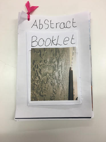
My Dummy Book


|
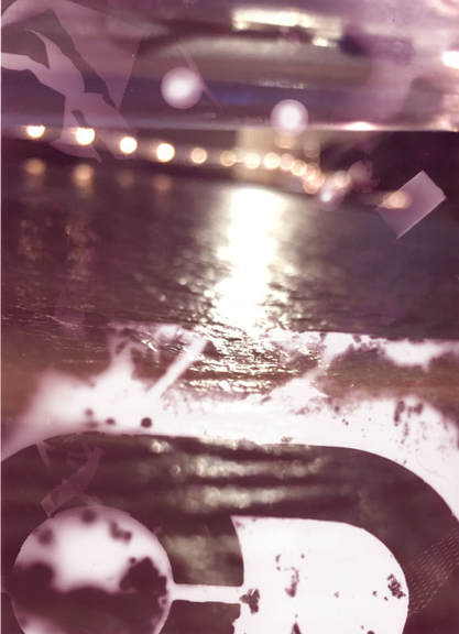
This image is different to all my other images because you cant really see or work out what the image is. There is a big contrast between light and dark colours. As you can see there is a big section of the photo where the bright light punches through, this is the main part of the image where your eyes are drawn towards.
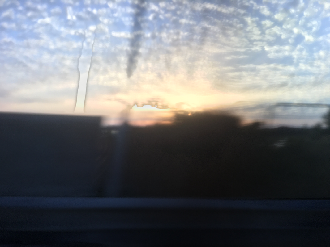
This image is abstract due to the misty look throughout the whole image and also the dark smudge in the top right of the image. The misty look throughout the image give a mysterious look towards the image.In the photo there are a lot of edges especially in the background.
This image is an interesting one because it has a dripping affect from the top of the picture to the middle of the image. The image throughout is quite distorted which give a good affect throughout the image.There is a contrast of colours between light and dark, on the top half of the image is light and in the bottom half it is dark and cant really see what the image is in the dark area.
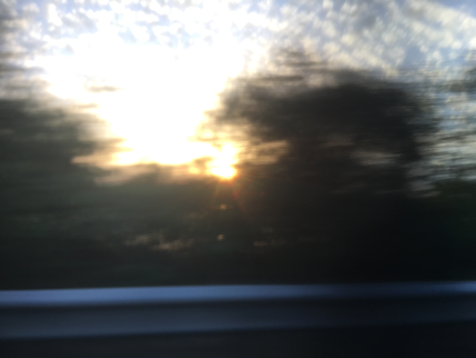
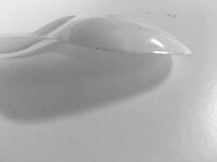
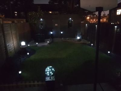
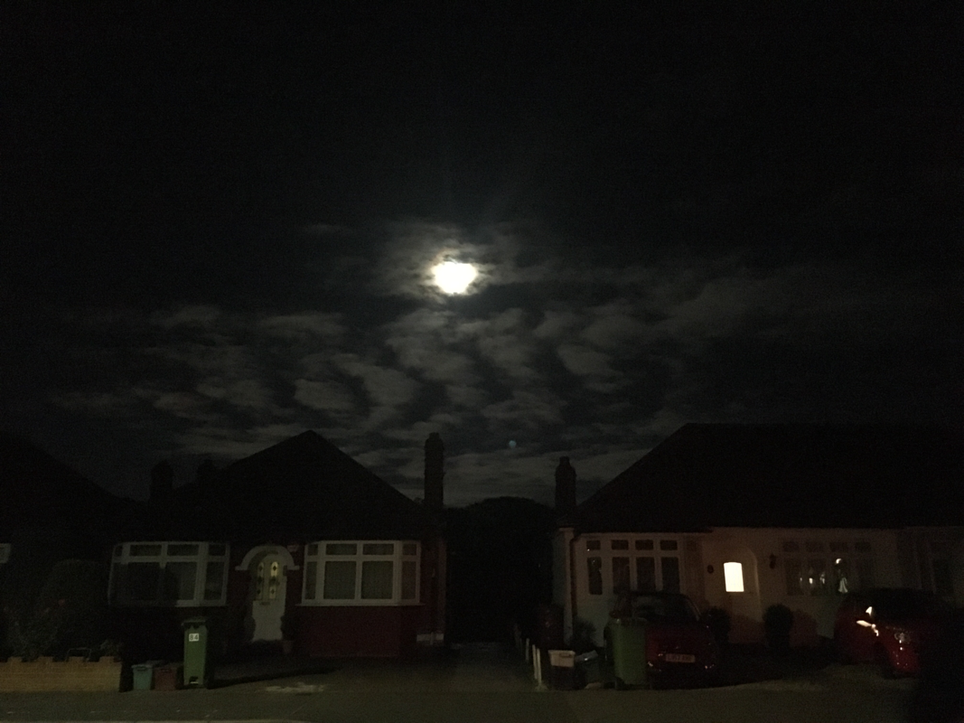
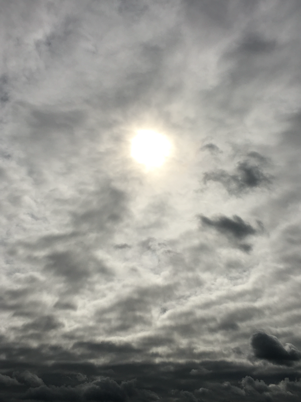
This image isn't as abstract as i would like, i think it is quite normal, for example nothing out of focus, ect. The only part of the image i do like is how the clouds have formed a zig zag in the sky, and also the moon piercing through the clouds.
This image is interesting because of all the edges on the wall. The angle the image has been taken, it makes it look like the design is pop ping out of the wall which draws your eye a lot more. In the background there are a lot of edges and light popping through in the image. The image is different to many of my others because there is nothing out of focus. I think i based this image on texture and edges and in this image the texture is very rough and the edges are jagged. There is a slight contrast between light and dark, for example the dark is not too over powering for the whole image due to other shades of dark tones, and for the light it is piercing through in the middle. This image has been taken really quickly so the lights have shot up and made a streak from the light up to the top of the image. There is a massive contrast between light and dark the streaks is a piercing white light and then the dark is dark but if you look closely there are more objects which makes it more interesting. This image is different because the part closest to the camera is in focus and the background is out of focus which makes you look more towards the image. The light further away is more piercing and as it gradually comes towards the camera the light calms down a little bit.
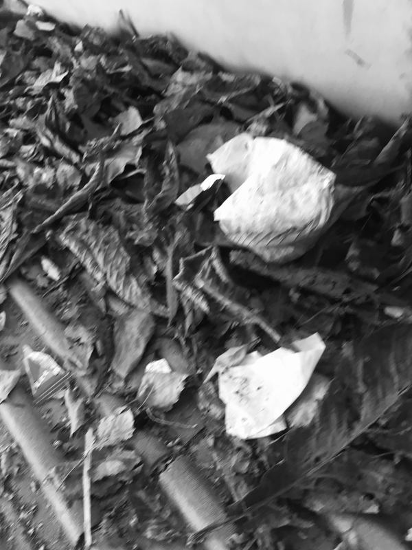
This image is quite bland throughout the whole image. If you look really close you can see a lot of dents and it is a remote control for the television. The way i could improve this image is by doing it from multiple angles, even adding a few object in the background or even putting some thing over the lens to create a blurry affect or some colours across the image.
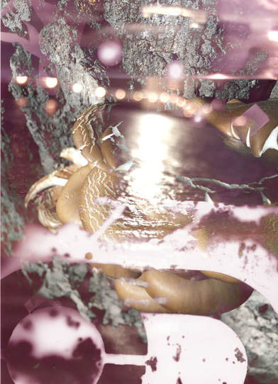
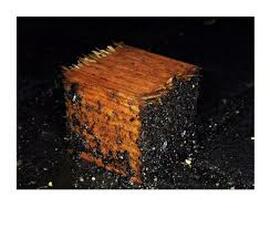
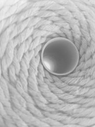
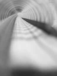
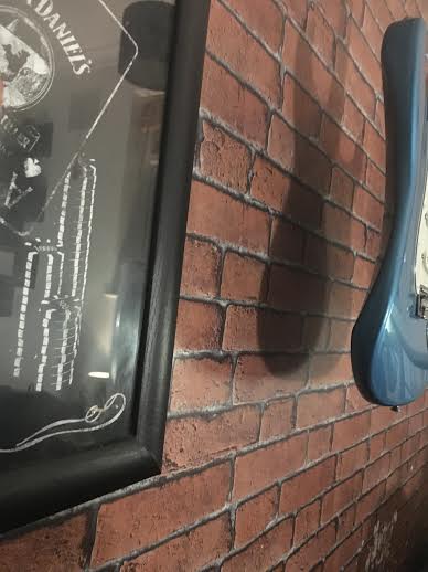
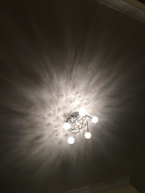
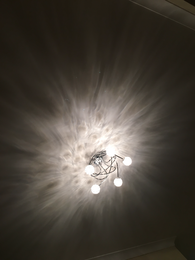
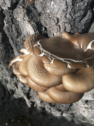
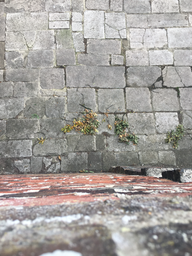
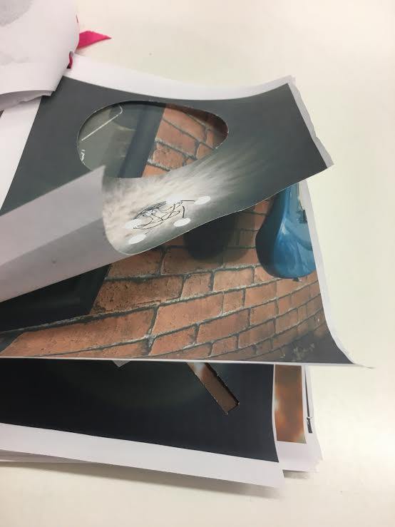
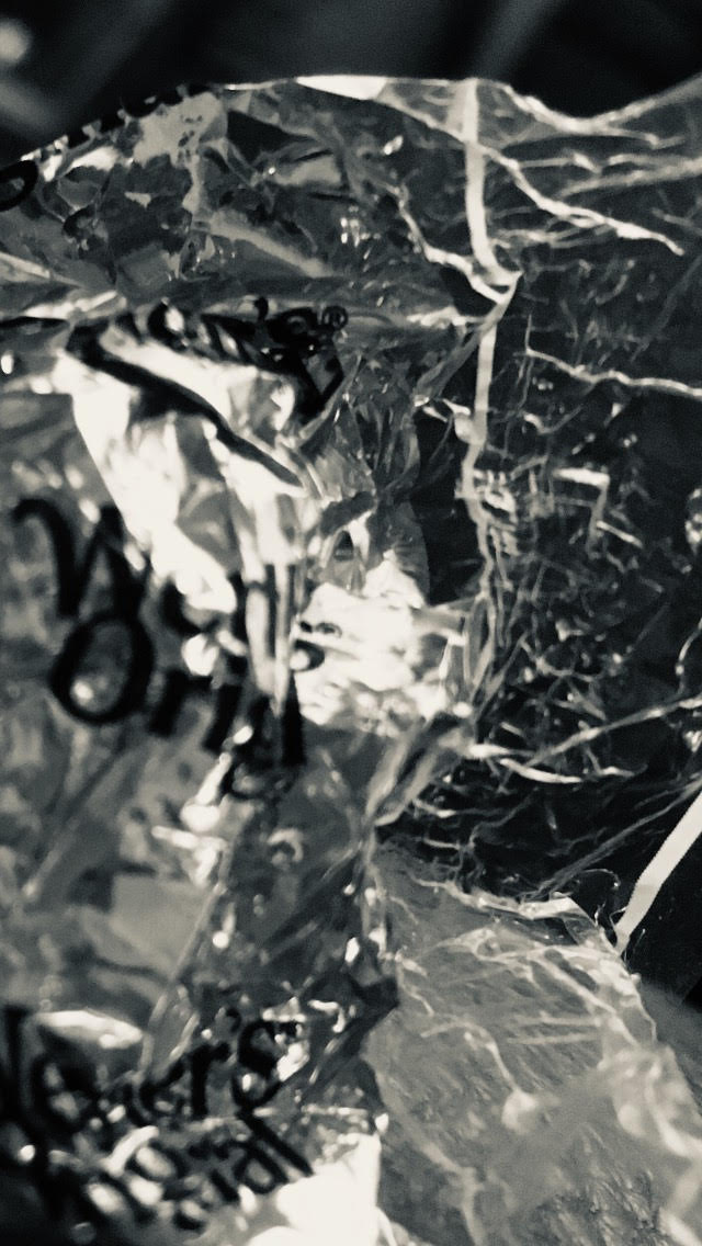
This image has a lot of texture throughout the image from the paper. It also has shadows in the image as well through the hole there is a bright light shaped as a circle and then the rest is a dark. This image has a good foreground and a good background. In the foreground it is a a crumpled rapper and that is in focus very well and then the background is slightly out of focus but makes the image all come together. This image has two main objects which is a poster and a blue guitar, in the background it is a brick wall and that gives a lot of texture towards the image and also it has a shadow on top of a shadow shaped as the bottom of the guitar. If you look closely there is a reflection in the poster and that creates a more interesting affect towards the image. This image is interesting because it is blurry in some places and then slightly in focus in different areas. The contrast between light and dark is very strong because there is a dark ring around the writing and then a very light part in the middle, and the middle of the image always draws your eye the most. In this image it looks like the parts are in focus is really close to the camera and as it gets more blurry the further away the object is. This image is more of a pattern image. I like this image because of the pattern that has gone on the ceiling from the light. The pattern on the ceiling looks like a lot of things for example a spider web ect. The way i could improve this image is by making the light centre or even doing it from multiple angles. This image is a lot of things put together for example a lot of texture, edges and distorted parts as well. The texture comes from the tree mostly were it is a rough surface but it also comes from the mushroom where it has cracked as it was growing. Every where in the image has some sort if edge but especially the shape of the mushroom. If you look further down the image you can see right at the bottom of the tree a blur and there is an object down there but you cant really tell what it is. I think a mixture of texture, edges and blurry parts really do make a image come together in a good way. This image very different to many of my other images due to you can look at it two different ways. The first way is the camera is positioned at the top of a wall and the second way is the camera is positioned on the floor. In this image there is a lot of texture coming from the concrete mainly. There is also a lot of edges for example the cracks in the concrete and also the edge of the plant; the edges of the leaves and also the edge of the whole branch.
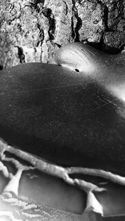
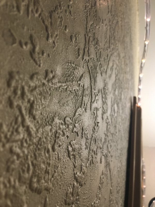
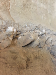
This is quite abstract i think because you really have to focus to actually understand what the image is.The image is a big crack in the wall and it has been taken at an angle so it makes the image way more interesting. In this image it has a lot of edges and also a lot of texture as well, the edges come mainly from the crack in the wall in the middle of the image and the texture is throughout the whole picture, because it is a wall that has cracked over the years t has created more texture. I personally think that a lot of edges and texture really does make an image really abstract.
|
Final Abstraction Booklet
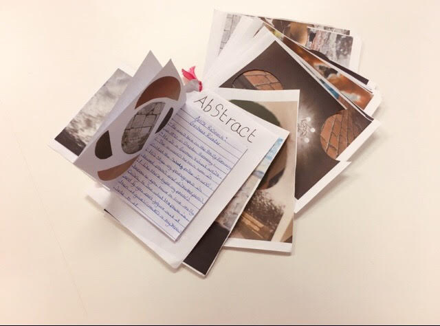
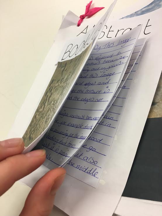
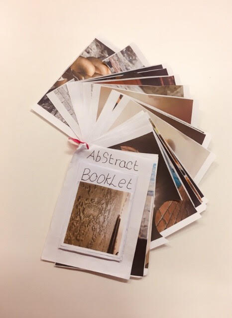
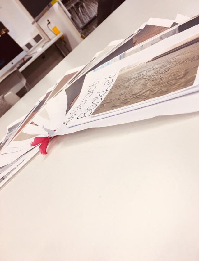
Evaluation
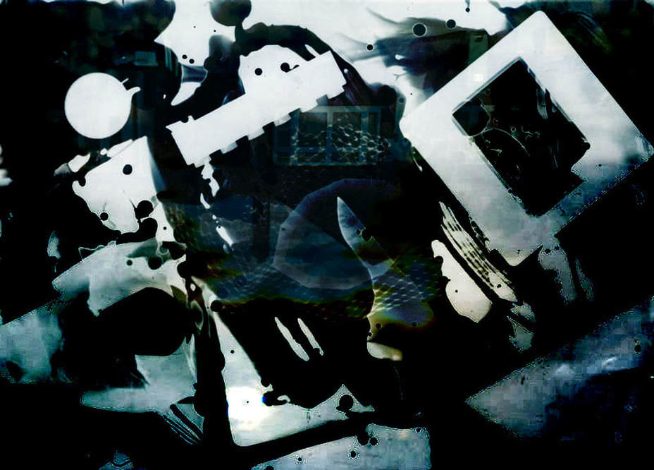
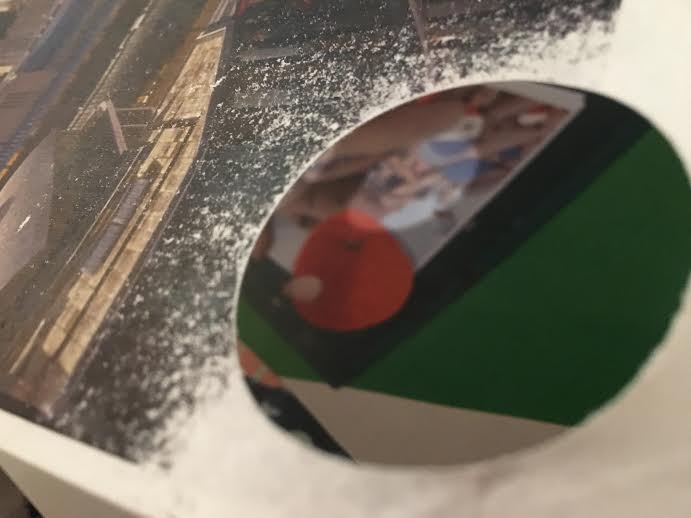
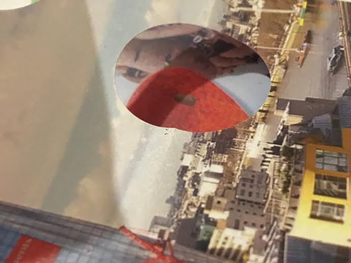
What I like about my final booklet is the way I have cut circles out of the images but in various places throughout the booklet, what interests me about it is the the way the picture behind comes through and it makes the whole image completely different, the contrast between al colours are good but some are unusual but the makes it abstract. What I could do to make my booklet better is to make the blank spaces a little bit more interesting, this could include adding colour etc. Another way to make my booklet better is to cut out more and/or different shapes to space it out throughout the booklet.
Saul Leiter
My Painting Of Saul Leiter Photographs
How I did my painting
~ I kept looking at the original photograph
~ then try an put it onto paper and make it look as similar as possible
~ then try an put it onto paper and make it look as similar as possible
Research About Him
Make a list of at least 5 characteristics (typical things) that define Leiter's photographs?
~ Bright colour
~ Lines throughout the whole image
~ The shapes are unusual
~ There is a lot of texture
~ The form of the images are unusual
~ Bright colour
~ Lines throughout the whole image
~ The shapes are unusual
~ There is a lot of texture
~ The form of the images are unusual
Explain how and why you made your own paintings based on Saul Leiter's photographs?
~ I made a painting of Saul Leiter's photographs because it would give a better understanding of how he thinks when it comes to him taking and patting on photographs.
~ I made a painting of Saul Leiter's photographs because it would give a better understanding of how he thinks when it comes to him taking and patting on photographs.
Editing on the picture
Evaluation
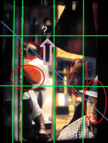
I have edited this image to get a better understanding of the way he lays out his images. The diagonal line going from the top left to the bottom right lines up to all the men heads. The whole image is lined up in some way vertical, horizontal or diagonal.
Photographs Saul Leiter style

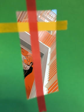
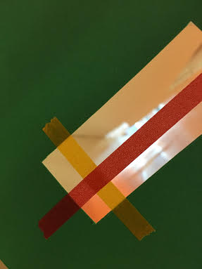
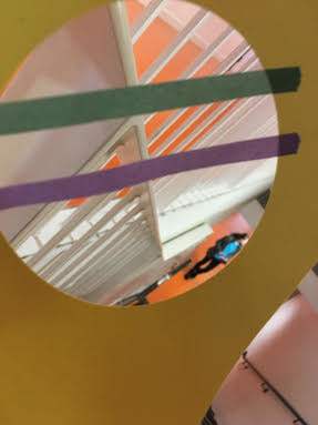
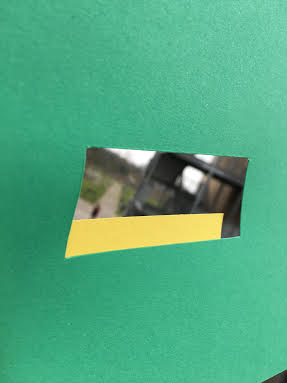
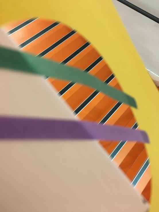
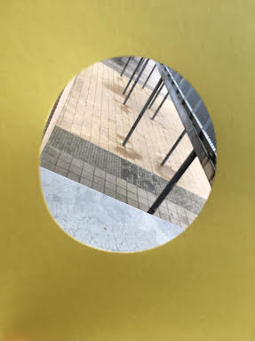
Evaluation
These images are completely different in many different ways. For example the position of the card, the different type of tape placed in different directions etc. I think the yellow card ones have turned out better than the green card because a circle will work with anything but the rectangle will on only work straight or anything lined up to the rectangle. The way I would improve my images is by lining up the image outside to the shape of the card or I could use different coloured card with different shapes to get a variety of images.
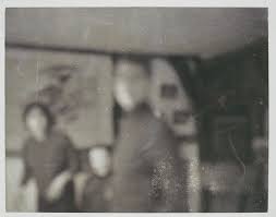
Similarities and Differences
painting
|
picture
|
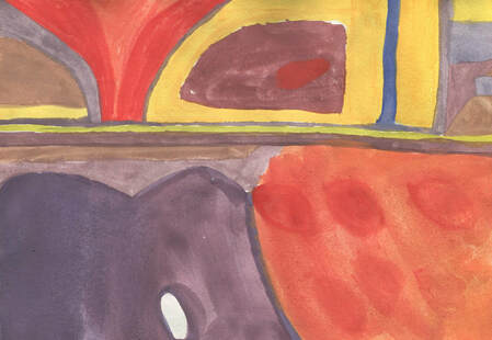
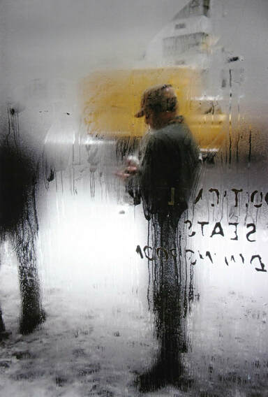
The similarities between the photograph and the painting is that in both images there is blurry objects e.g: people and cars. In both images there is a lot of texture throughout the whole image for example, in the painting there is blotchy-ness and out of focus and in the photograph it is photographed through a rainy window which creates the image to be out of focus.
Artist research - Aaron Siskind
|
|
|
Information about his life?
He is an American photographer, he was born in 1903 and died in 1991. The awards that he won was Guggenheim Fellowship for creative arts, US and Canada.
What kind of photographer was Aaron Siskind?
Siskind was best known for doing abstract photography. The most common images he normally took was close-ups of trees, road signs, graphiti and rubbish. Siskind almost always took a photo of a flat surface/shapes and hardly ever take pictures with a 3D shape to it.
What are his other images like?
His other images are very similar to the ones above. In some of the images there is a distorted background which I like a lot, most of there images are fully in focus and fills the whole frame.
What is the colour of the images?
The colour of the images are black and white and I like that because it is a bit different to an ordinary image that colour to it.
What started the interest in photography?
Siskind started to get interested in photography after he got a camera for a wedding gift and he has been interesting in it ever since. He said that he spent most of his honeymoon taking pictures.
what did he plan to do before he got the camera?
Siskinds plan was to become a writer for a living because he was extremely interested in poetry and music. But as soon as he got that camera he could leave it.
What year was he starting take photographs,how did this make his images more interesting?
Siskind started to take photo's around the 1930-40. I think it makes his images a lot more interesting because it shows what type of images were made in the 19th Century.
What I think about his images?
I like his images because its something different and unusual. My favourite image is the 3rd one across because it has a lot of detail for example texture it brings the image to life, and also the black and white theme makes the image a lot more appealing to the eye, which I think makes the image really intriguing.
Instruction of how to create a Aaron Siskind photograph
~The first thing is to find a something abstract e.g. rubbish or graphiti or something rustic.
~Go close up to the object or go long distance and then zoom.
~Work out what angle you are going to take and the photo.
~When picture taken if not gone close up zoom in on the image.
~Go close up to the object or go long distance and then zoom.
~Work out what angle you are going to take and the photo.
~When picture taken if not gone close up zoom in on the image.


Instruction version 2
1~The first thing is to find a something abstract e.g. rubbish or graphiti or something rustic.
2~Go close up to the object or go long distance and then zoom.
3~ go parallel to the object and quite close up
4~When picture taken if not gone close up zoom in on the image.
2~Go close up to the object or go long distance and then zoom.
3~ go parallel to the object and quite close up
4~When picture taken if not gone close up zoom in on the image.
Abstraction final project
My images are going to be based around the artist Aaron Siskind. I personally really like his work mainly because you have to focus a lot on the images and also the texture images; they are very unusual.
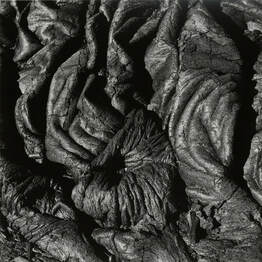
This image is very unusual because it is in black and white, and you have to focus on the image to find out what it is. The formal element for this image is texture and shape. This image might be scrunches put tightly together or rolled up tops and twisted tightly and been photographed in black and white.The contract between black and white is very slight, but enough to give the image some texture.
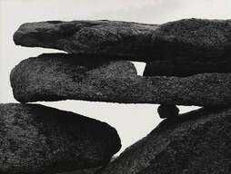
This image is very interesting due to the odd shapes laid on top of each other. The formal elements of this image is light, shape and texture.The texture of this image is mainly coming from the rocks they have tiny little dents all over the rocks. The light is very pale and boring but while the background is quite plain it brings out the rocks and makes them look more powerful. The contrast between the black and white is very strong, the black is very dark and the light is the same colour all the way through.
My images


These images are abstract but I could improve it by adding some more texture to it. An idea is to add paint on top of the image or cut some holes out and place different picture underneath.
Putting Acrylic paint on top of the images
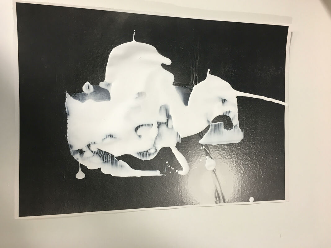
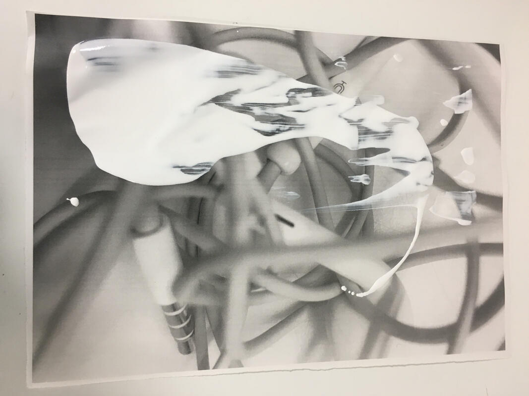
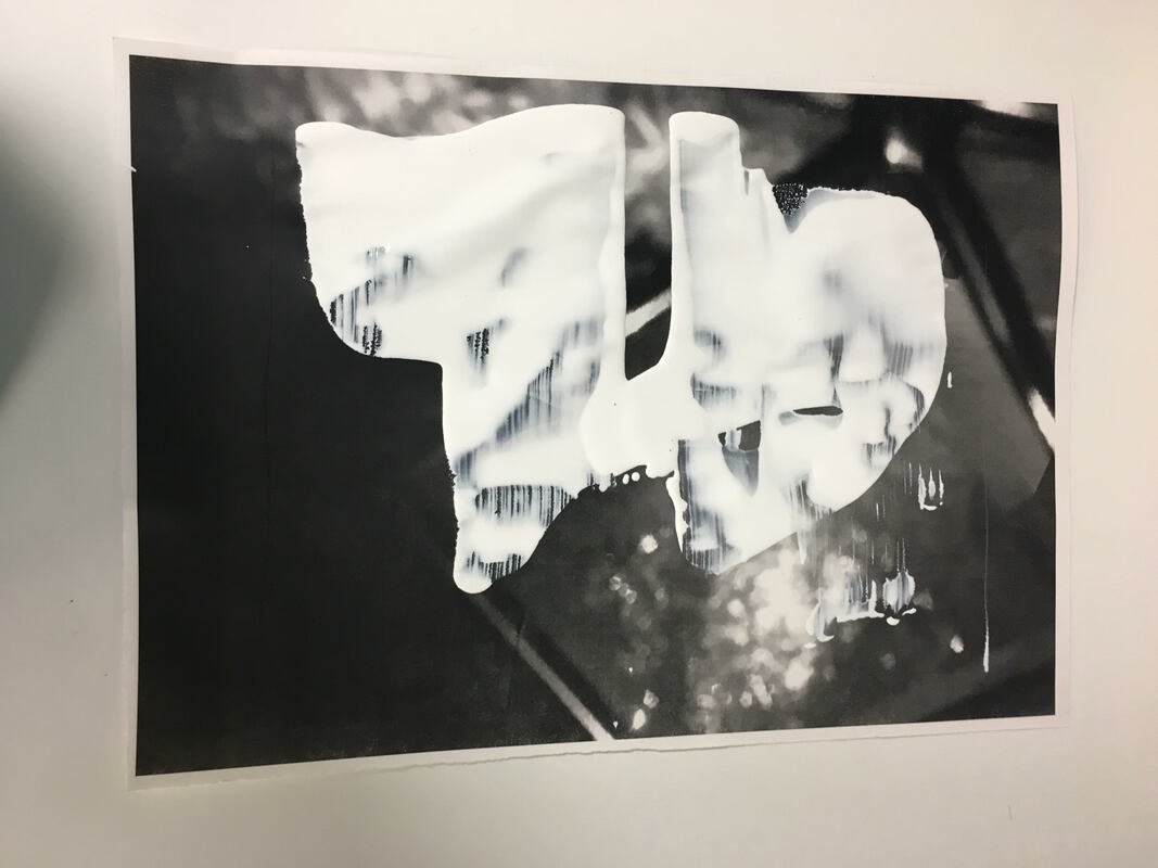
Putting acrylic paint on the images is a good idea because it creates a lot more texture and it also creates some life to the image. A way to improve the image is to add some coloured paint on top of the white paint and that will look a lot better and more interesting.
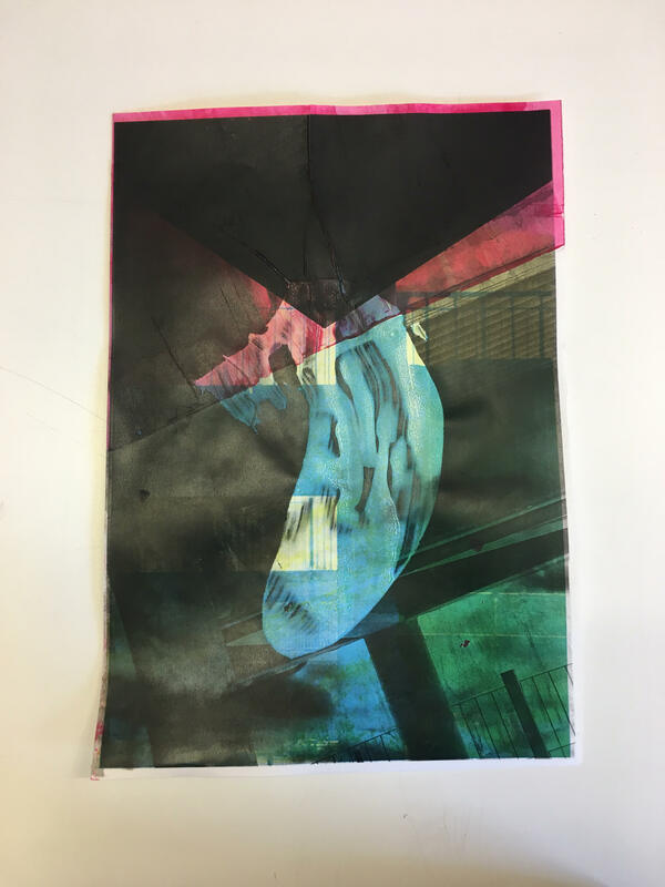
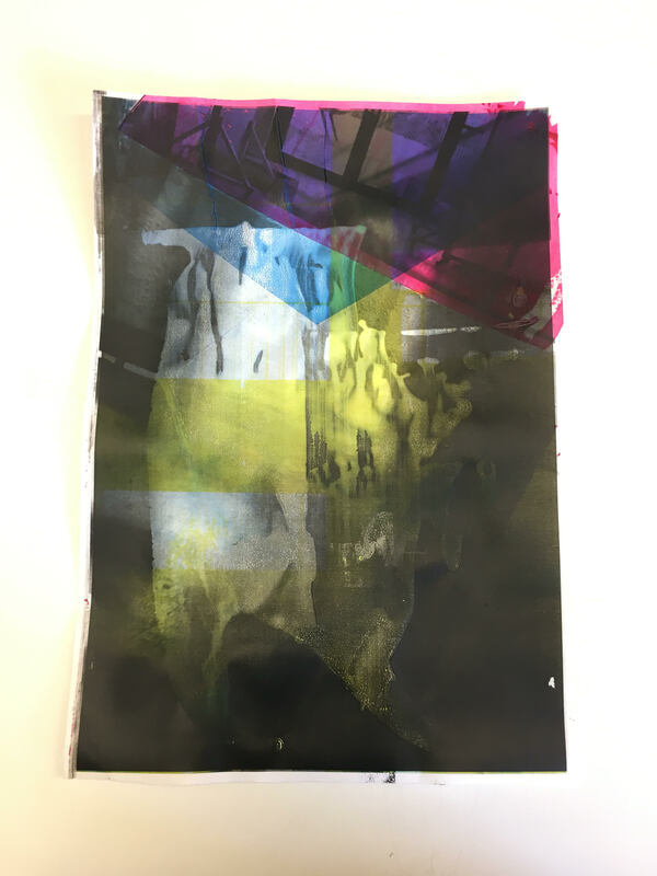
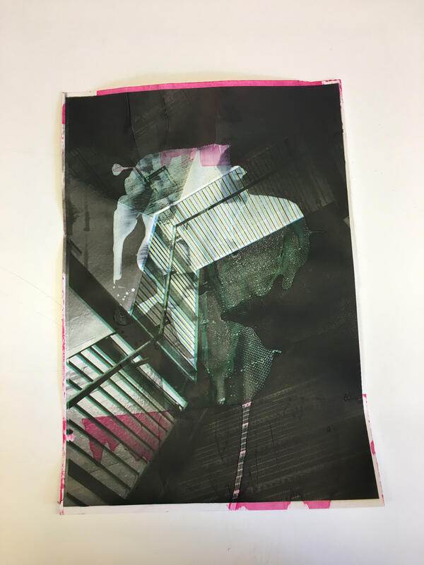
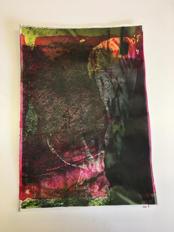
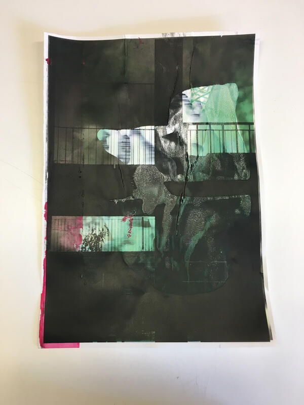
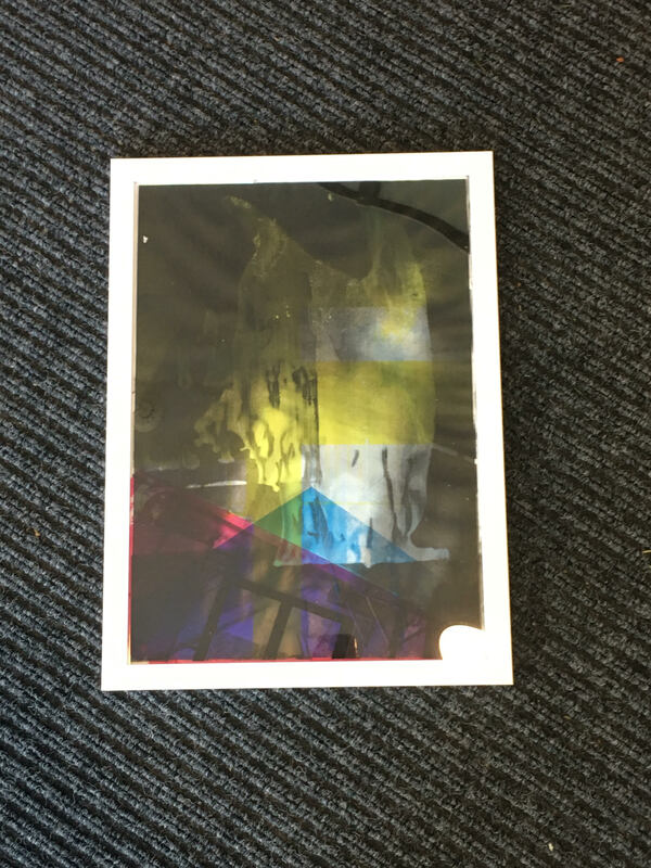
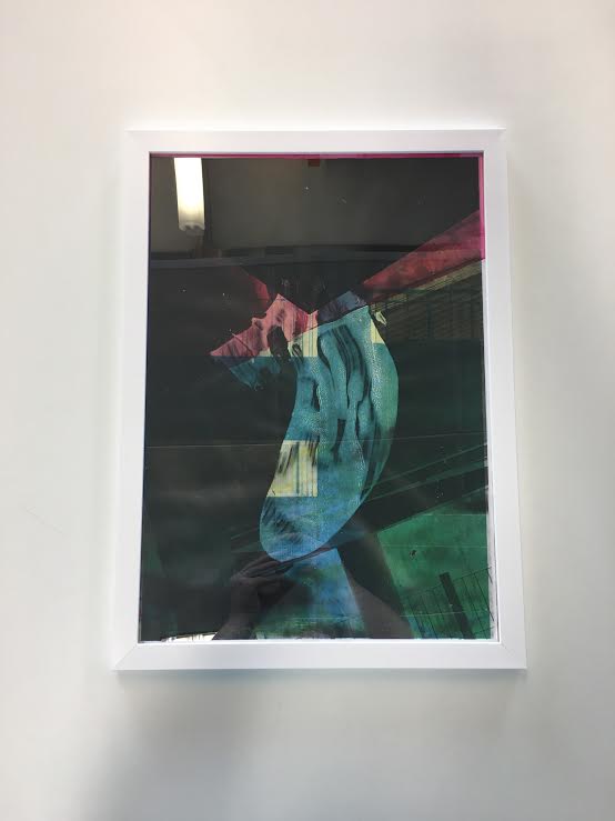
I really like the final out come of my final project. I think all I want to do to improve it a little bit is to put it in a frame and make the images a little bit brighter. In these images I have also printed over them with a different image but in different colours I used black, yellow and light blue.
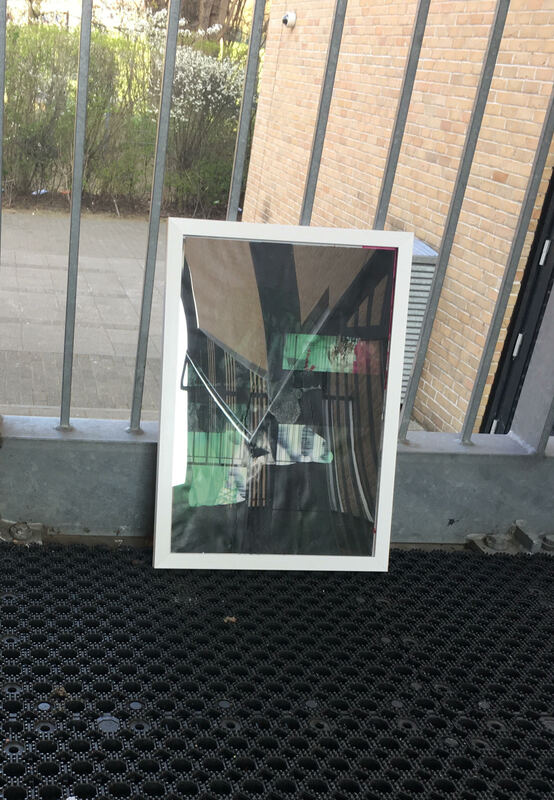
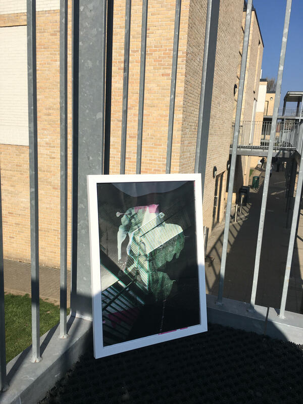
I personally really like these images, the frame makes them stand out a lot more. I think taking picture in different ways but also in different places make them completely different to all the others.
Evaluation
During my project I have been researching Aaron Siskind, what I find interesting and/or unusual about his work is that he can take something simple and create something amazing. My favourite image of his is called 'chicago'. I have carried out a few experiments during the abstraction project, my final one was acrylic paint on pictures, and then photographing over the top of it, another was taking black and white images. The one that worked best was putting acrylic paint on an image and then photographing on top of it. I think the reason I like this one the best was because it took the most of my time and it paid off and also it looked very interesting because theres was multiple layers of colours. I have only taken one creative risk while doing this project and that was printing different colours over different colours, but it turned out alot better than original. The way I have developed and refined my work was putting the final in frames to make it stand out a lot more. I made 4 final outcomes in the end and they are in a frame. My favourite image is 'image 3' because it has a lot more layers and looks very confusing which is my aim for this project If I had more time doing this project I think I would do 2 final outcomes but a lot more interesting and also use photshop to add more layers to the image for example neon colours and normal colours.
My final homework for abstraction
Evaluation for my abstraction homework
What went well with my final abstraction homework was the layout of it all, it looks very simple but then in detail at the same time. Another thing that I like about this project is that all the images on the board are completely different to the other ones which is so much better because it makes them all stand out in completely different way. What I could do to improve my final piece is to make all the images the exact same size and lay them out neatly because it would make it all look too much better. Another thing that I think I could improve on is making the formal elements stand out for example using a bolder marker or do it in a different colour to make it stand out a bit more than before. The final thing to do better is to add some colour to the board because its a little bit bland and plain.
