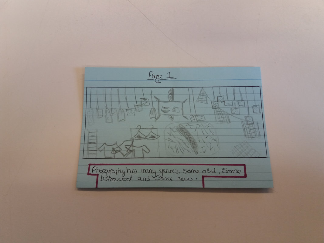
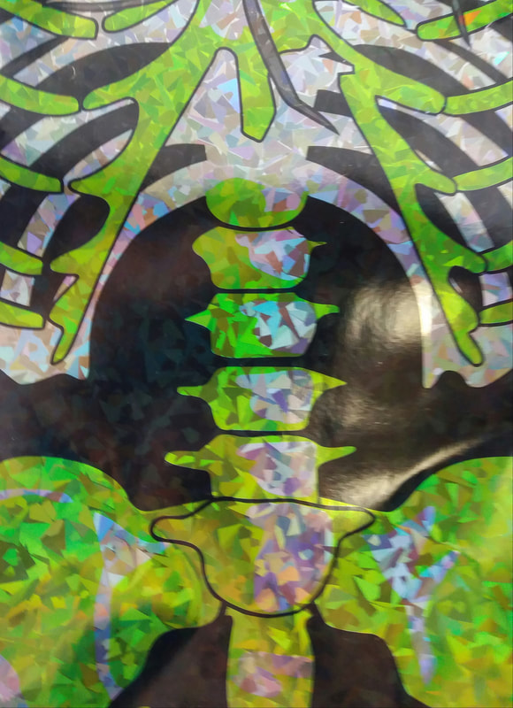
3 Most Famous Concertina Books
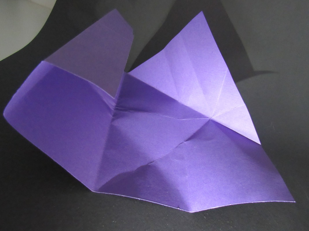
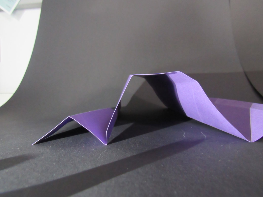
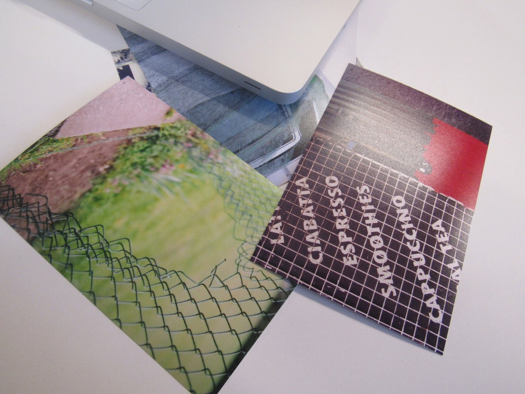
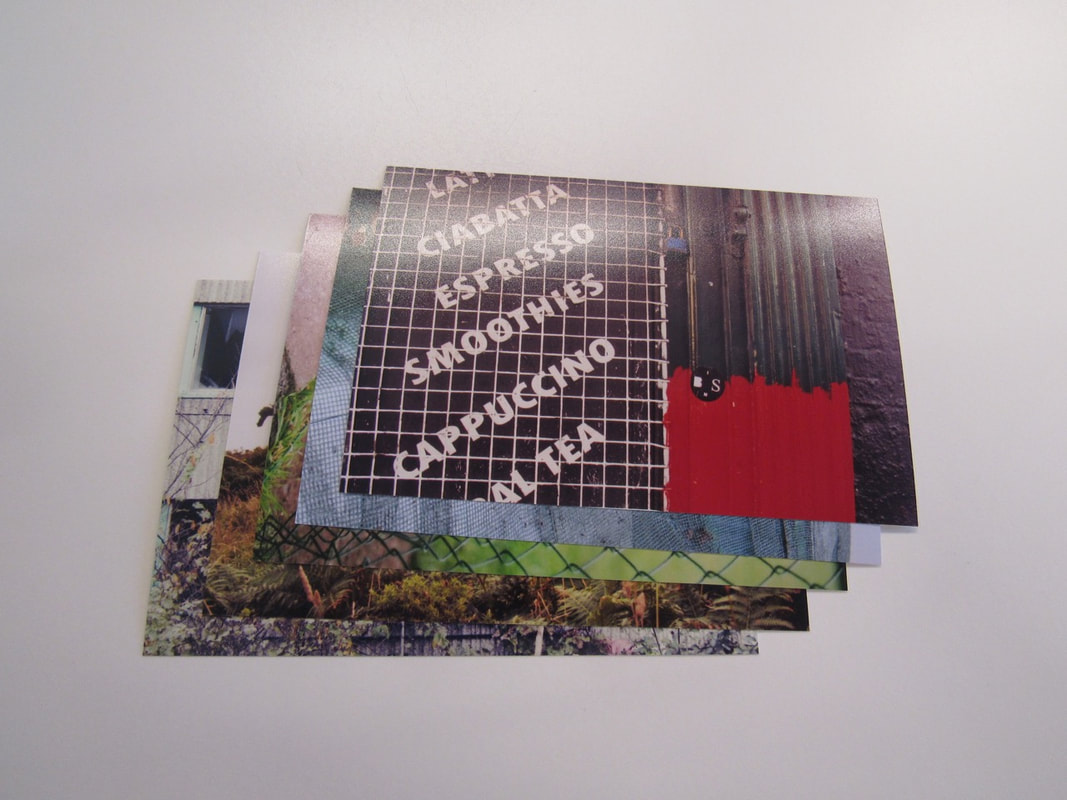
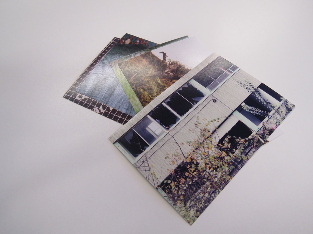
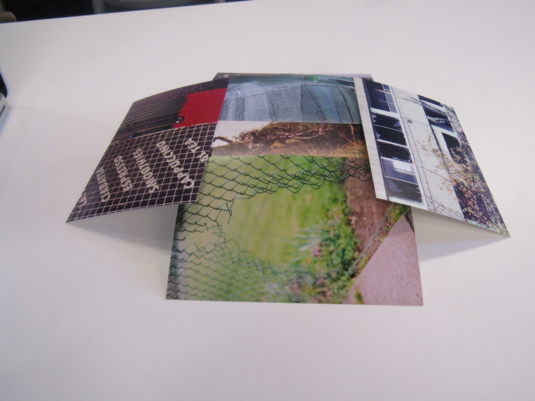
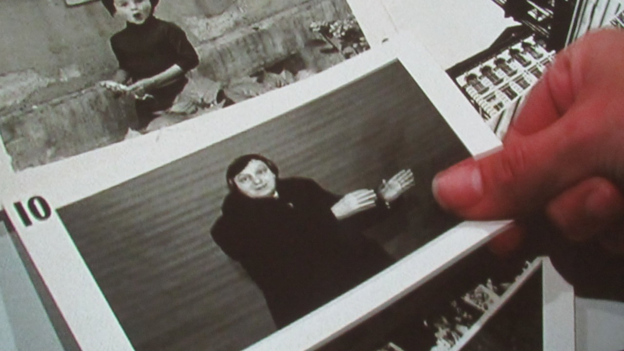
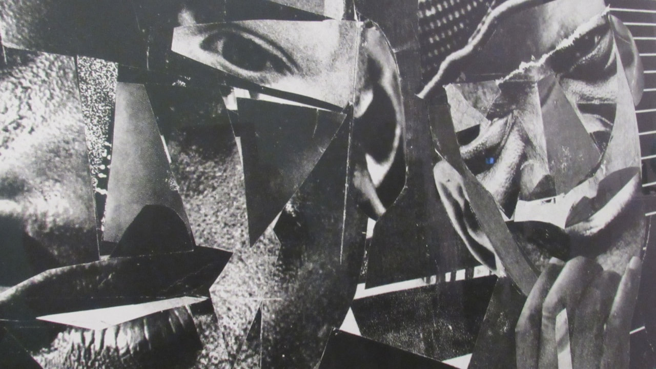
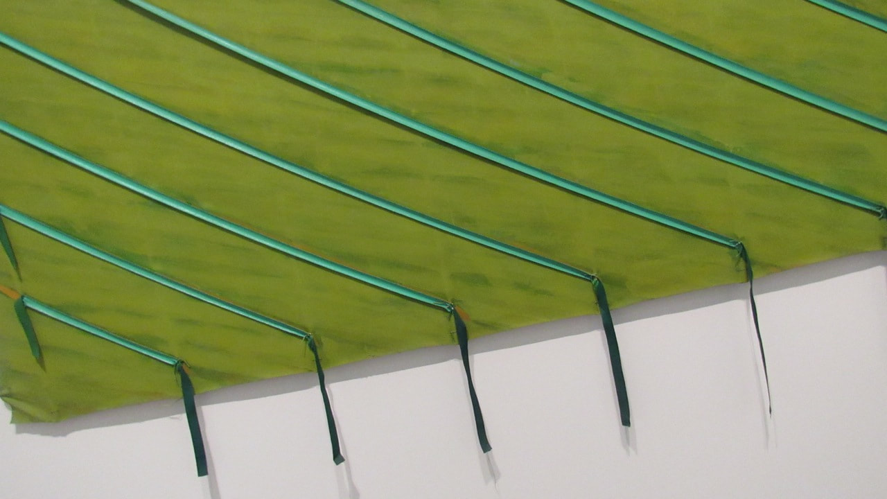
Concertina Book
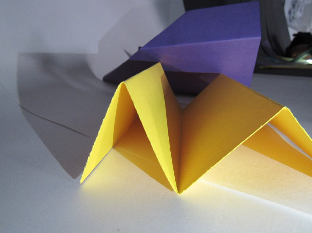
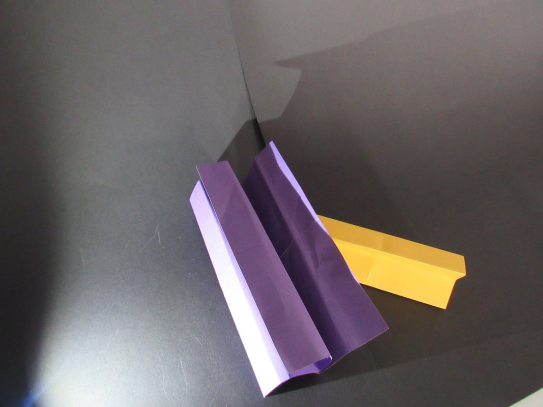
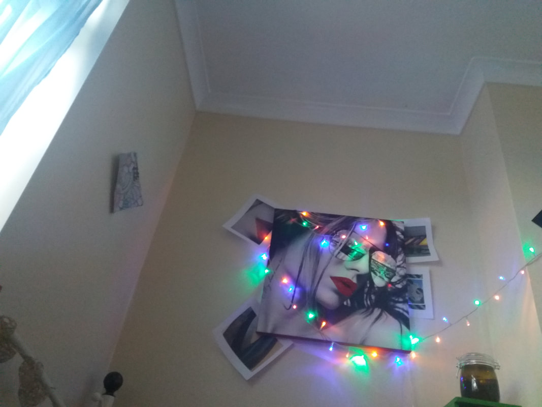
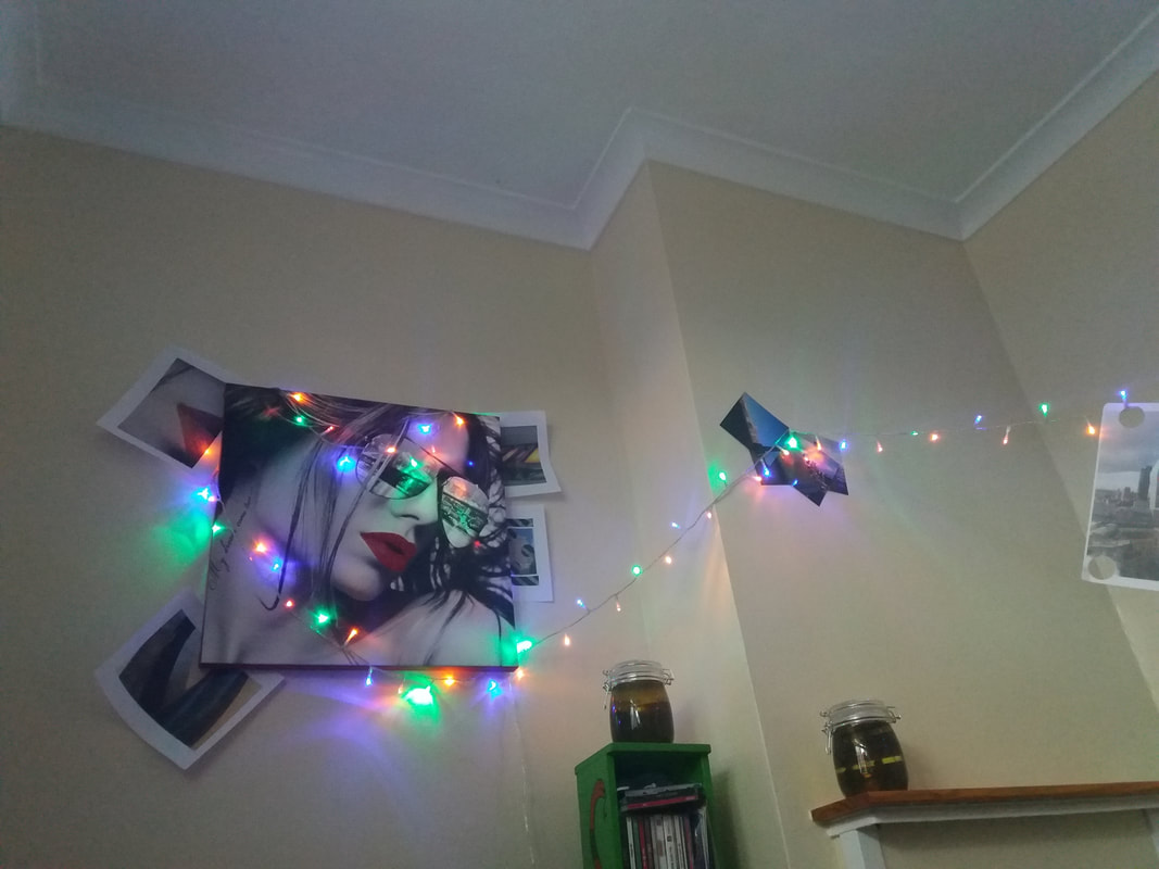
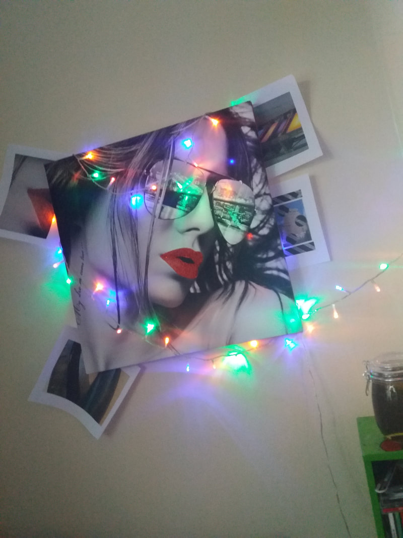
A concertina book is a set of photo's laid out in whatever way you decide to. You are able to make it many different sizes to make different size books. What I found out from this video is that it all connected and can create a really good affect when you leave it to fall out. It has also been made in a parallel fold which looks like zig-zags when standing up.
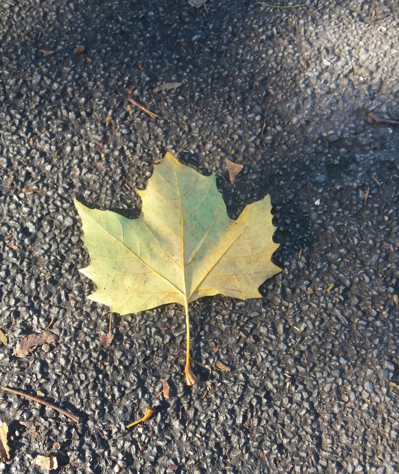
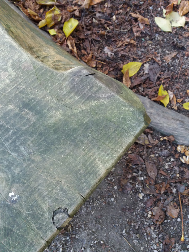
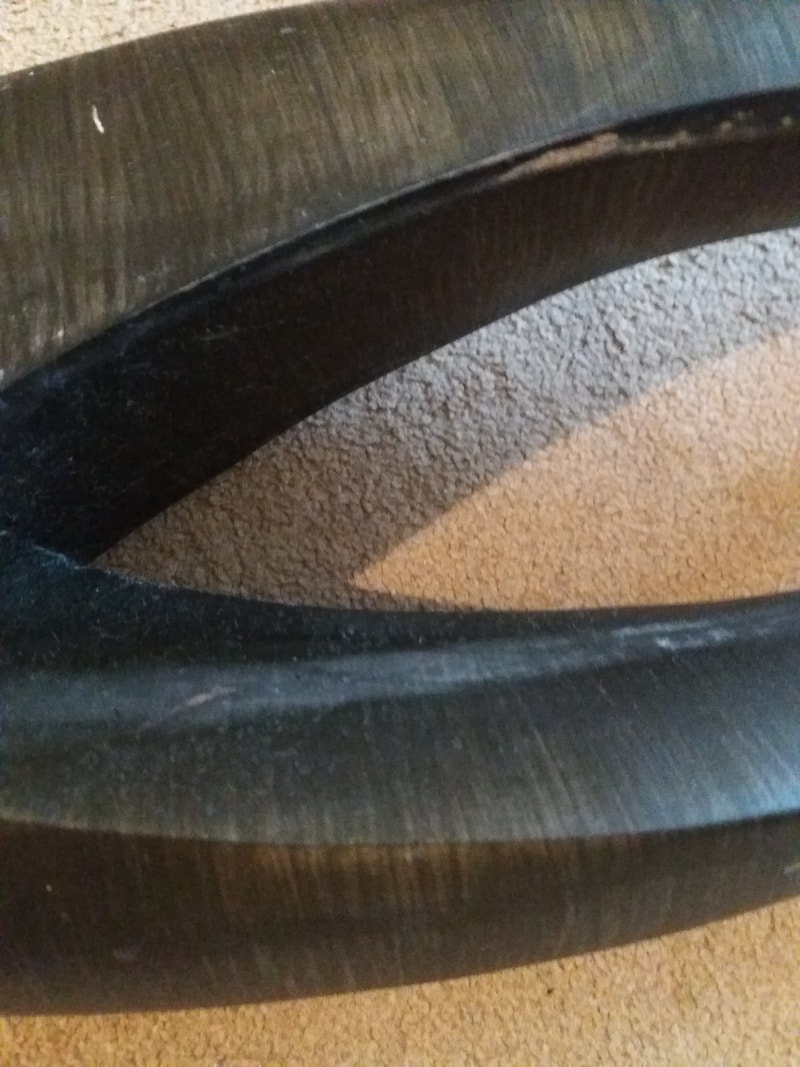
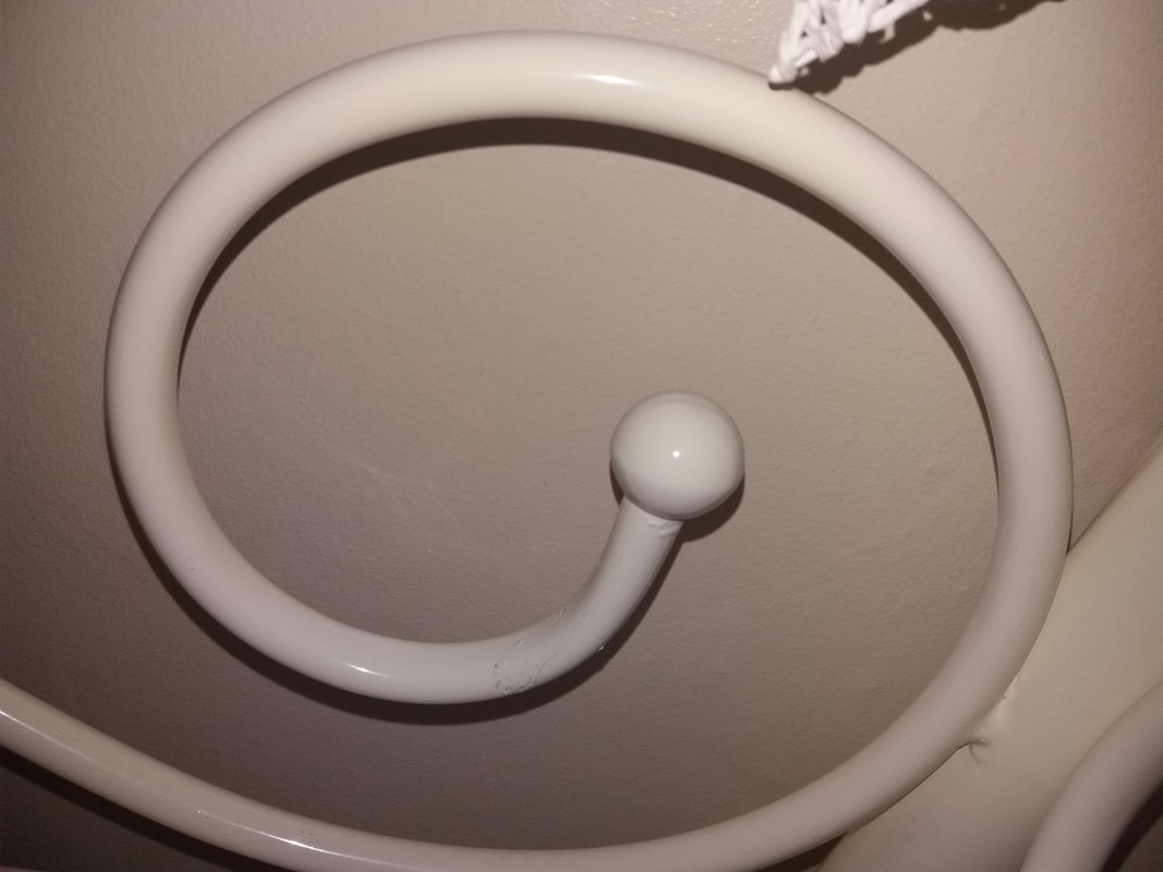
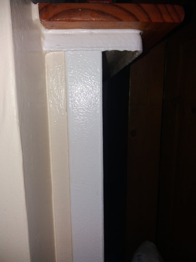
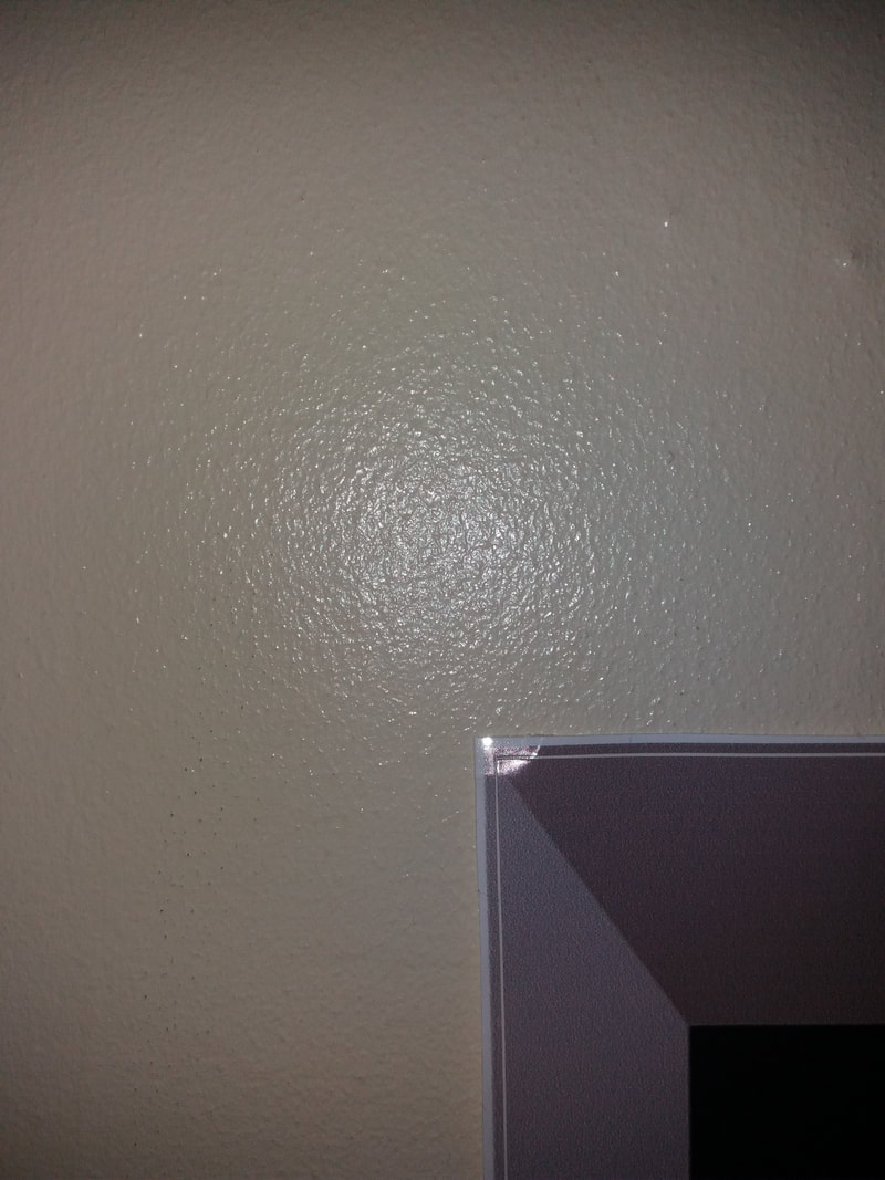
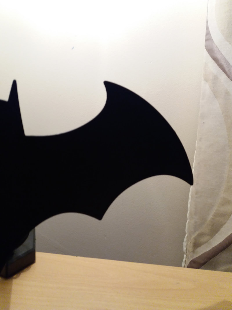
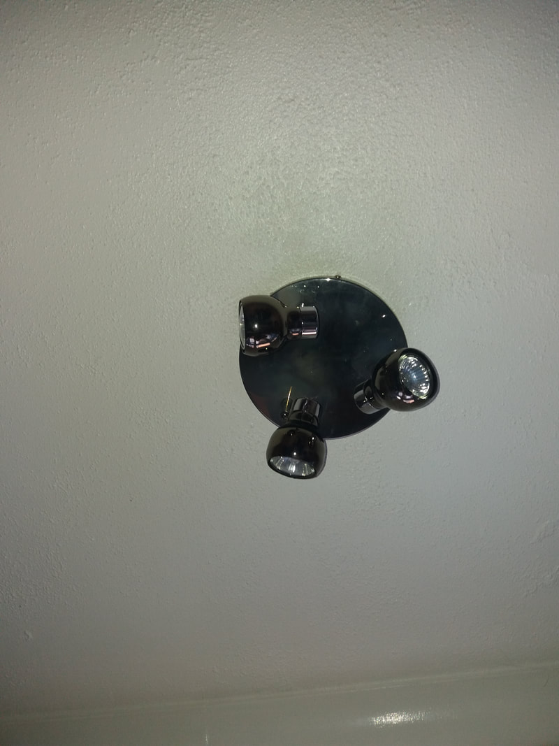
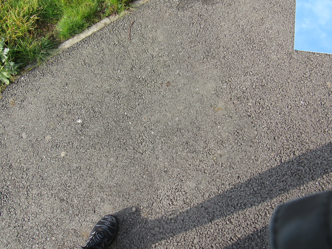
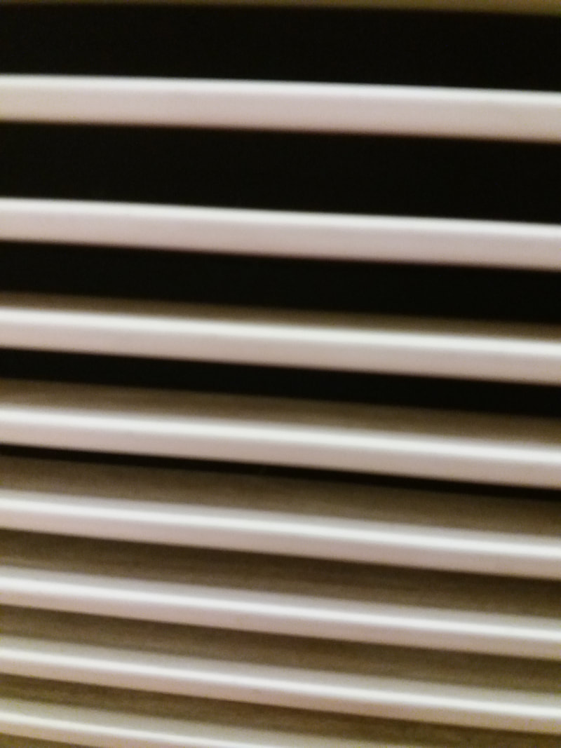
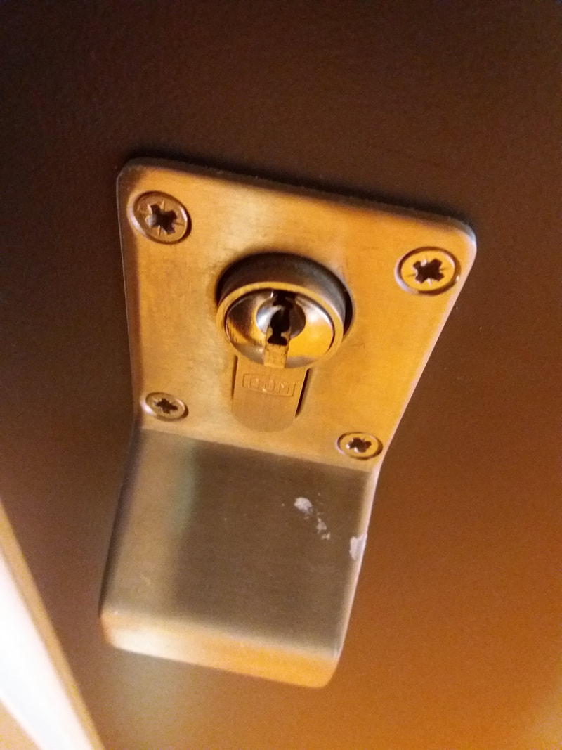
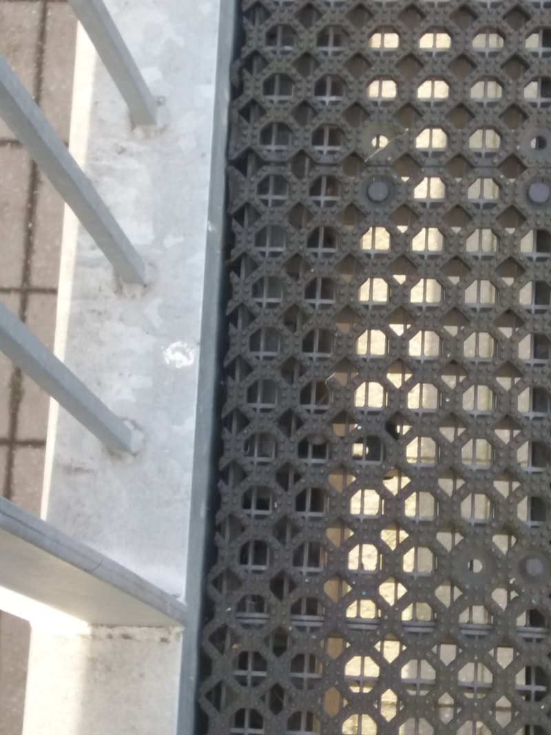
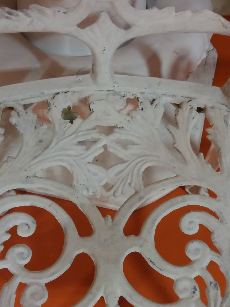
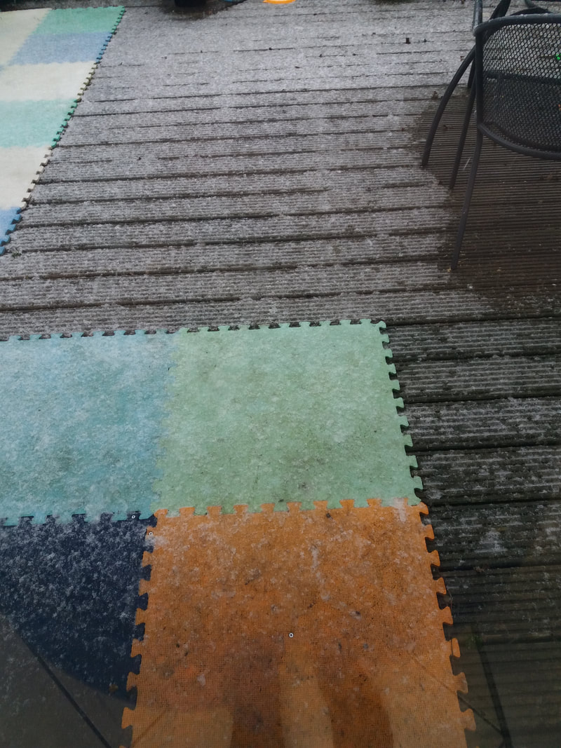
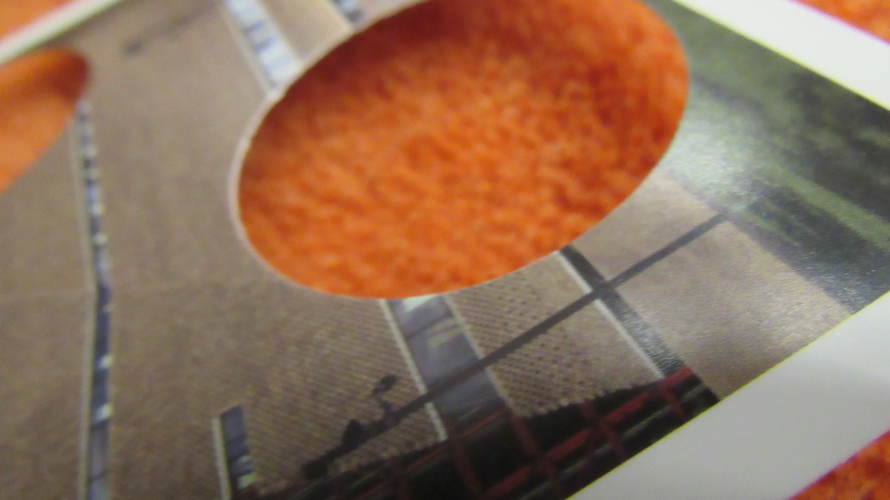
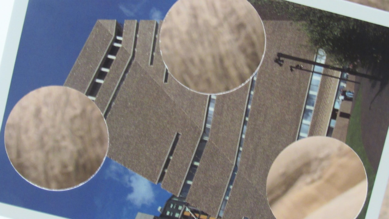
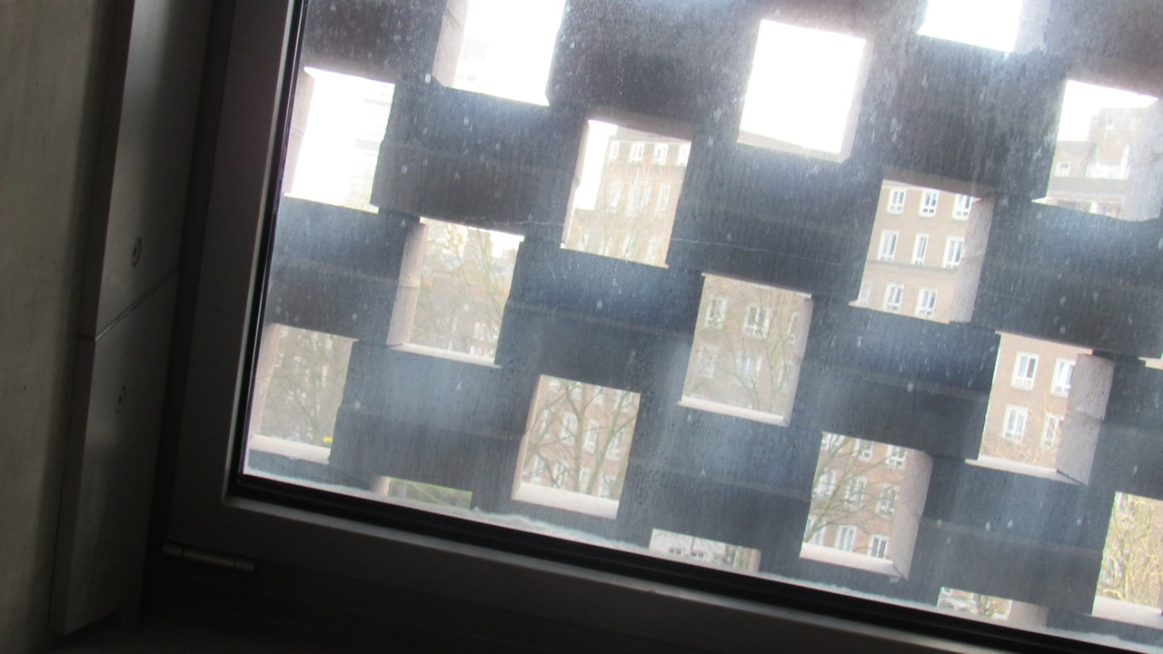
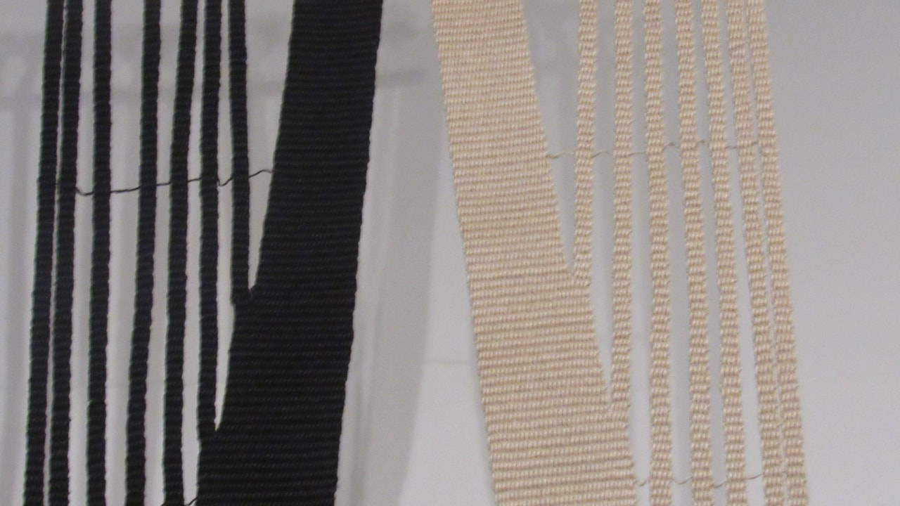
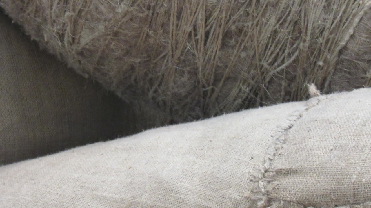
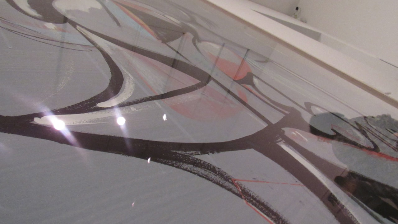
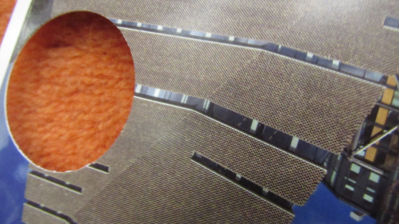
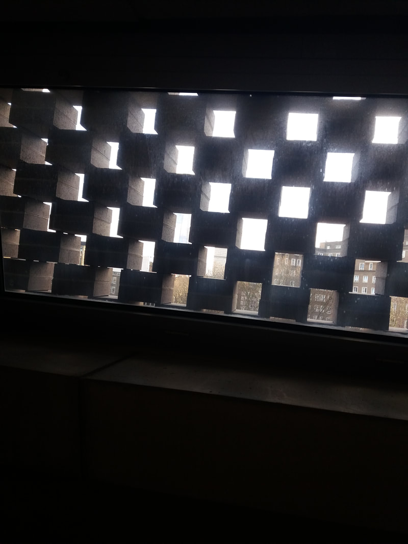
30 pictures of edges

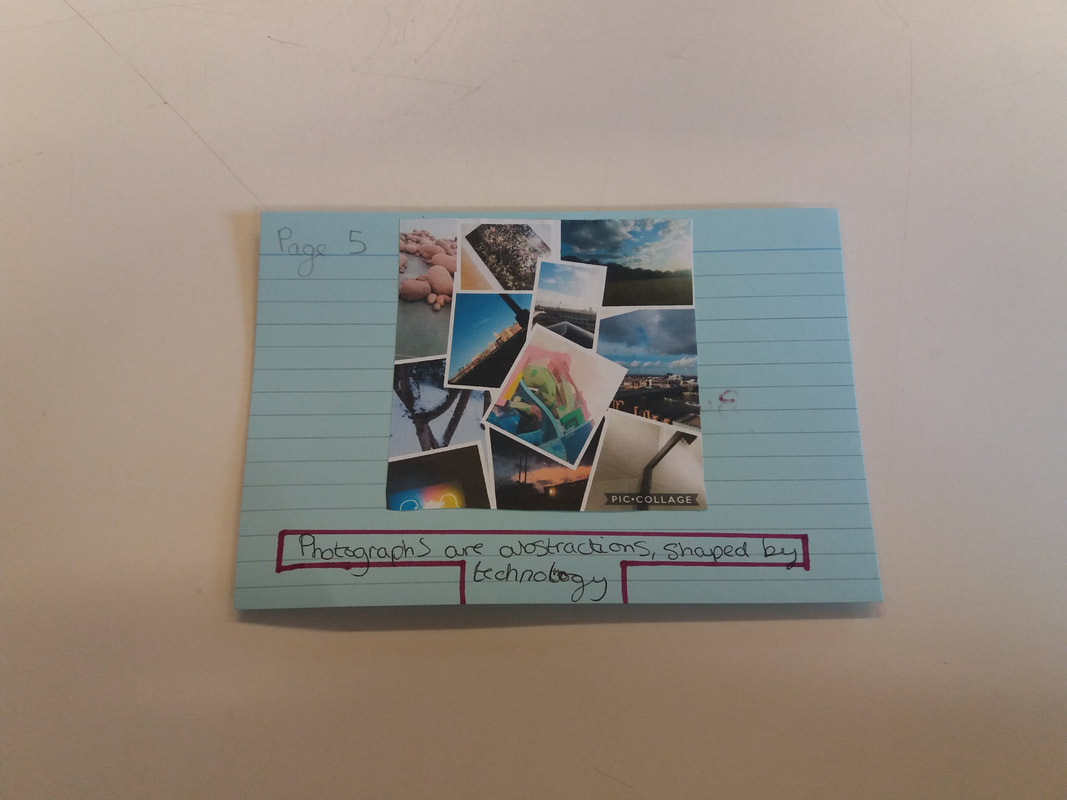
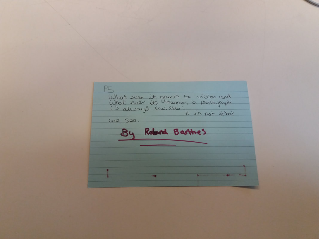
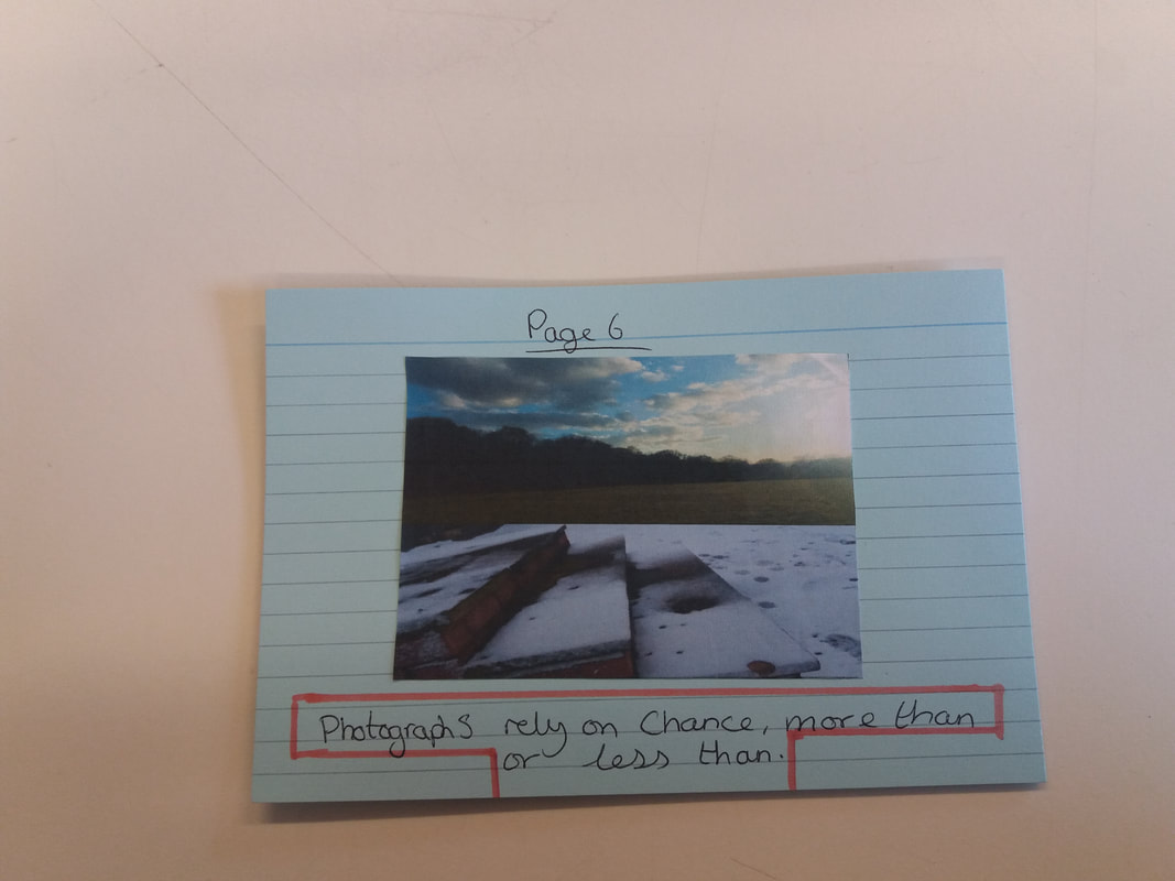
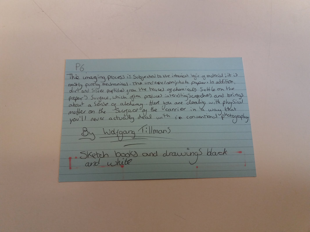
What Went Well
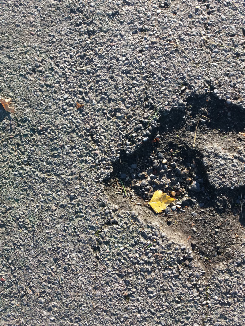
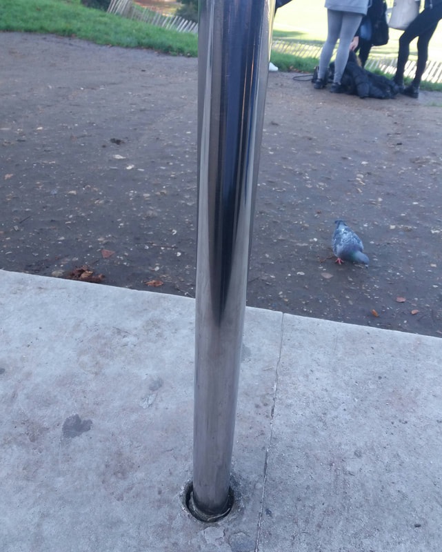
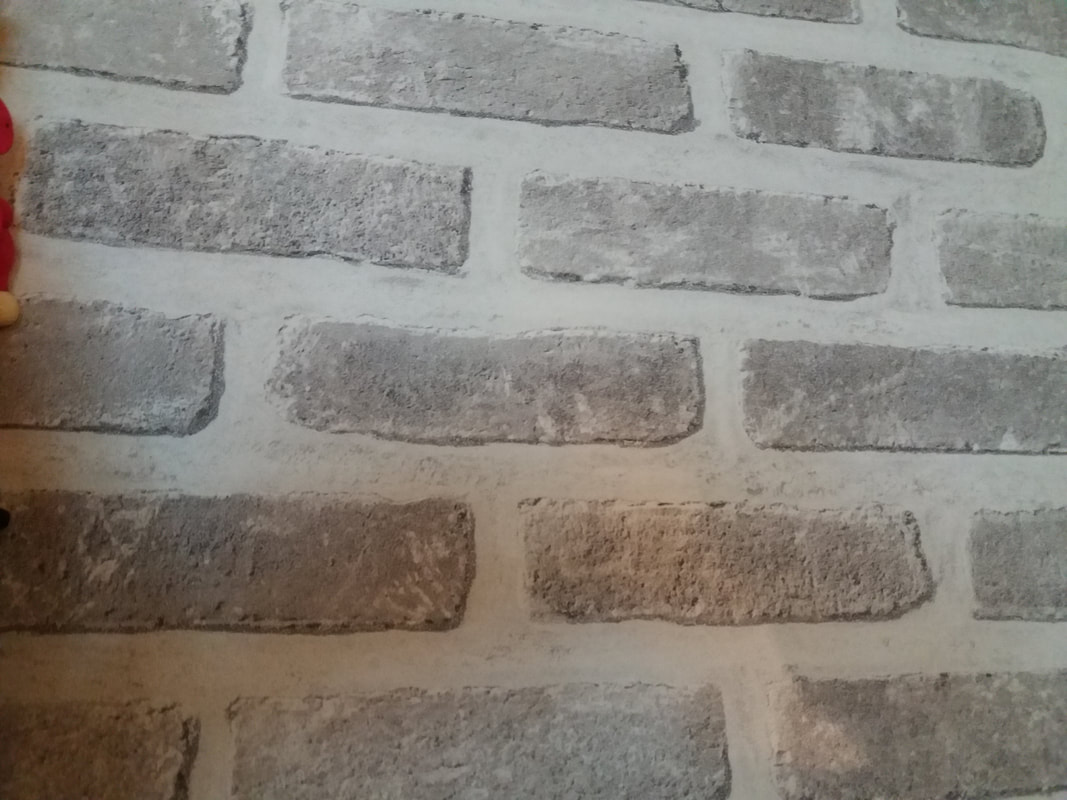
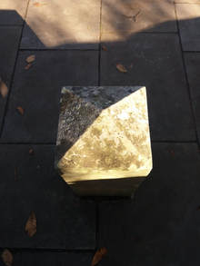
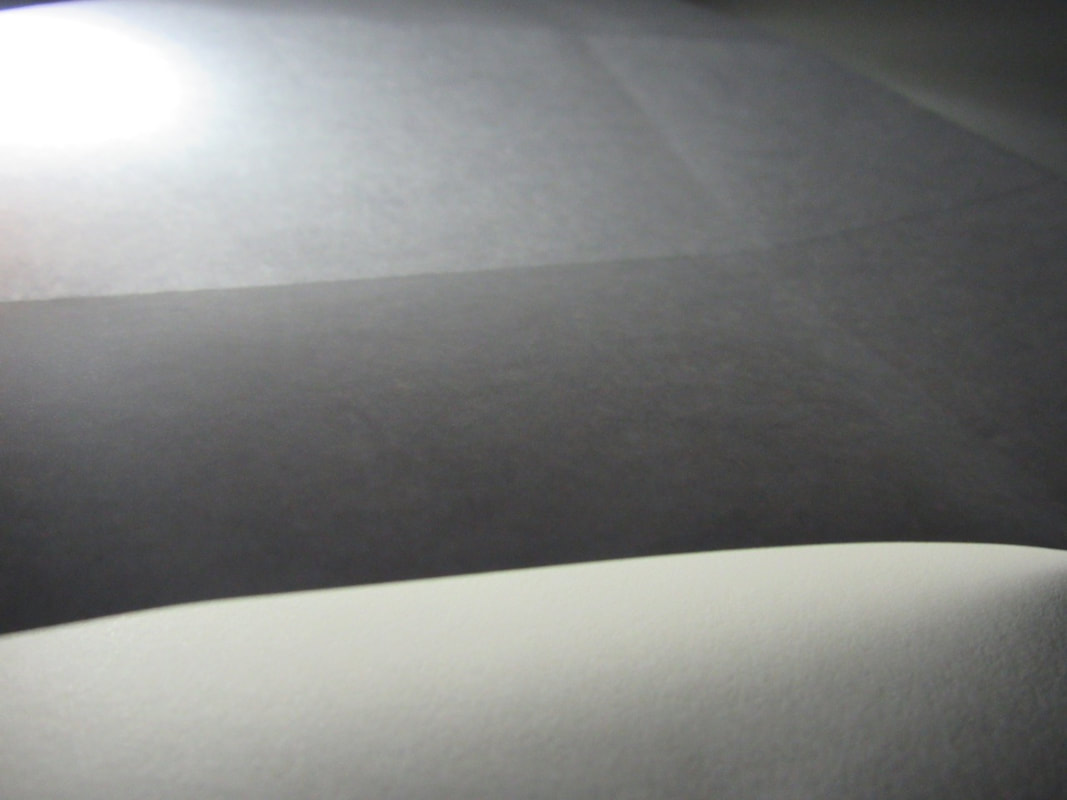
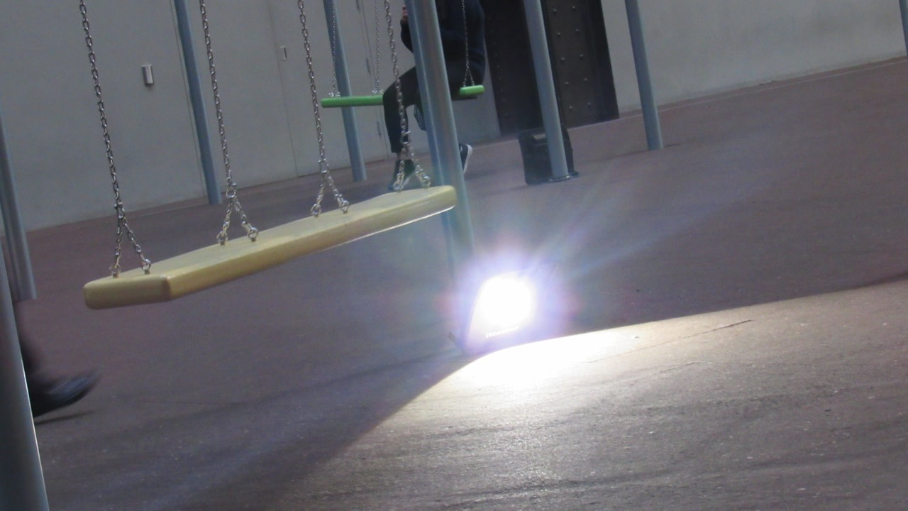
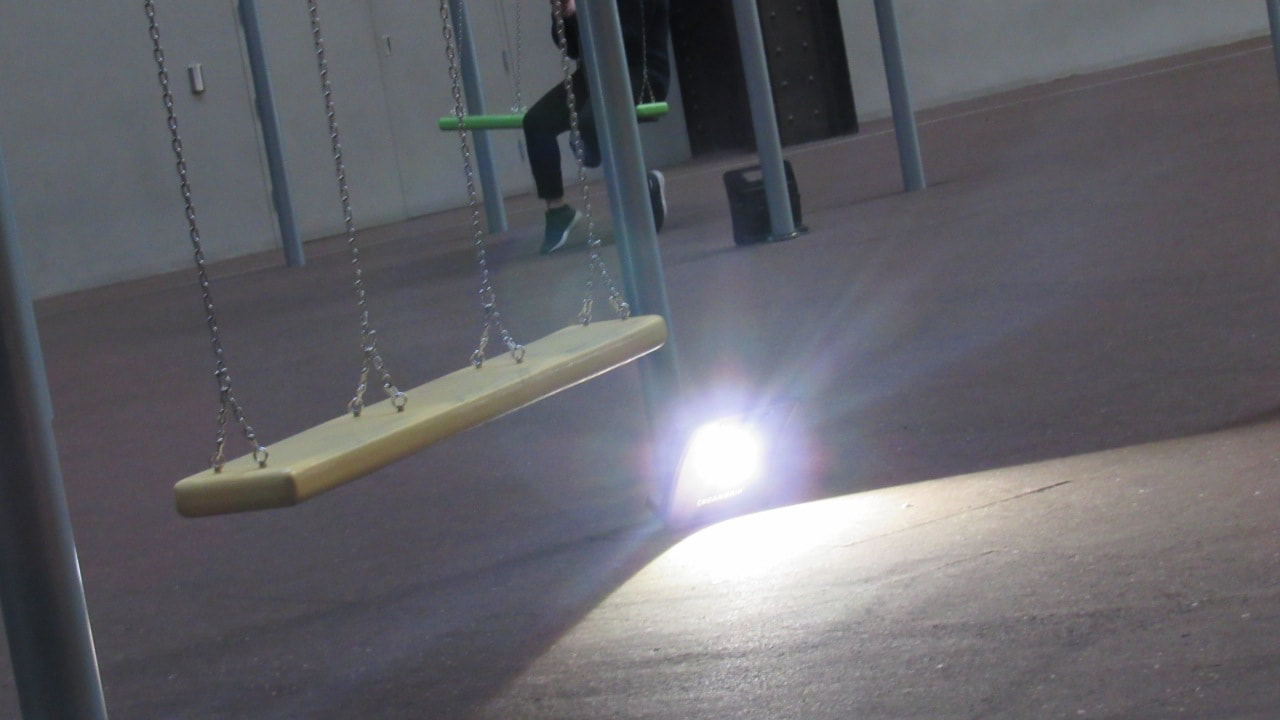
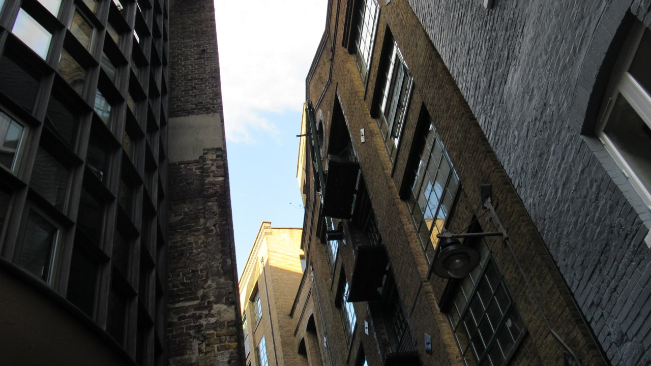
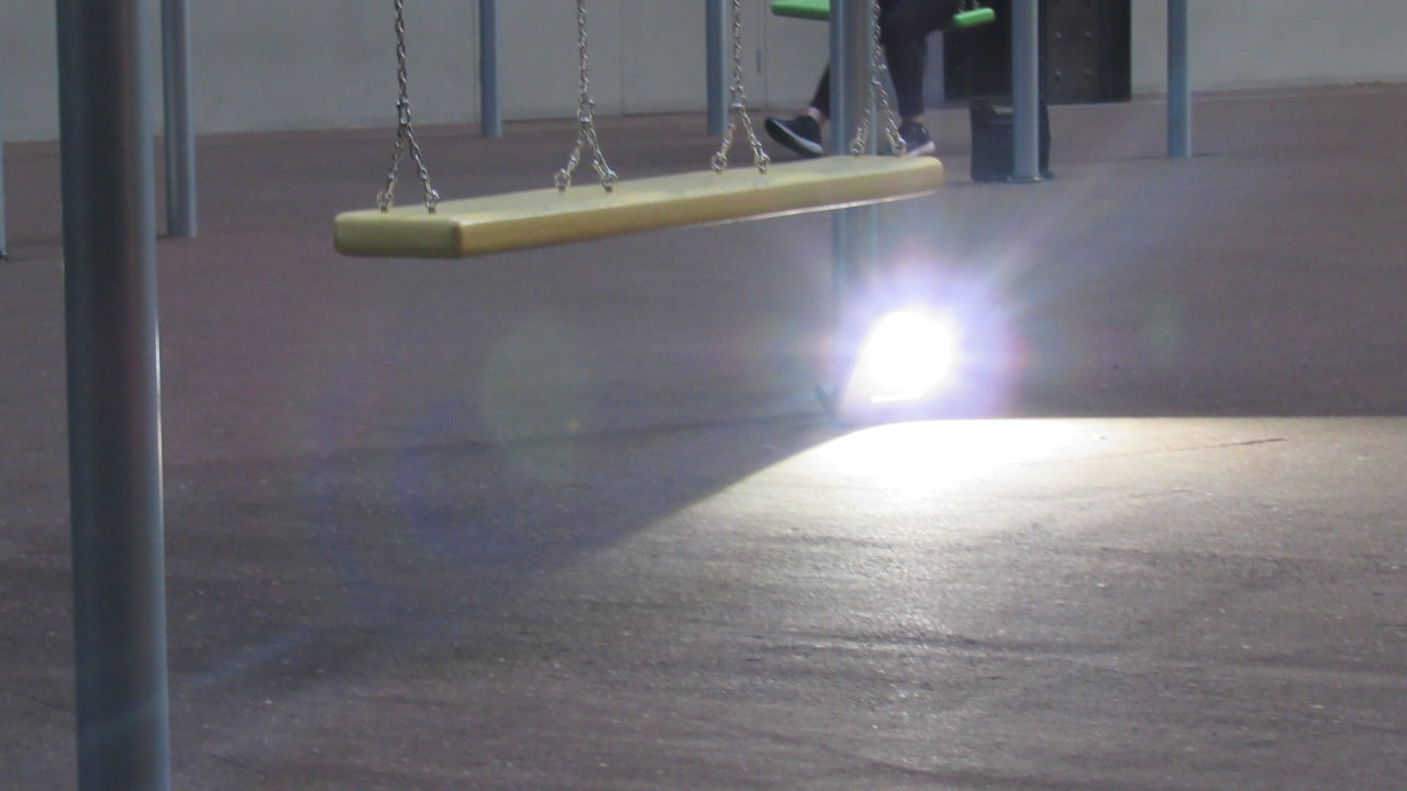
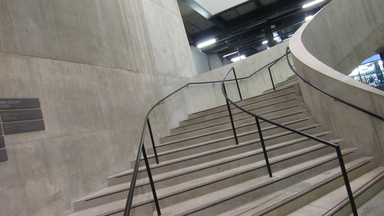
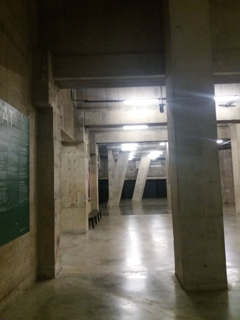
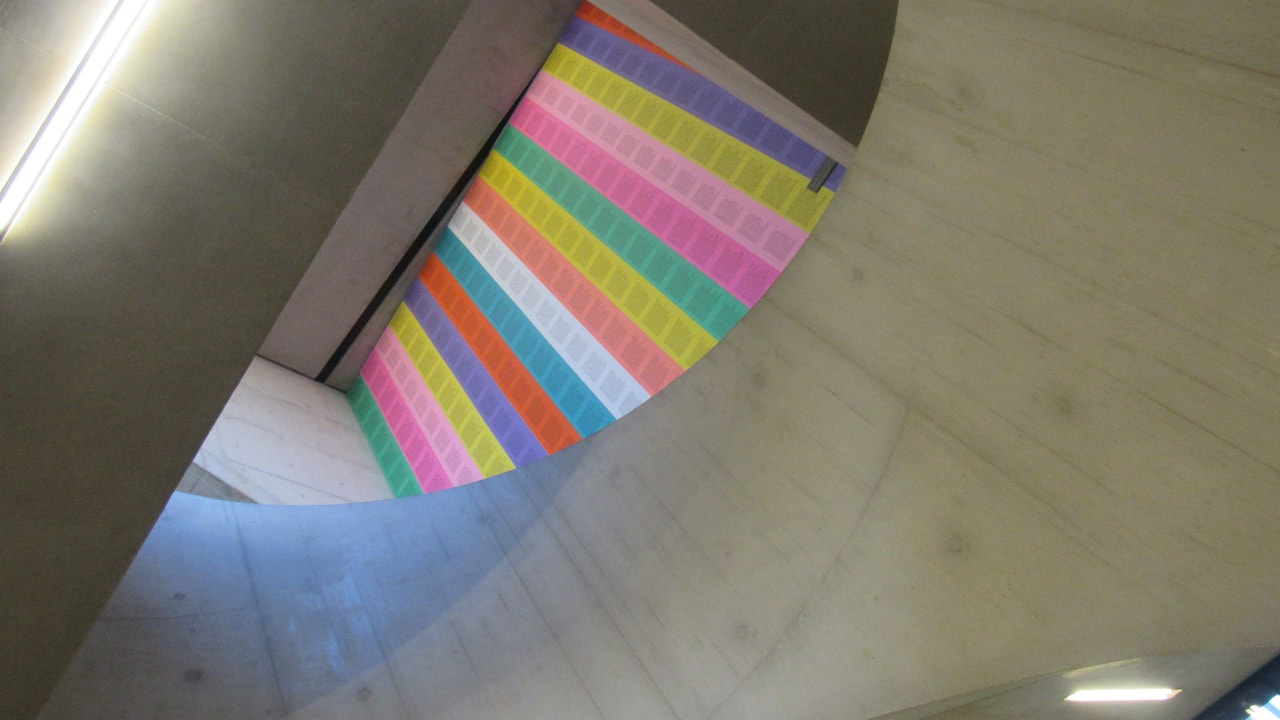
I think this picture is really good due to the light that is on only half of the concrete, and that light pulls your eye towards it which makes you more interested in this photograph.
I think this picture is really good due to the light that is on only half of the concrete, and that light pulls your eye towards it which makes you more interested in this photograph.
Even Better If
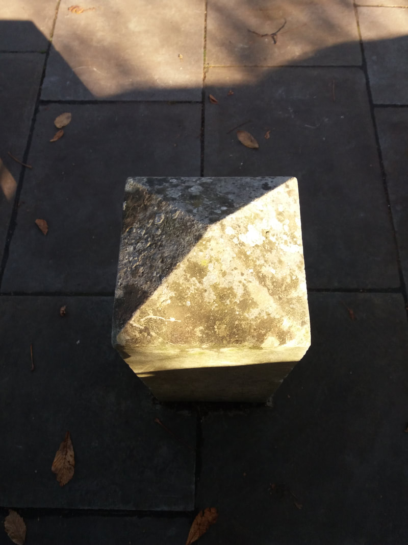
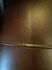
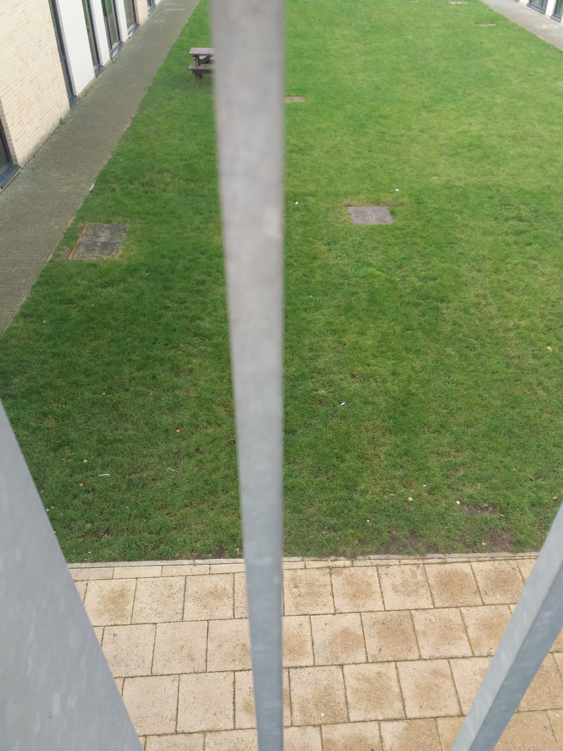
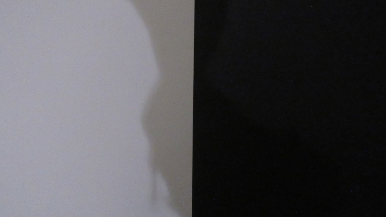
I think this photograph isn't good due to the line in the centre of the photograph, which is un-even and it should have been straight and an equal amount of space on each side of that line.
I think this photograph isn't good due to the line in the centre of the photograph, which is un-even and it should have been straight and an equal amount of space on each side of that line.
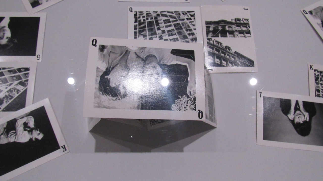
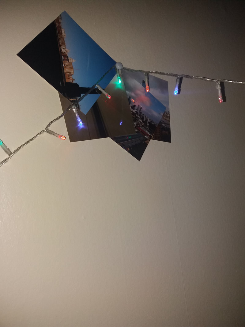
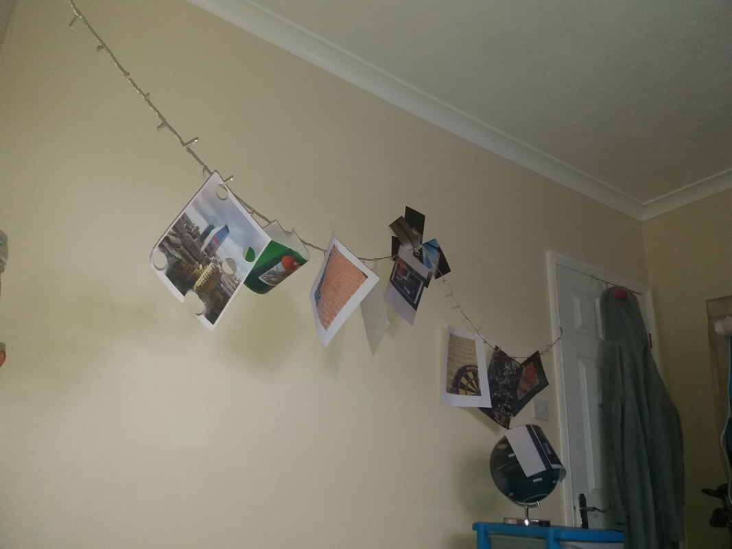
My Concertina book
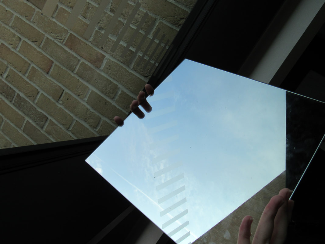
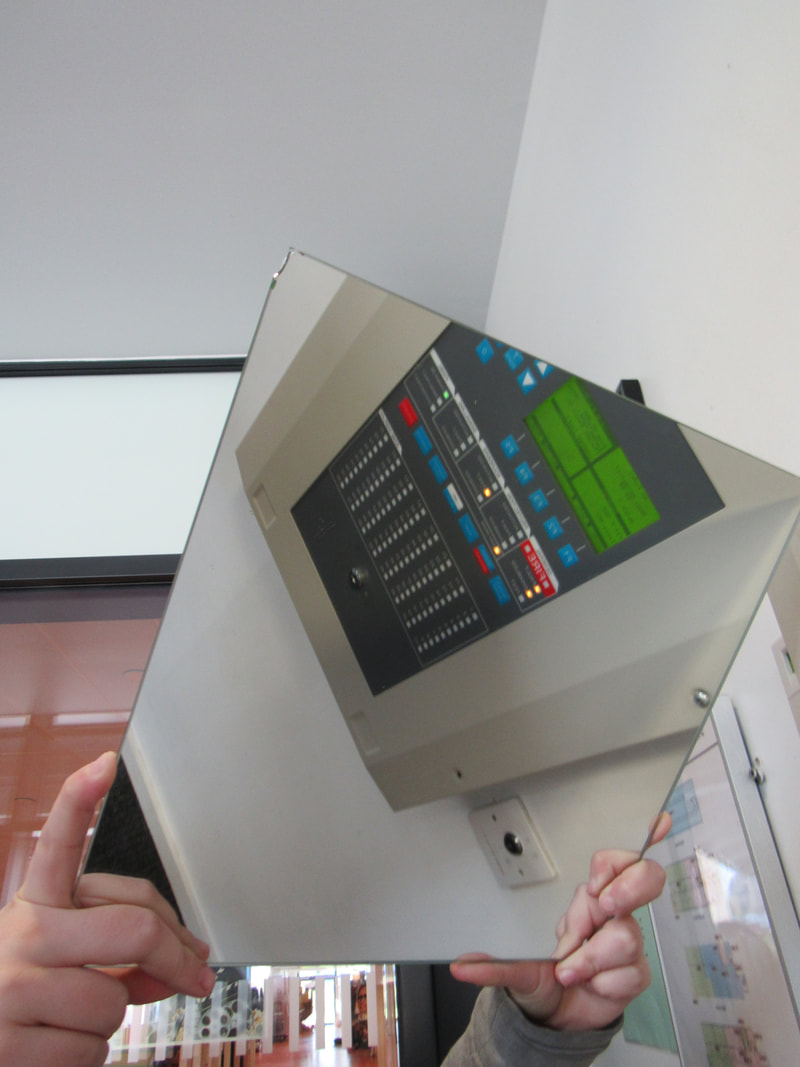
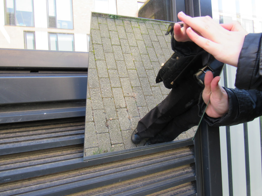
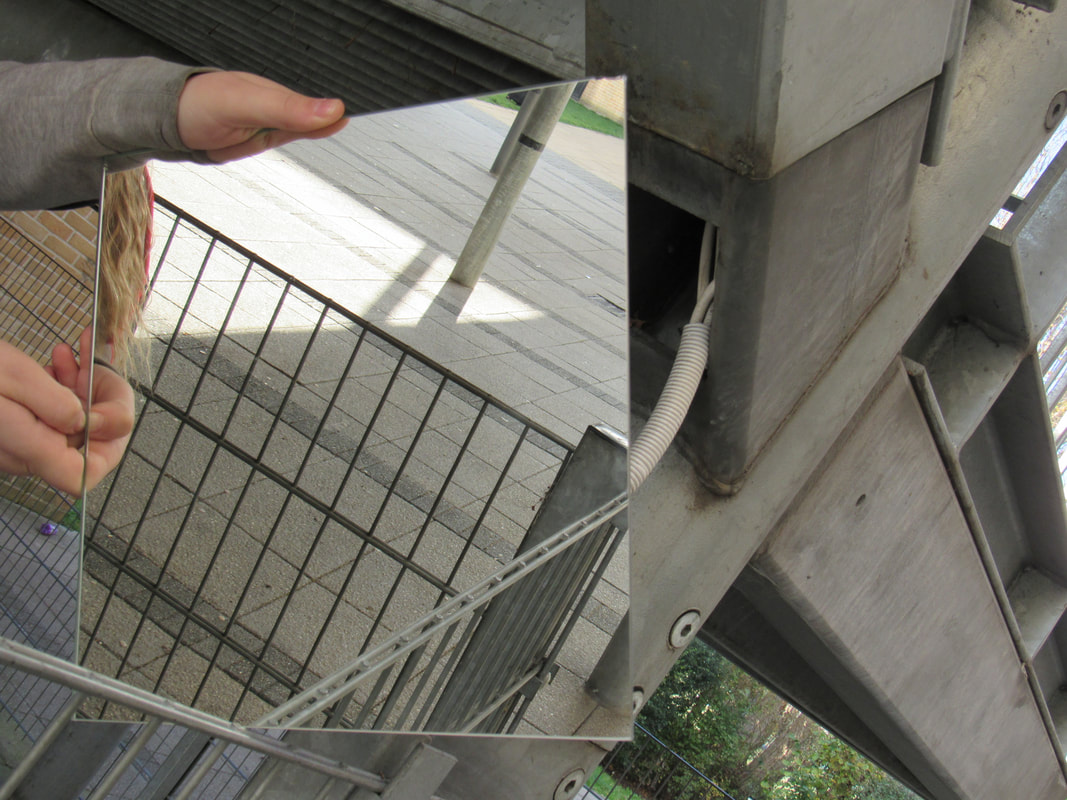
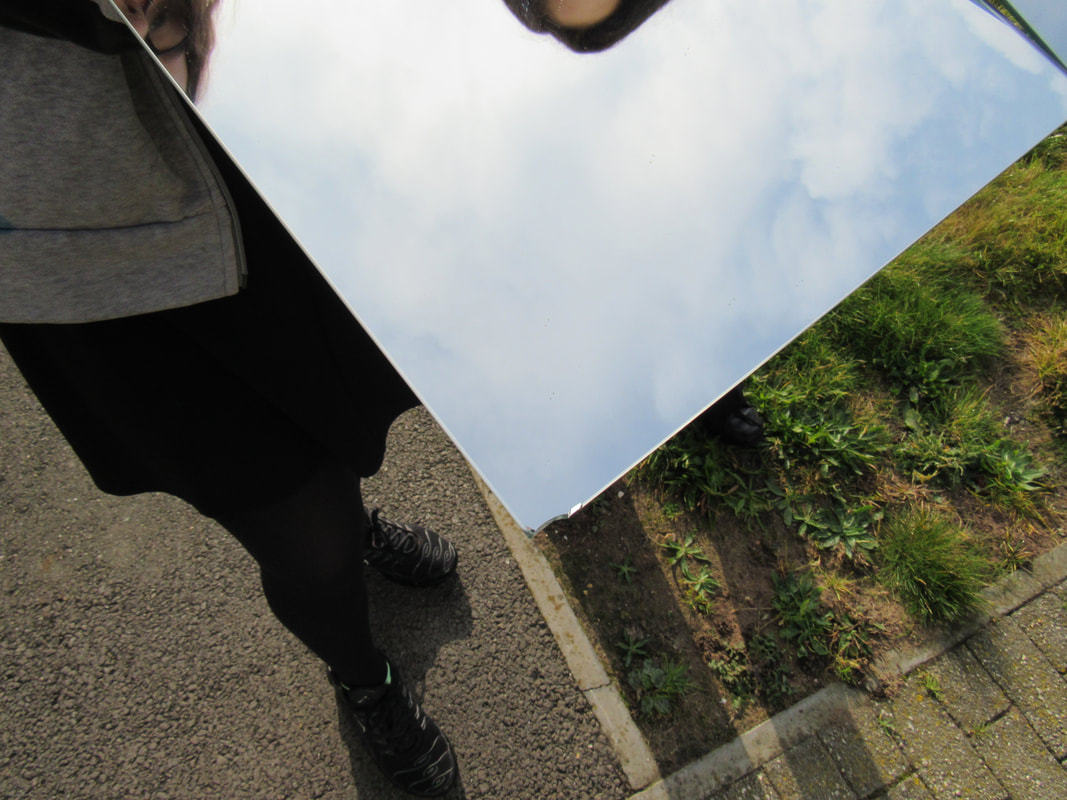
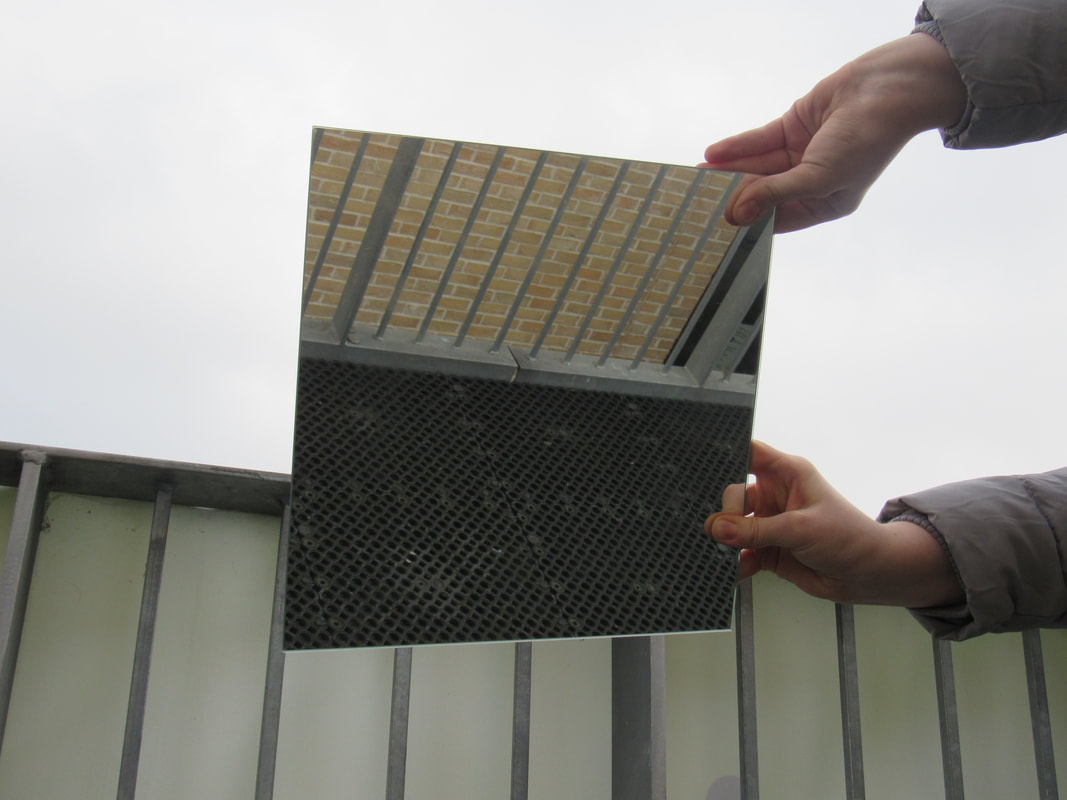
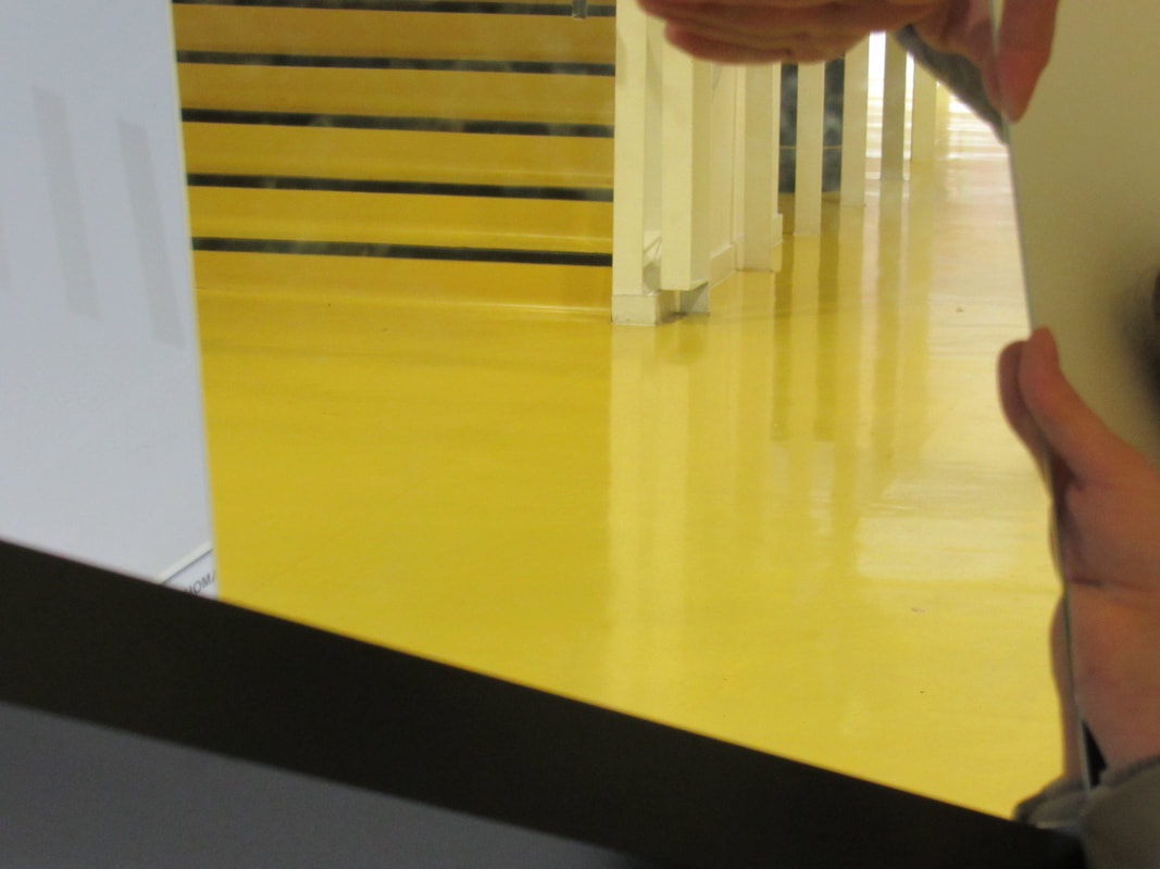
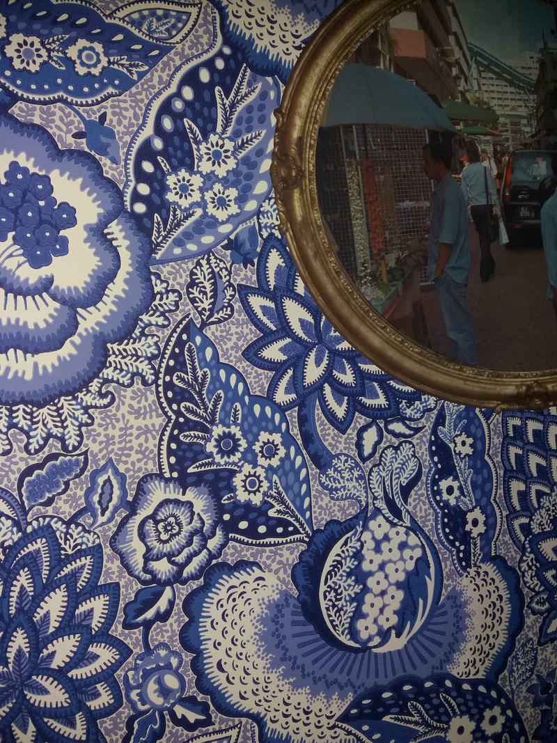
Mirror edges photos
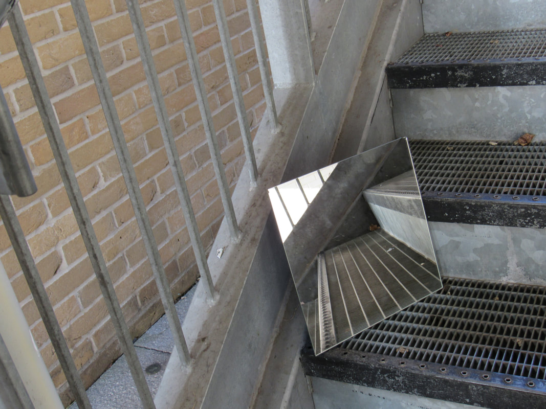
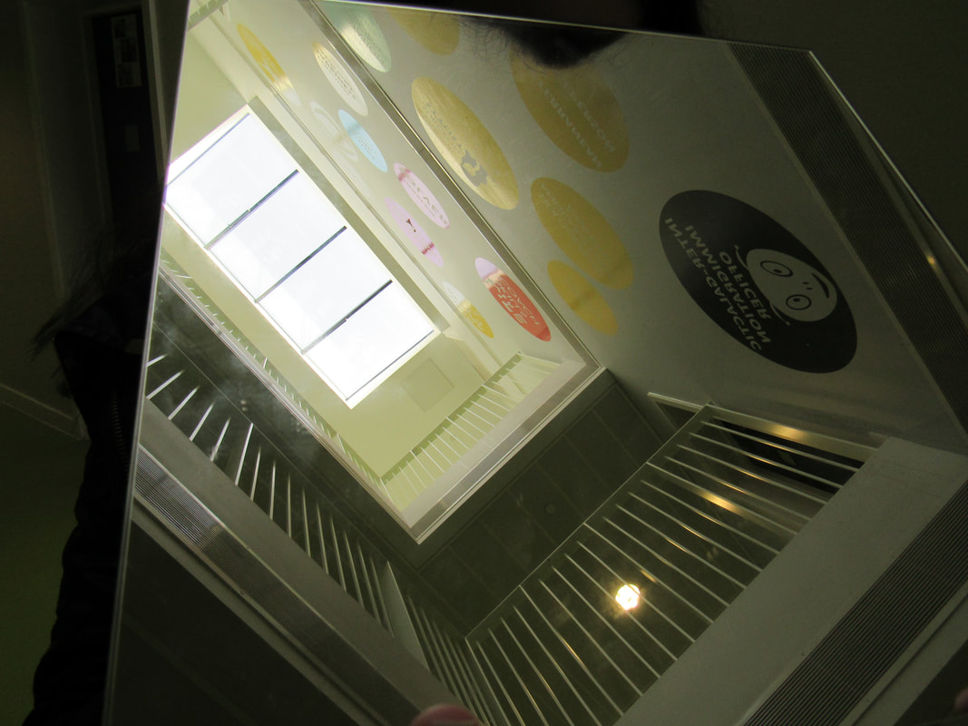
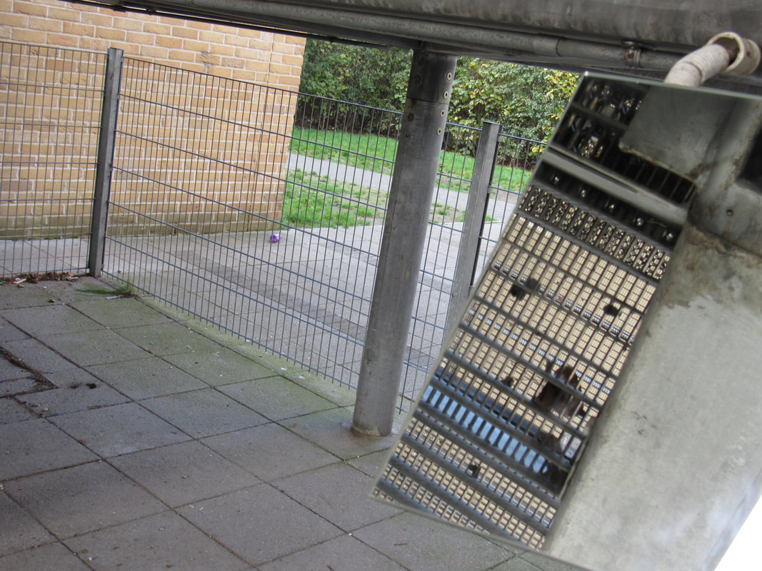

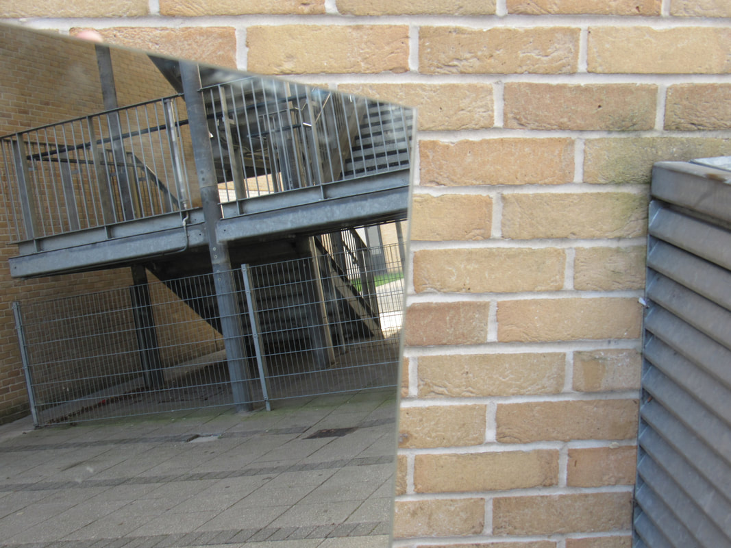
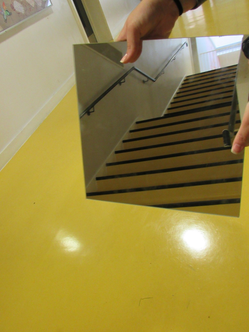
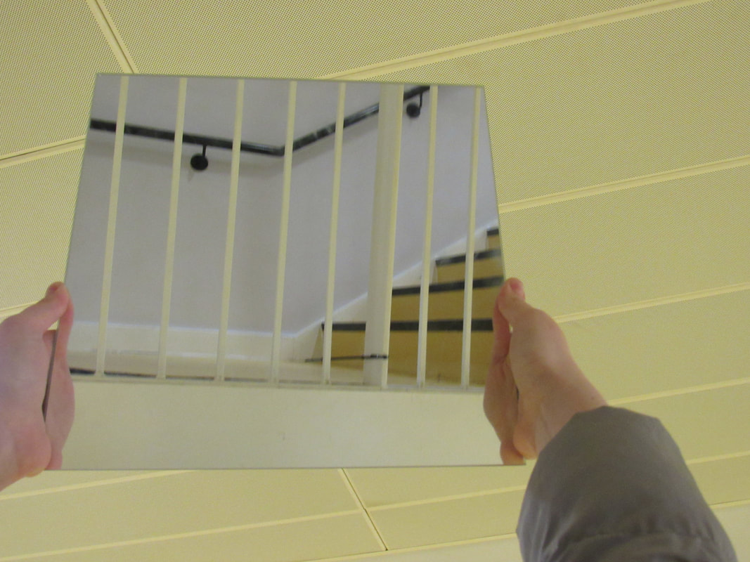
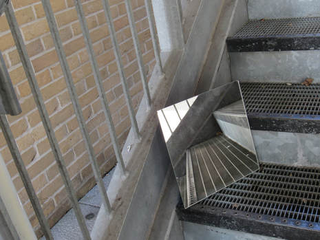
What I like about this photograph is the reflection in the mirror and makes it look like the stairs are an angle, I also like it because of the wholes in the stairs which has scattered rubbish everywhere. The way I think I can improve this image is to photograph a little bit further back to get all of the stairs in.
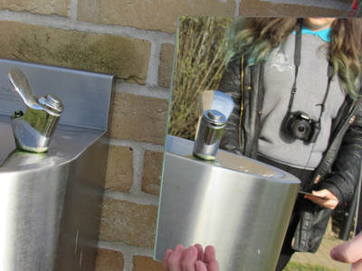
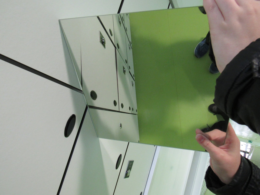
What I like about this image is the way the mirror has been placed and the reflection of the water tap, the contrast between all the colours is very good because it brings them all out in different ways. What I think could do better in this image is to remove the fingers holding the mirror and also to have a clear background in the mirror but at the moment there is a person there blocking it.
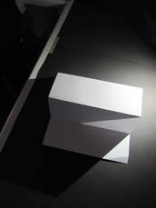
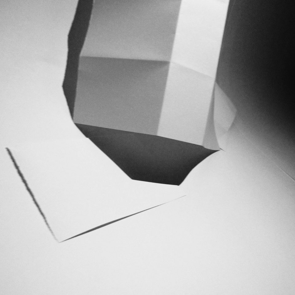
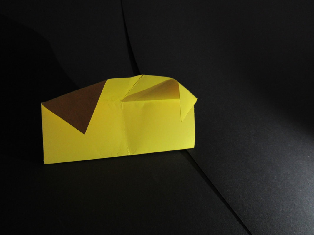
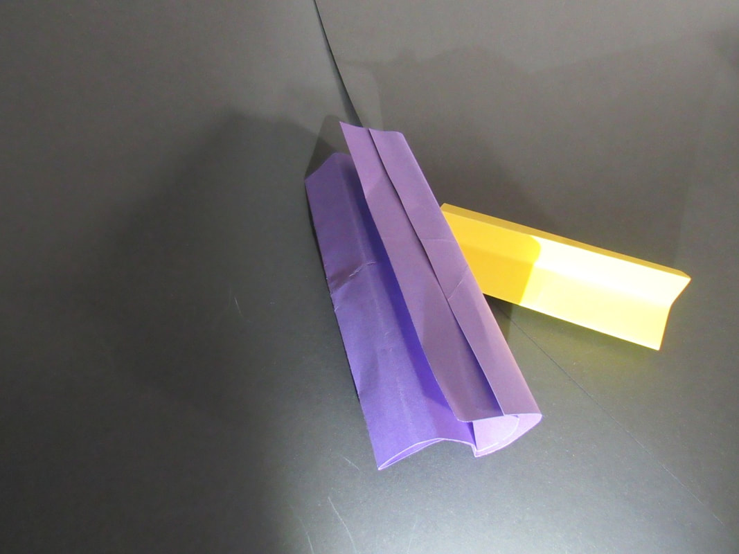
Paper photographs

Evaluation

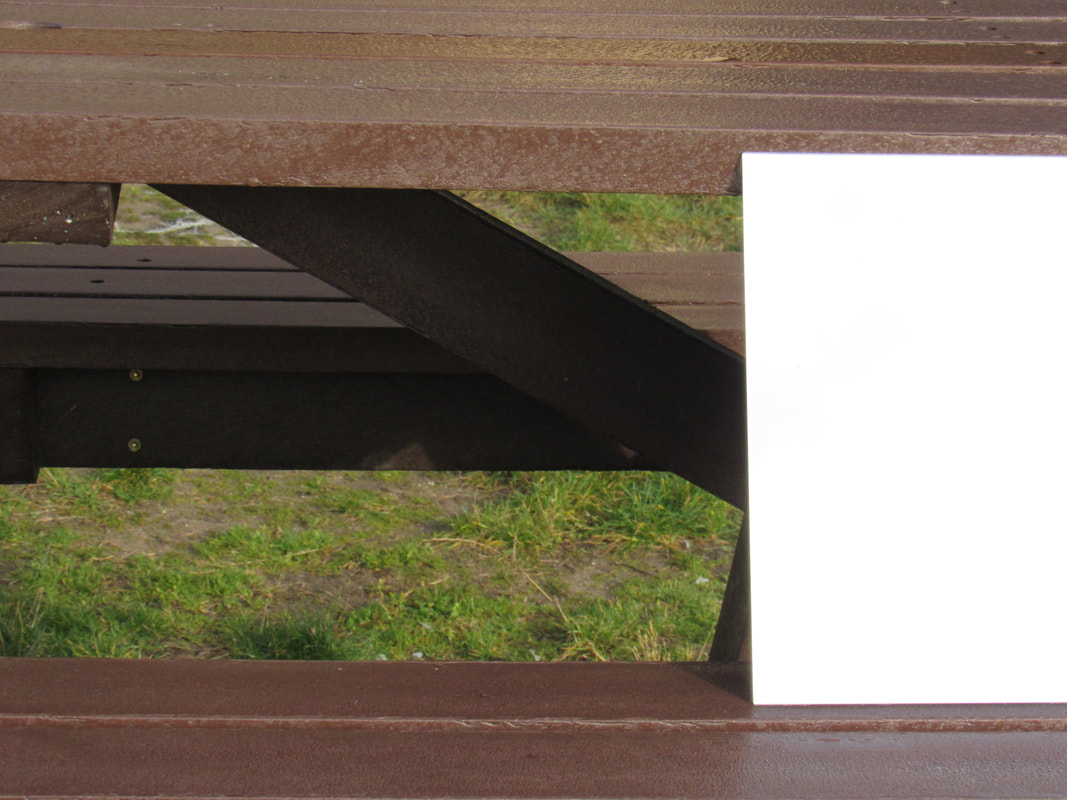
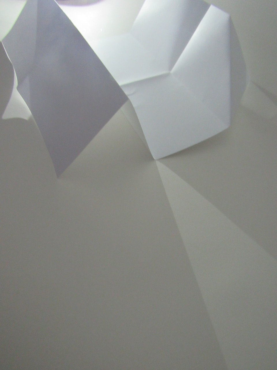
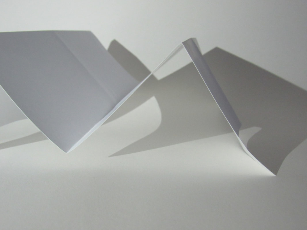
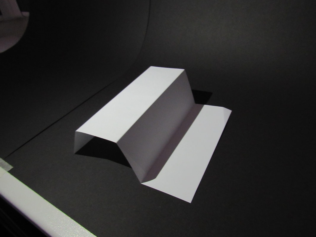
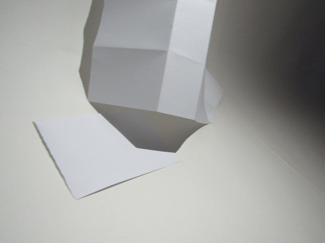
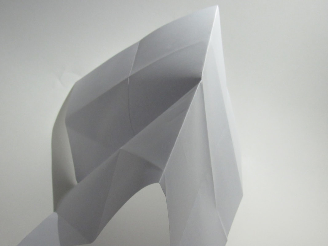
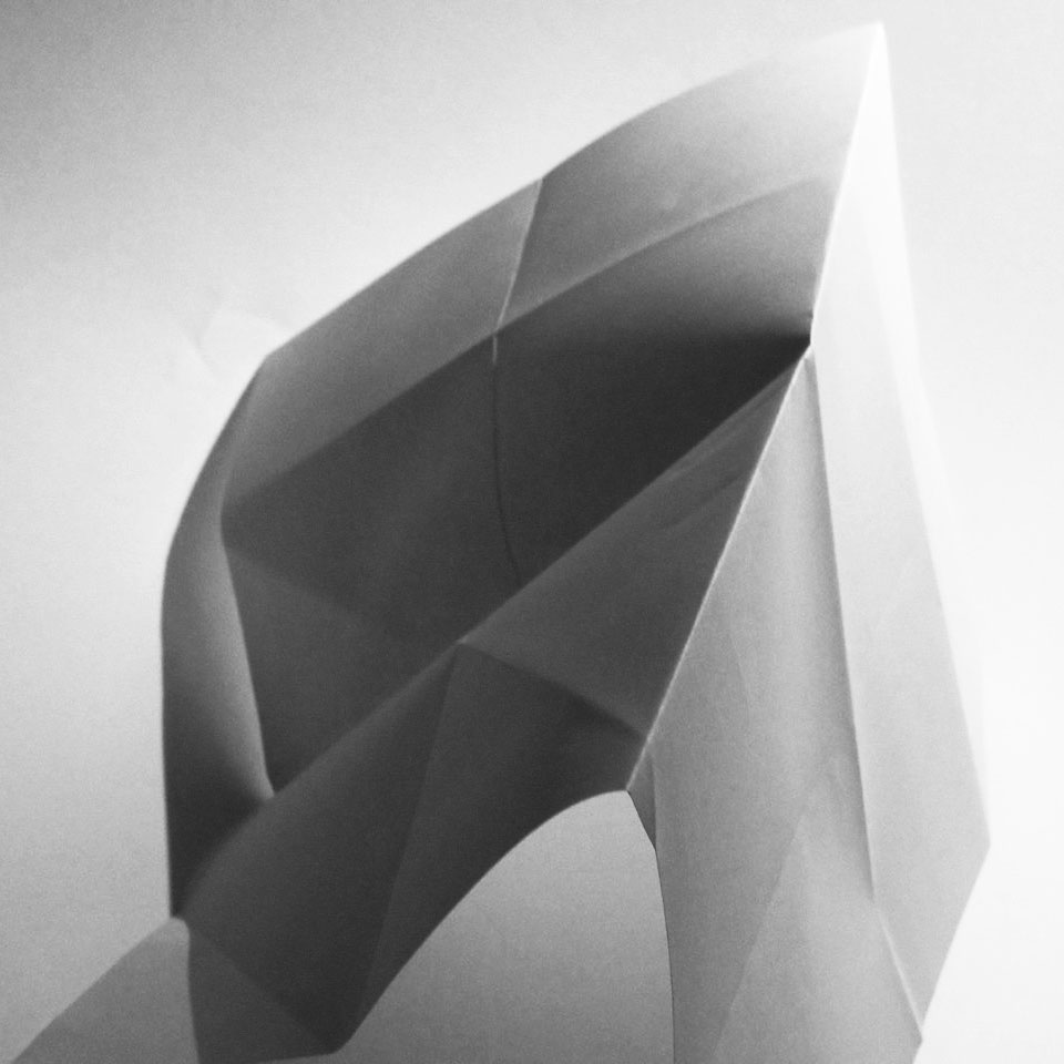
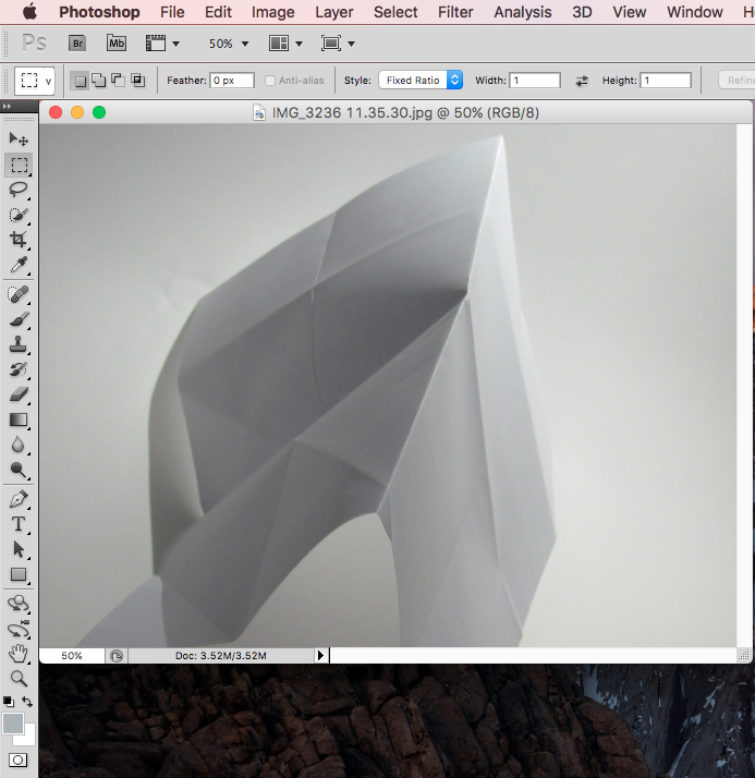
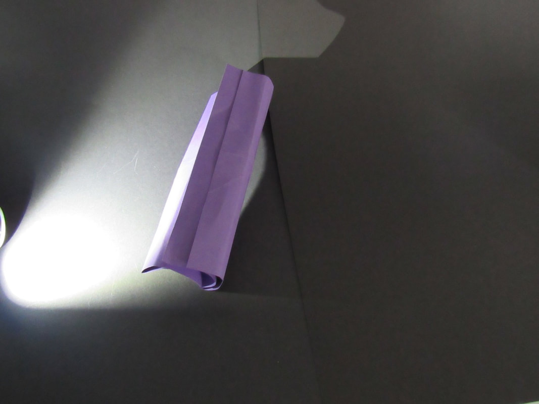
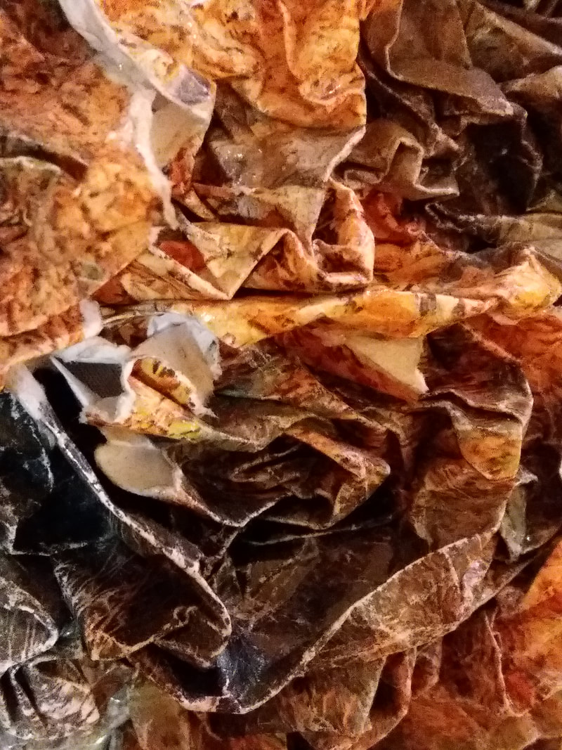
What I like about this image are all the creases on the paper where it might not even be folding there but it was from a previous fold, it gives the paper a lot more shadows. What I also like about this image is that big shadow on the. left of the paper. What I think I could do better for this image is to take the image lower down so you can see the whole piece of paper.
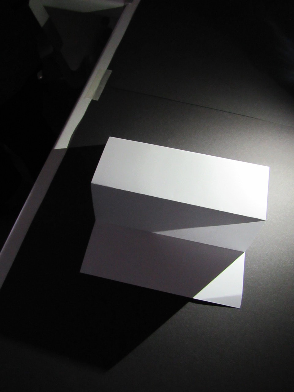
what I think I could have done better in this image is to photograph it in a completely different angle maybe from the front, and also I think I could have cut the rim of the table out to make the image only about the shadows and the folded paper. What I dod like about this image is the lighting on the paper, it gives the image a good contrast between the colours.
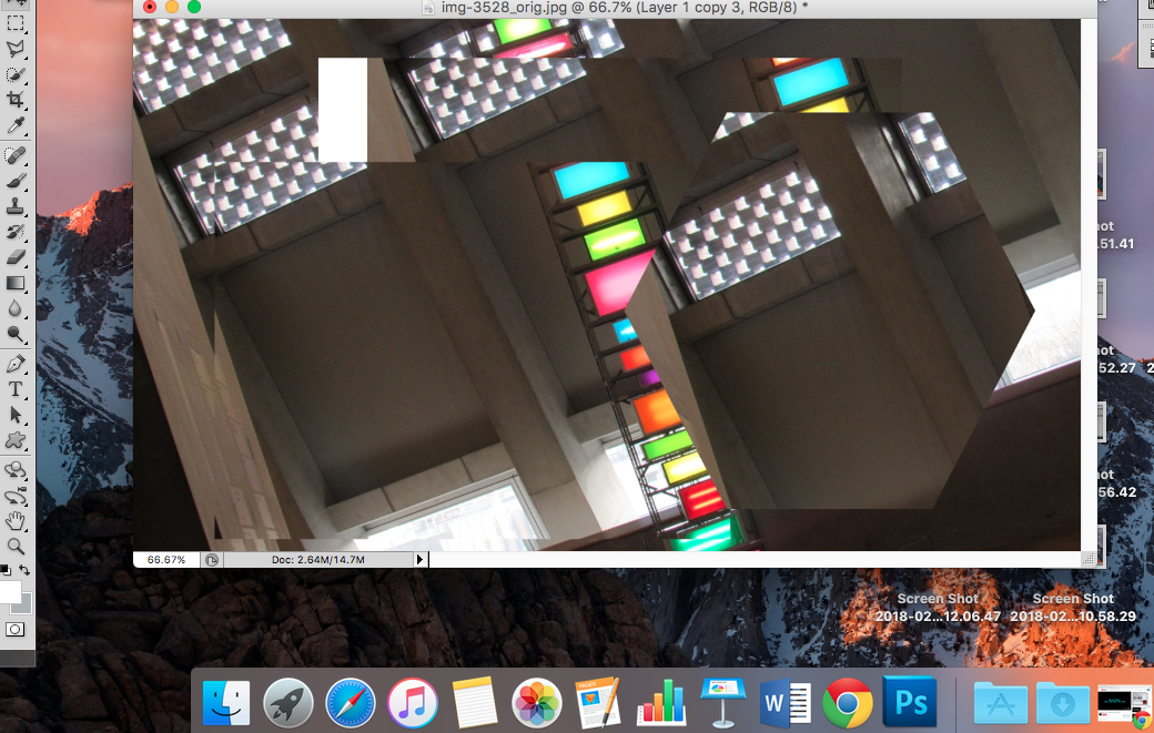
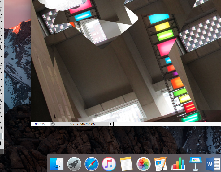
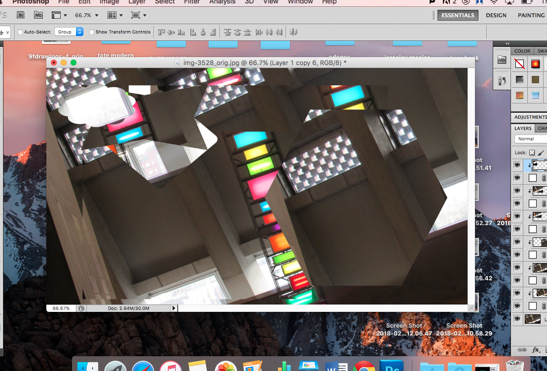
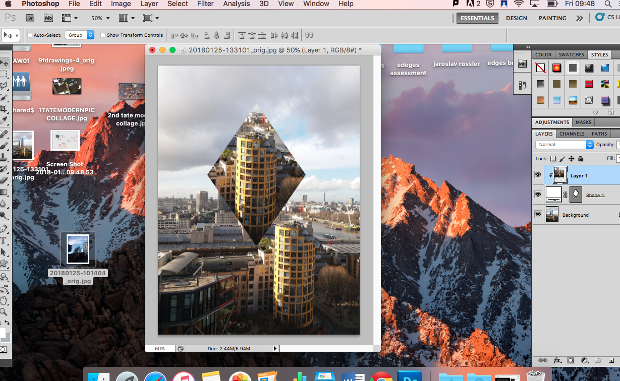
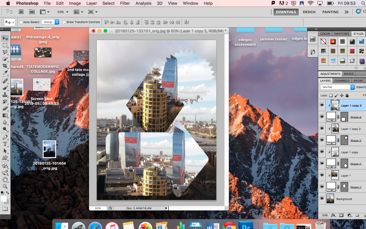
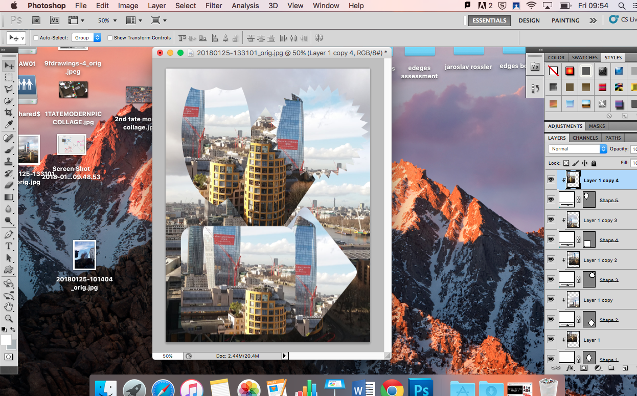
Editing in Photoshop


Method Of Final Image
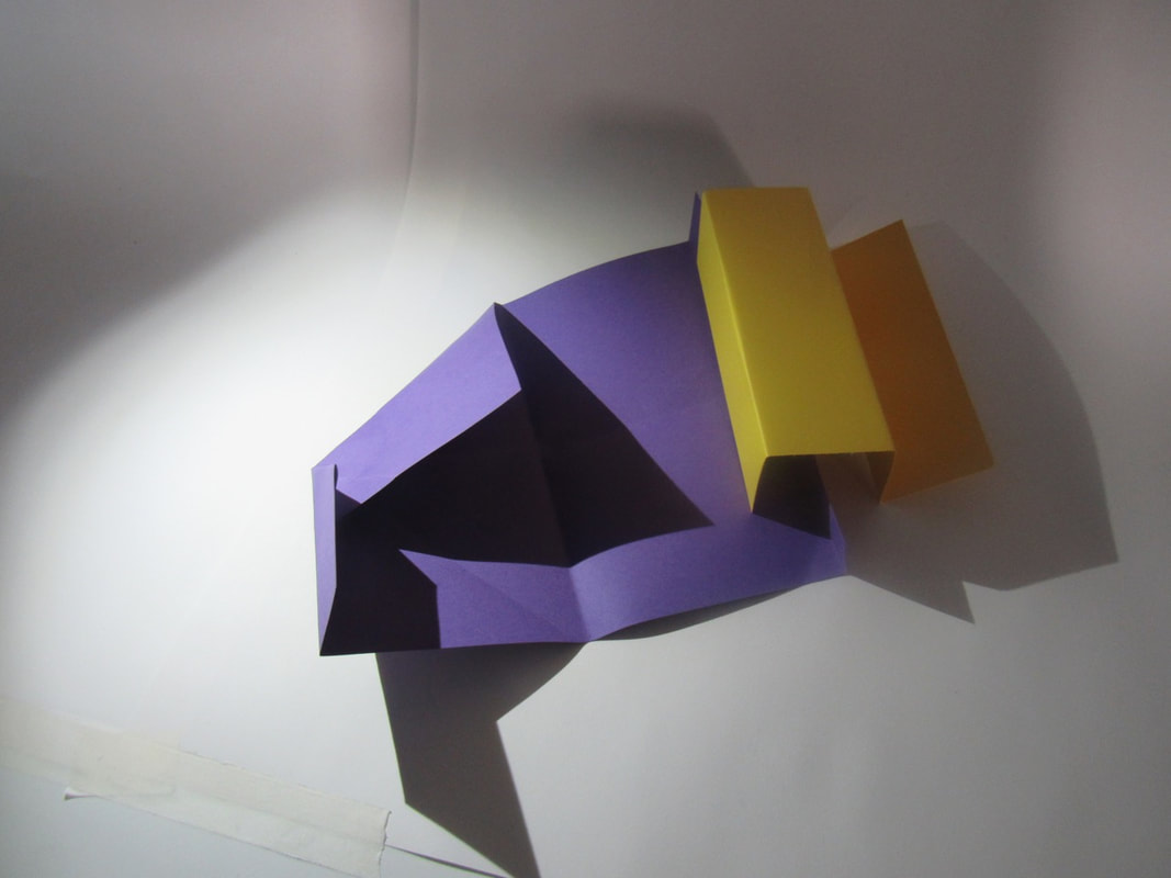
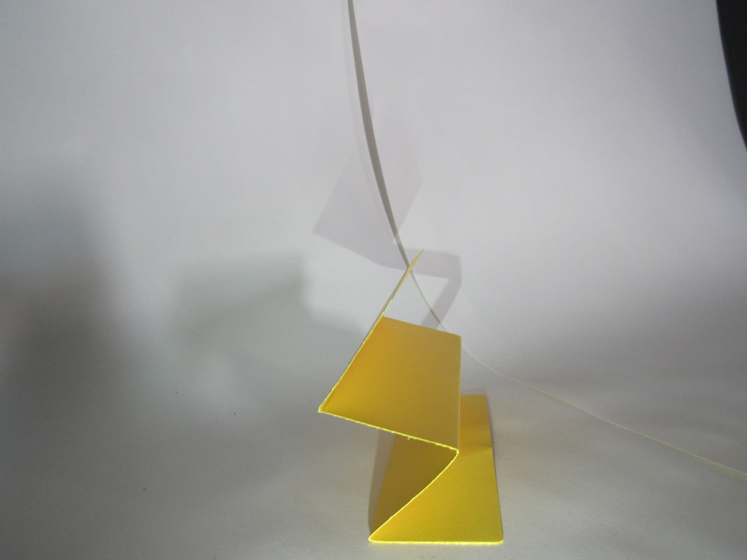
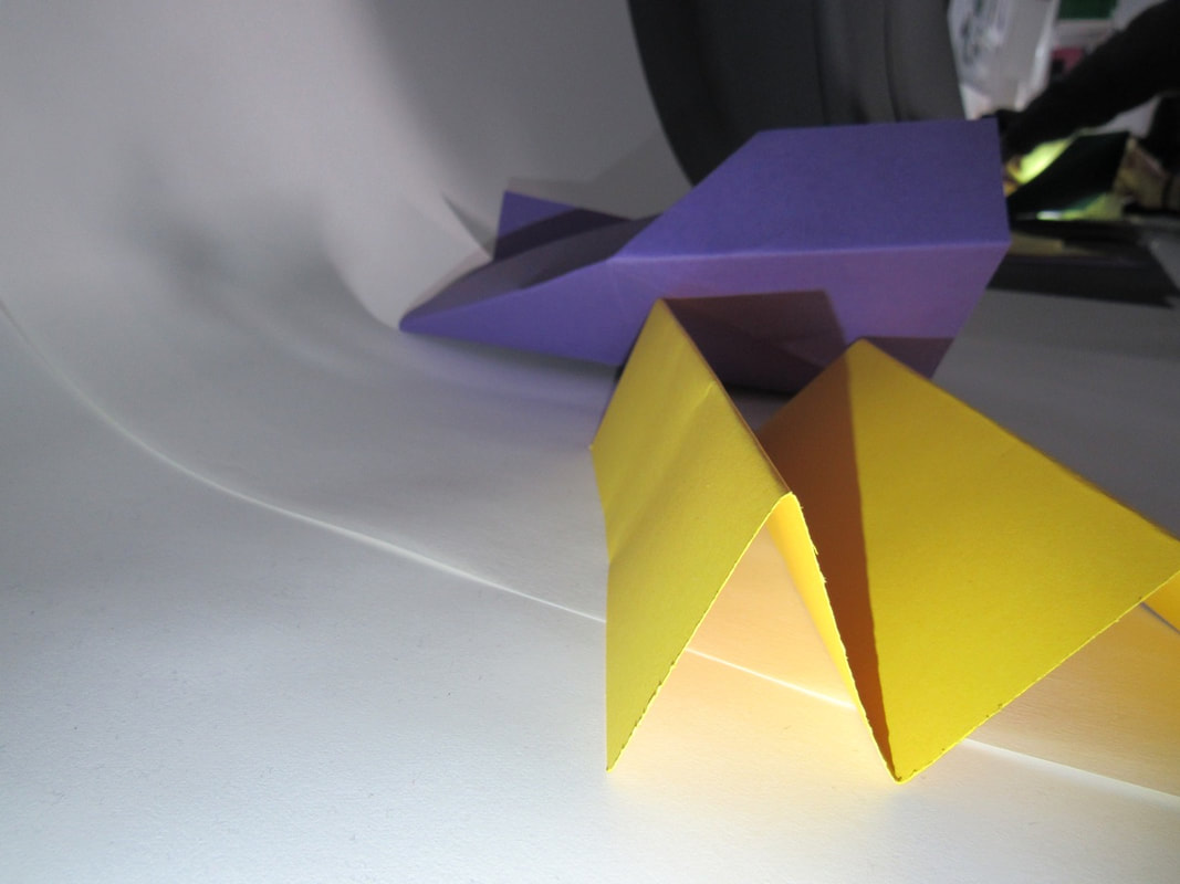
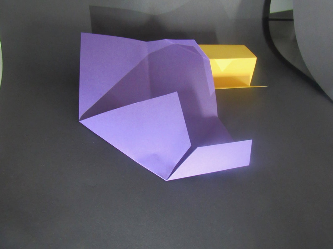
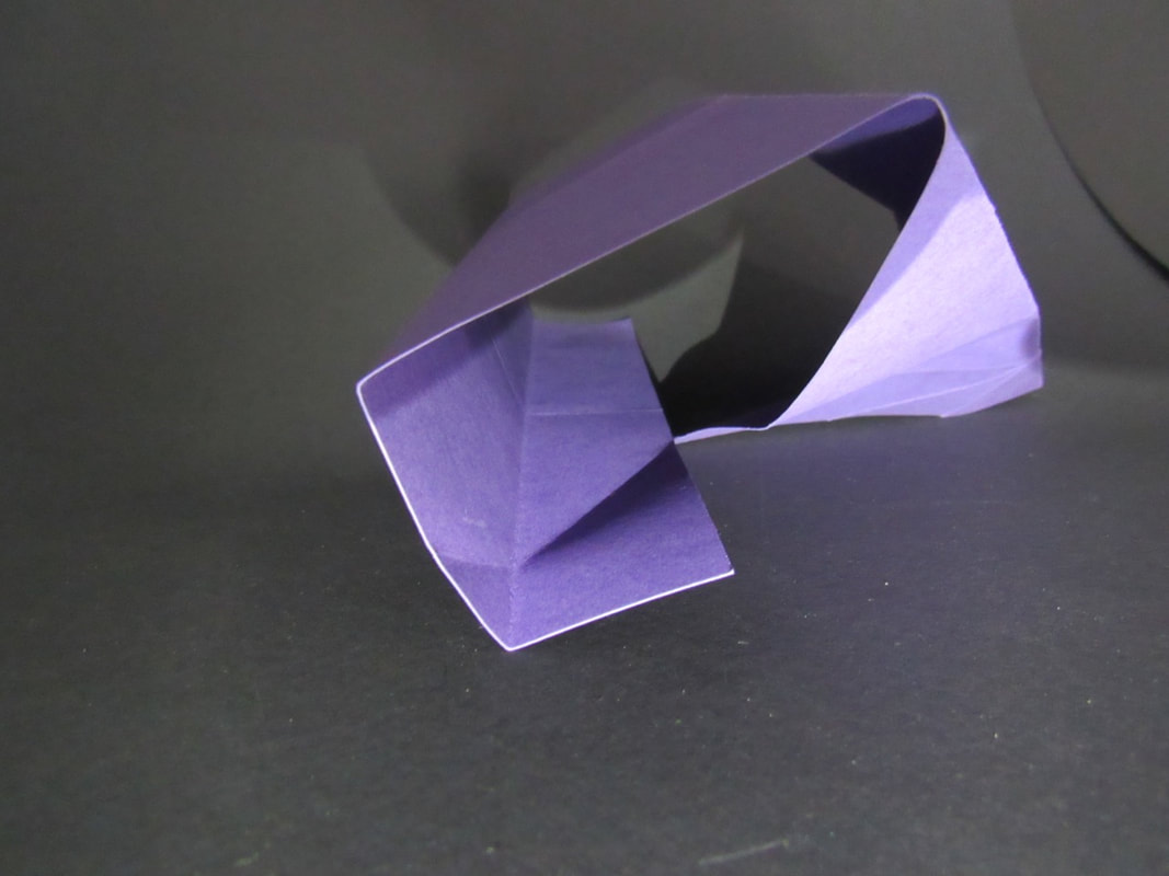
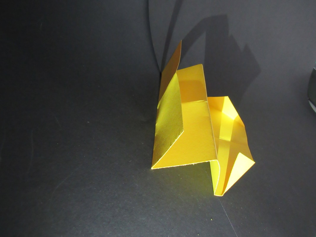
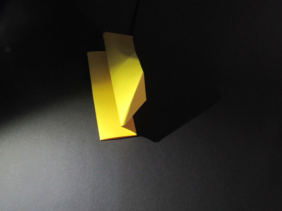
Paper Shadows
Evaluation

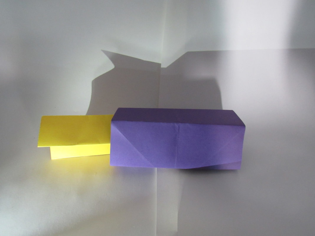
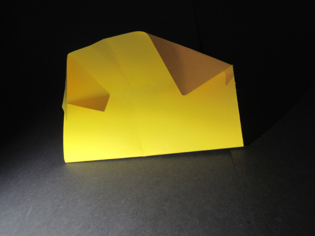
what it think I can do better on this image is to make sure it is not blurry and also put them in different ways to make it a lot more interesting. What I like about this image is that the shadow from the purple paper has covered the yellow paper, and that was the aim of this project.
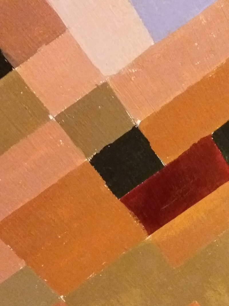
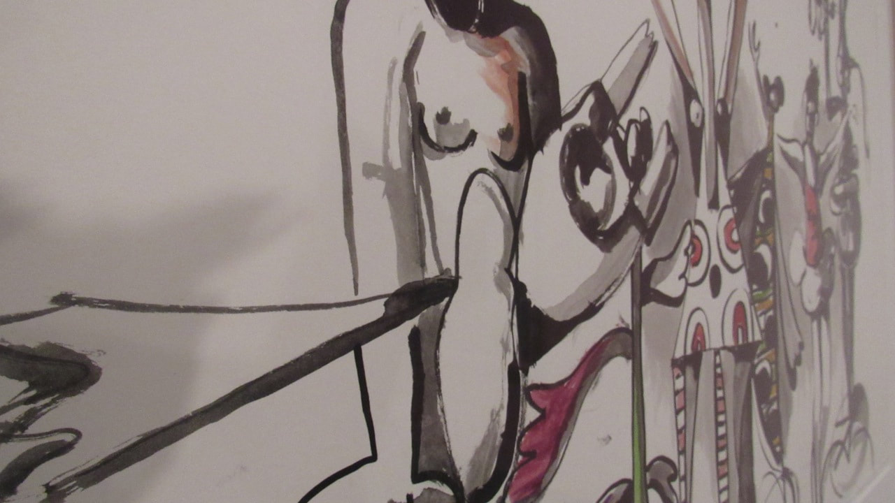
Drawing
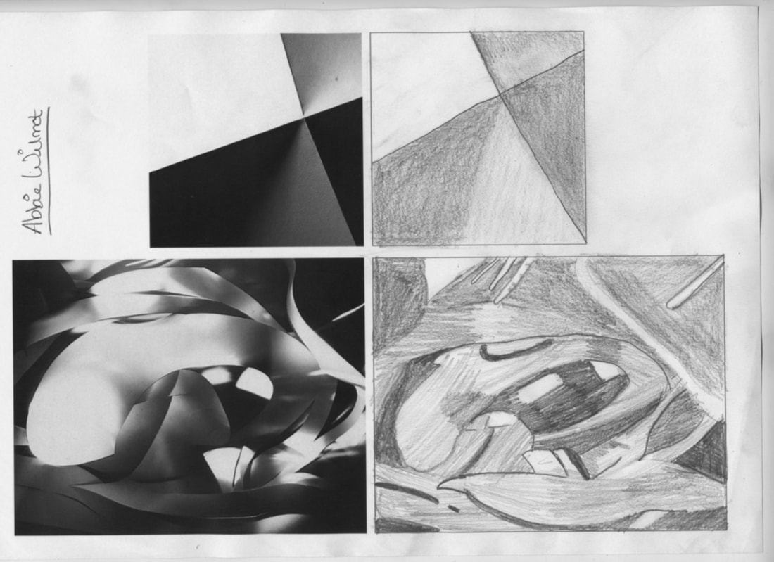
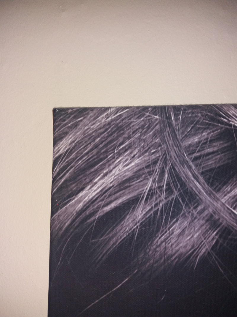
I think that I did pretty well with it. My teacher told me to look at the detail closely at not just to be a good artist . We were also looking at the light and the shade.
Research About Jaroslav Rossler
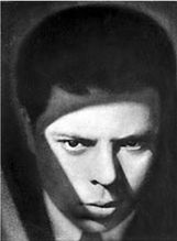
Jovoslav was born on the 25 of may 1902 in Czech Republic and he died on the 5 of January 1990 in Prague , Czech Republic.
he is one of the most important Czech photographers and it proves from his work that he made from the first half of the 1920s ranks along with the earliest and also the most radical examples of the application of the abstract and constructivist principles to the photography world, this is along side of his book creation as well. I also think that his paper art is really good and different to any others that have seen yet and also the different types of directions the paper is pointing or heading to is really interesting.
What I like about his works that there are really light areas and really dark areas which give it effect of the picture. Also I really that most of the objects that he is using in circular which also makes it really cool.
Research About James Welling
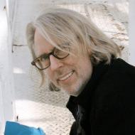
James Welling was born in 1951 in Hartford, Connecticut , US. He also made some books and they were called Light sources , Gelatin Photographs and New Abstractions. He educated in California Institute of arts , Carnegie Mellon University. He had a nomination which was godheads choice awards best poetry.He also earned both a BFA and a MFA in California Institute of the arts in Valencia, California, he also studied there as well along with others like Dan Graham.He was also photographing crumpled shards of dried out dough. What I like about his works is that the lines are really dark on the creases on the fabric. What I also like about his work is that its all folded up and then pushed back down flat.
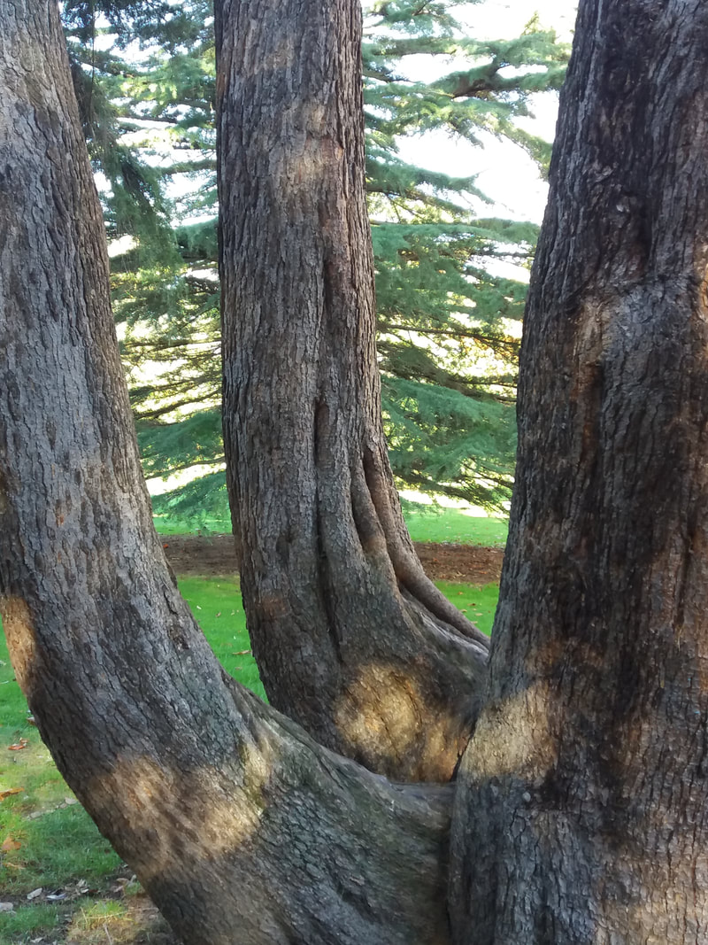
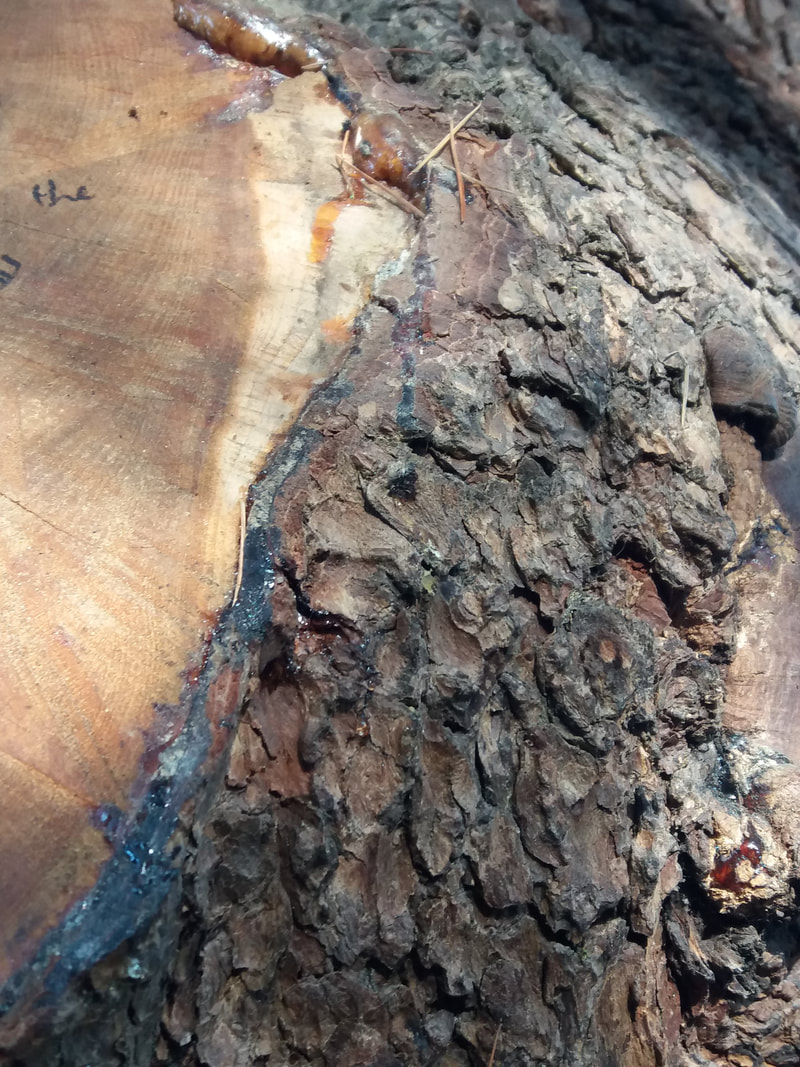
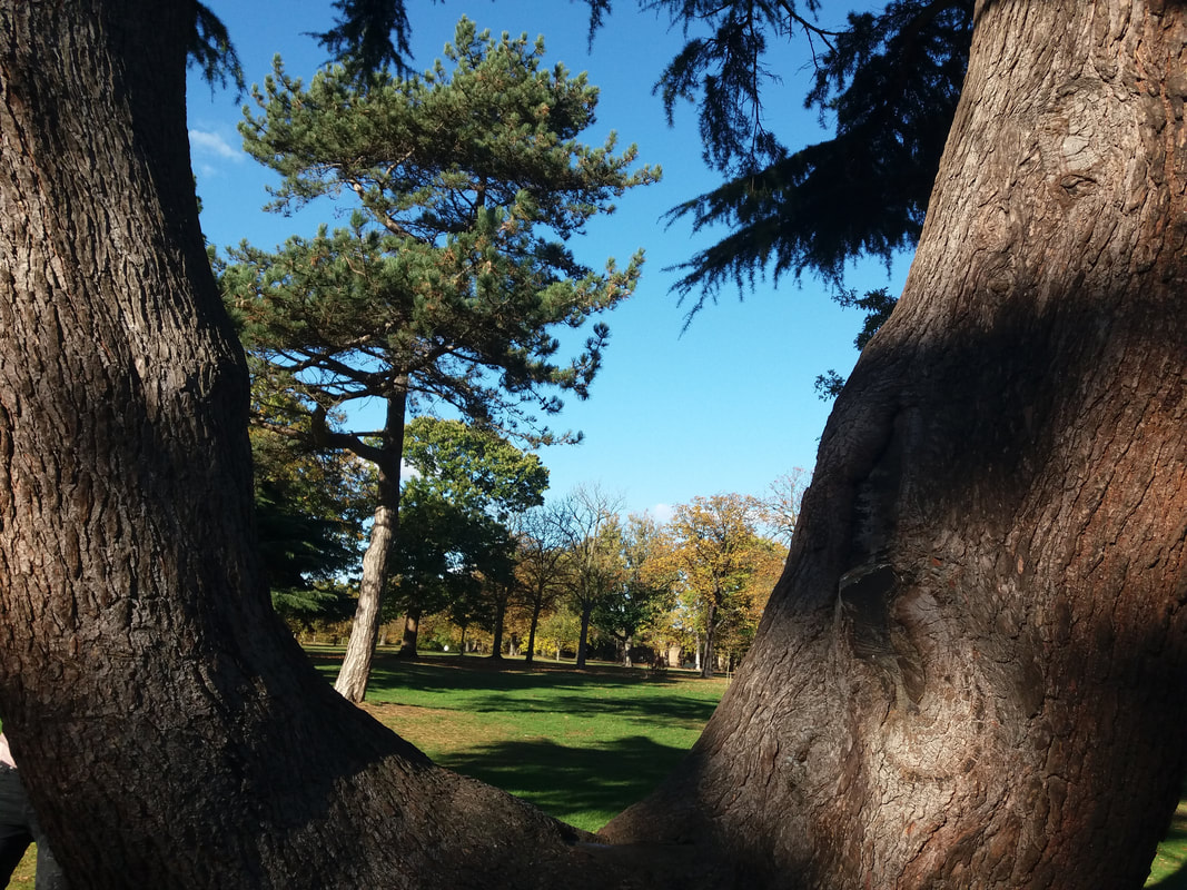
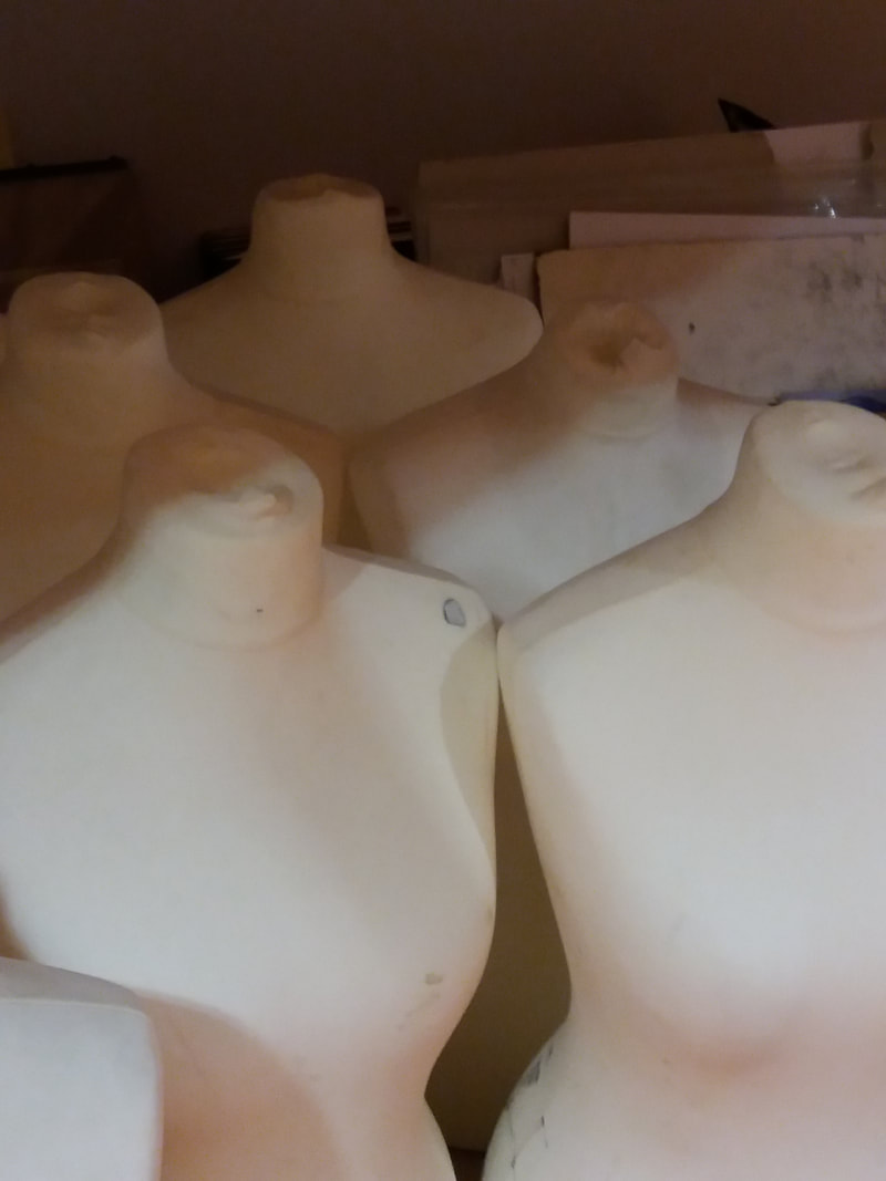
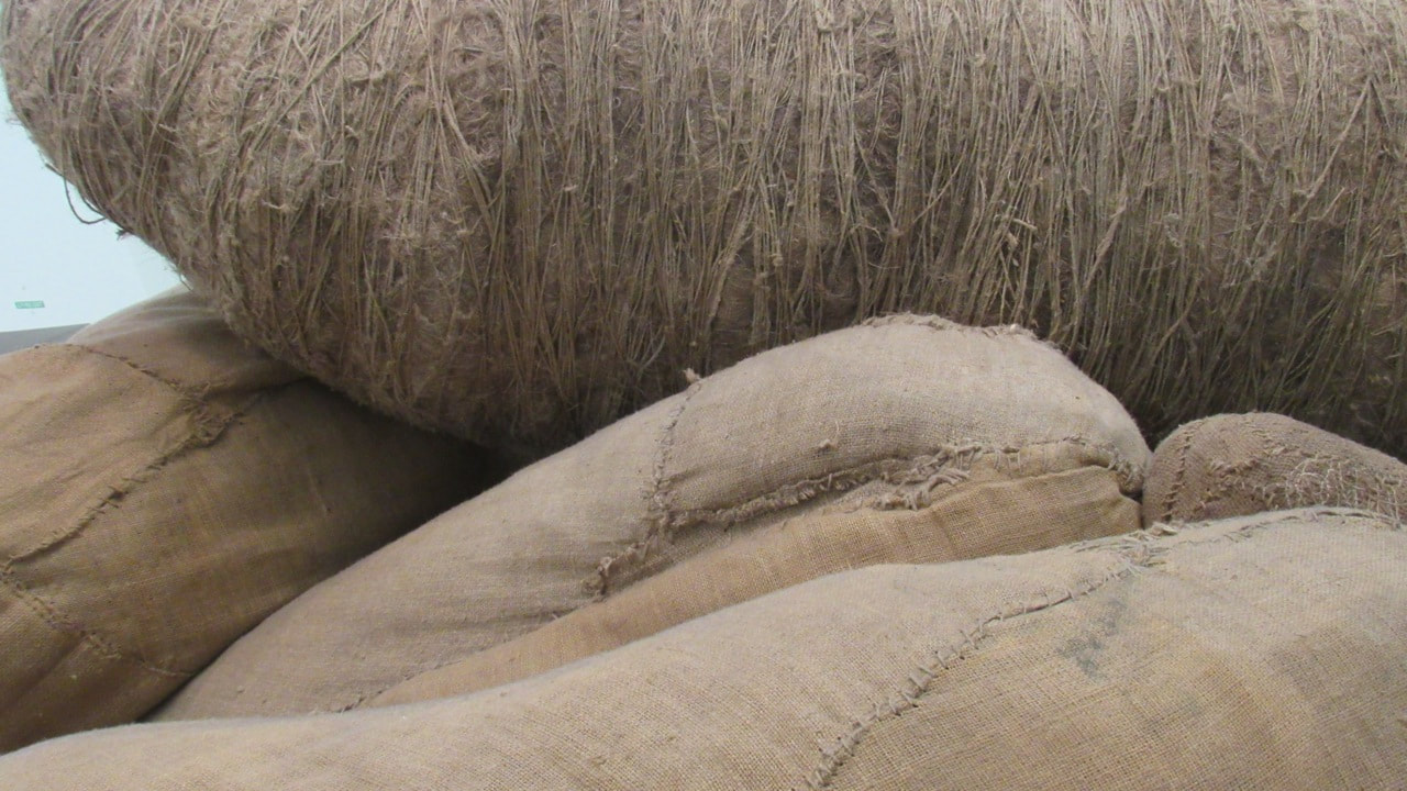
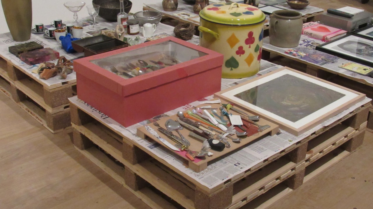
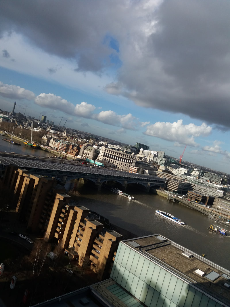
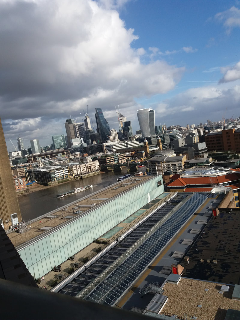
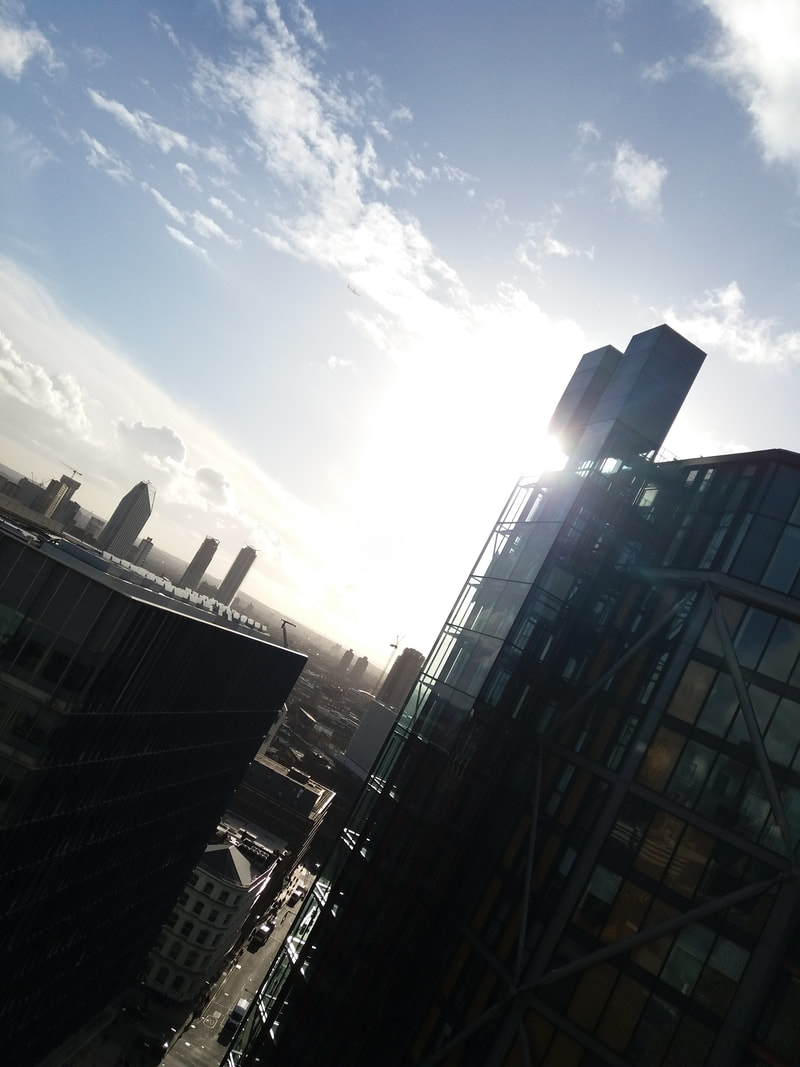
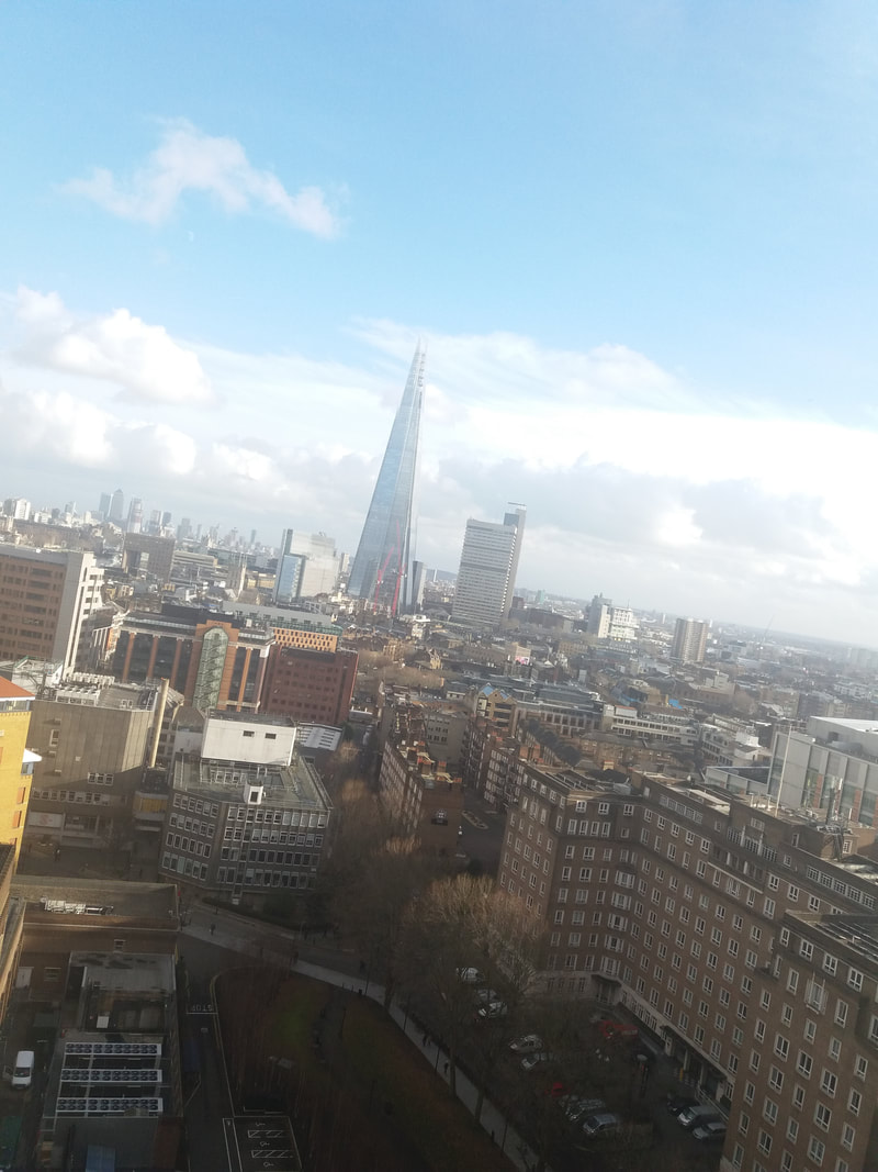
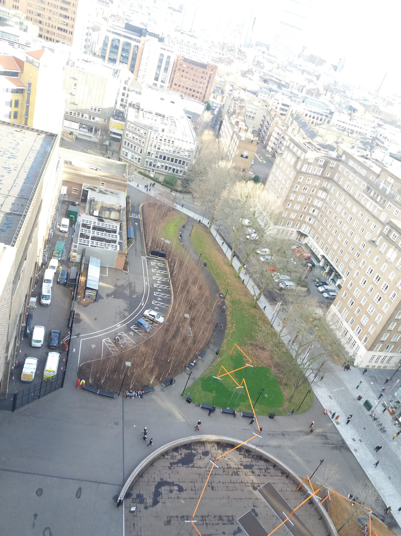
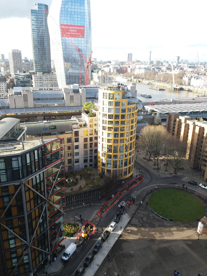
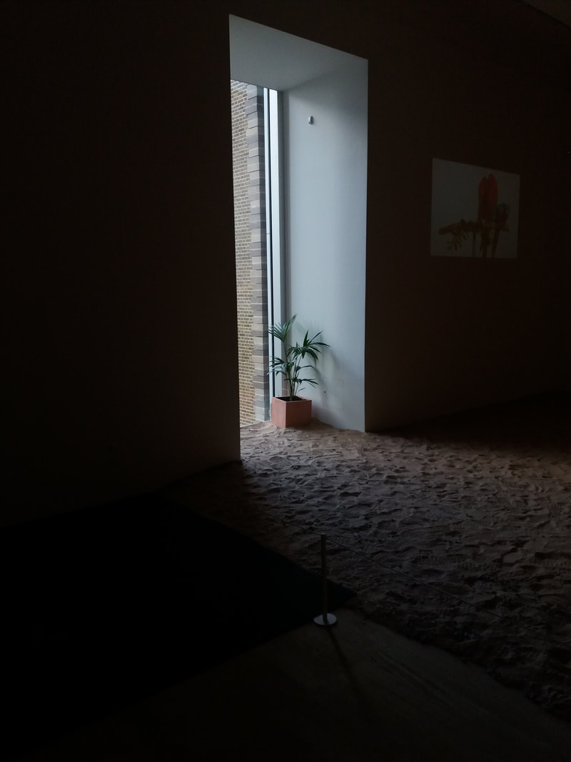
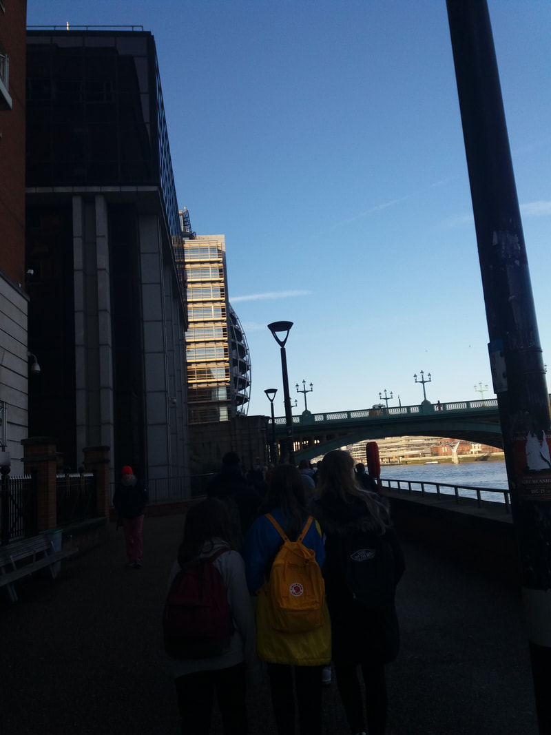
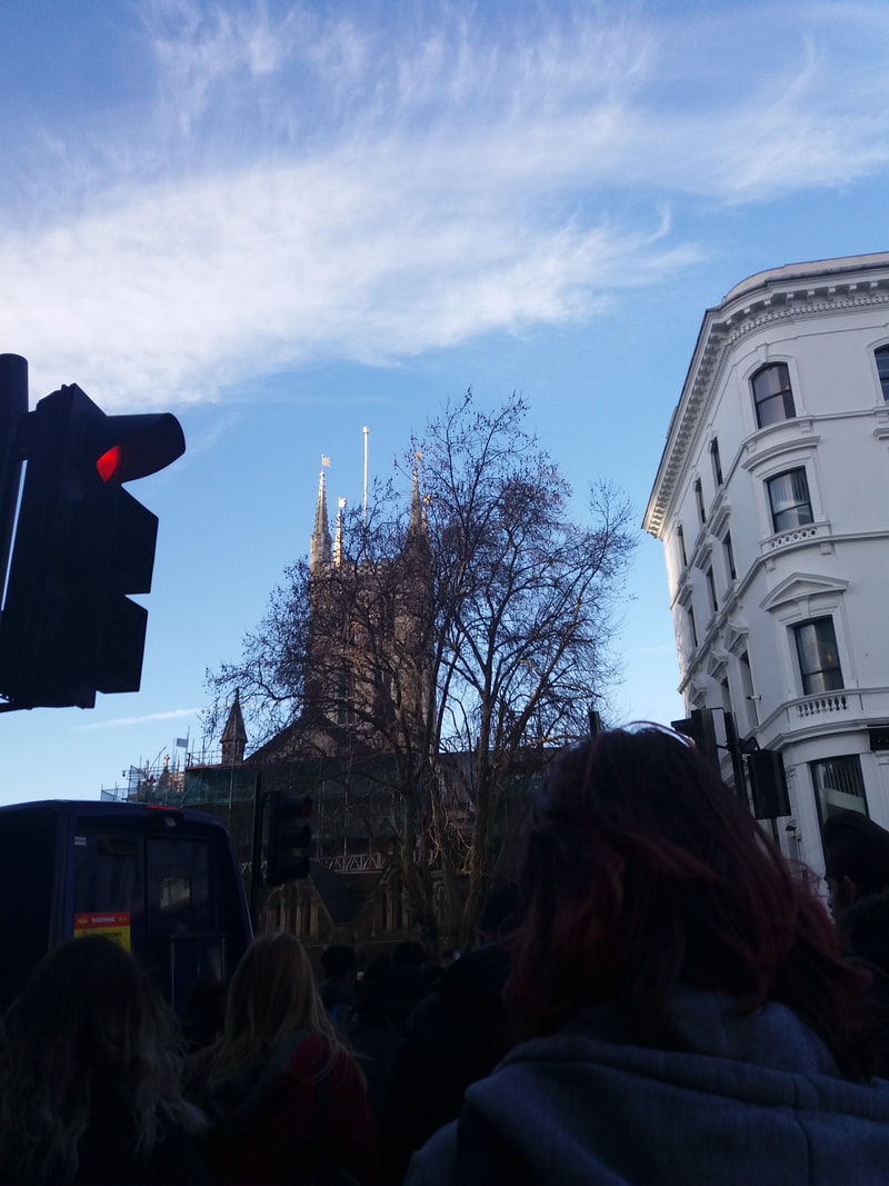
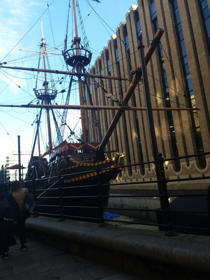
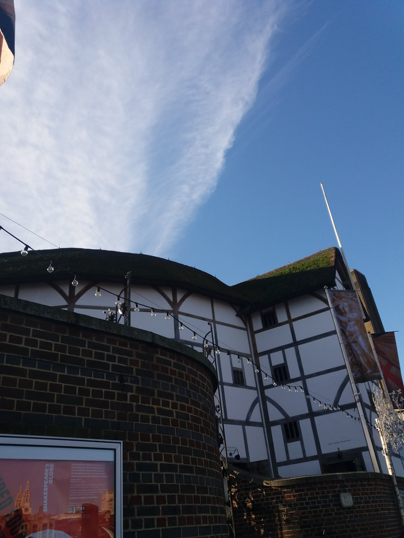
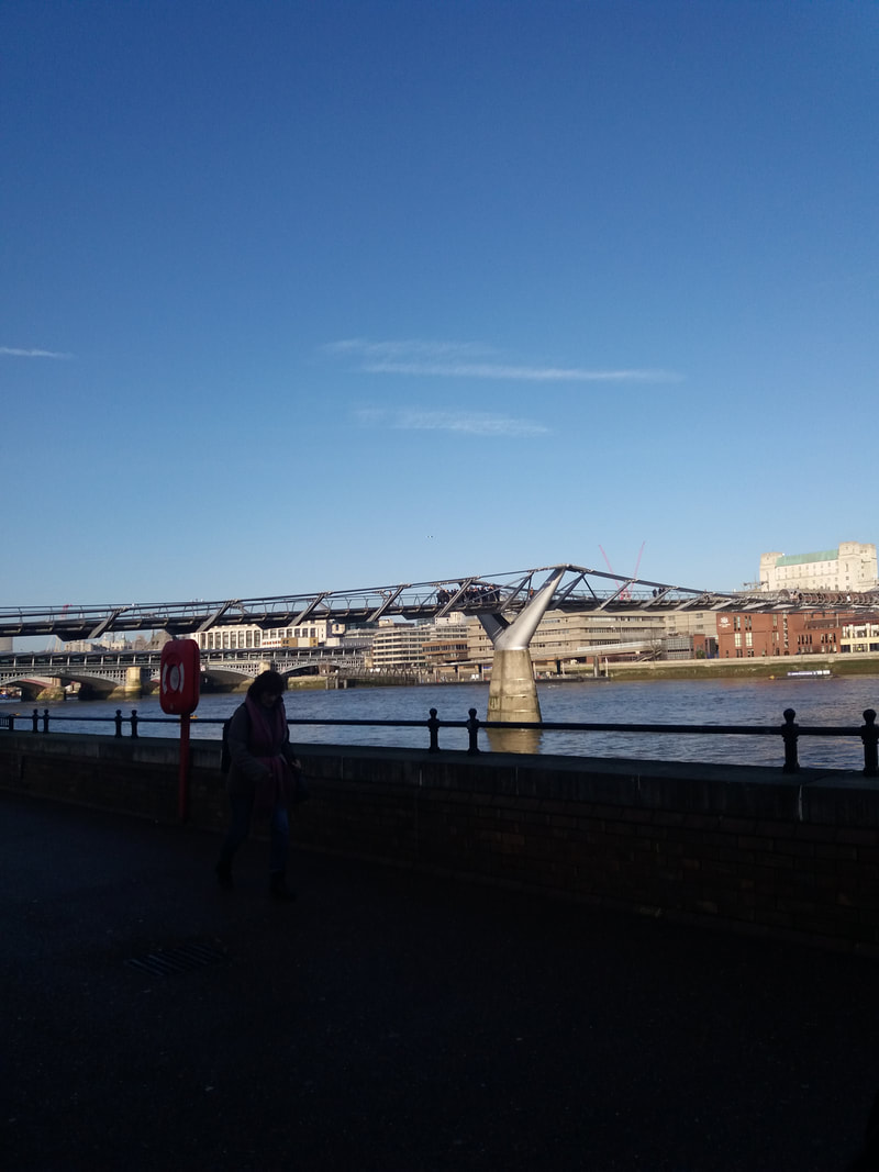
Images Around School
Assessment
I am doing an assessment with the class and it is related to edges. You have to choose 5 pictures which look good together. We are also practising working to a deadline in response to a theme. I am taking photographs of the pictures individually in new locations.
Images
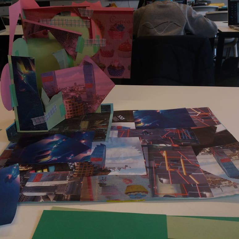
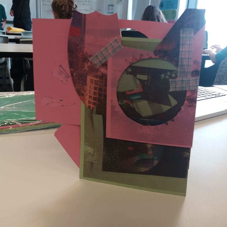
The Method Of My Structure
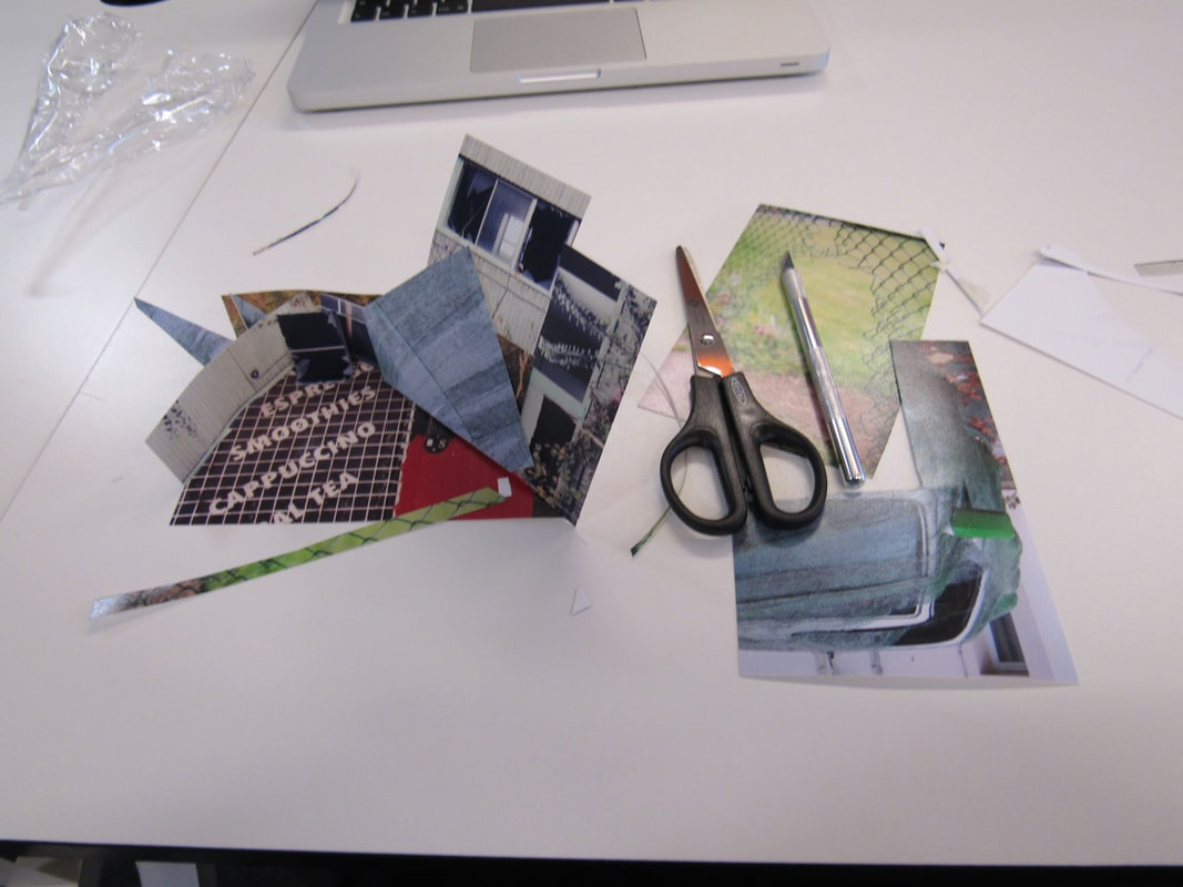
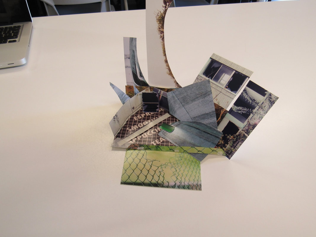
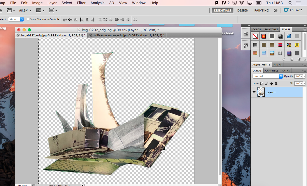
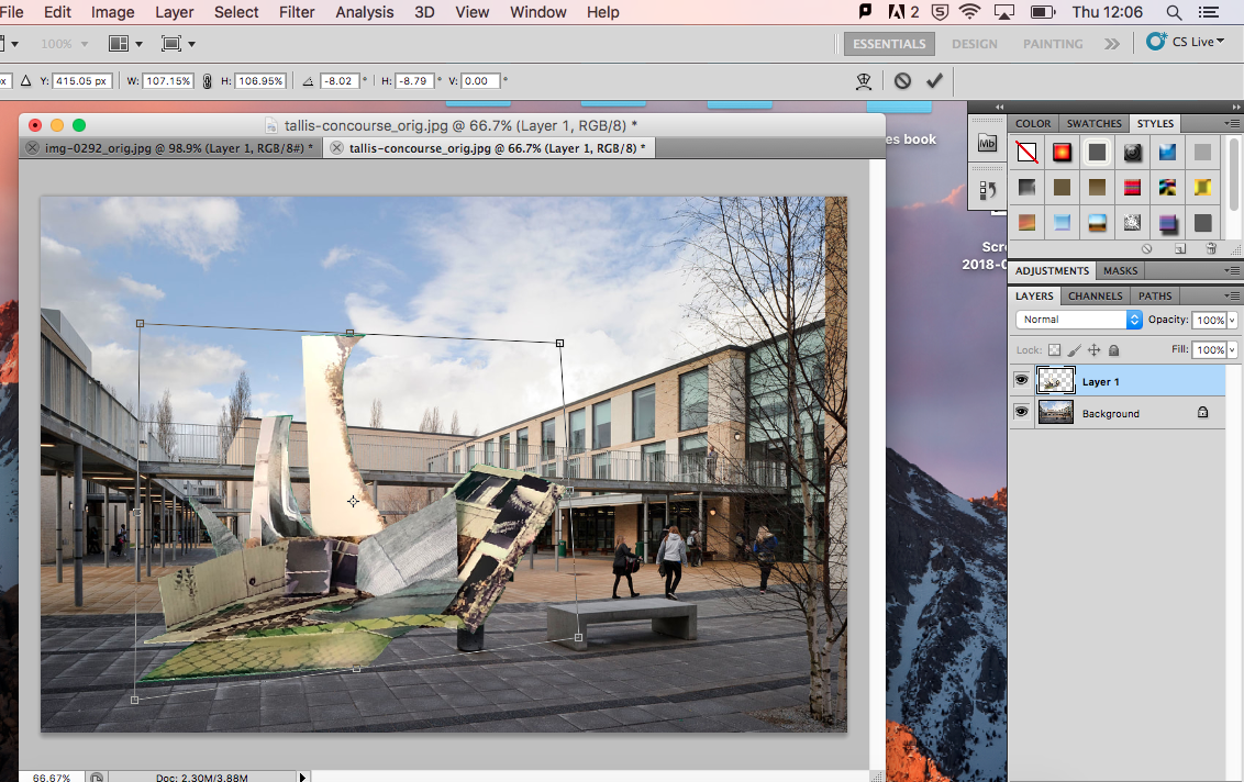
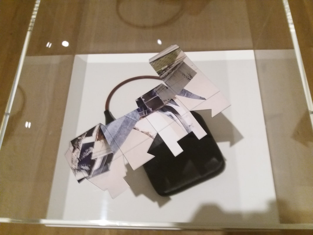
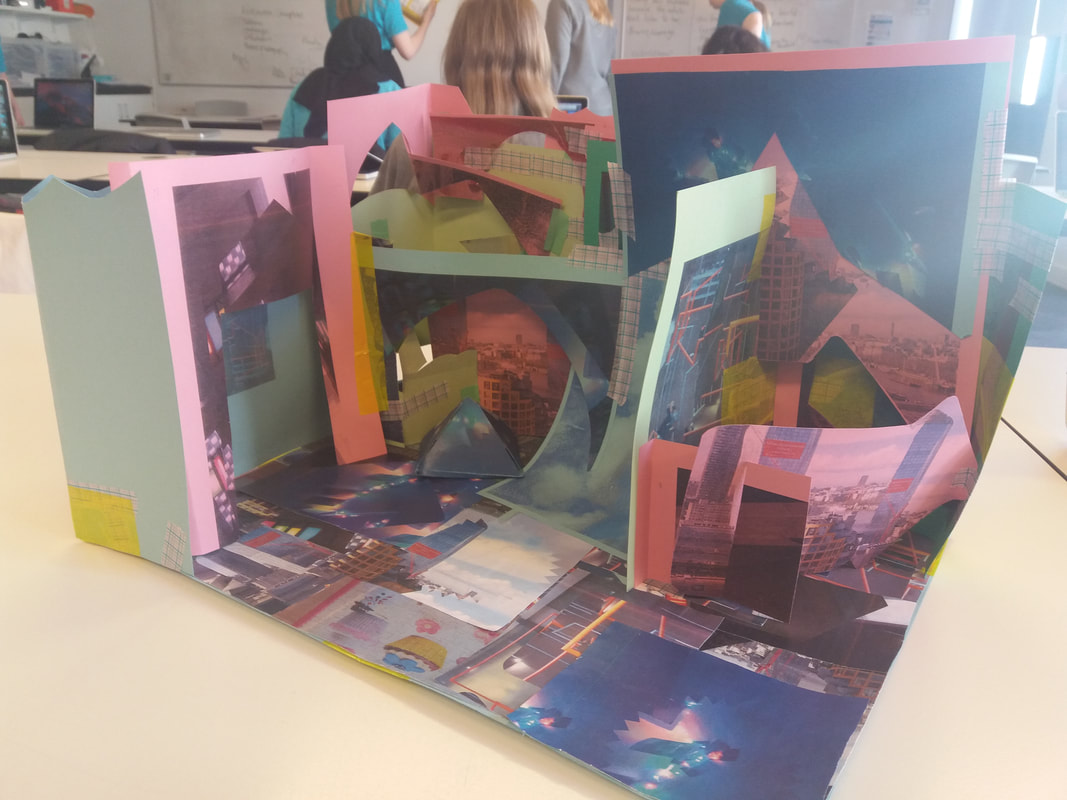
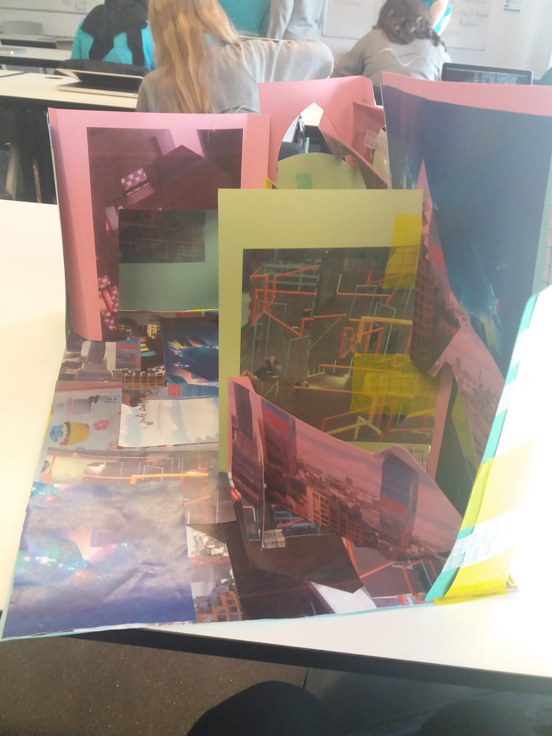
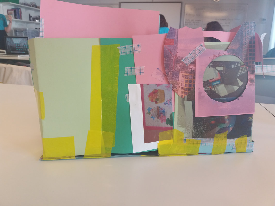
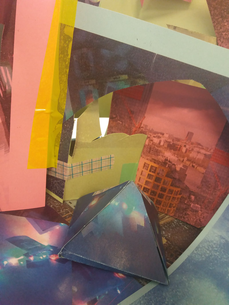
My Structure

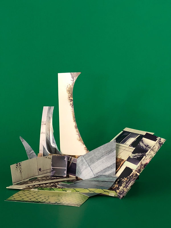
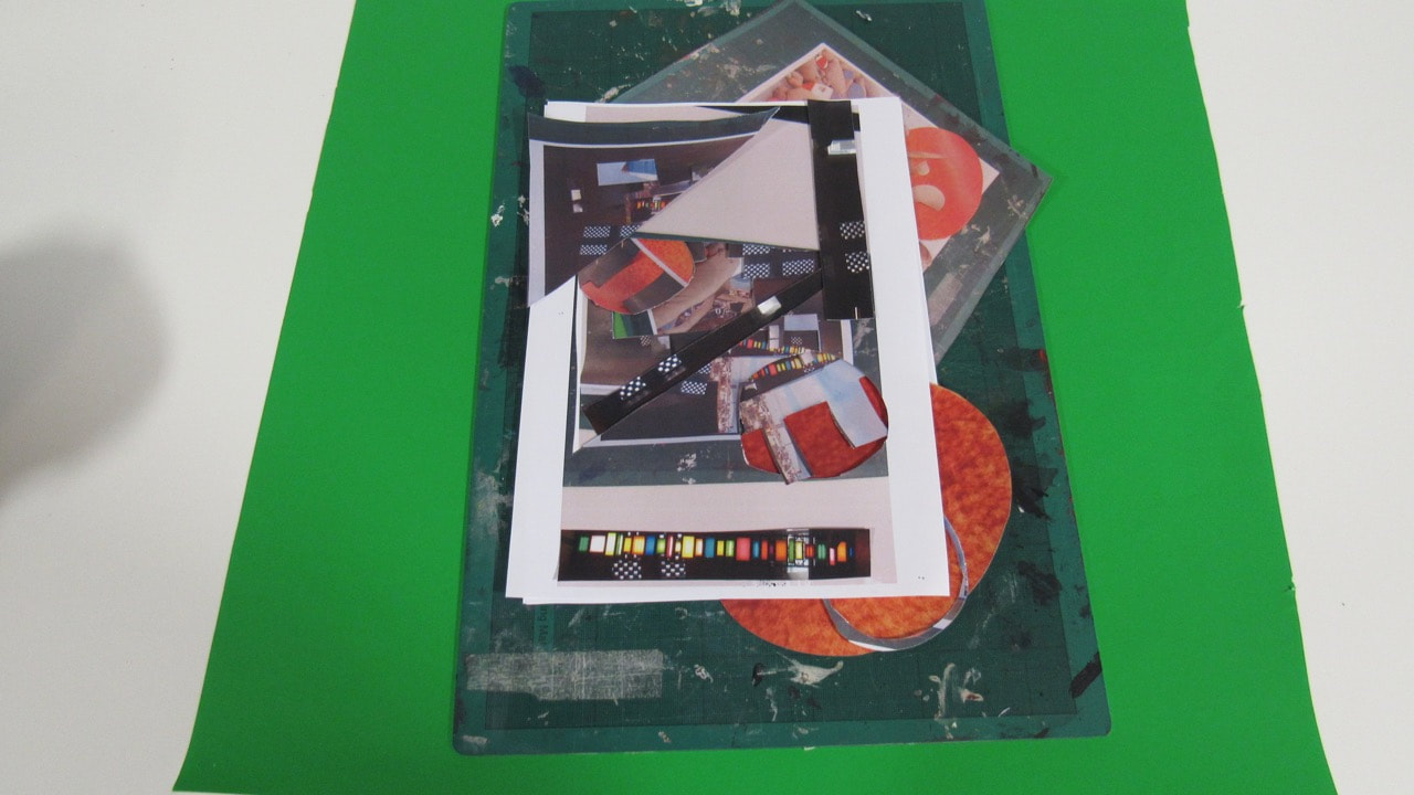
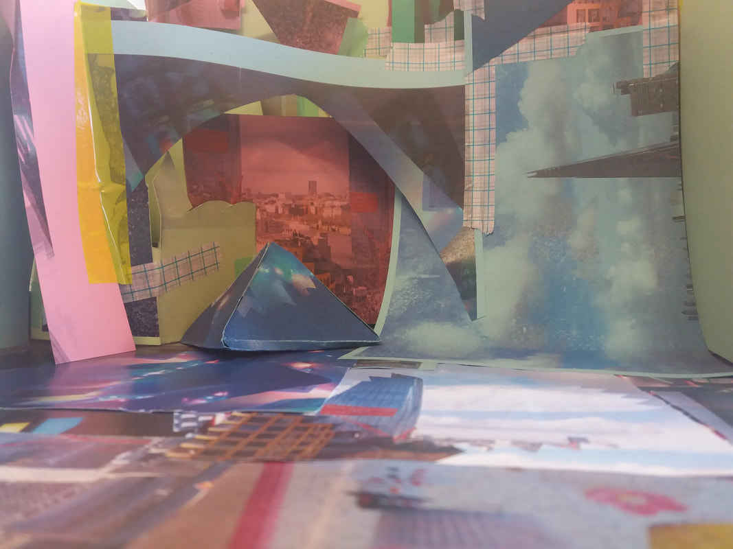
My Sculpture On A Green And White Screen
We placed this front of a green and white screen is because when we come to putting our sculpture in front of a landscape portrait it will be so much easier to place on to the portrait.
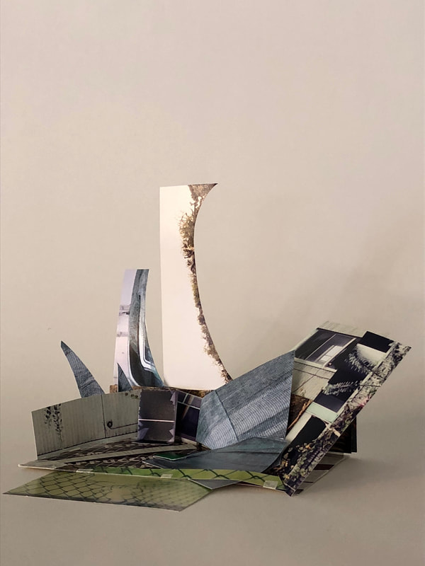
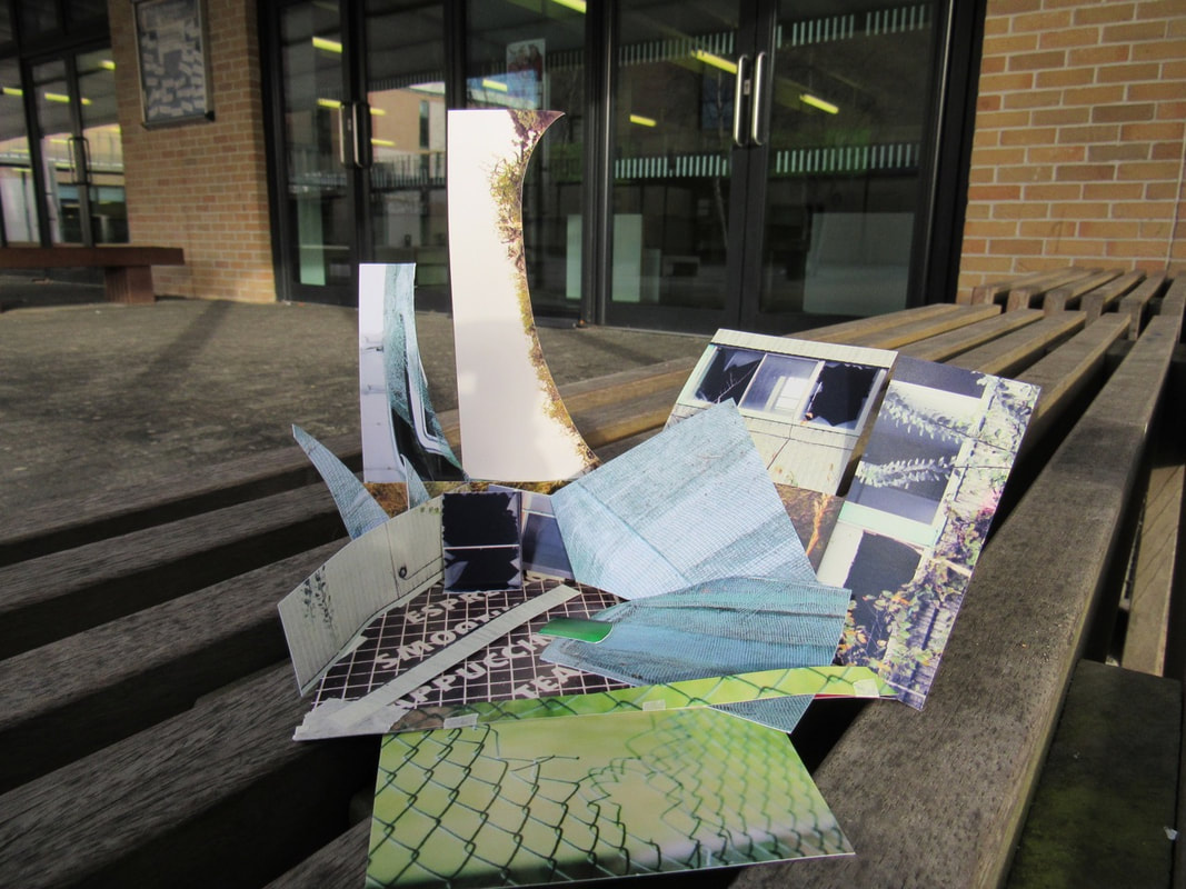
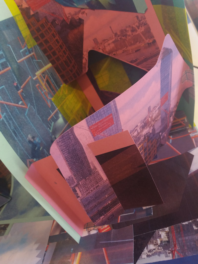
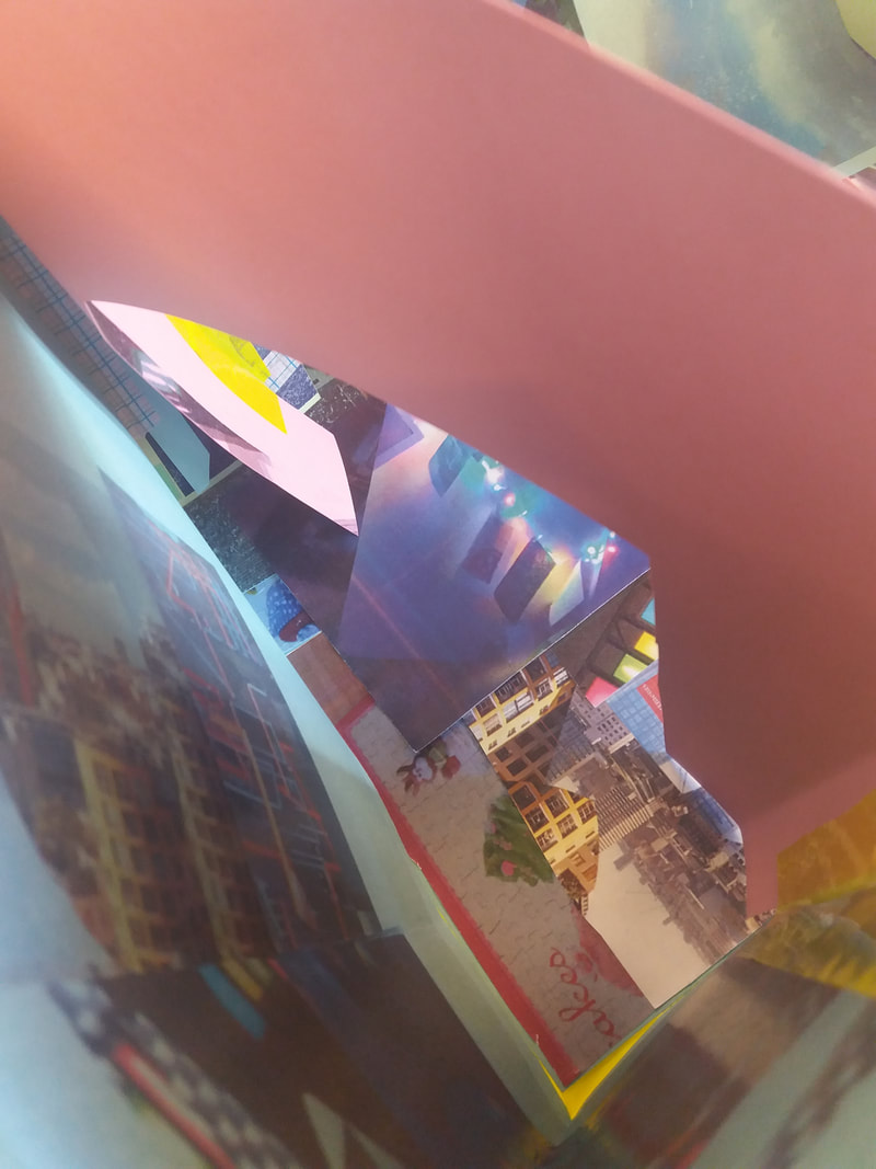
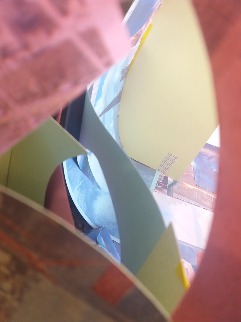
The Making Of My Sculpture
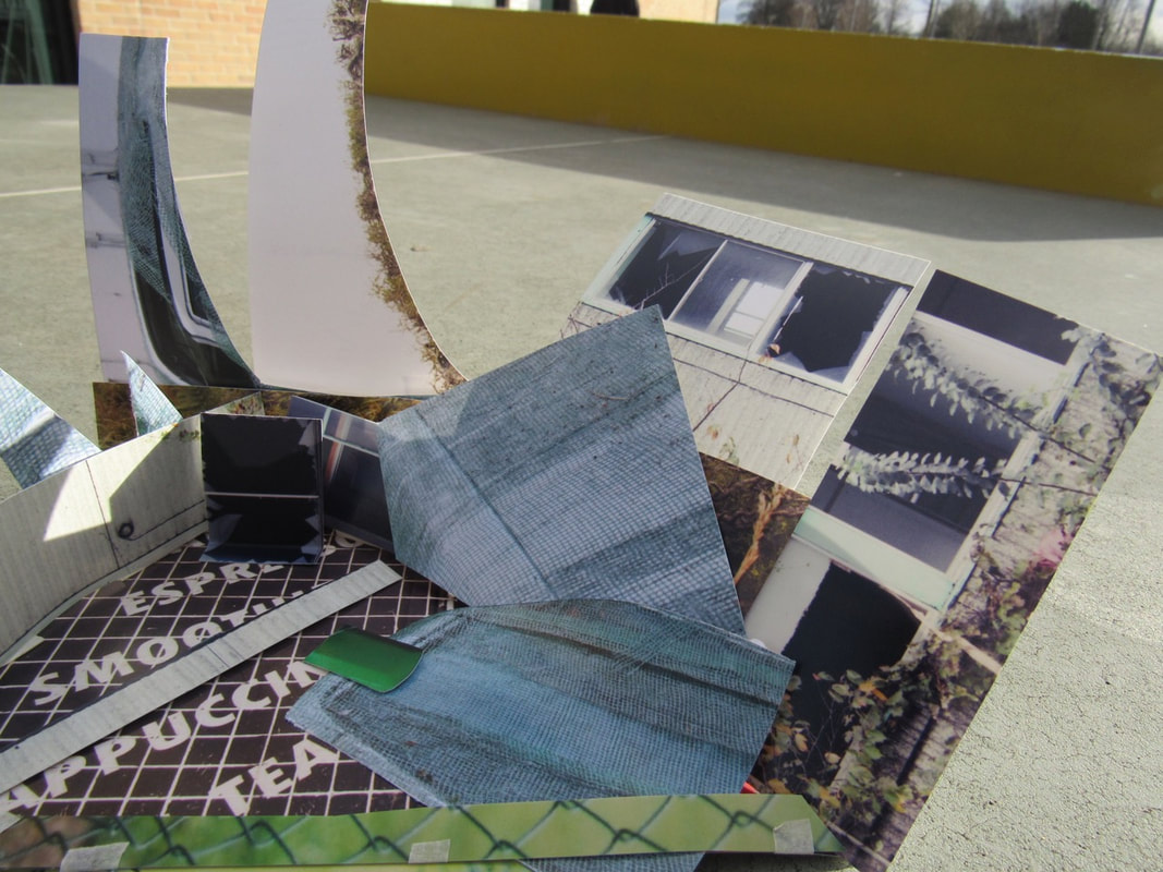
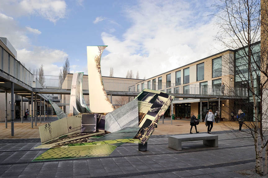
My Finished Product
Evaluation
WWW
I think that I did well especially pushing through things that I found really difficult, I also think that I did really well on my sculpture.My assessment went really well and I really liked working independently because it took all of my attention towards 1 thing not many others and I that worked really well and paid off.
EBI
I think I really need work on my photoshop skills because I find it really hard especially finding all of the little editing tools, also I think I need to work on taking a few more pictures because that would really make my work even better, I also think that I need think a little bit more imaginatively towards my work.
Photograph comparison essay
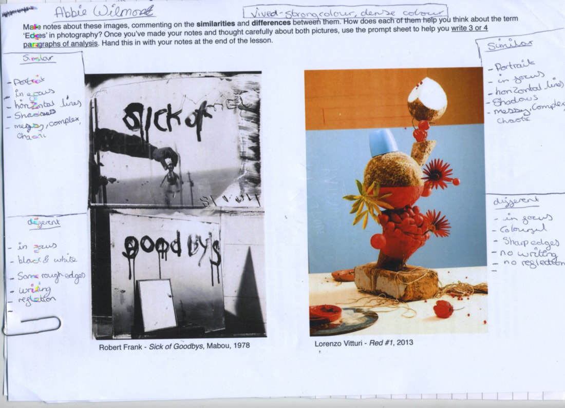
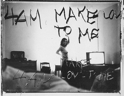
Frank's image has dripping paint which says ''sick of good bys'', also it has a horizontal line, going throughout the middle of the photograph. It also is quite chaotic throughout the whole picture. Vitturi's image has very sharp edges and is placed in a specific way which I really like. It is also a very vivid colour through the whole thing, and it only has a few shadows but there very light shadows so you have to look really closely to see them, and it is really chaotic especially the placing of the spaghetti. Both photographs are portrait and I think Vitturi's image is definitely still life and Frank's image is a mixture of all like still life, portrait and also has collage in it. Frank's image I think it is quite unusual because it has a bit of everything and there is no specific genre to give it but in Vitturi's picture you can easily say its a still life.
The similarities are that there portrait, in focus, horizontal lines, shadows and are very chaotic and complex. The differences are that there in focus, Frank's is in black and white and Vitturi's is in vivid colour, Frank's is rough edges and Vitturi's has sharp edges, Frank's has writing and Vitturi's has none and there is also a lot of refection in frank's. Vitturi's image is made using fruit and still life objects but Frank's image is used out of paint on a mirror and the rest is mostly the reflection behind the camera. In Frank's photo the texture is really roughened the shapes are really abstract which is really interesting, but in Vitturi's image it has a lot of texture and different shapes and that makes it really interesting and catchy. In Vitturi's image the space is in the middle ground and in Frank's the photo is in foreground and middle ground. In Frank's image the dripping paint is most interesting but in Vitturi's photo all of the organic fruit and how it is placed strikes my attention.
In Frank's image I can see a lot of edges especially the shadows and the edges of the dripping writing. In Vitturi's photo I can see a lot of sharp edges from the flowers and the edge of the fruits. If I got to talk to both artist i would ask Robert Frank why did you choose to use paint not pen? and is there a reason why you spelt goodbys wrong? and for Lorenzo Vitturi I would ask him where did you get all the fruit from? and where did you get the idea of putting spaghetti all over the table?
I would give Frank's image a new name of ''dripping reflection'' because of the dripping paint and the detail of the reflection behind the camera itself. I would give Vitturi's photo a new name of ''chaotic red'' because the whole picture is really chaotic and because of the red that is produced in the image. If I was inside Vitturi's image i would feel scared because i wouldn't want the sculpture to fall and i would feel dirty because of all the spaghetti. If I was in Frank's photo I would feel dark because of the amount of shadows that are made and because there strong shadows it would give the whole room an affect. I think made those type of images is because there different to other photos but especially in Frank's image you have to work out where those other objects are coming from. Maybe in Frank's image he might of gotten that idea from writing on a mirror and it smudging down or over the whole entire mirror and maybe for Vitturi's image he might of gotten the idea from a staking of fruit which might of triggered his brain to think of that idea. I think in Frank's image he might be saying a loved one might of passed away or something else like an illness and in Vitturi's image maybe saying dont worry about being messy and just do it.
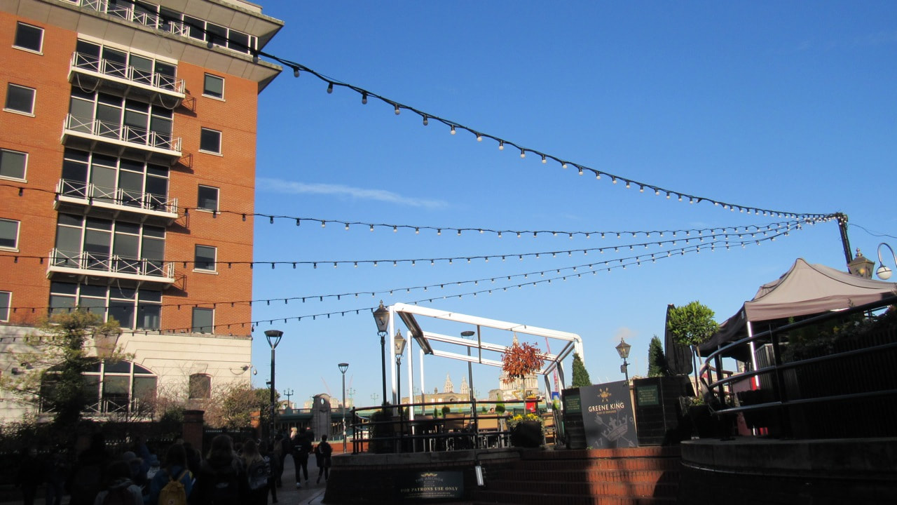
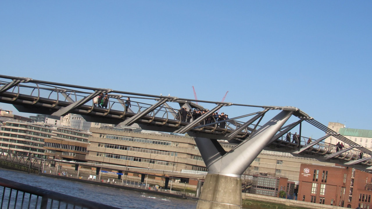
for my 7 week project I have chosen to the theme 'edges'
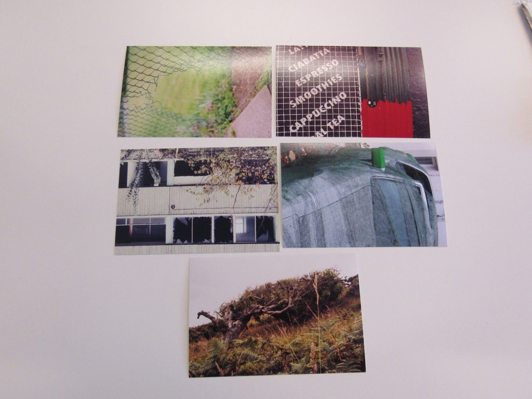
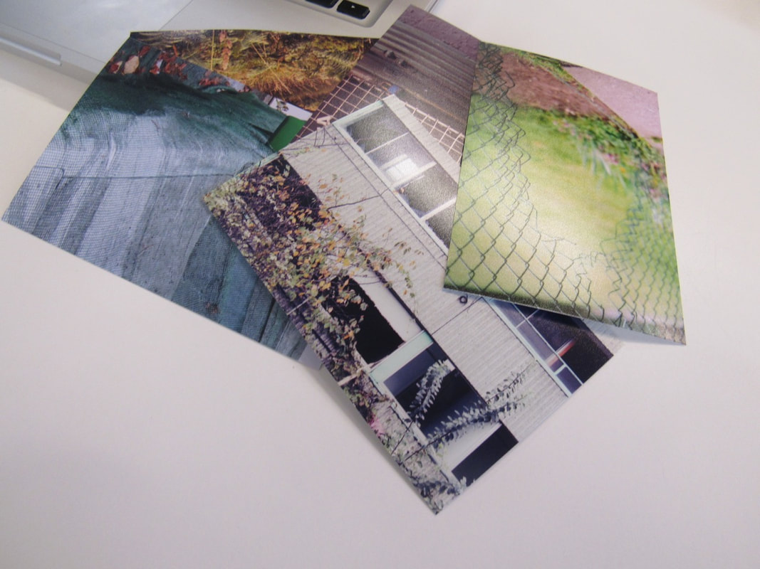
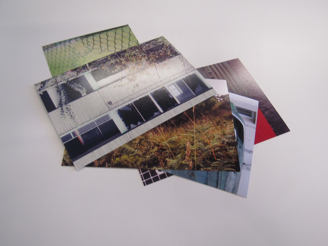
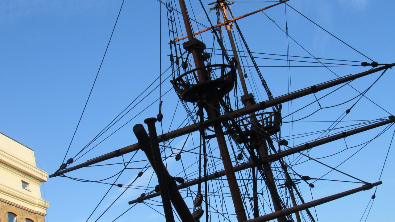
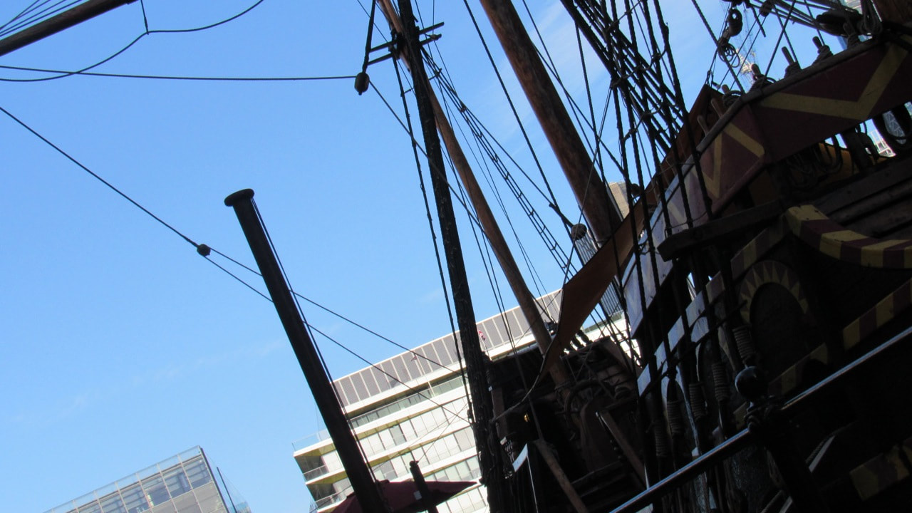
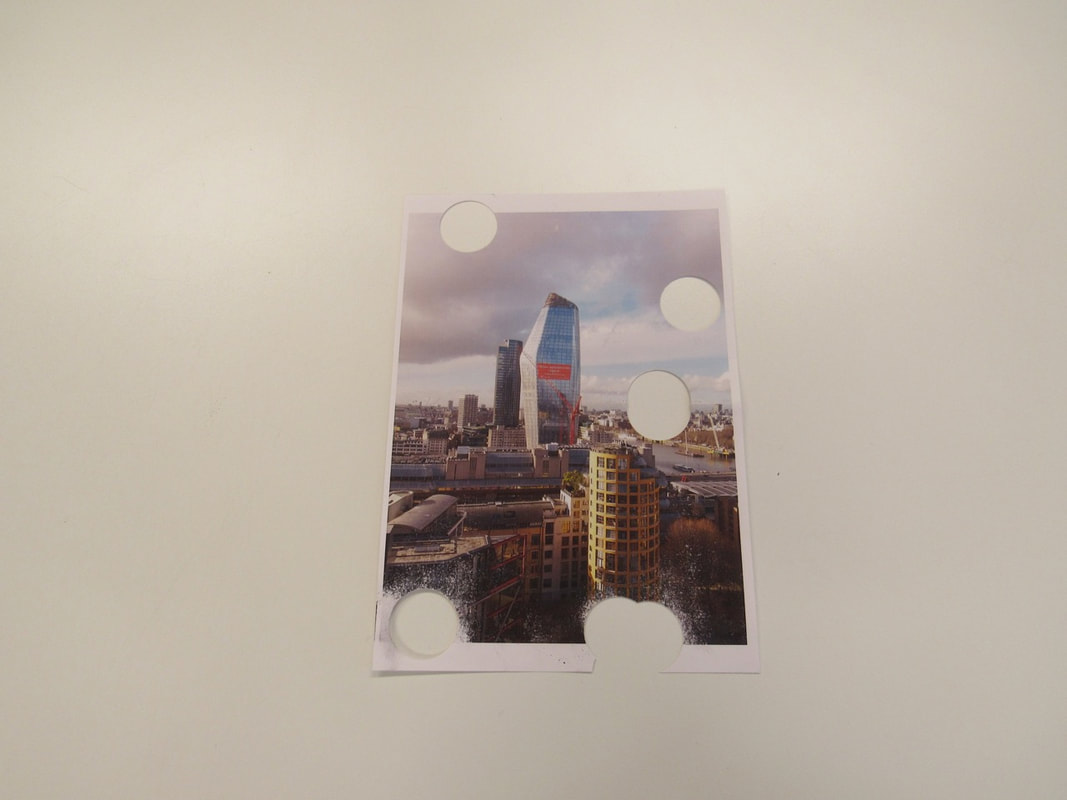
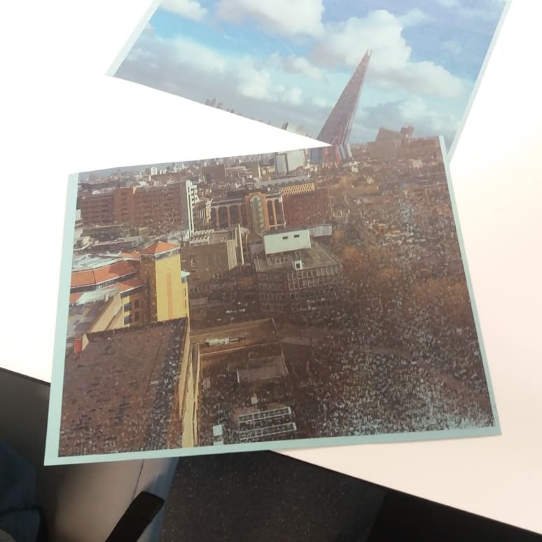
examples of edges photographs
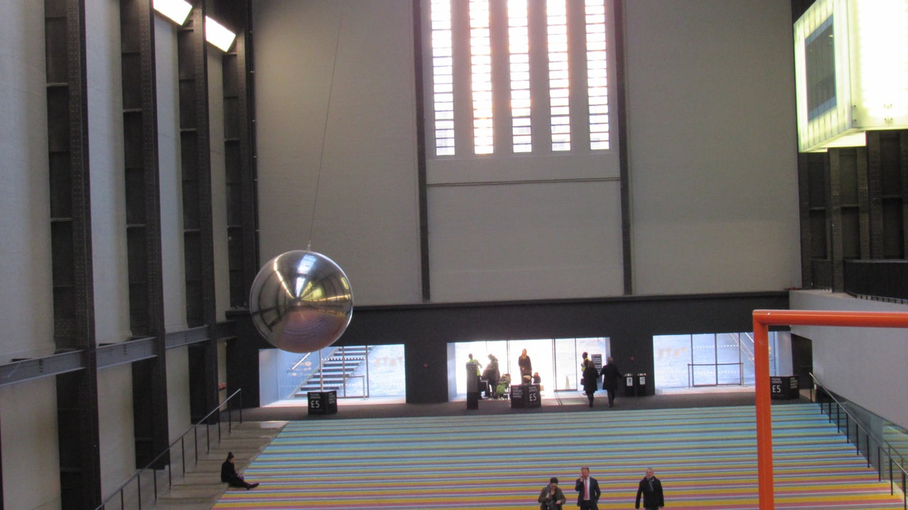

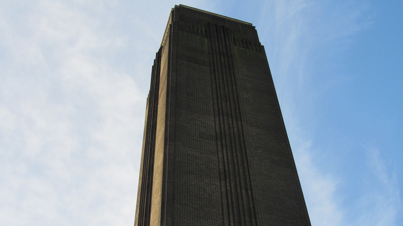
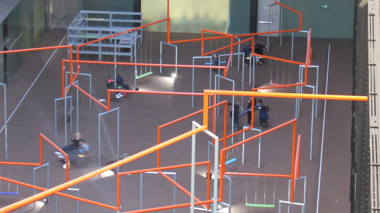
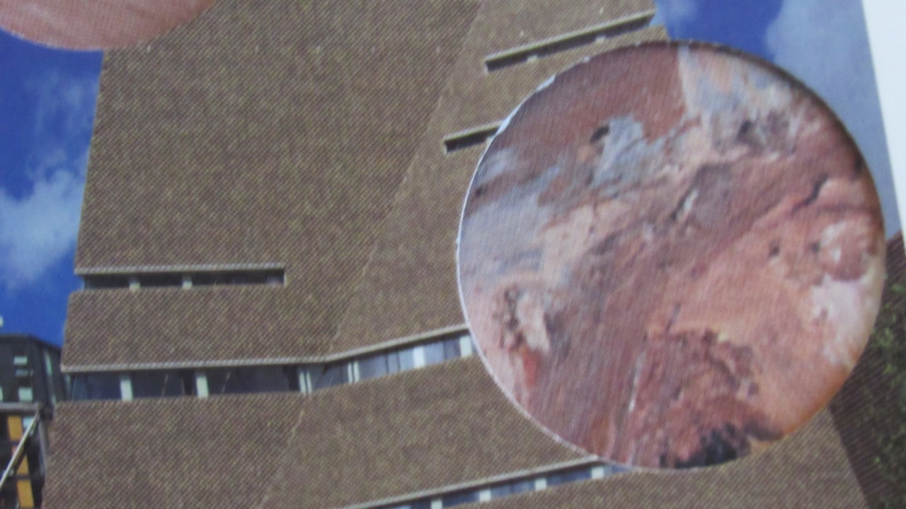
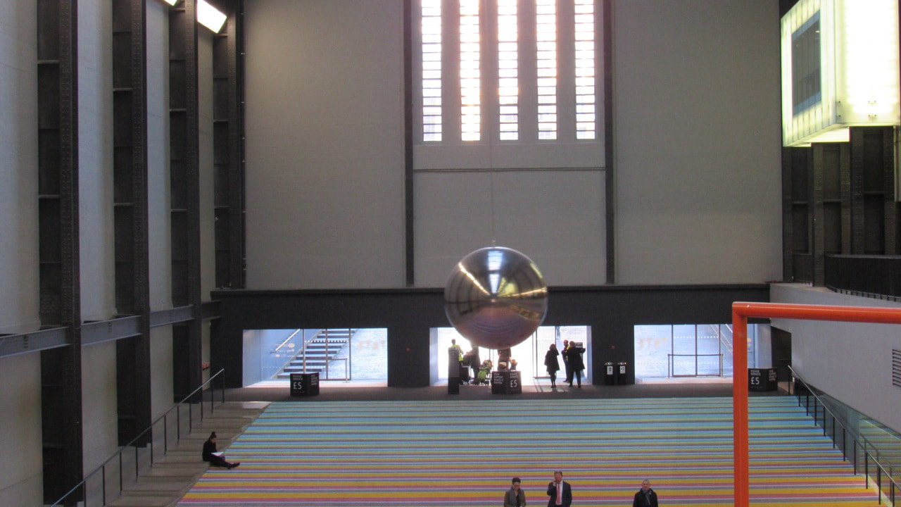
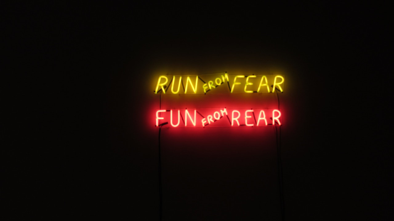
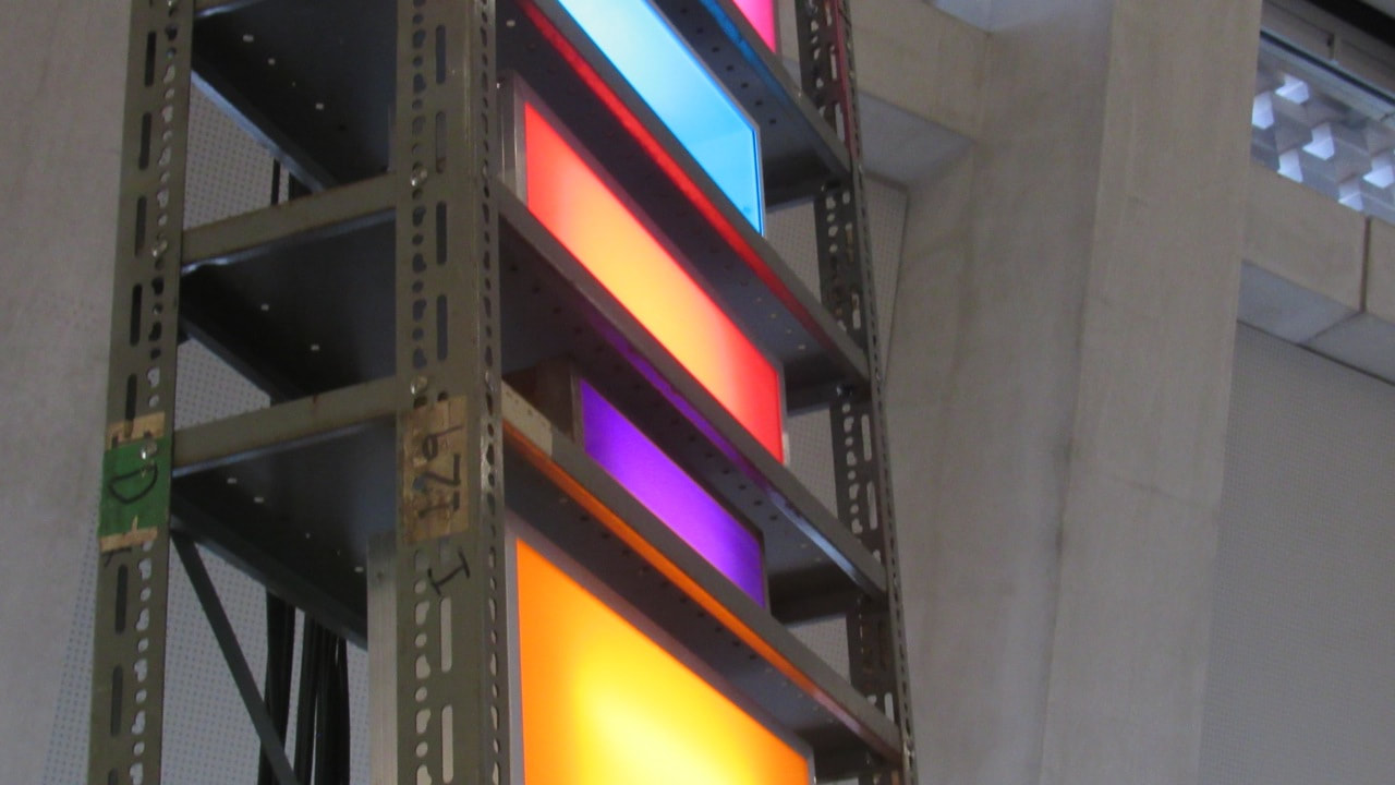
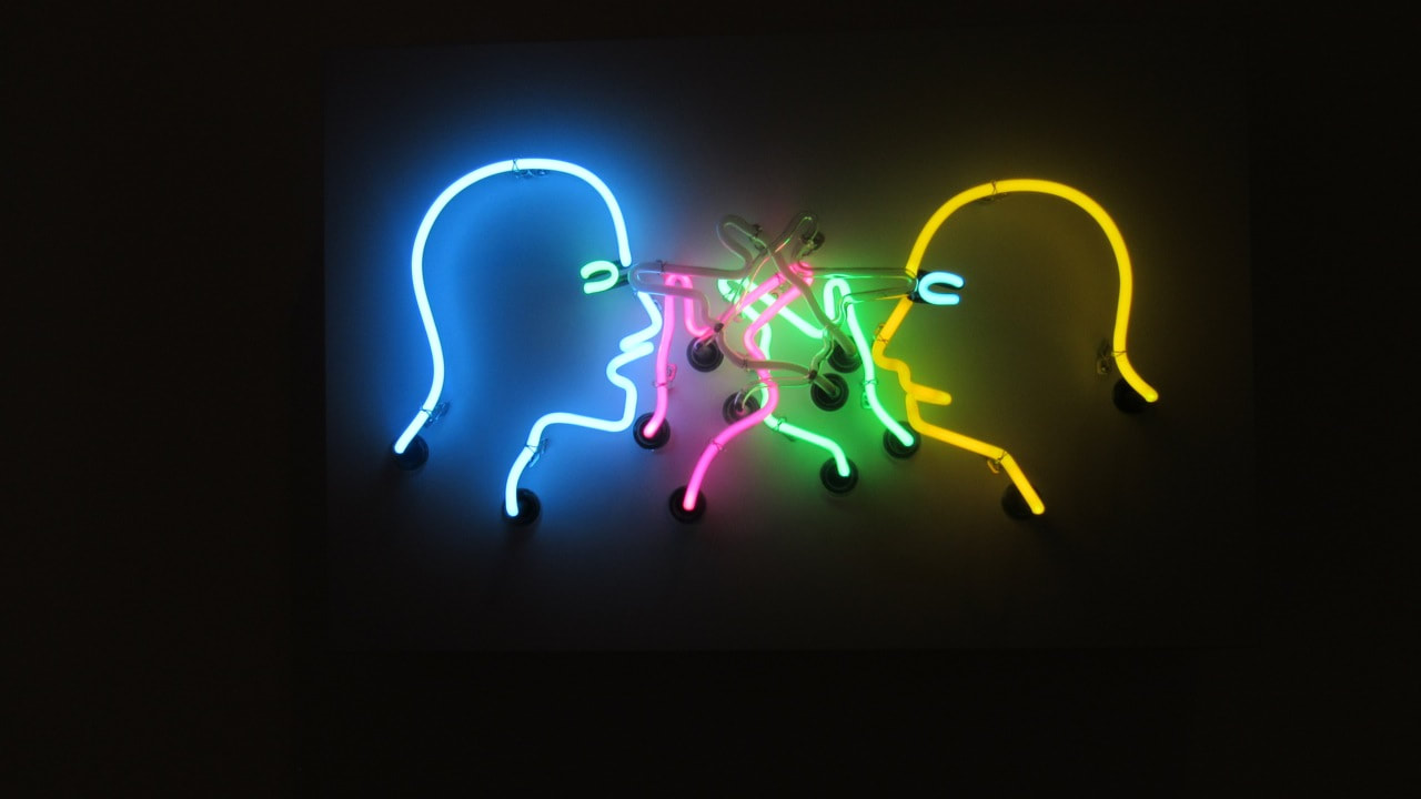

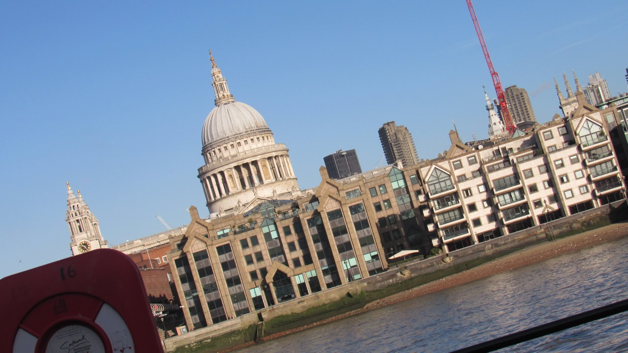
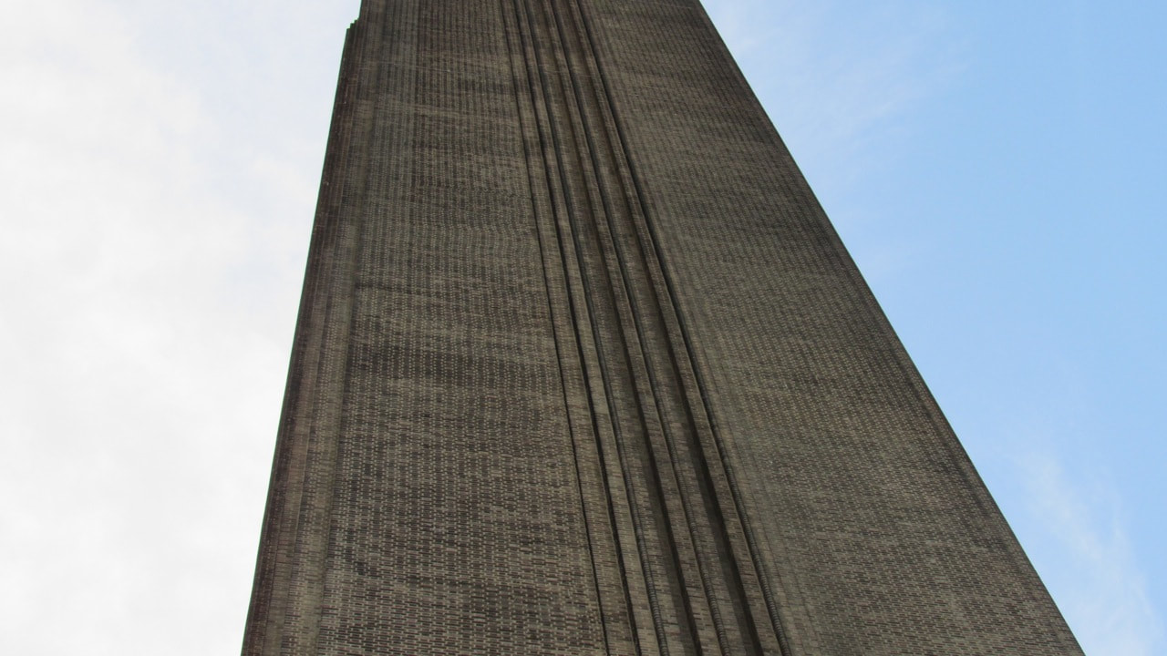
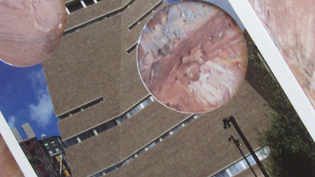
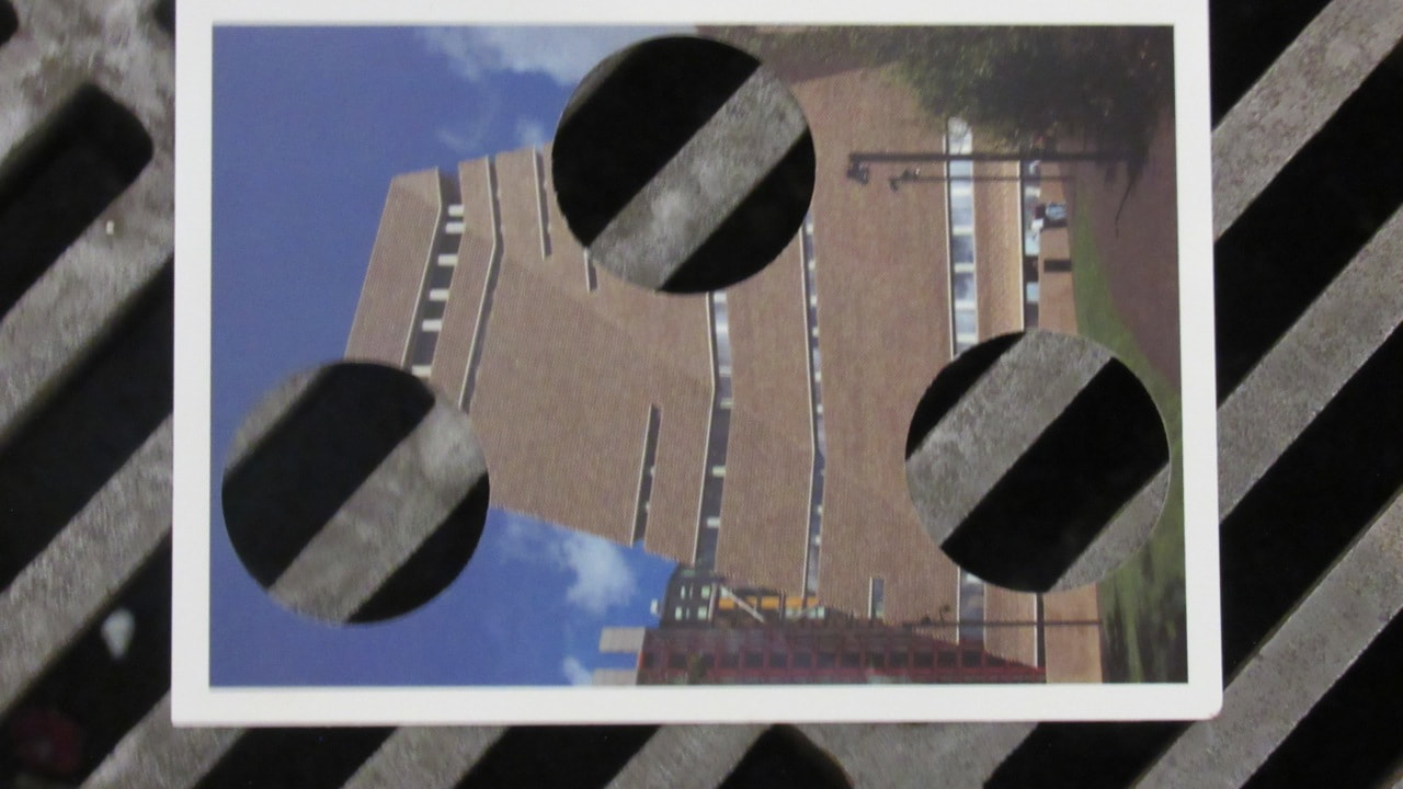
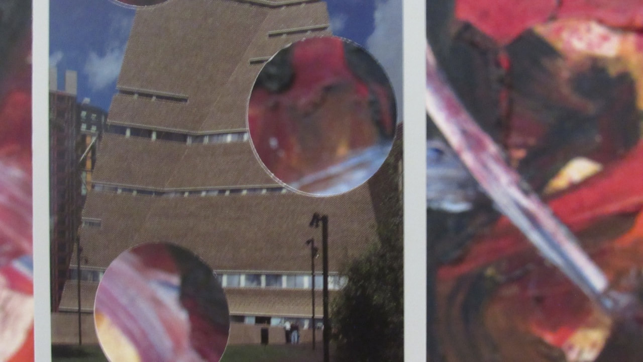
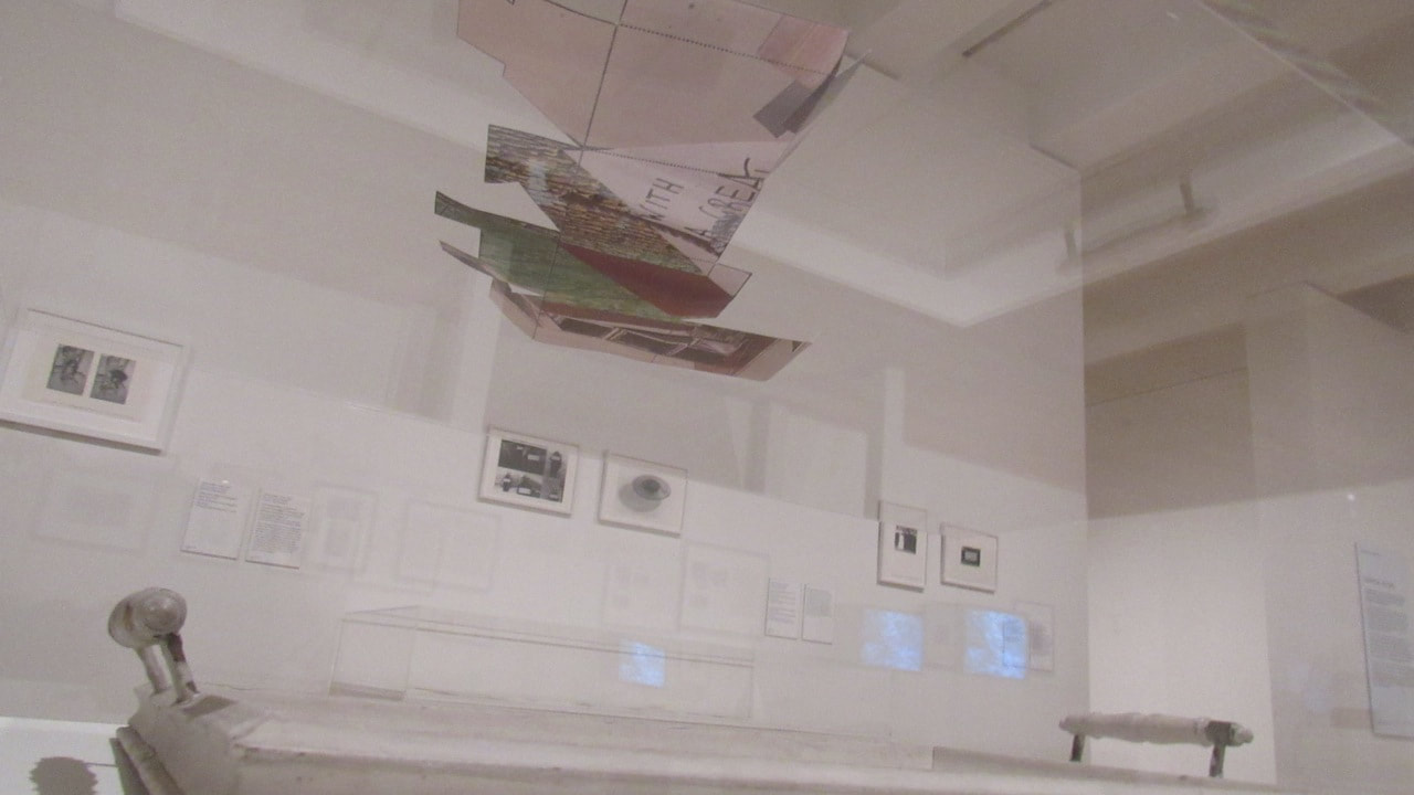
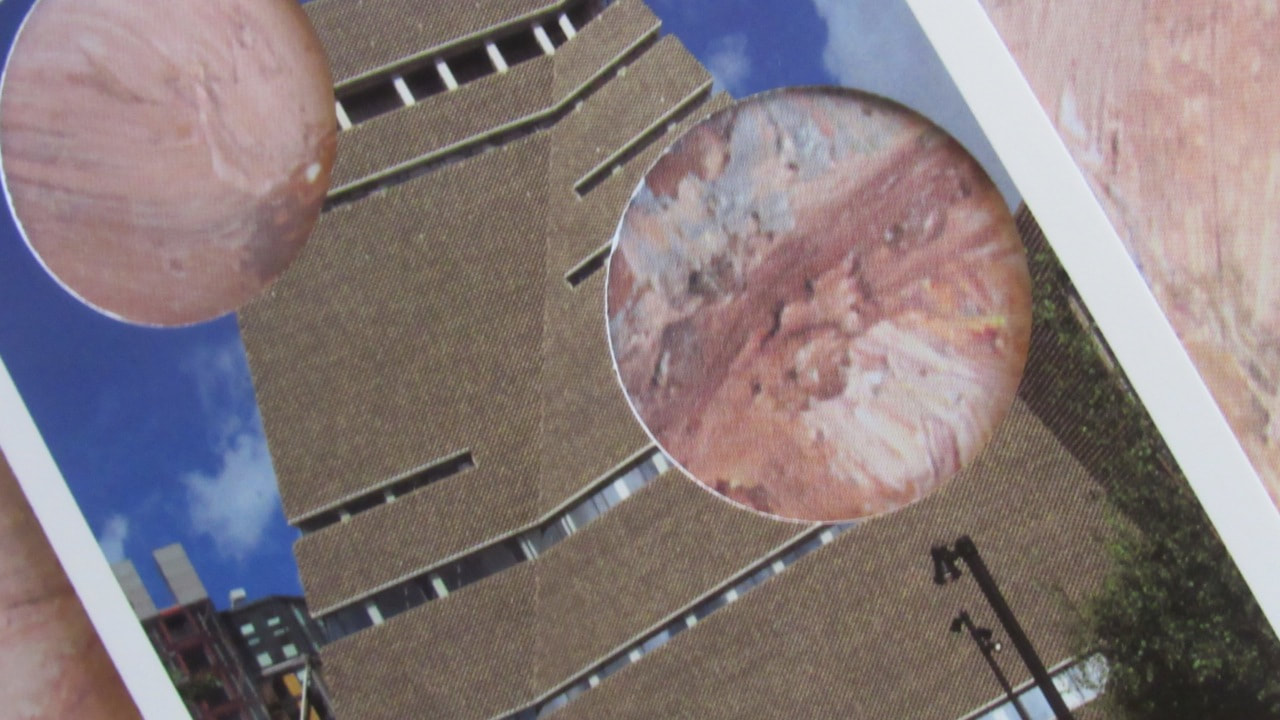

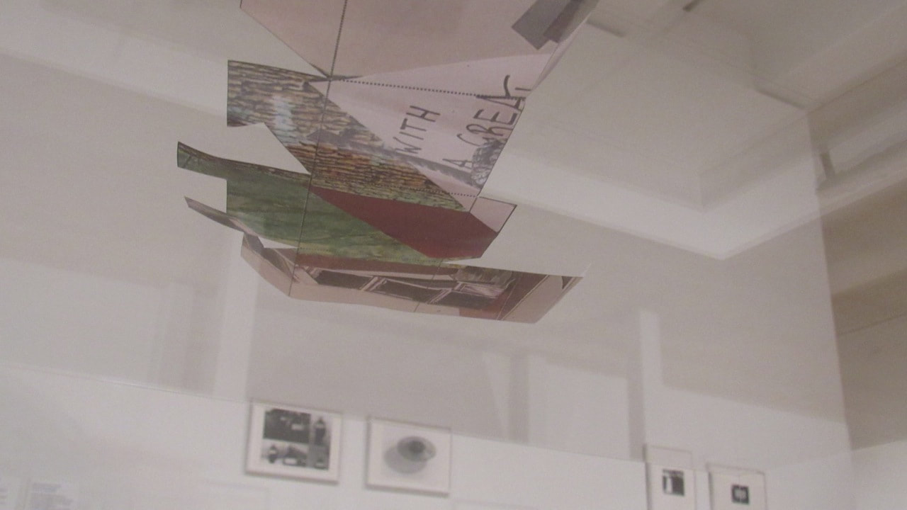
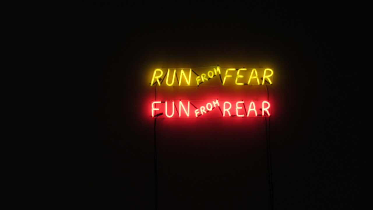
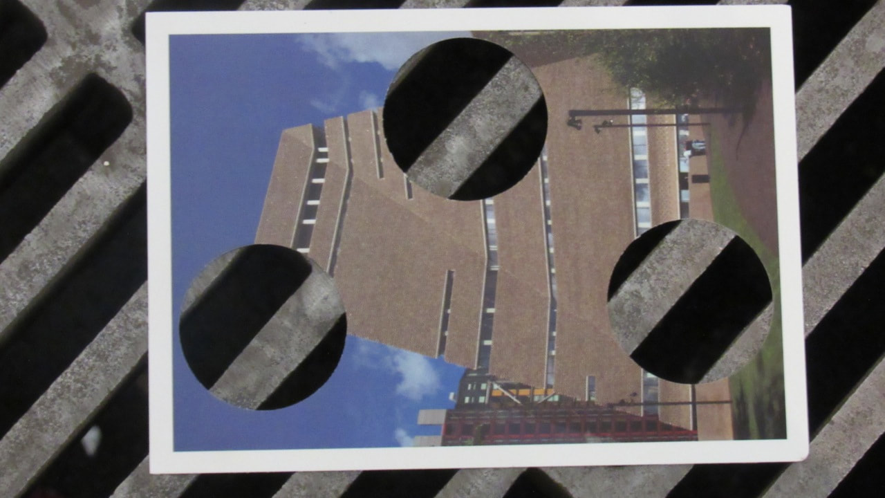
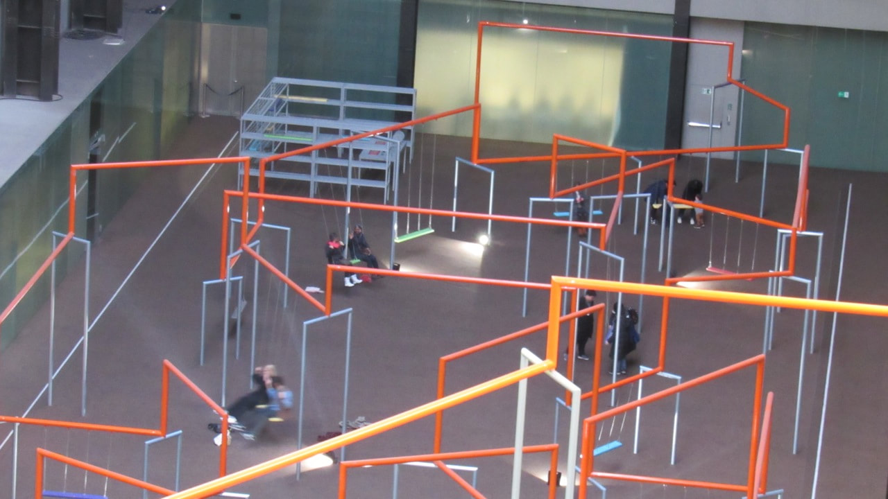
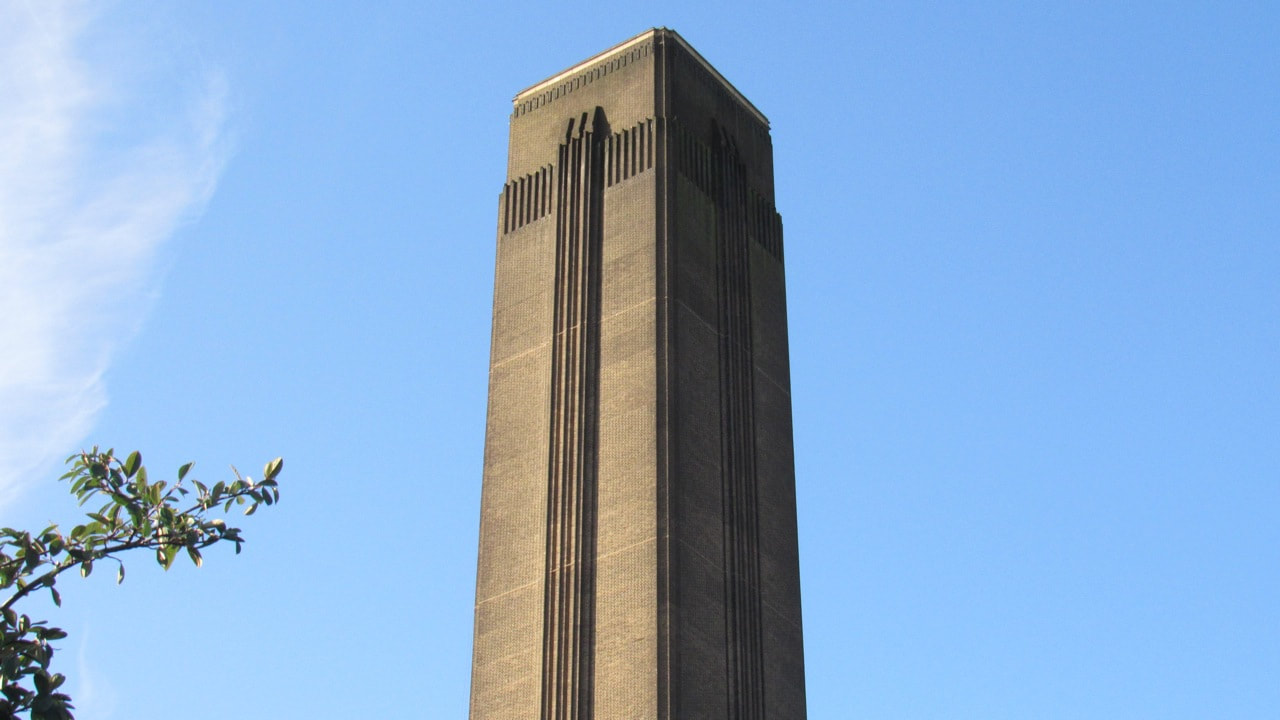
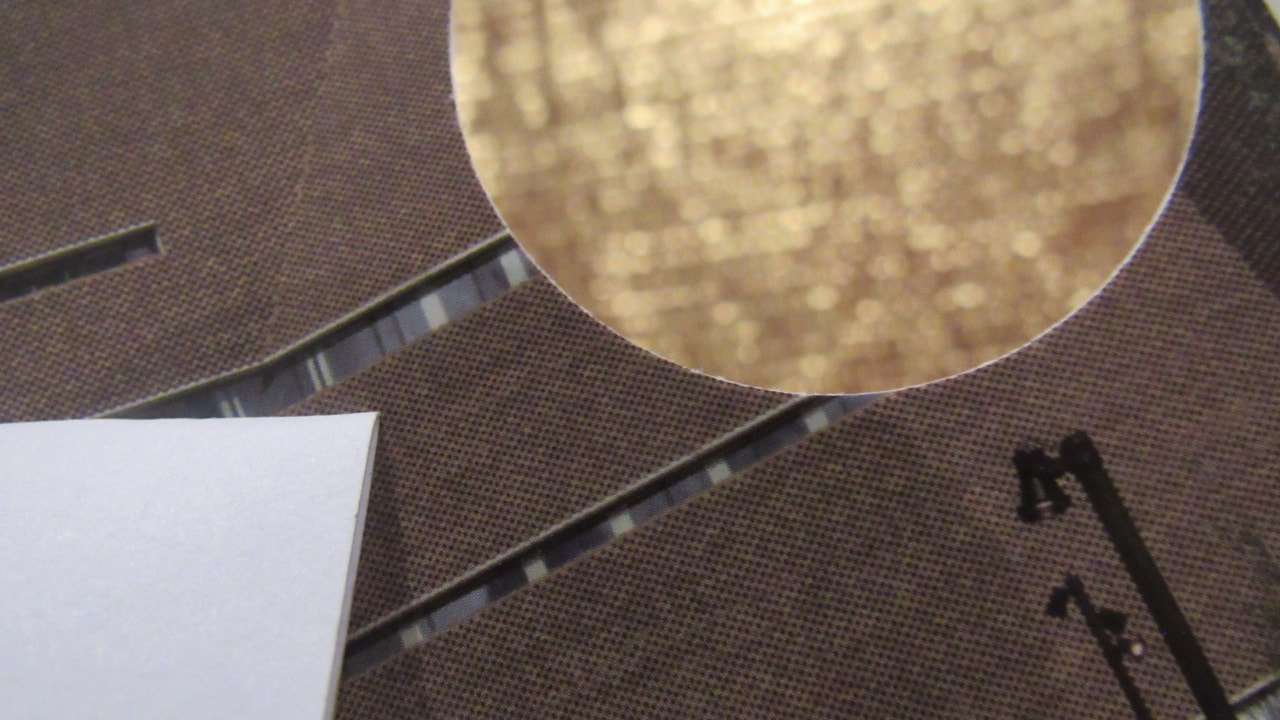
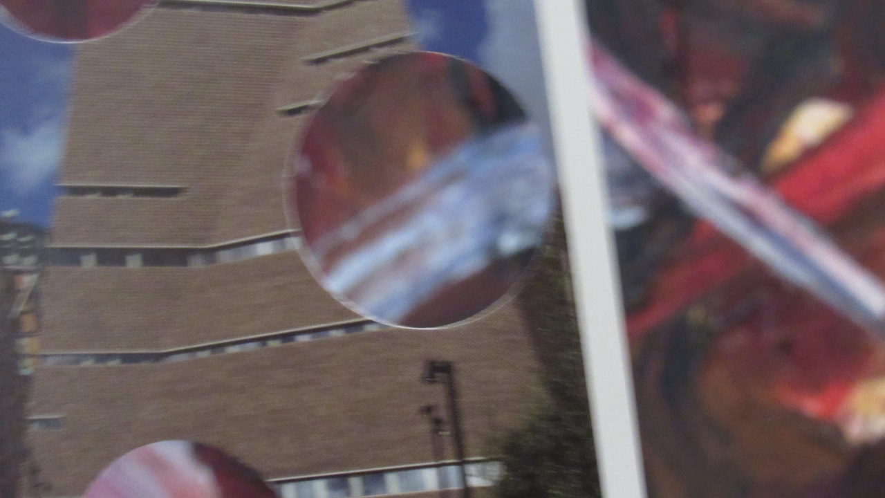
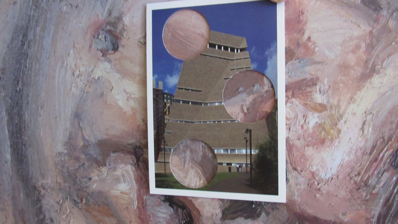
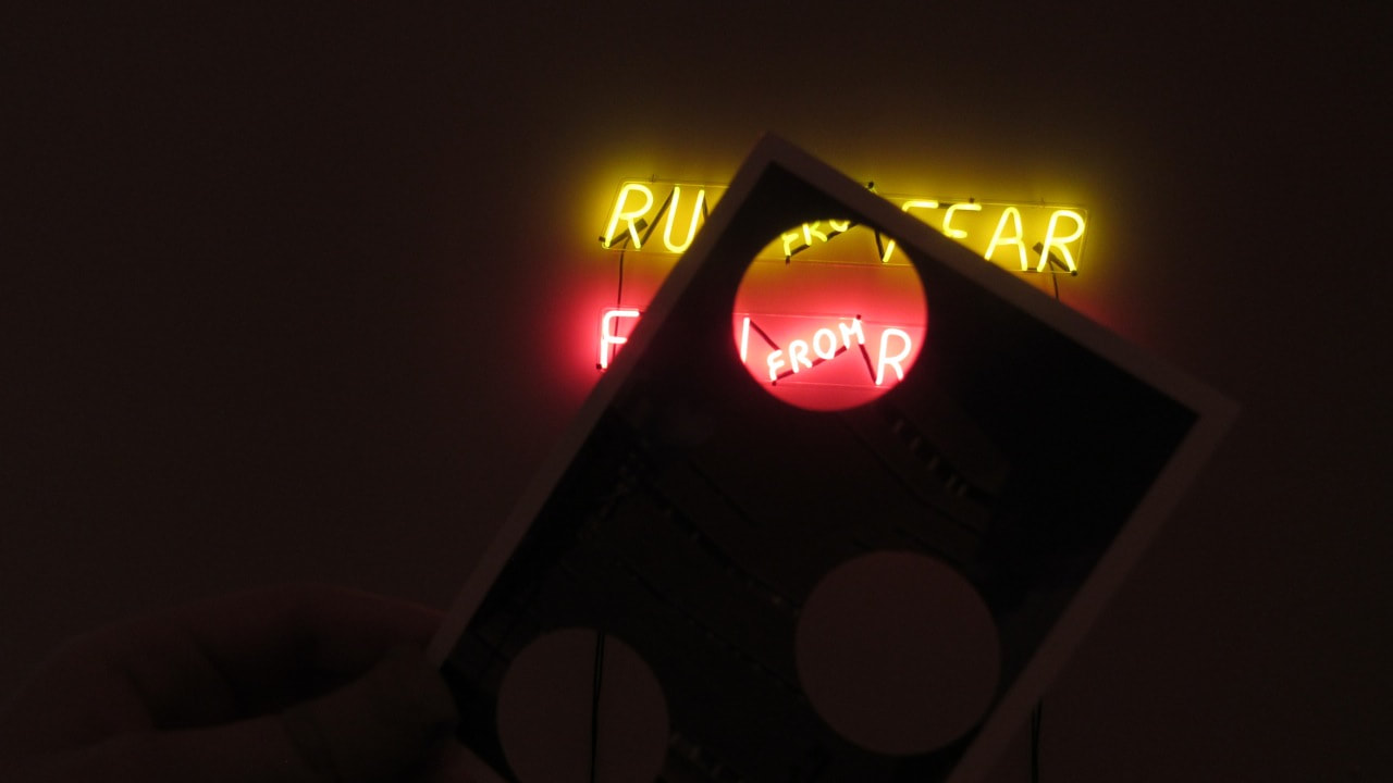
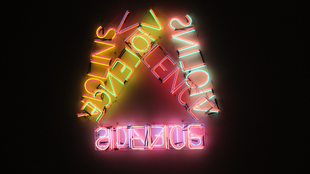
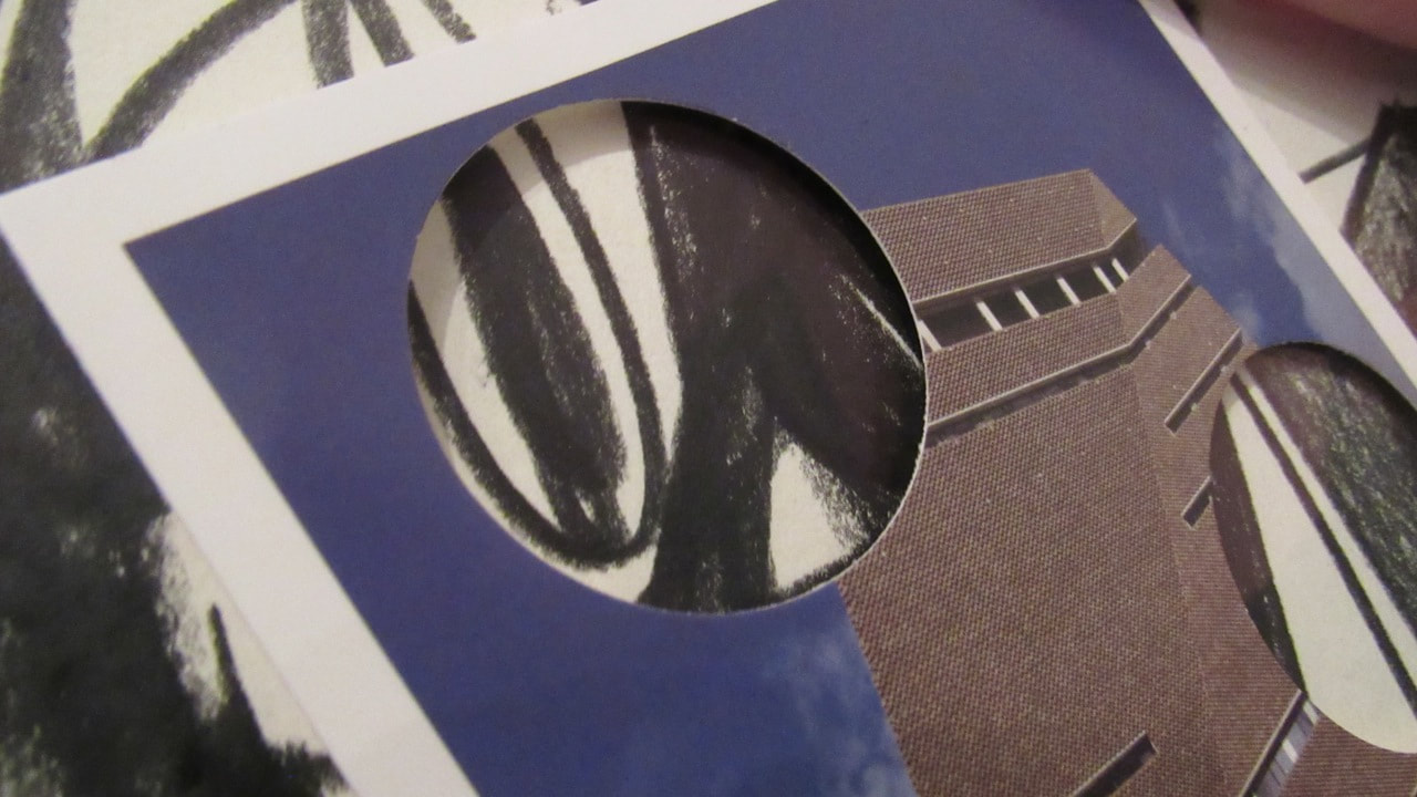
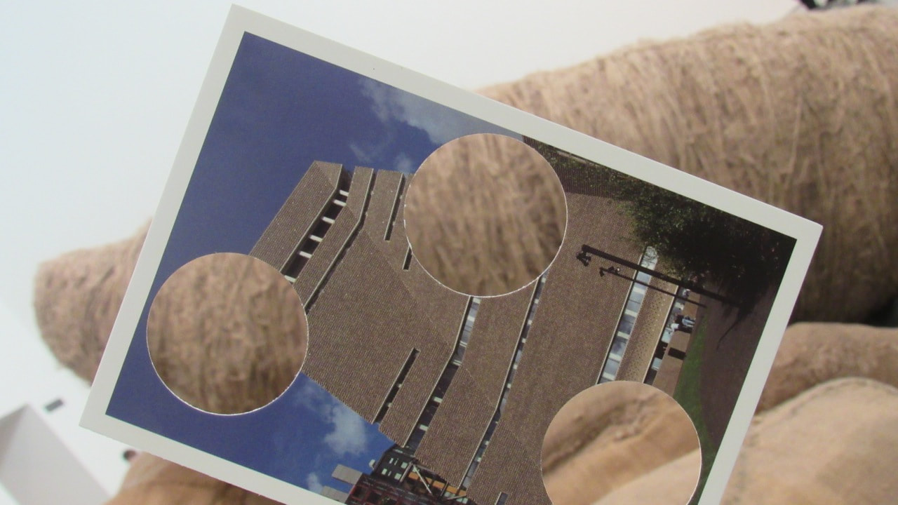
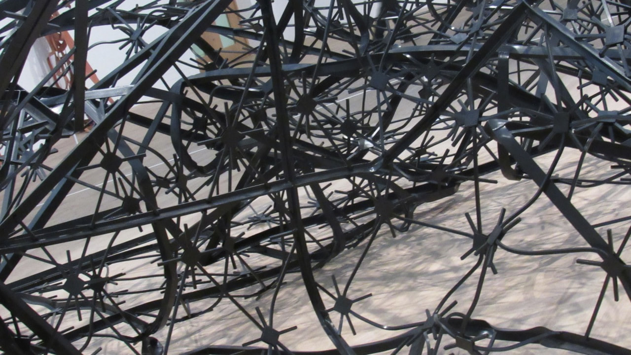


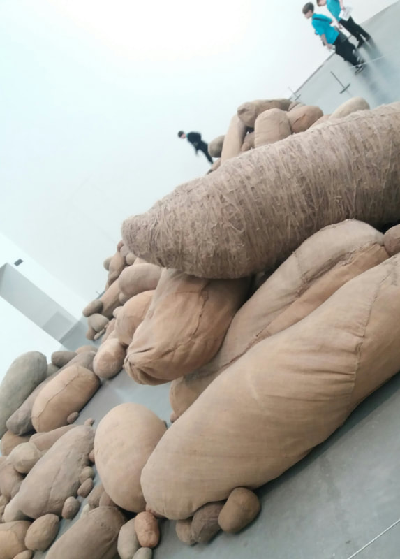
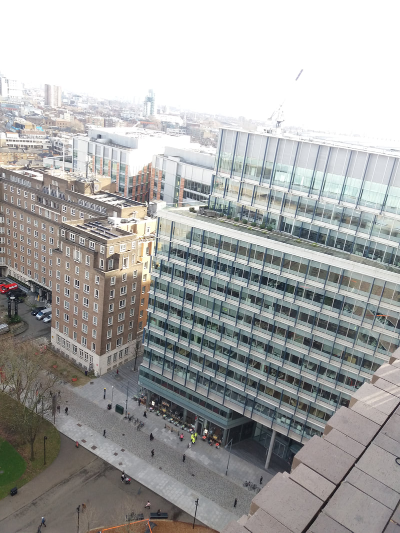
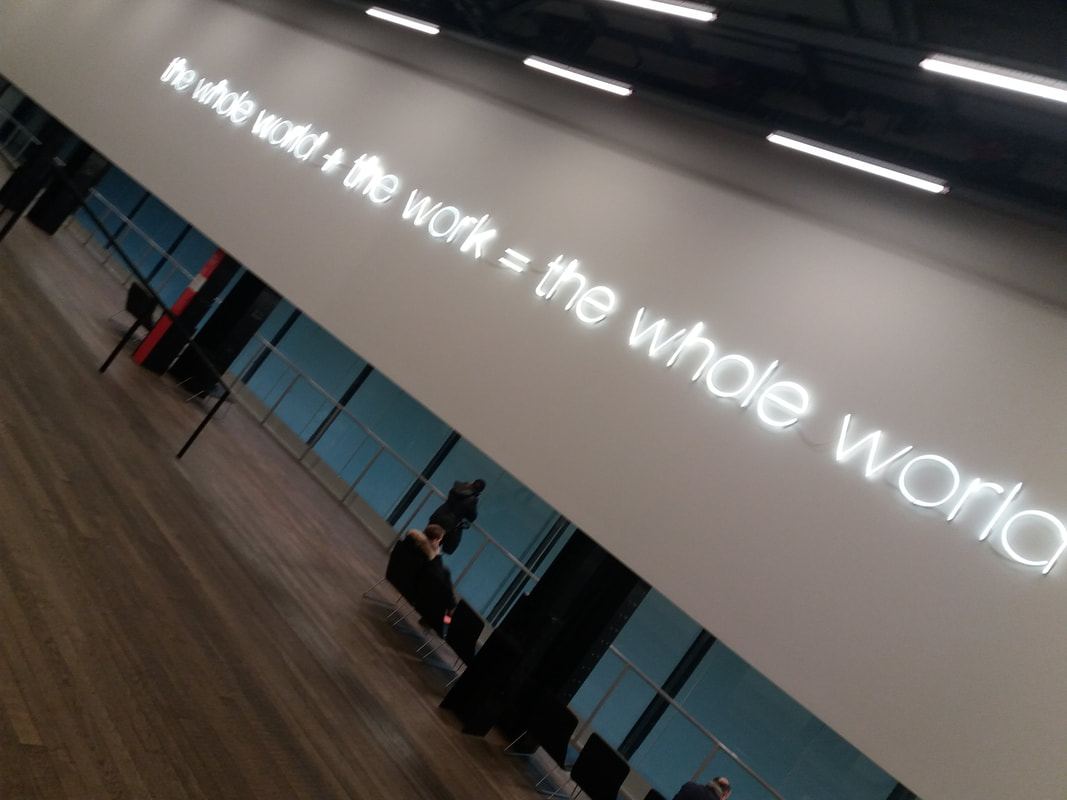
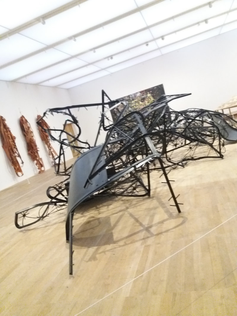
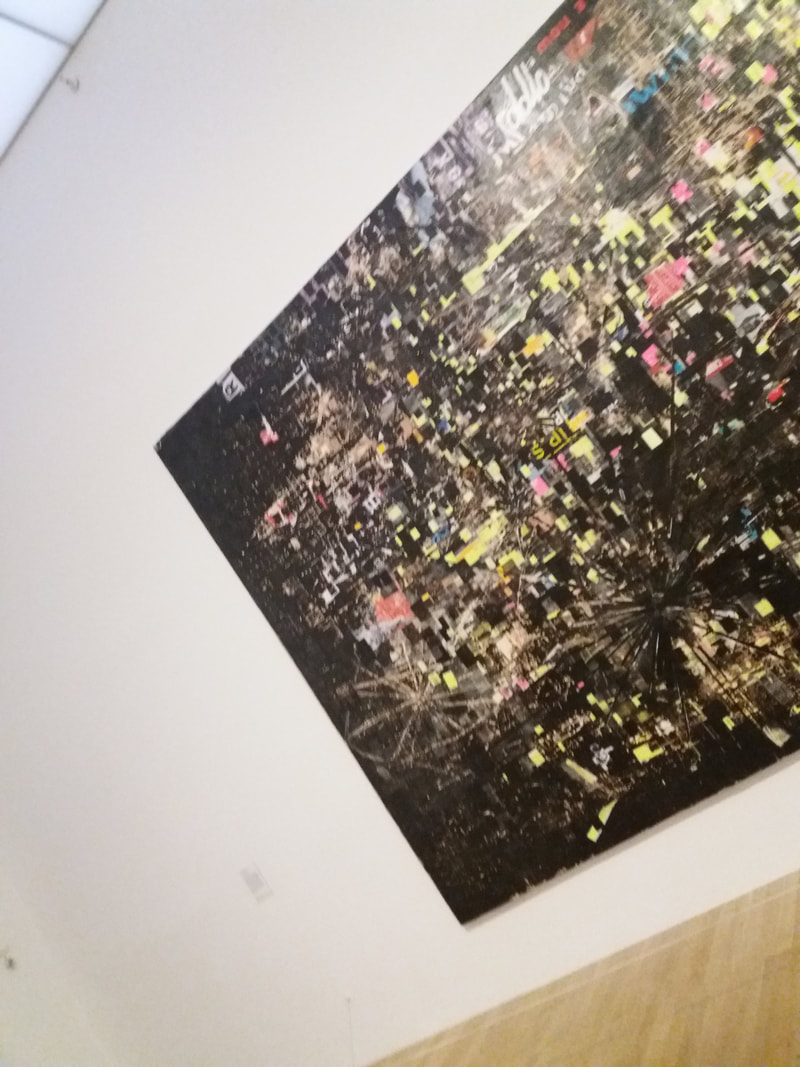
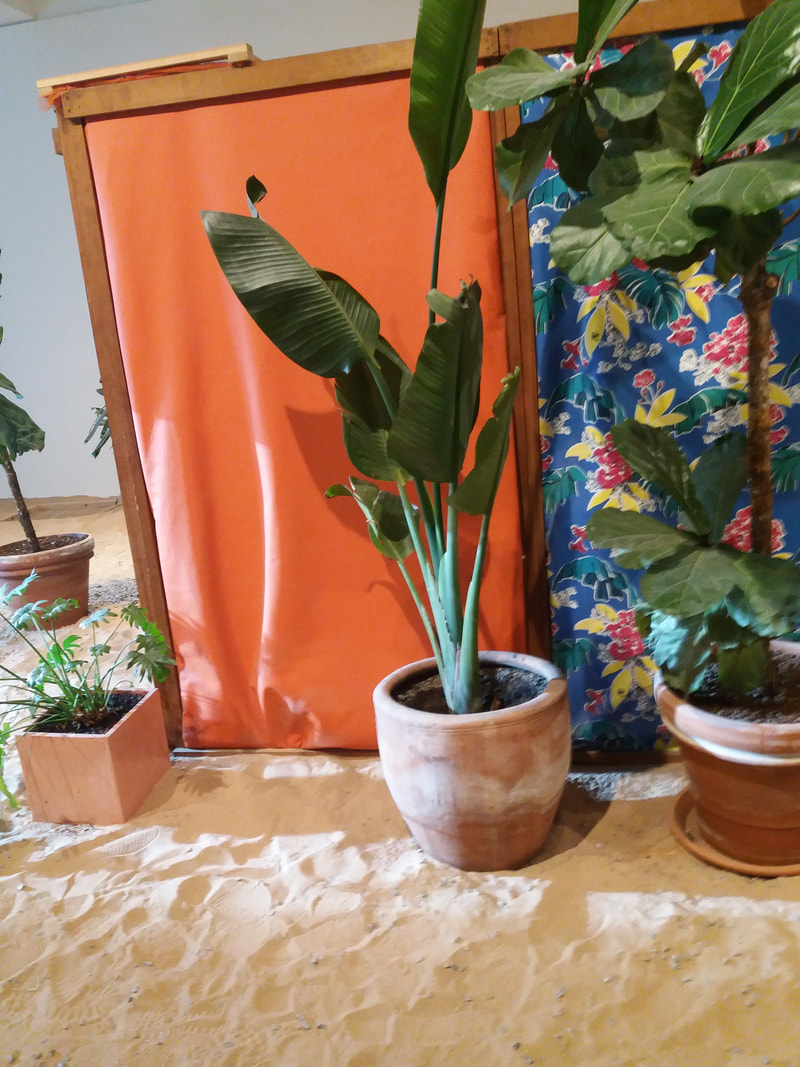
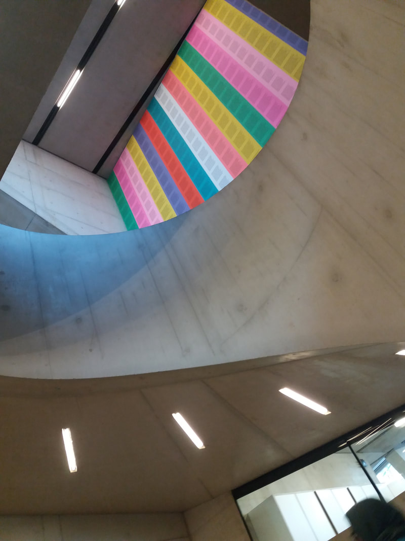
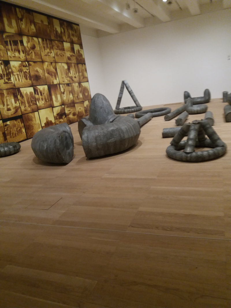
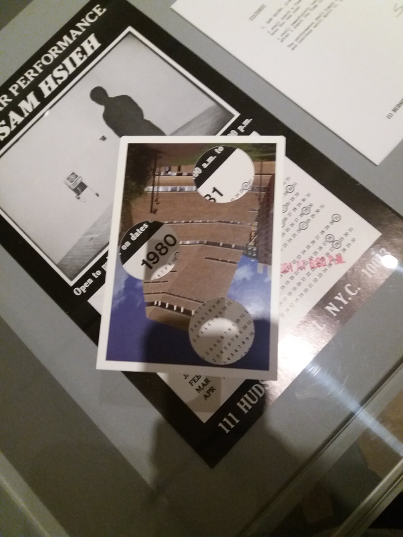
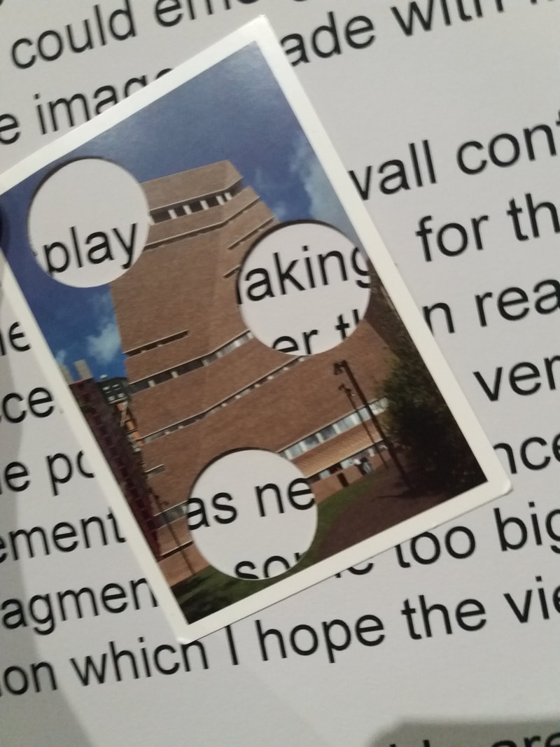
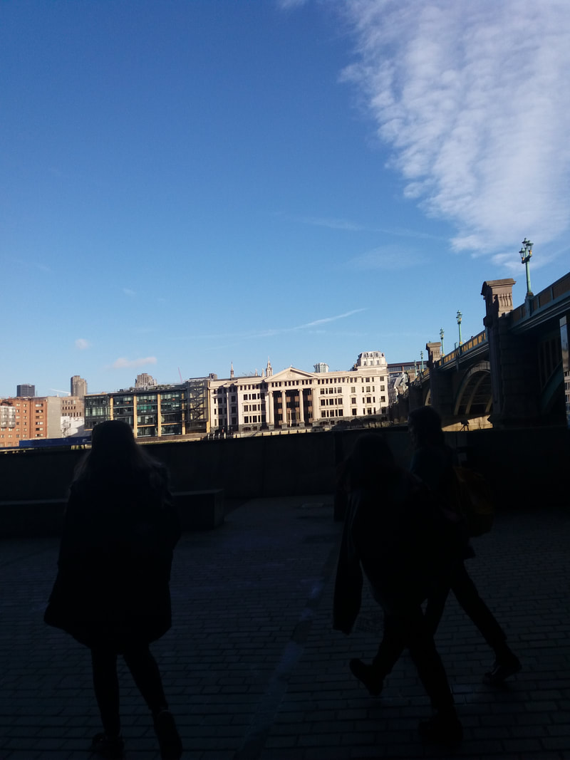
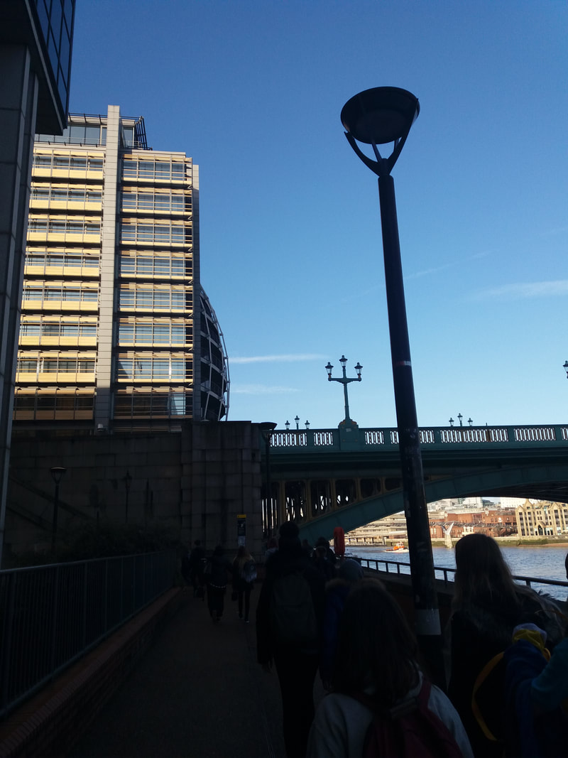
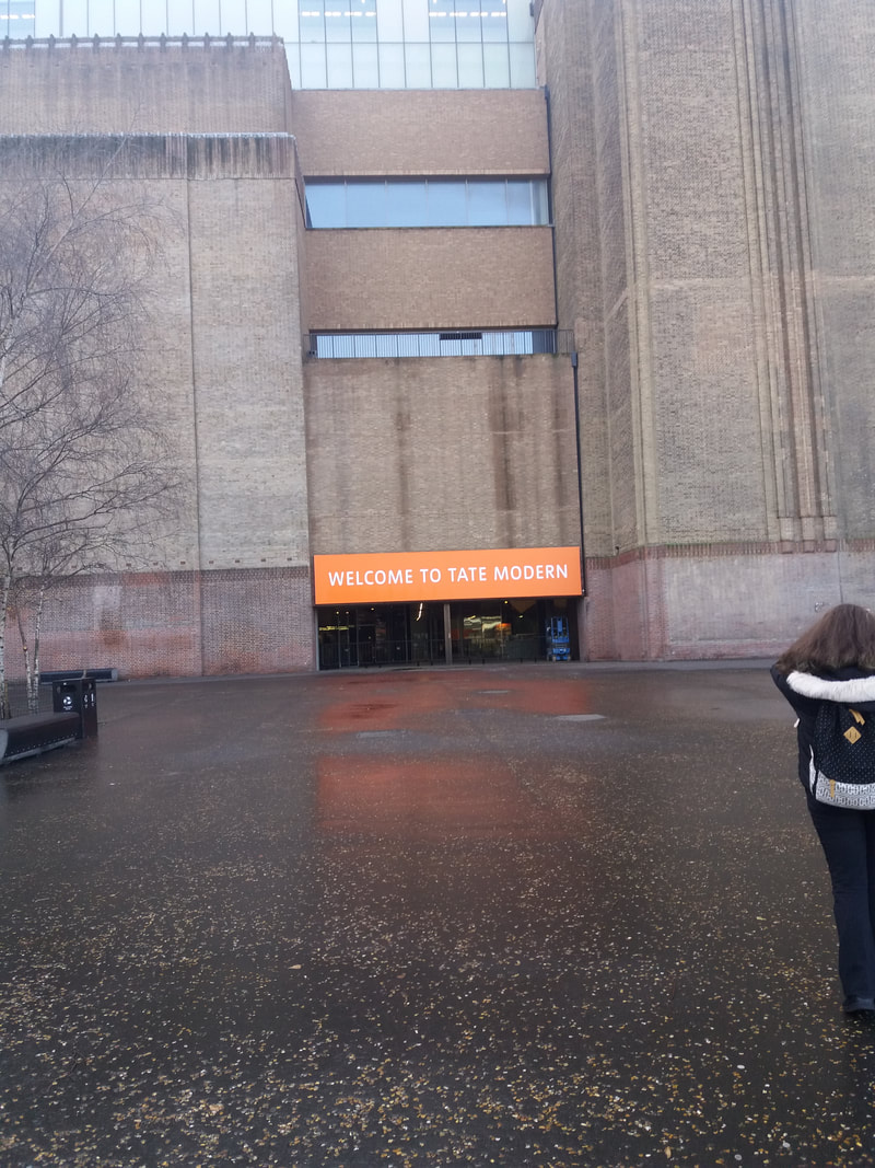
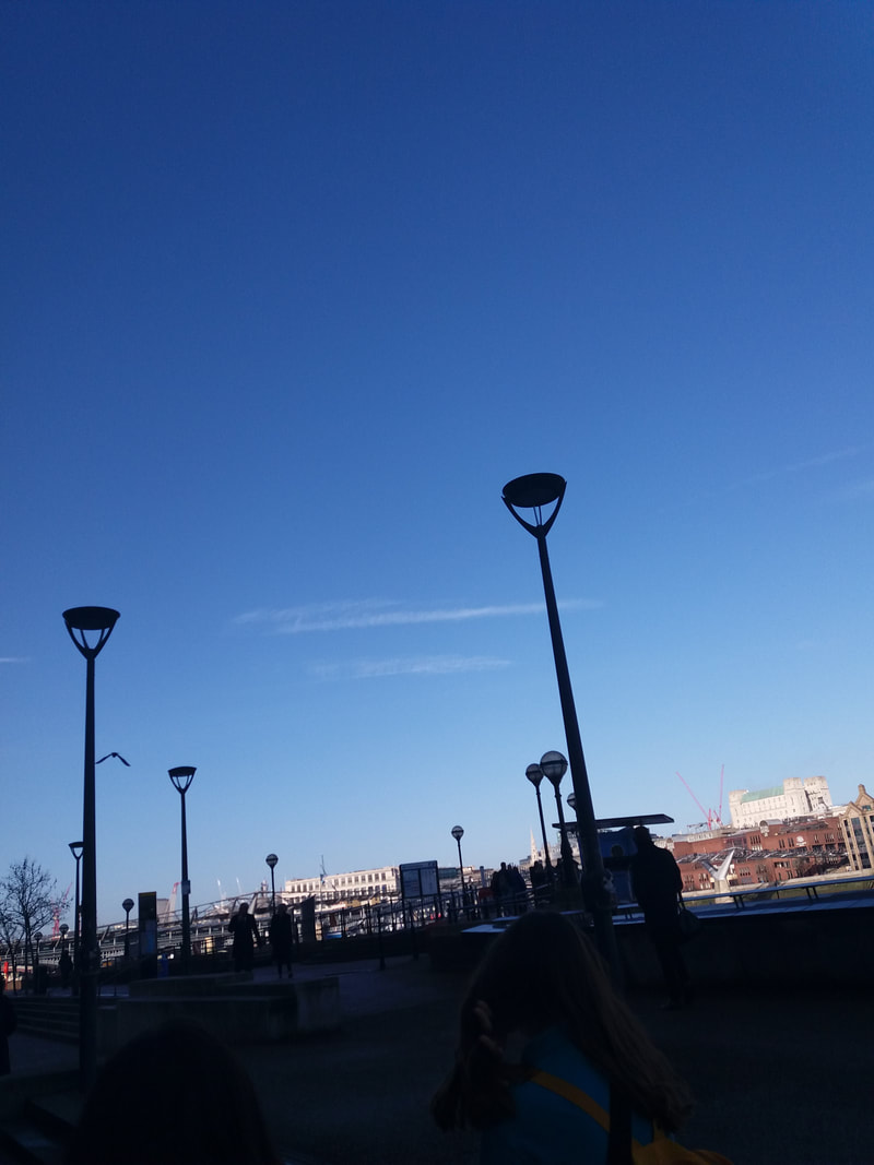
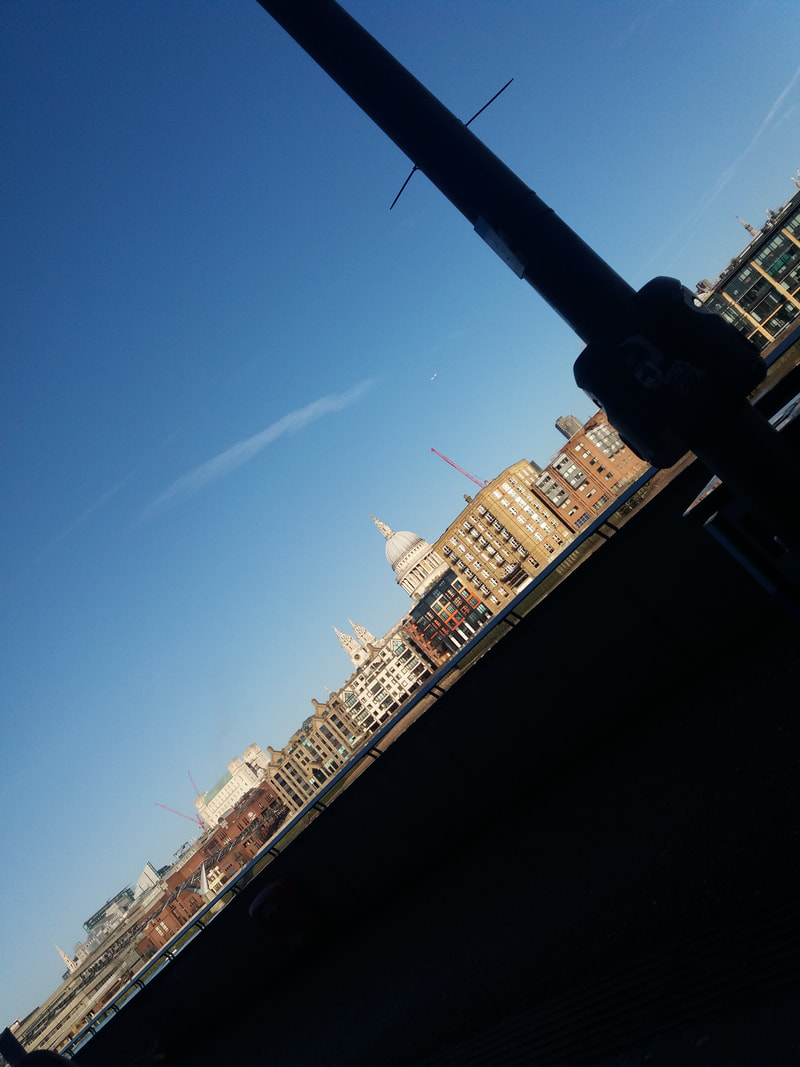
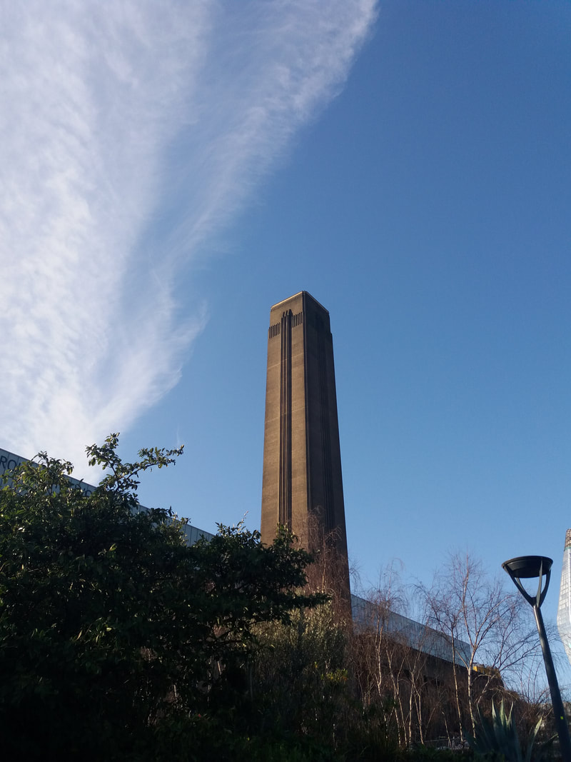
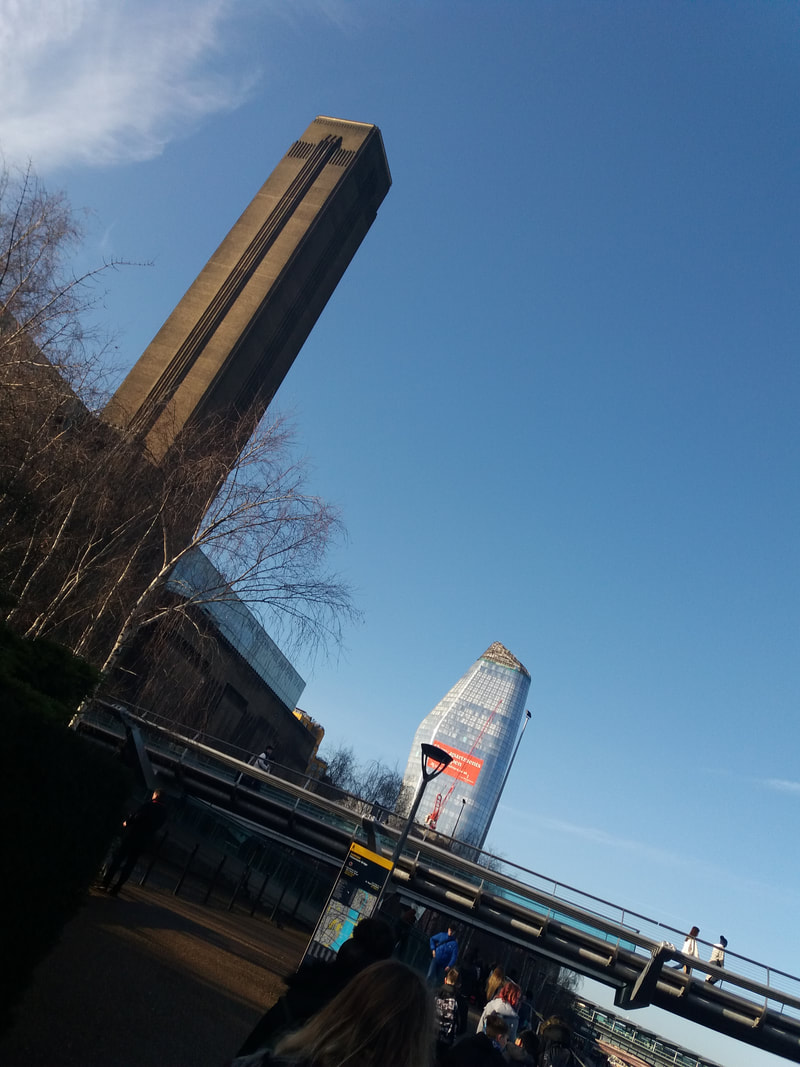
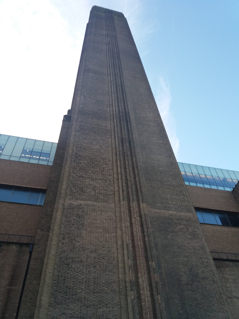
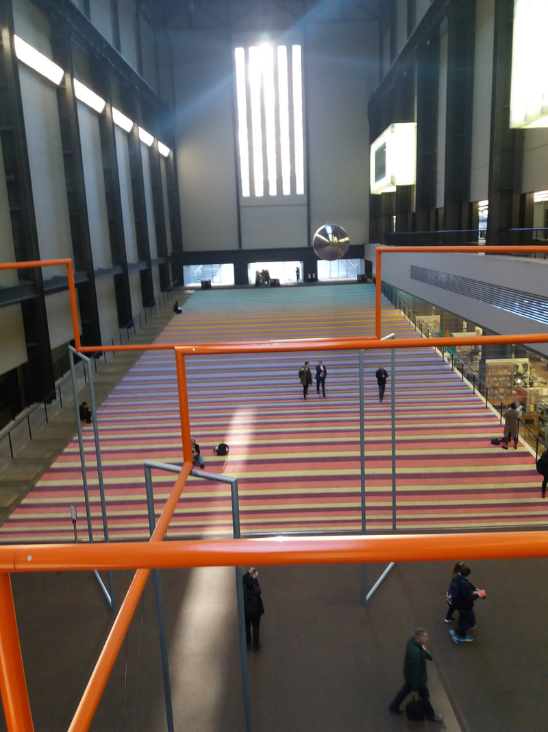
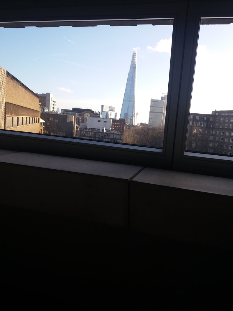
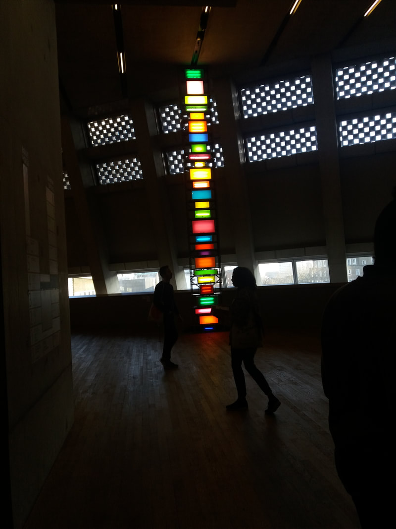
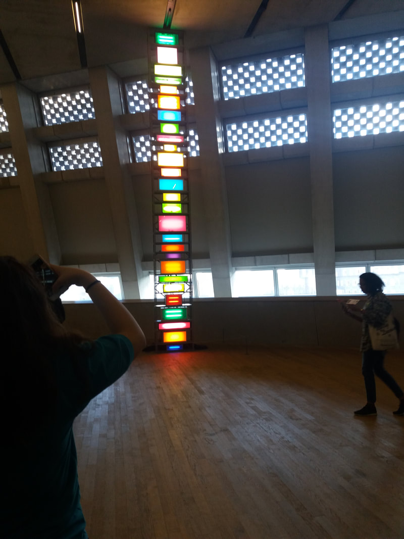
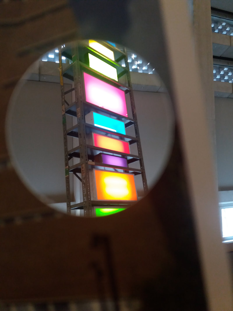
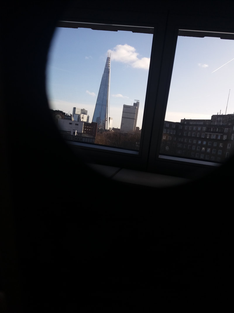
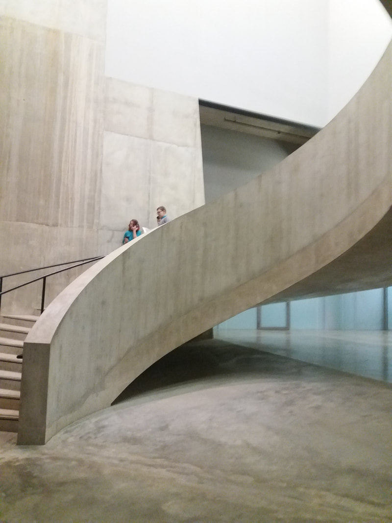
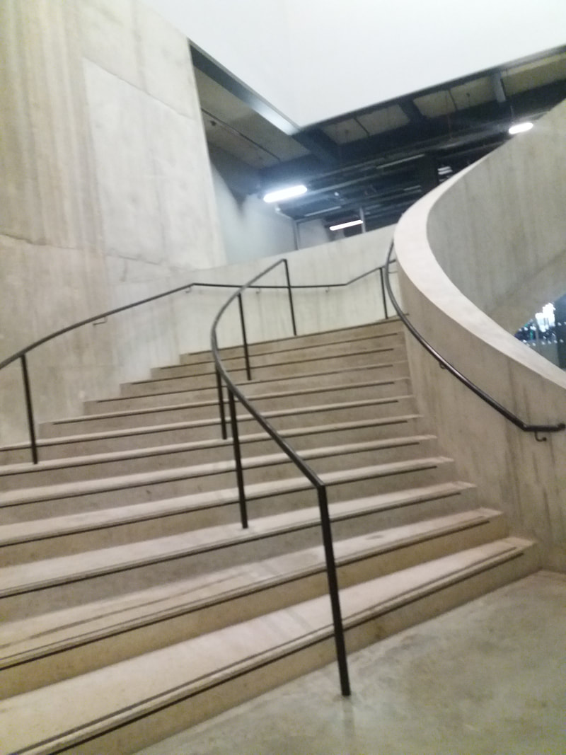
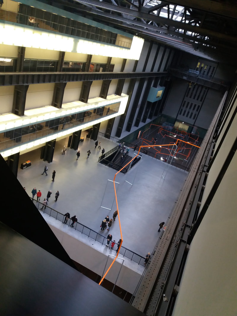
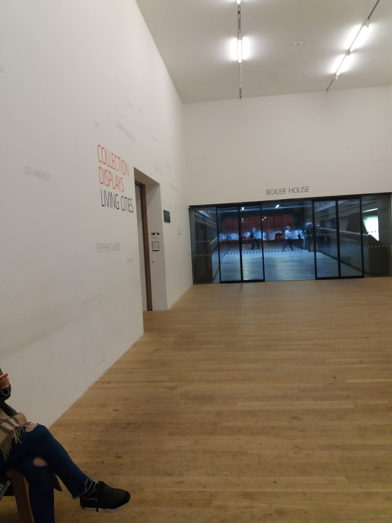
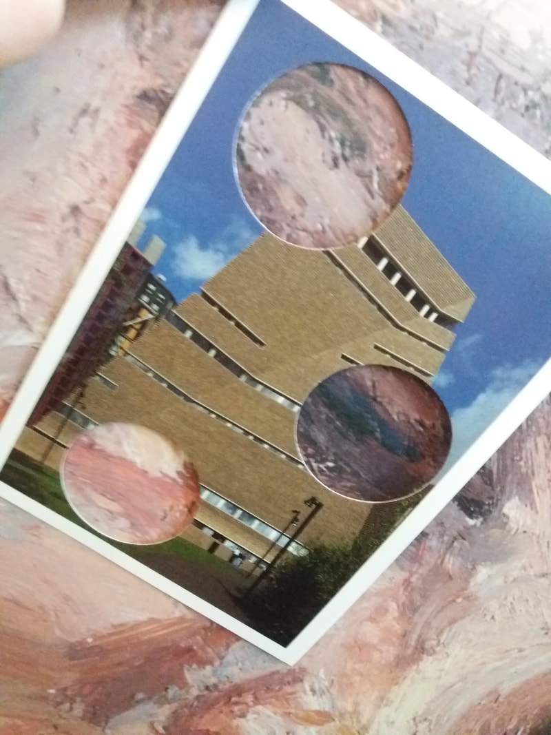
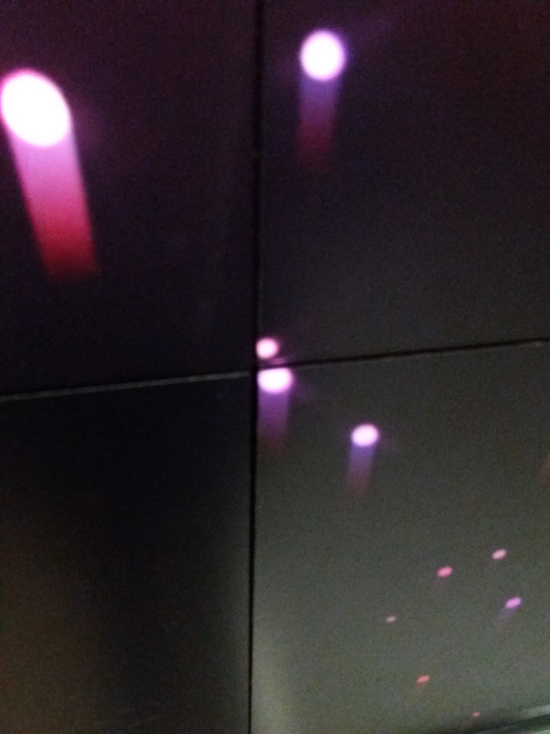
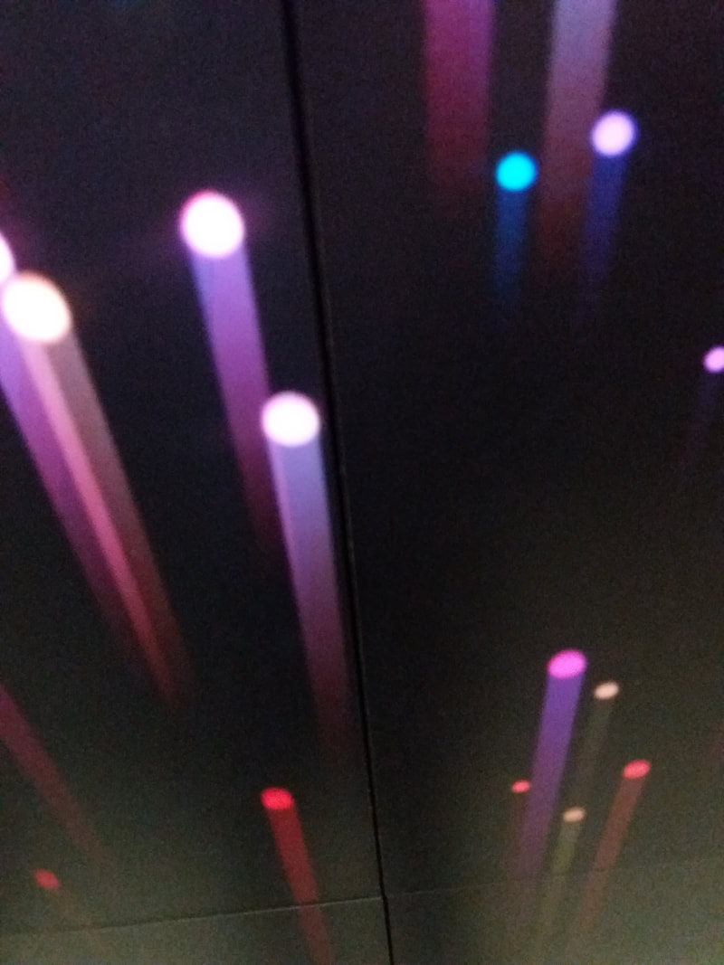
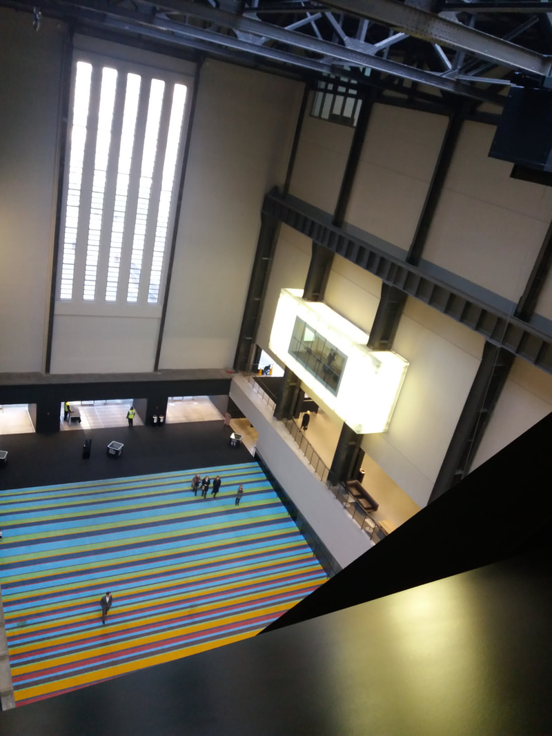
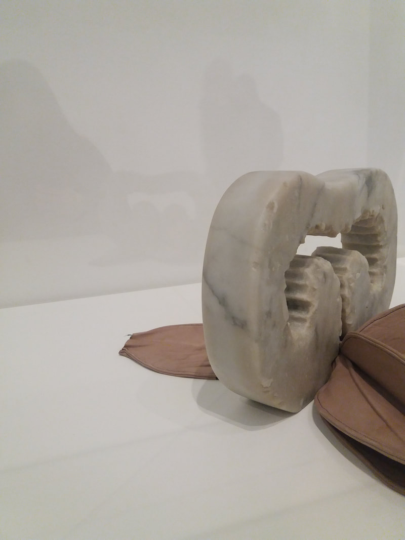

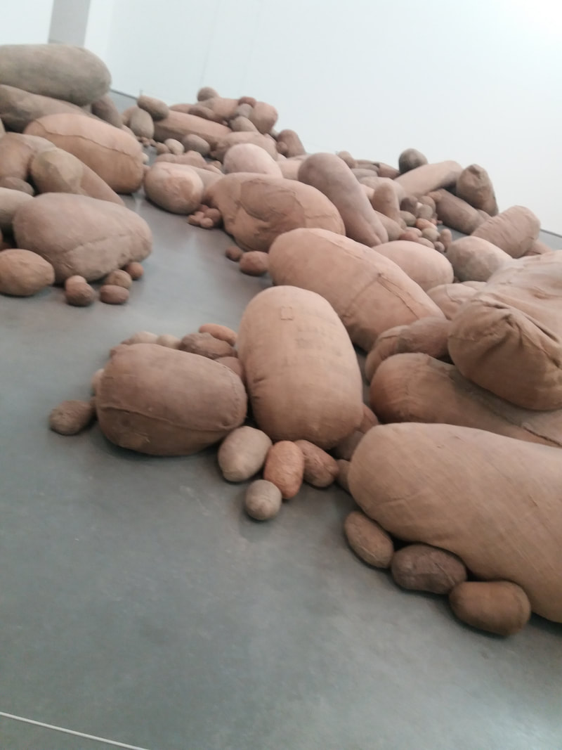
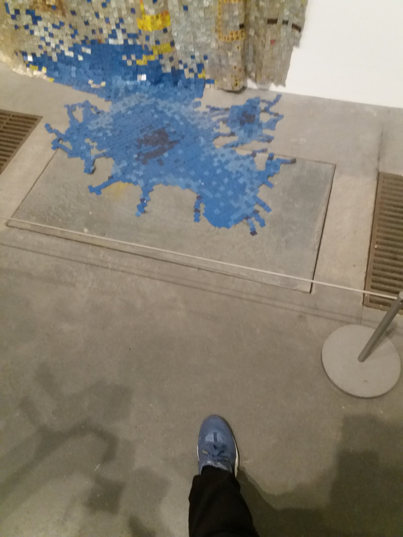
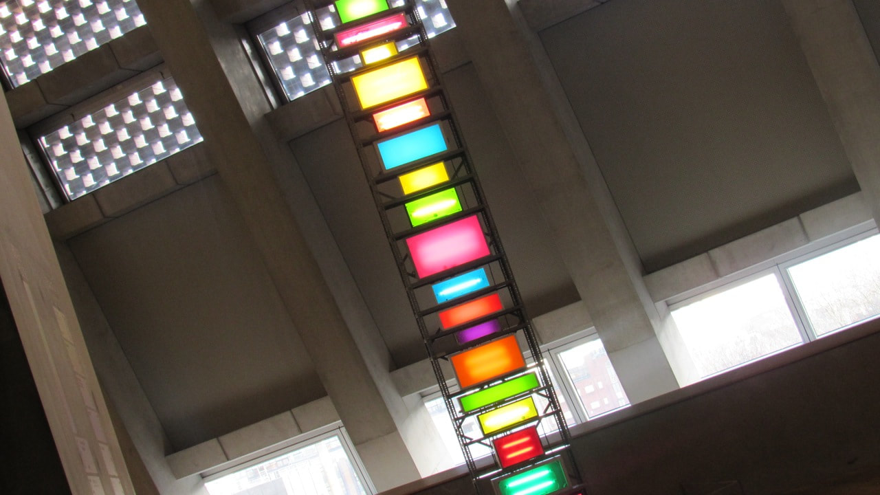
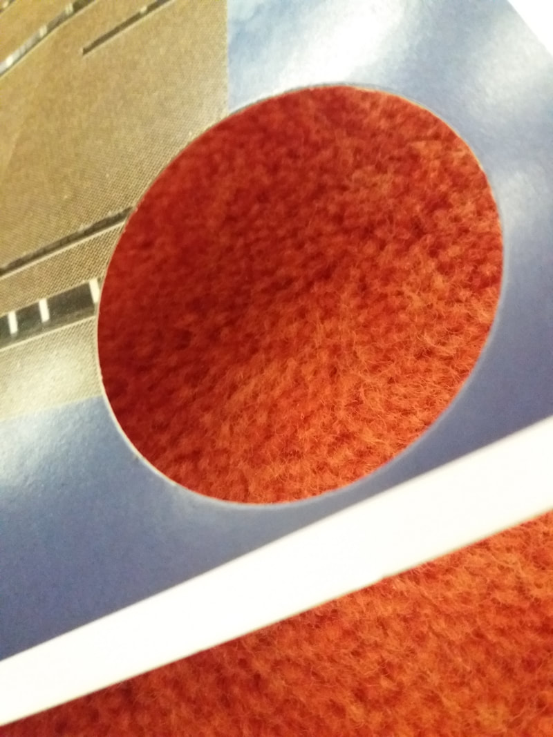
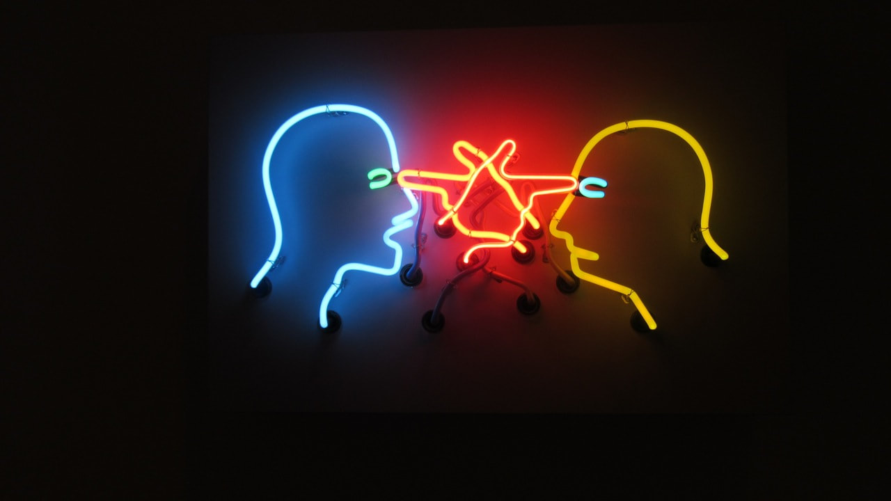
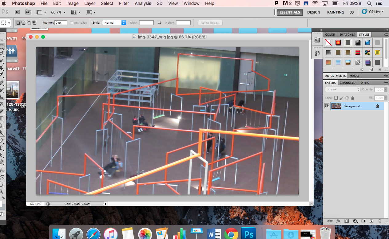
my experience of the tate
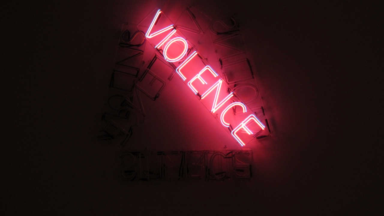
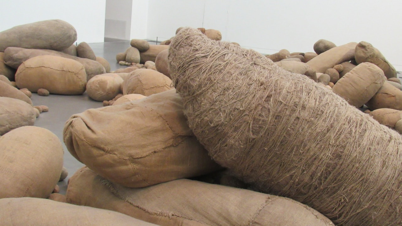
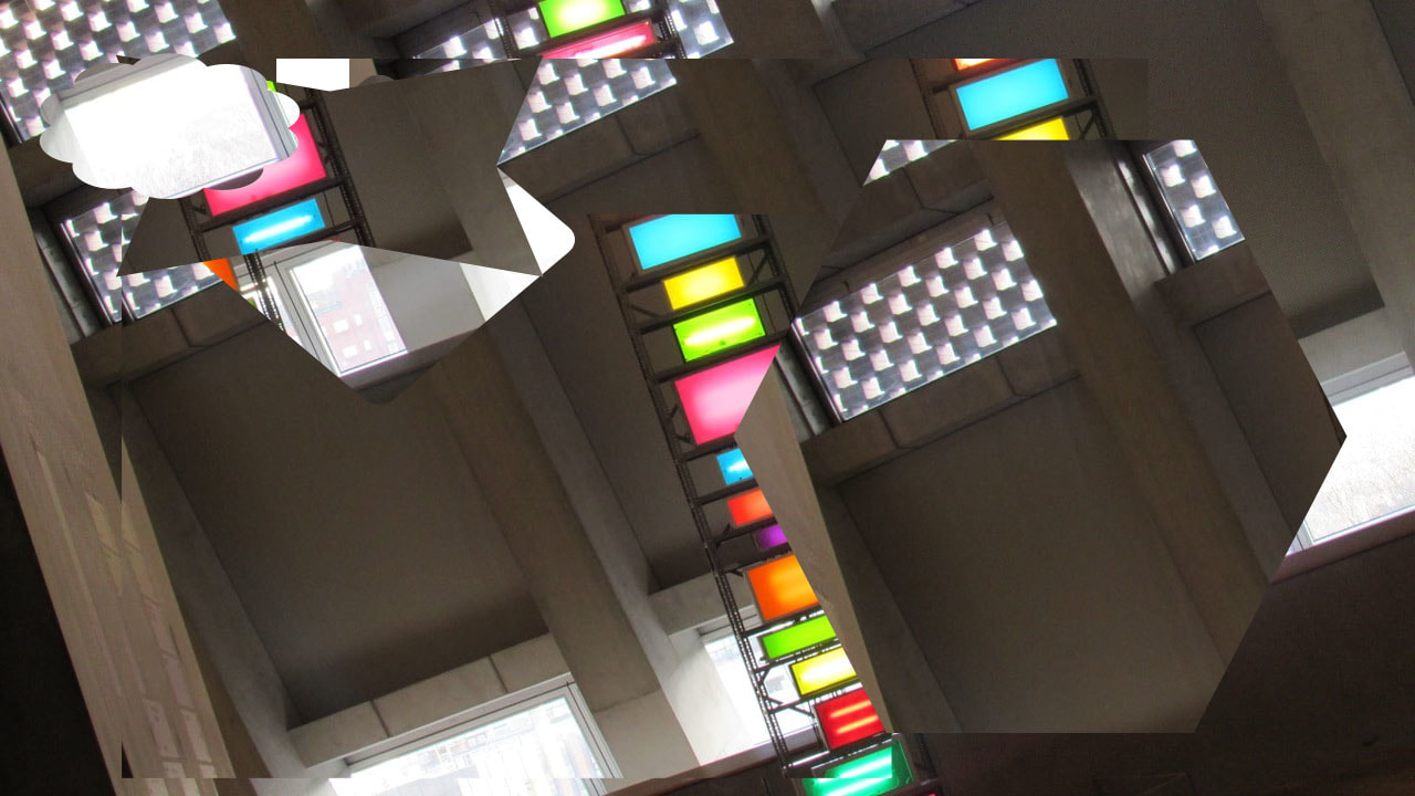
We went to the Tate Modern where we took many photographs using a postcard with circles cut out of it and we also used a sculpture picture printed into a cube, my favourite room was the neon light room it was really cool and the camera really did pick the lights. I didn't really like the the potato room it was just boring. I also really enjoyed level 10 (top floor) it was amazing because i have never really seen that before or the experience.I also think what I really like about going is seeing different ways to present all different types of sculptures and pictures.
my favourite pictures that i took


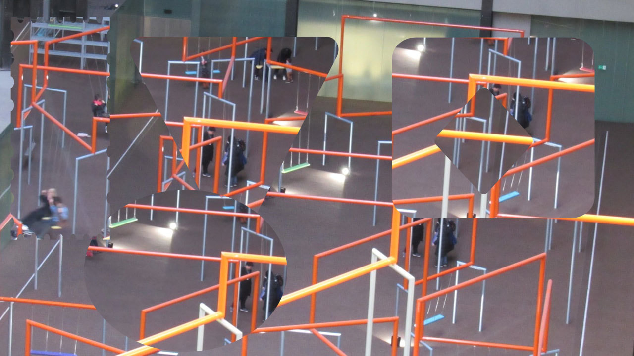
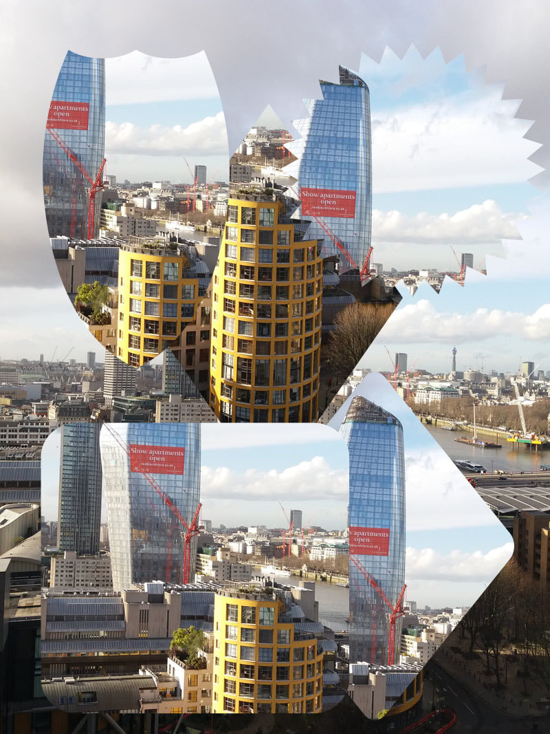
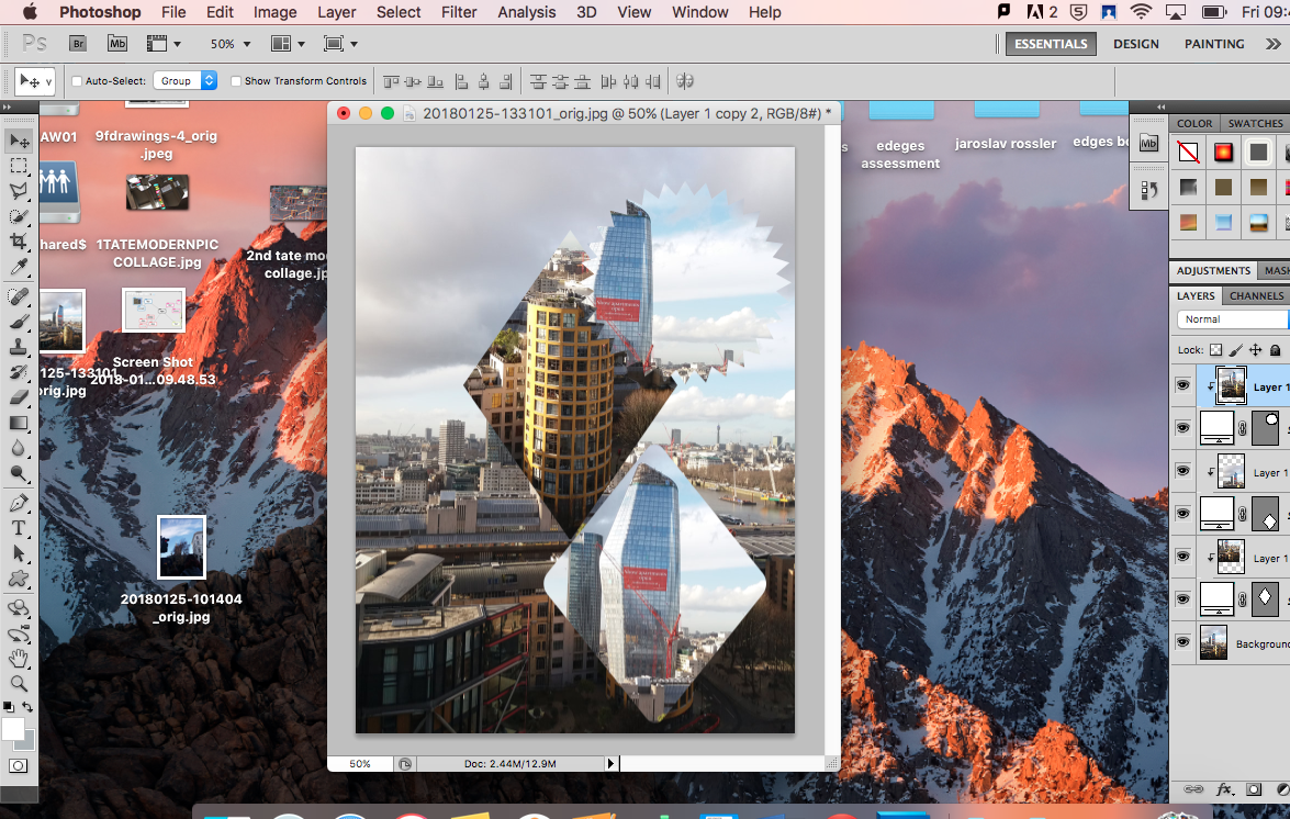
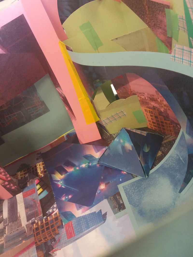
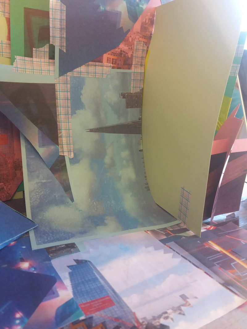
Tate Modern colages
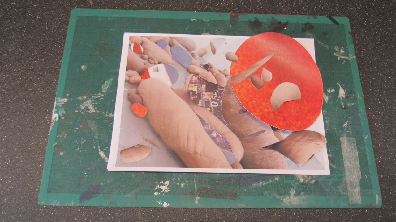
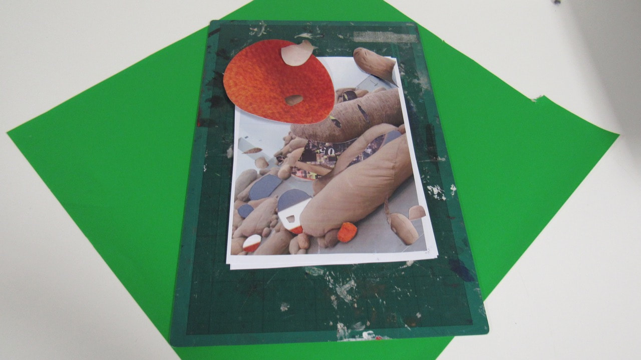
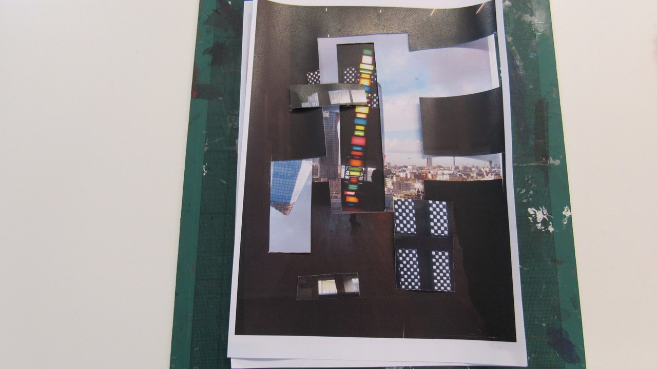
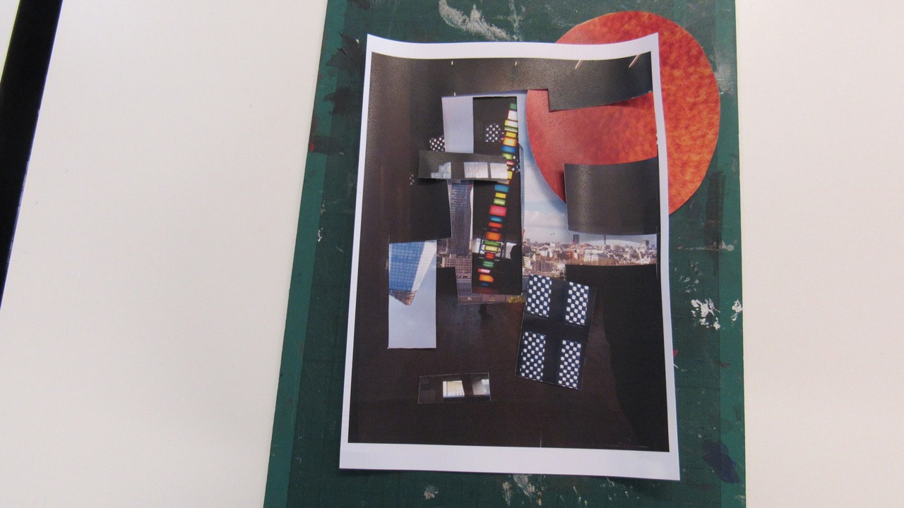
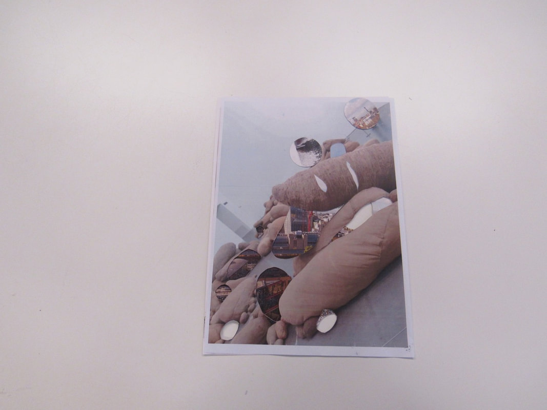
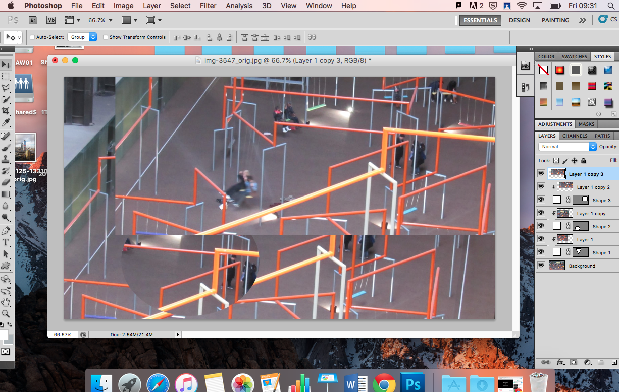
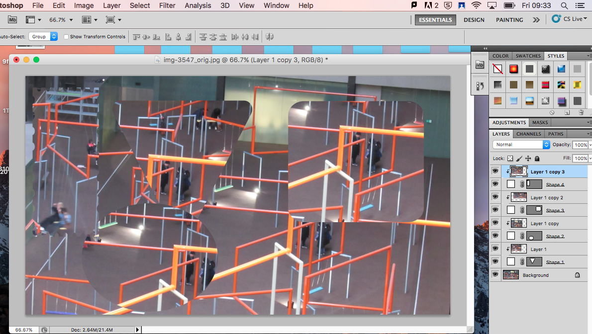
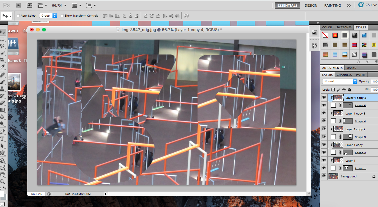
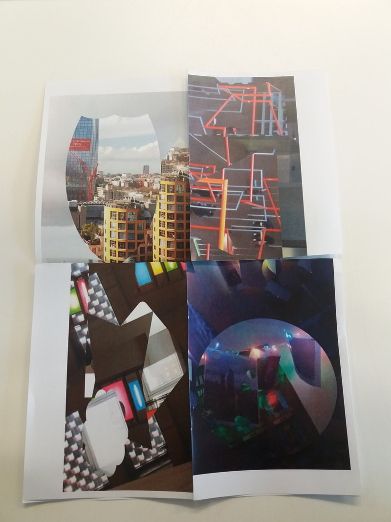
edits on the Tate Modern pictures
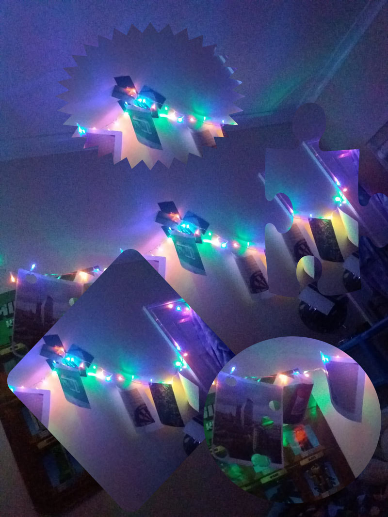
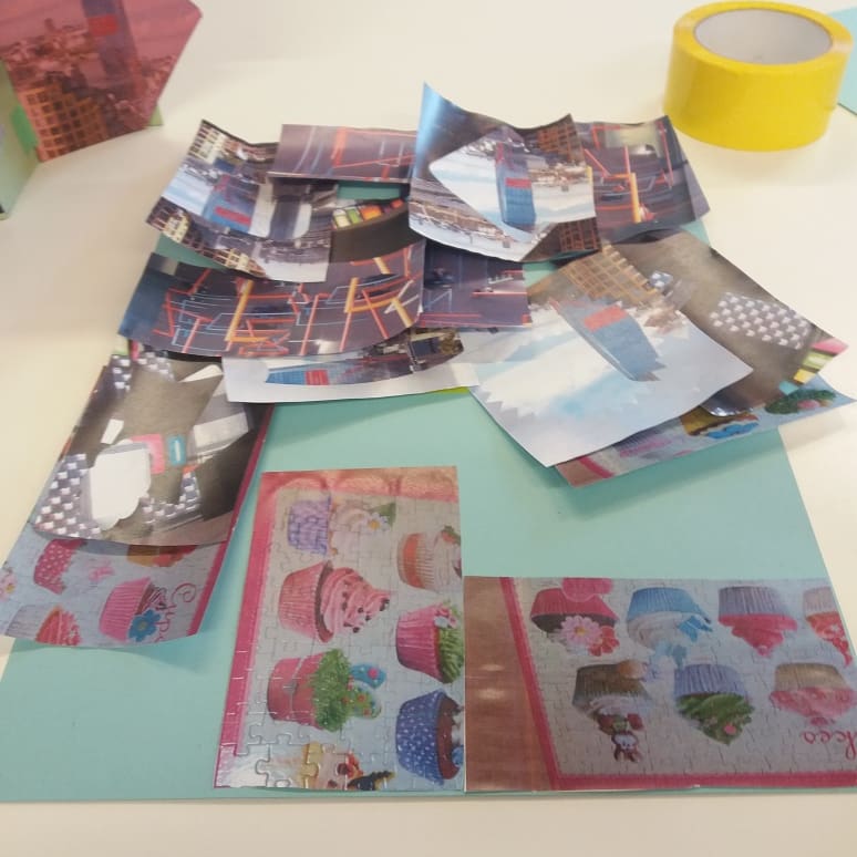
progress of my making
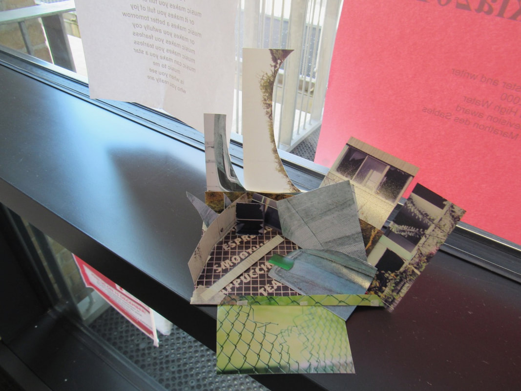
Exhibition
Individual experimenting
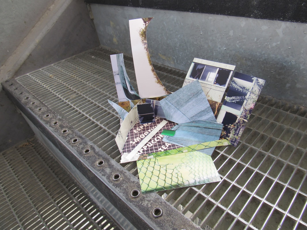
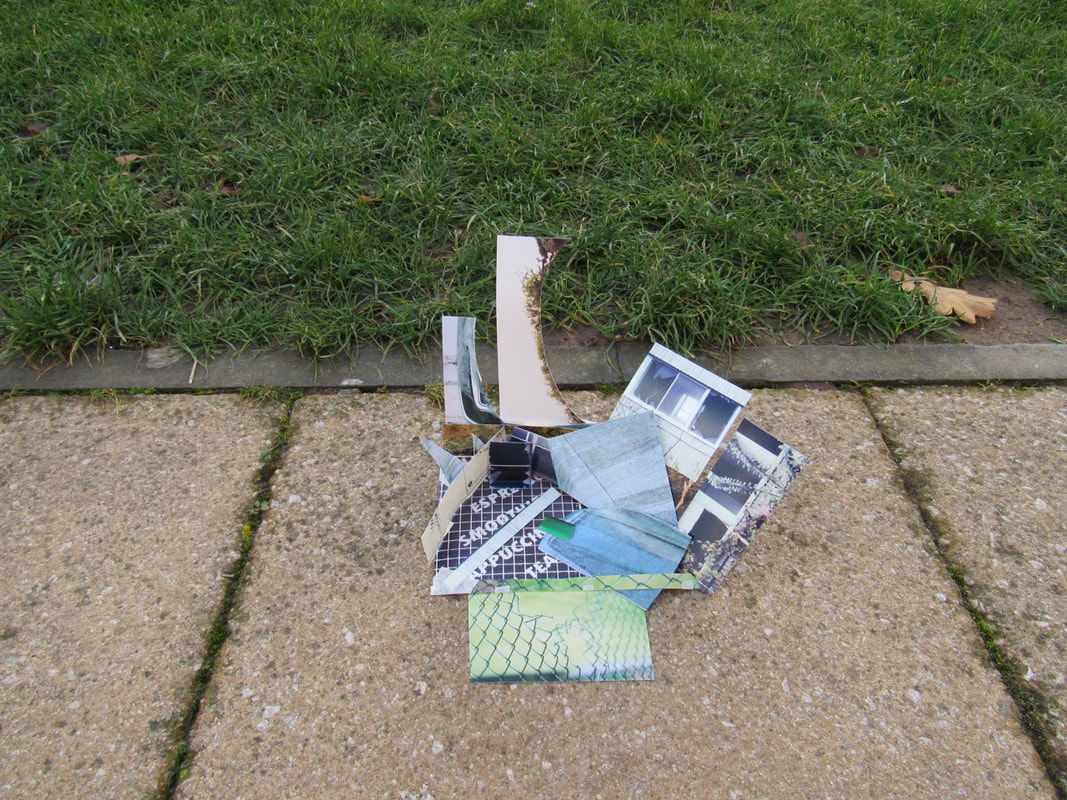
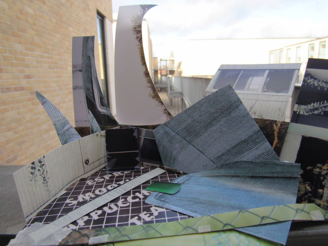
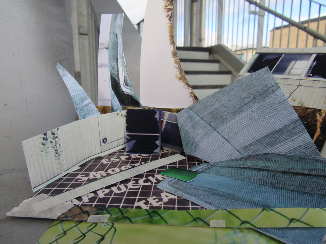
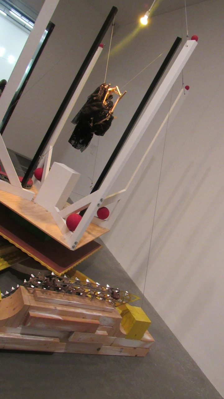
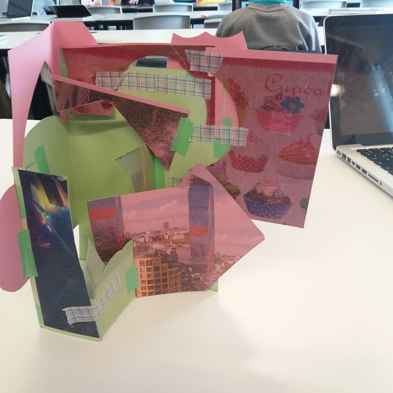
Progress of my sculpture
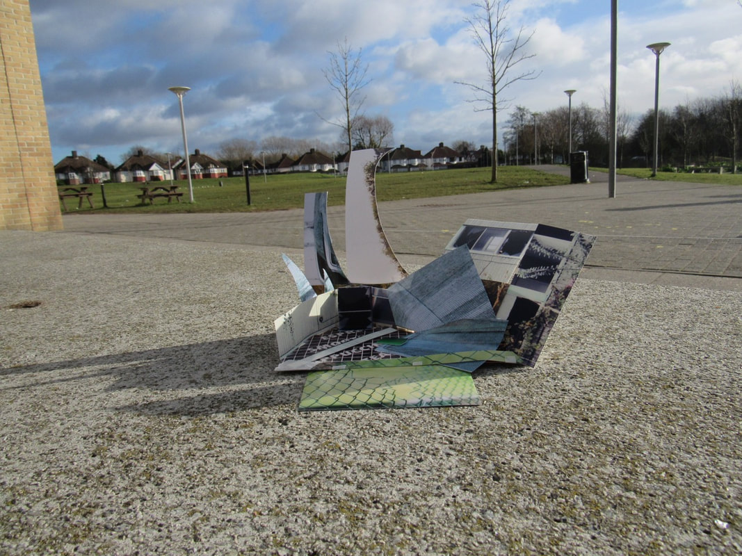
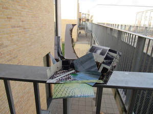
finish product of my sculpture
Final outcome evaluation
what went well: I think I did really well on my final outcome due to all of the different types of photos that I incorporated into my piece and also the way that I used them and placed them. I also think I did really well in the way I presented the base of my sculpture, I really like the collage of all the different pictures that I have used.
even better if : I think I need to work on the strength of my sculpture and I could do that by using extremely strong tape to hold it up better because it wasn't paper that I used it was card. I also think need to work on the way I take my pictures because I want the person who will see the sculpture in different space and angles, I also think I should work on the shadows and the lighting of my pictures just to make it more interesting for the viewers to look at. If I wanted to make the picture way more interesting I could do some editing in photoshop and that will add texture to the photograph.
even better if : I think I need to work on the strength of my sculpture and I could do that by using extremely strong tape to hold it up better because it wasn't paper that I used it was card. I also think need to work on the way I take my pictures because I want the person who will see the sculpture in different space and angles, I also think I should work on the shadows and the lighting of my pictures just to make it more interesting for the viewers to look at. If I wanted to make the picture way more interesting I could do some editing in photoshop and that will add texture to the photograph.
My sculpture relates to edges due to the cut out edges of the card and also when I take a picture I could put a light on my phone to make a really cool and interesting shadow, it also related to edges because when I place the tape on my work it makes an edge around that and also the whole sculpture has multiple edges.
I got my ideas from before when I did a sculpture with only 5 small pictures on card so I thought if I enlarged it, it would look better and more interesting for the people that are going to view my work. I was experimenting with another lot of small pictures on card to create a sculpture just so it will recap over my mind and so I have an idea of wha to do and how to create it in a good way so it will stand up and not fall down which means I will need extremely strong tape because it is bigger and because it is A4 paper on card as well.
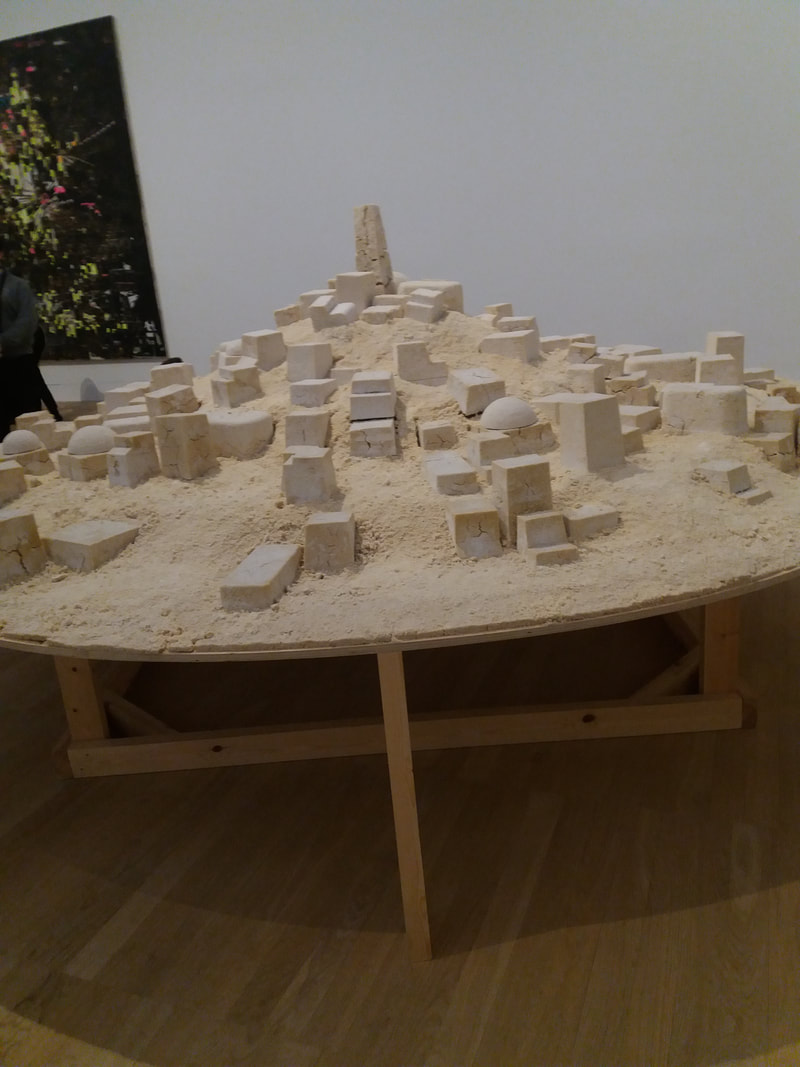
my assessment information- research and ideas
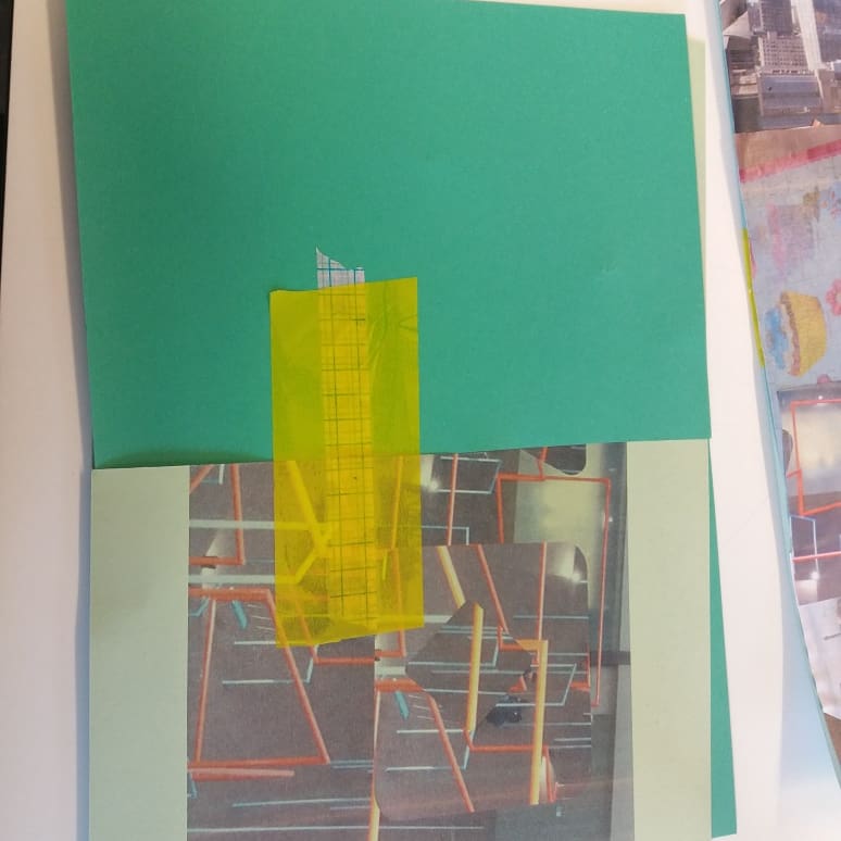
The artist I have been researching is called Guy Laramee, what I found interesting about his work is the types of art he does into wood which creates alot of edges throughout the whole piece of work, what I learned from him is that you can start with an extremely dull piece of wood and make it into something amazing.The ideas I had about edges in photography is a mixture of all different things, example: photoshop collages and the maybe put it into to a big sculpture, so there is multiple edges throughout it all. The types of edges I have explored during my edges work is creating multiple pieces of photos and cutting into them with maybe a circle cutter or a scoulpool to make different shapes and then put them all on top of each other.I think my best idea was creating loads of photoshop collages and printing them out on coloured paper to give it a good affect.
my assessment information- experimentation, development & refinement
The experiments I have carried out during the edges process is photoshop collages and edits on the photos, sculptures, picture sculptures. The best experiment that I have done is the photoshop edits and collages.The only creative risks I have taken is the photoshop collages especially trying out different types of ways to do it just to make it more interesting.The way I have developed and refined my sculpture is by adding a corner where it is full of interesting little sculptures which makes a back aswell.
my assessment information- resolved final outcome
My final outcome I made was a big sculpture with different pictures all included and photoshop collages. The one I am most happy with is my sculpture because everything is included which makes it way more interesting. If I had way more time I would gather loads of pictures and put them all together onto one massive bit of card.The most important thing that I have learned during the edges project is that anything that you make will be have some sort of edge and you can easily make something extremely dull to something amazing.
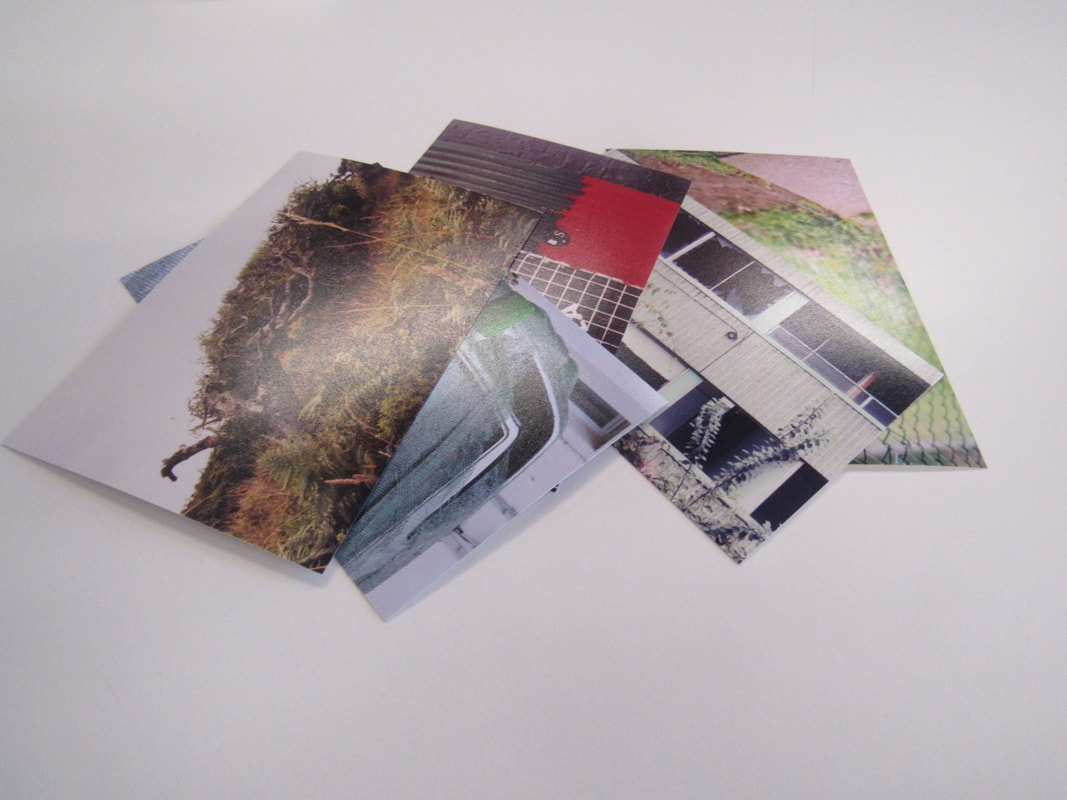
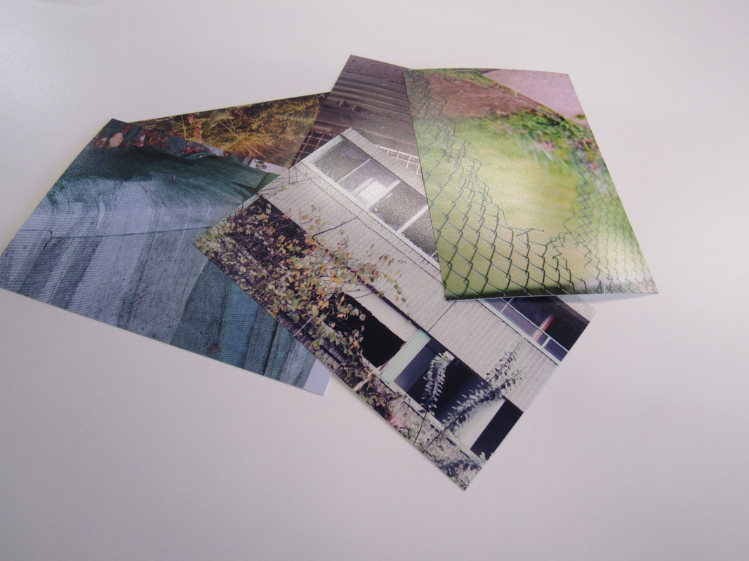
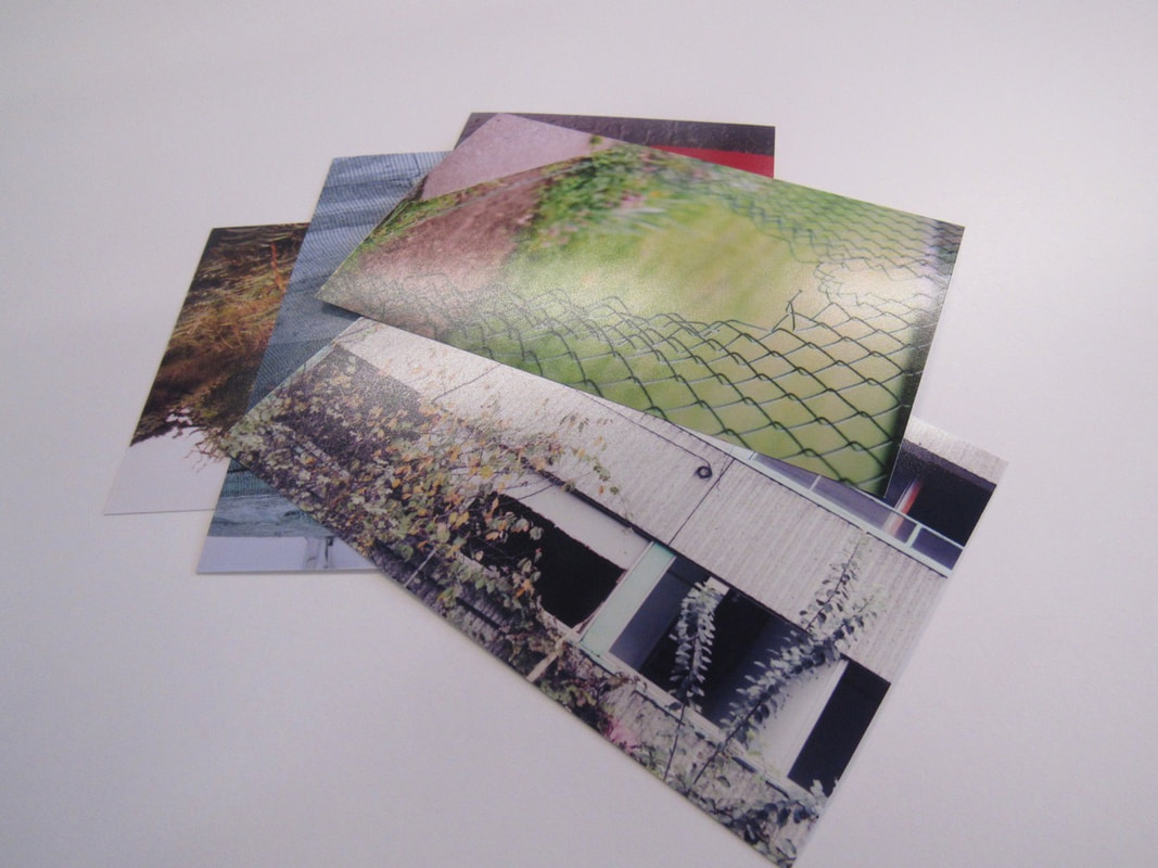
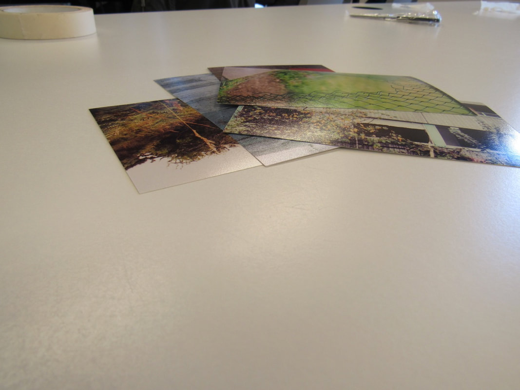
my final outcome of my 10 cards