What is a photogram
A photogram is when you create ad image by the use of light and chemicals to show where the light has been absorbed and where it hasn't. You mainly do thins process in a dark room so the image will get the best of light absorbed when using the machine.
How Do You Make A Photogram
1~ Firstly you chose a series of objects to place on your light sensitive paper (which absorbs the light shown in the spaces where the objects have been).
2~ Then you arrange the objects in whatever position you wish.
3~ Thirdly, you turn the machine on which projects light onto the paper.
4~ When the paper has been absorbed for a good amount of time roughly 8~10 seconds, you remove the paper from the machine.
5~ When done you put the image in a 2 chemicals and then which the image has come through you rinse in water to take off the excess chemicals.
6~ Then you leave to dry.
Evaluation
|
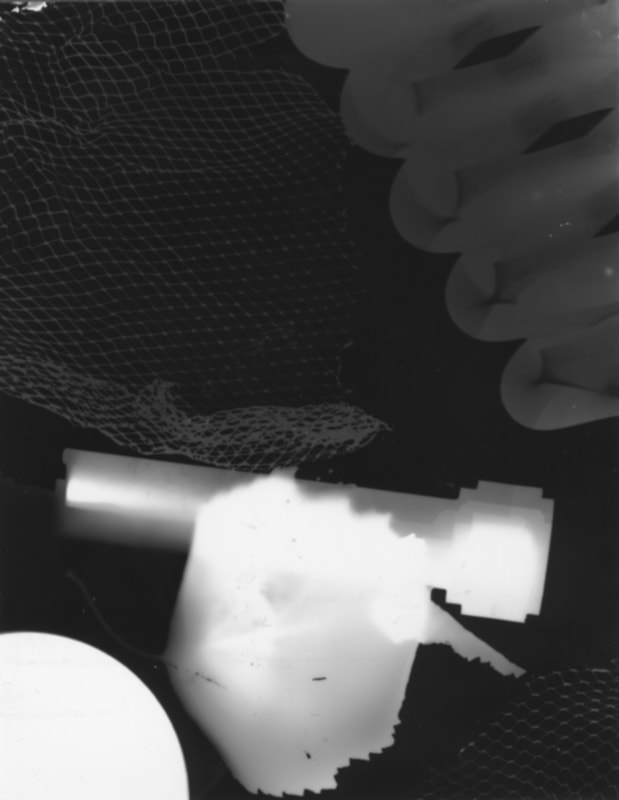
What I like about this photogram is where I have put the spring in the top right of the image, it has made it look like spirals which create a intriguing affect to the image. What I think I can do to improve my image is to leave it in the chemicals and let the paper absorb more light for a bit longer because the image hasn't come out as strong and defined as I would have liked.
|
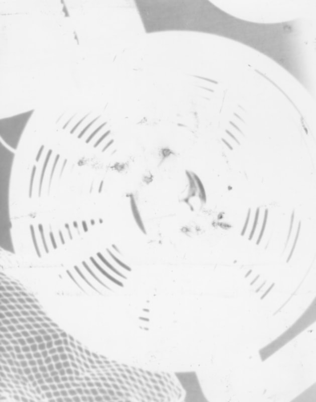
What I like about this photogram is that the spiral bit looks like its getting smaller as it is going into the background. What I think I could do to improve my image is to take it out of the chemicals a little bit shorter because it is quite bright and you can't really see the image clearly. Also the contrast between the colours aren't very good, the white has overpowered the black.
|
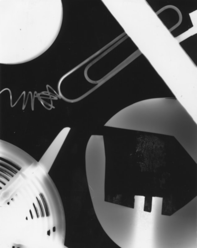
What I like about this photogram is the contrast between black and whit it is perfect, neither is overpowering each other. What I think I can do to improve my photogram is while I was making it I should have thrown little bits of scrap on top of everything just to give it a little bit more texture and to give the image a bit more liveliness to it.
|
