Exam question paper
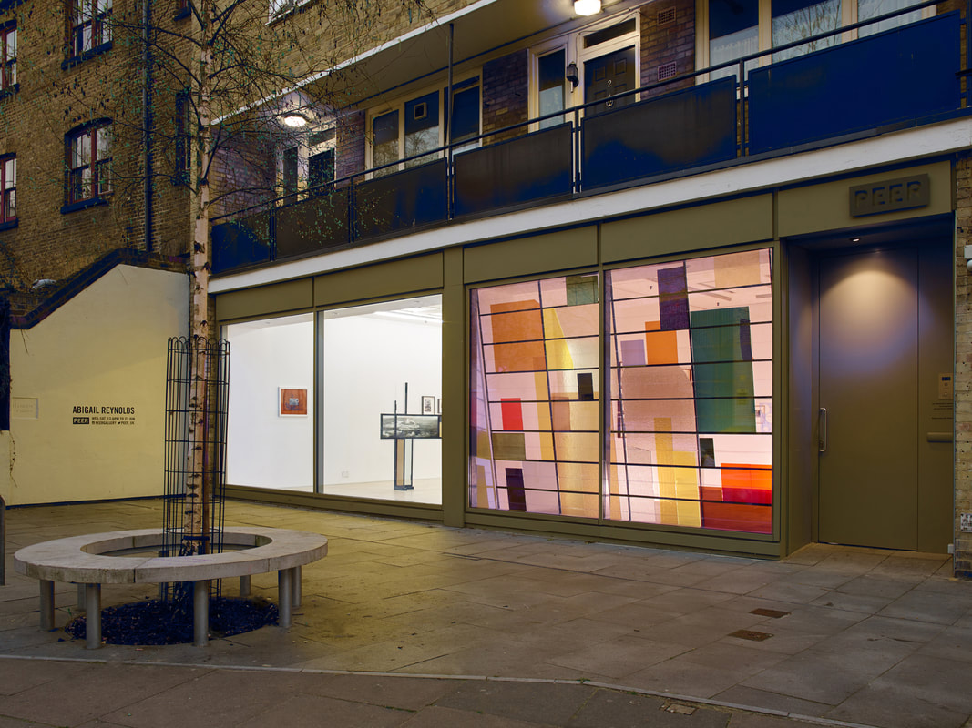
Paper can be the subject of the photograph and the material from which it is made. Jerry Reed and Ion Zupcu have taken photographs of paper constructions and used the careful control of lighting and shadow to explore monotone compositions. Aaron Siskind used the camera to record the textures and tones of torn and damaged paper posters found on the walls of buildings. Abigail Reynolds and Aldo Tolino layer, rip, cut, fold and occasionally combine photographs to form paper three-dimensional relief images.
Research appropriate sources and produce your own response to Paper.
Research appropriate sources and produce your own response to Paper.
Component 2
Why I chose paper
I chose paper as my theme because of the way you can experiment and do loads of different trial and errors, being able to combine so many techniques and put them into place to make this final piece of work. Paper can be portrayed and made into so many things which could be a collage full of abstract images placed into one piece, or tears in the paper with many different image combined into one. I find paper really interesting as you can do so many different things with it and arrange it to your liking, being able to throw all your ideas out onto paper, paper is also shown as being a ritual as you write on paper all the time, coming from trees to shavings of tree bark to then paper which is used in every day life.
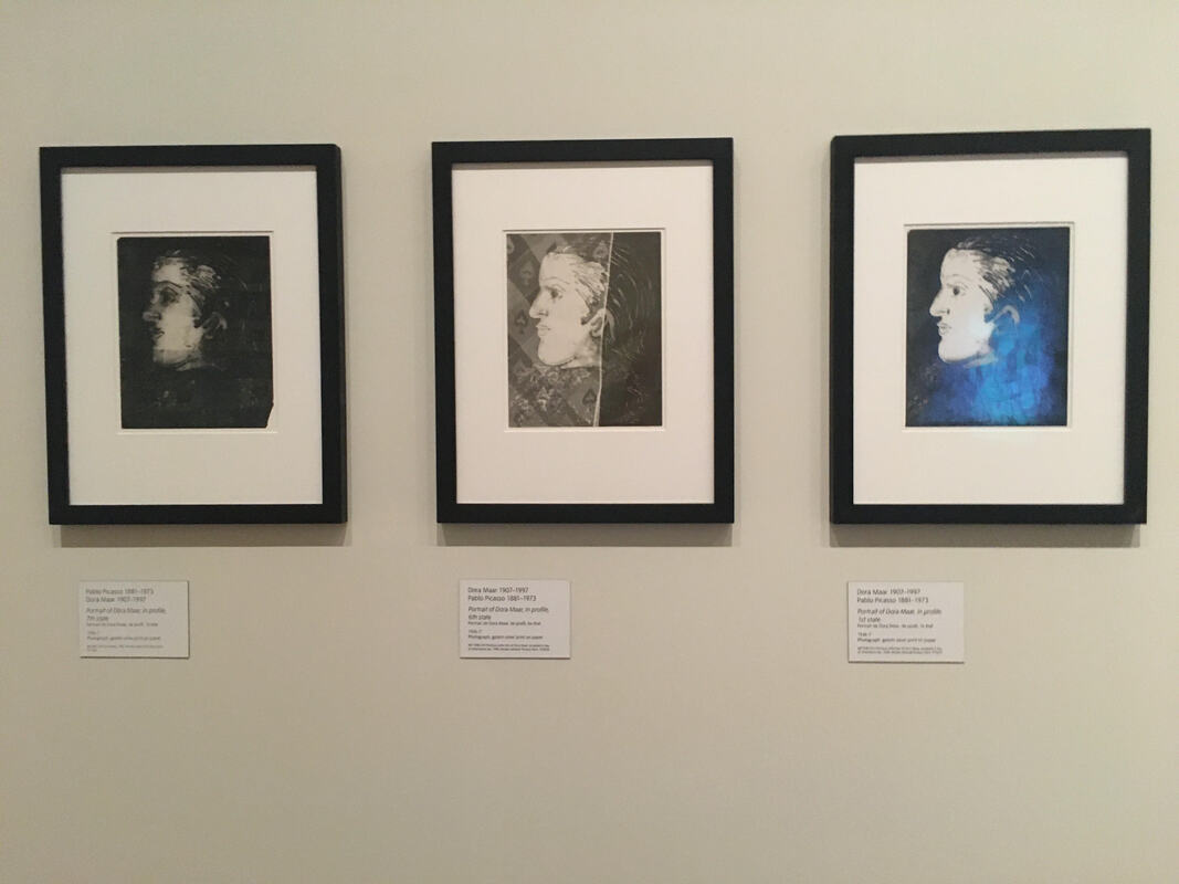
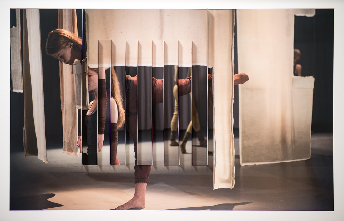
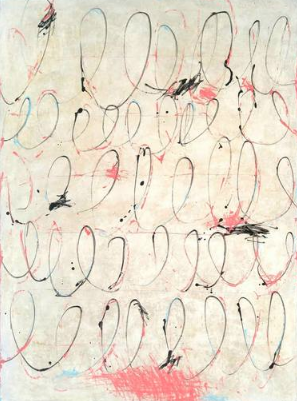
Tate Modern - Dora Maar
Research about the named artists
Ion Zupcu
Ion Zupcu is a fine art photographer who mainly does still life images.
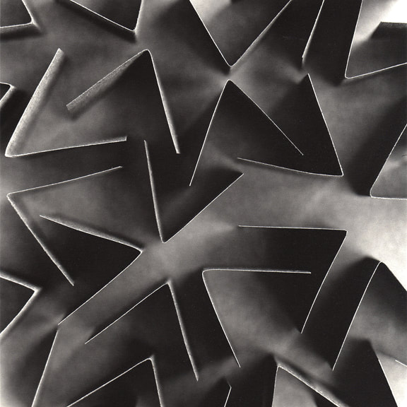
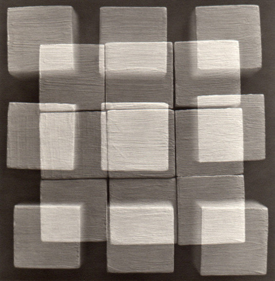
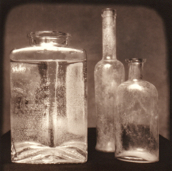
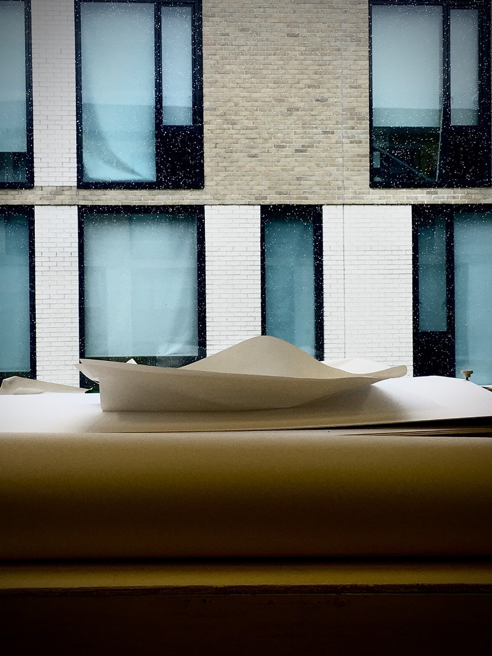
What interests me about these specific images is the way they have been presented, there quite random but also simplistic as well. The shadows that have been formed by the position of the light on these images shows me how much only a little bit of light can change the image to a completely different image. Out of all 3 of these images the ones that draw my eye even more than the others is the second and third one, the bottle image looks like some sort of sparkle has been placed in there or residue of something shiny. The middle image has an overlapping effect which could represent the combinations of ideas that have come to the artist. All three of these images have a undertone of grey which emphasises the actually image as they are brighter or even and outline of dark. Image one I think is based around abstraction as the directions of the cut out arrows are pointing in so many different directions, some are facing each other, some are connected which could suggest the contrast between the dark black and light grey.
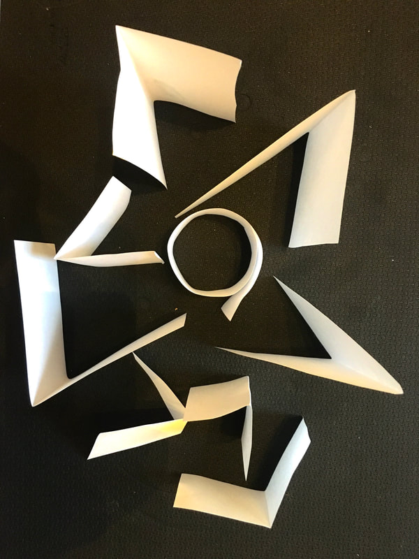
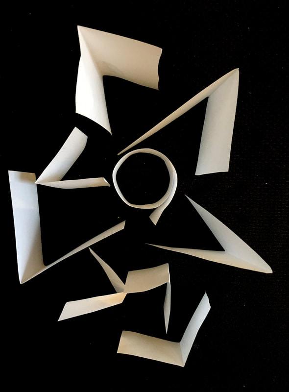
Response to Ion Zupcu
Ideas
- Take a glass and blow coloured bubbles into the glass so when it hits the side of the glass it will pop and when your look at it there will be circles of where the bubbles have been and recently popped.
- different coloured paint or pencil overlapping in different direction, there may be a colours being created as two or three different colours combine.
Evaluation
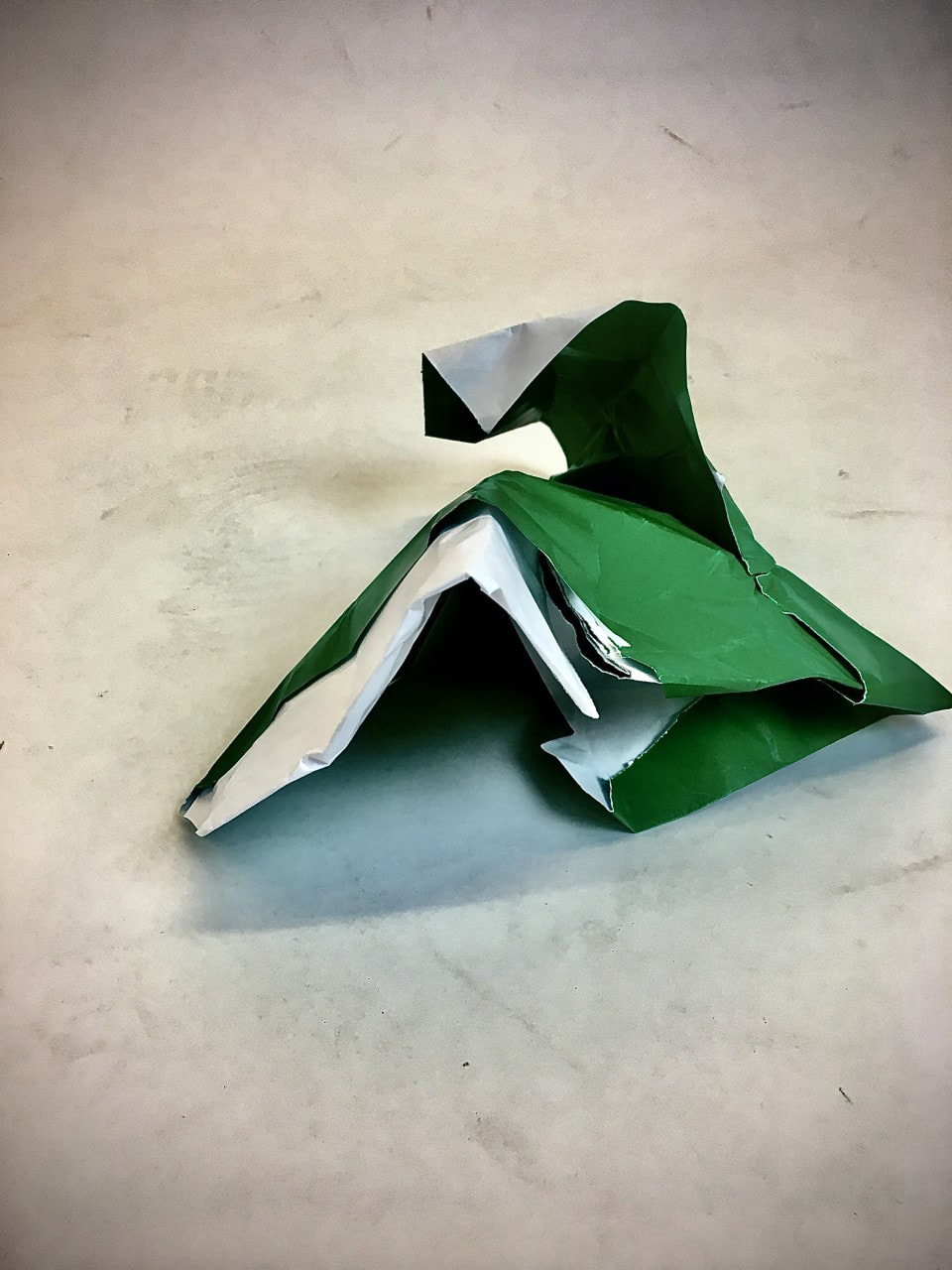
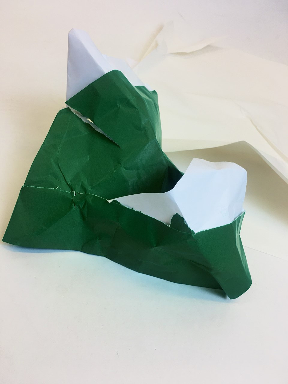
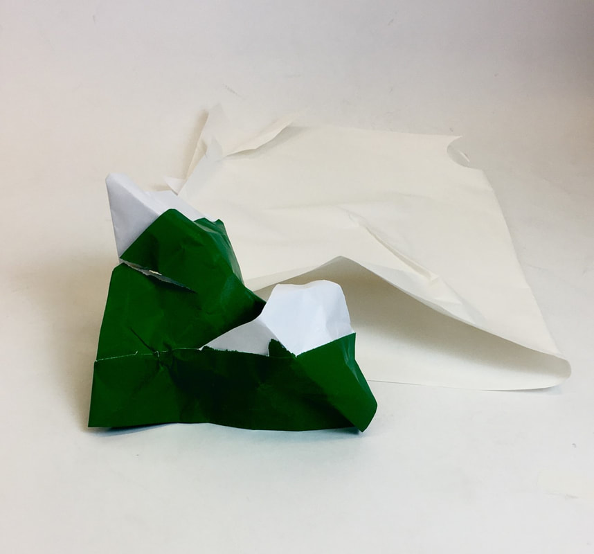
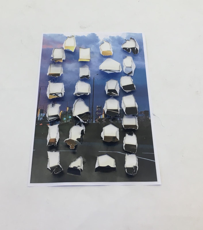
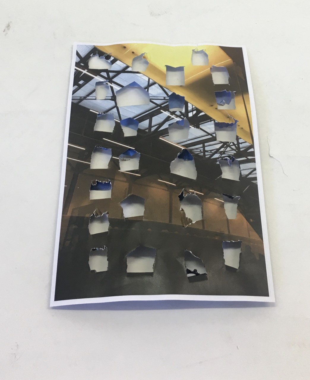
In this response, what I did was cut many different shapes out and folded them over. Image one is the one that isn't edited, in this image it only slightly shows the depth of each individual piece of paper what i mean by that is the sharpness of the folds or even the crinkles in the paper where i have help them with a grip. It also shows the shadows that are being made from the direction of the light onto the paper. Image two is the one image that has edited, what i have done is increase the contrast between the black and white so the only parts of the image are the white pieces of paper folded in the middle of the image.
Aaron Siskind
Aaron Siskind is a photographer who mainly takes images of a flat surfaces
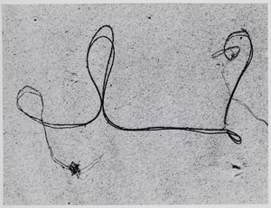
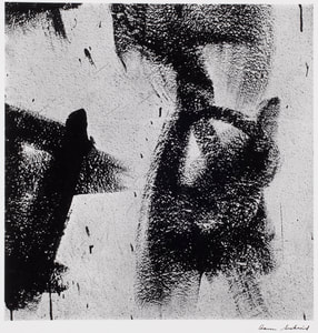
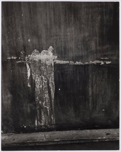
What I like about all these images is the way they have focussed on one object and made it into something that is slightly unrecognisable and abstract. As you can see from these images, Siskind only takes images with only one object in which does show the detail of something so little and how you can make one simple thing into something you have to focus on for some time. Image one looks like its a bit of string on a road, the way it has been tangled up in so many twirls and knots, also as its on its own it really does show all the bumps that has been produced. Image two looks like two things, one thing I can think of is some snow or white paint on black paper and someone has drawn a umbrella in it or something. The third image gives an impression that it is of a wall in a dirty area which has had graffiti drawn on the wall or paint and the wind has blown it to go directly down the wall. Another way these images intrigue me is by the large contrast between the background and the main object that is being photographed.
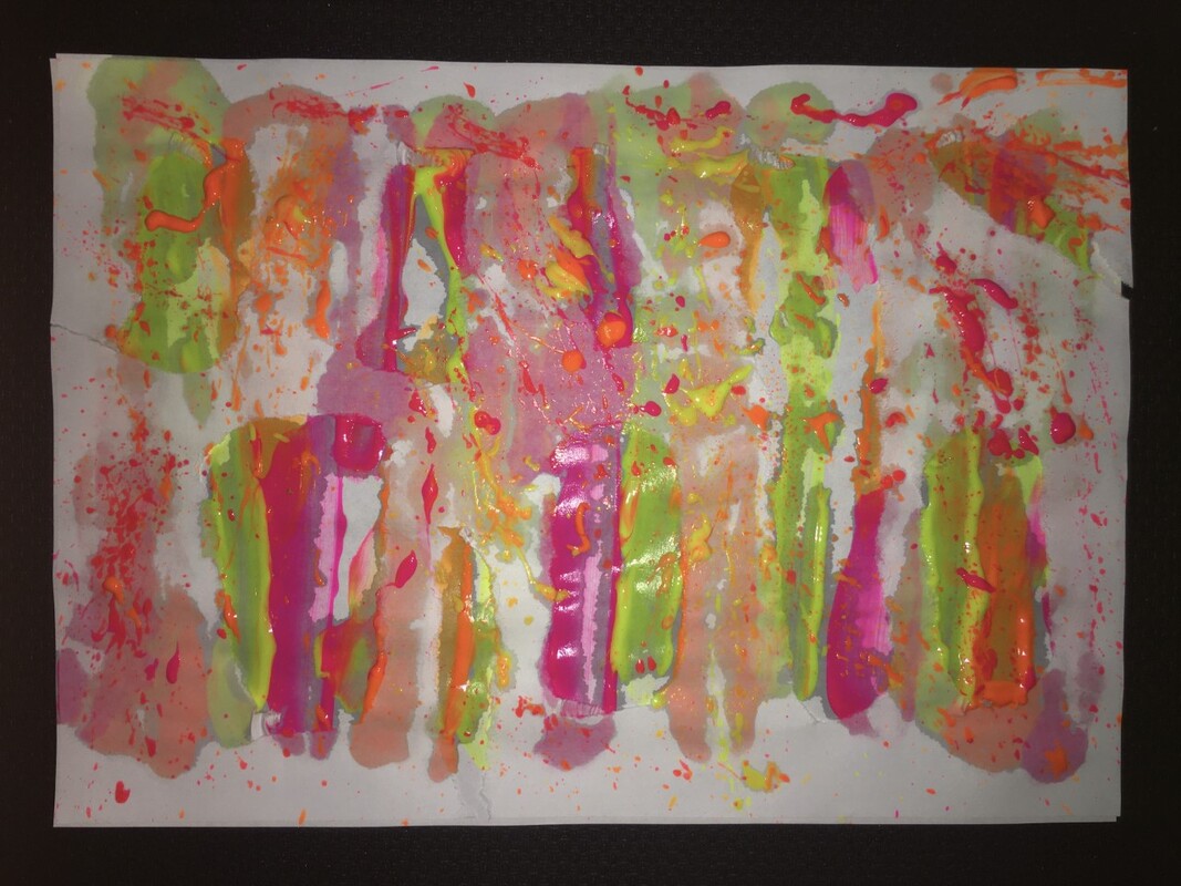
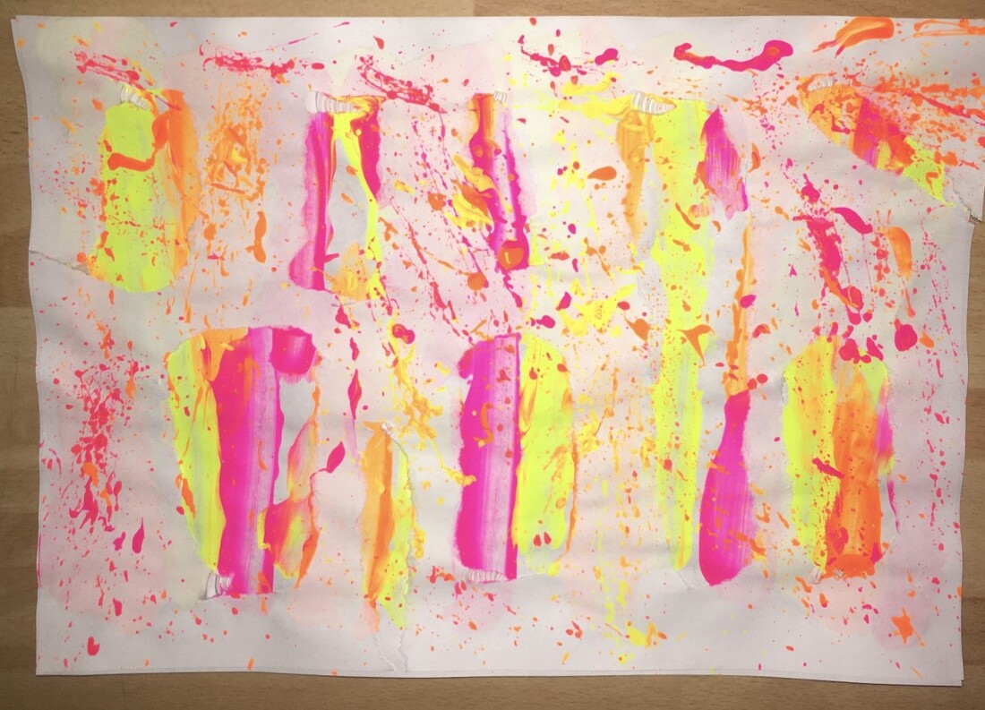
Response to Aaron Siskind
Aaron Siskind Photobooks
Ideas
- plain white paper with string with paint on it and lay it down in a squiggle and then pull it straight down, doing that with different colours and different directions.
- two portraiture images and tear the top image to give it two different perspectives.
- put a ripped piece of paper over the top of a fully painted piece
- have a dark printed image on a paper and then add hand prints over the top of it.
Evaluation
This response to Aaron Siskind I think was very successful, the dried version looks better than the wet version, mainly because you don't have the background paint showing through. The reason I took a wet and a dried version is so I could compare the different textures and how bright the colours of the paint was. As you can see there is rips in the top image and strikes of paint underneath, and also little flicks of paint over the top piece of paper. The texture being portrayed I think is very good as you have three different colours which are very bright/neon.
Abigail Reynalds
British Artist
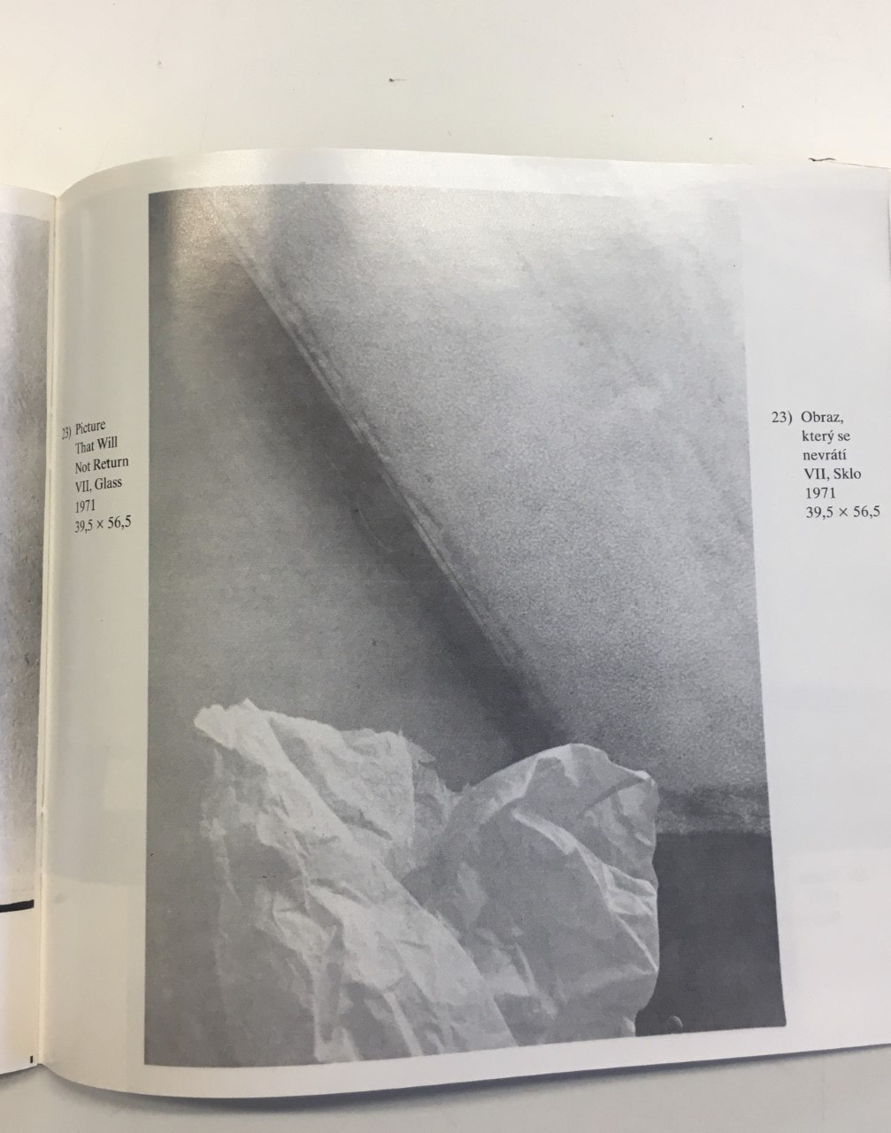
Jan Svoboda
Czechoslavakian photographer
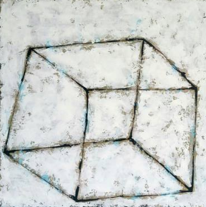
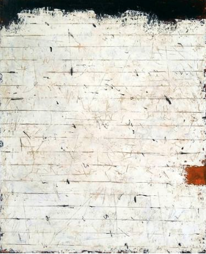
Jan Svoboda is a photograher and his aim was to ' redefine the language of photography in relation to painting and sculpture'. These images above are very abstract as they maybe suggested as being 'wrong', what i mean by this is that they are not in line or just aren't perfect. The focus on these images are only on the darker lines or shading which i find very interesting as it creates a tone of darkness. The image that i am most intrigued by is the 1st image, the cube outline is distorted and isn't the regular cube as it is wonky. All three of the images have little black spots all over the image which might suggest that it is old and worn. I find this work inspiring as it is he only artist that bases his work mainly on paper and the different type of drawing and texture it is showing.
Response
ideas
- images with a large contrast between colours
- scrunched up paper with light making shadows
- images with a large contrast between colours
- scrunched up paper with light making shadows
Evaluation
What I feel liked really well in the set of images that I made is the way the shadows are produced by the direction of the light. All 4 of the images have a lot of texture built onto them that could be the lighting, the texture of the paper ( scrunched, flat) or the way I have slightly edited them. The most successful image out of all of them is the top right, my reason being the way there is a big contrast between all three colours and also the scratching of the floor gives it a rustic and old tone to the image. My least successful I think is the bottom left as there isn't a lot of texture of colour except from beige and green, what I could have done to improve that is decrease the background light which may have been the reason why there is a big blast of white throughout the whole image. Overall the images that I took gave me a bigger variety/ more ideas to include in my further trials and final.
What I feel liked really well in the set of images that I made is the way the shadows are produced by the direction of the light. All 4 of the images have a lot of texture built onto them that could be the lighting, the texture of the paper ( scrunched, flat) or the way I have slightly edited them. The most successful image out of all of them is the top right, my reason being the way there is a big contrast between all three colours and also the scratching of the floor gives it a rustic and old tone to the image. My least successful I think is the bottom left as there isn't a lot of texture of colour except from beige and green, what I could have done to improve that is decrease the background light which may have been the reason why there is a big blast of white throughout the whole image. Overall the images that I took gave me a bigger variety/ more ideas to include in my further trials and final.
Against the light book- Jan svoboda
overall responses
Trial 1
Evaluation
This trial that i did didn't go as well as i would have liked to. The way i would have improved it is maybe by printing it on cartridge paper just to give it more texture to the image.
This trial that i did didn't go as well as i would have liked to. The way i would have improved it is maybe by printing it on cartridge paper just to give it more texture to the image.
